Chun-wei Fan made Libadwaita build with the MSVC compiler, meanwhile Christian Hergert implemented support for the system dark mode when running on macOS.
Misc Changes
Libadwaita 1.1 also includes a bunch of bug fixes, though most of them are also in the 1.0.3 point release.
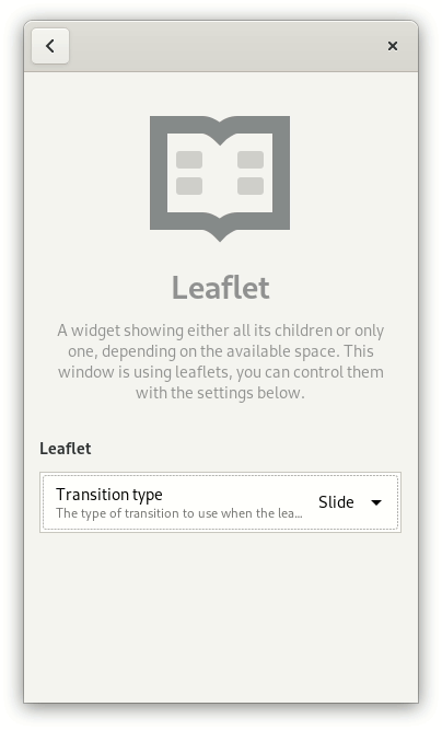
Libhandy 1.6
UPDATE: there’s 1.6.1 now, fixing a bug with HdyStyleManager.
Since Libhandy hasn’t had a release along with Libadwaita 1.0, the 1.6 release can be summarized as bringing it up to par with Libadwaita. As such, the two big new features in Libhandy 1.6 are:
New Docs
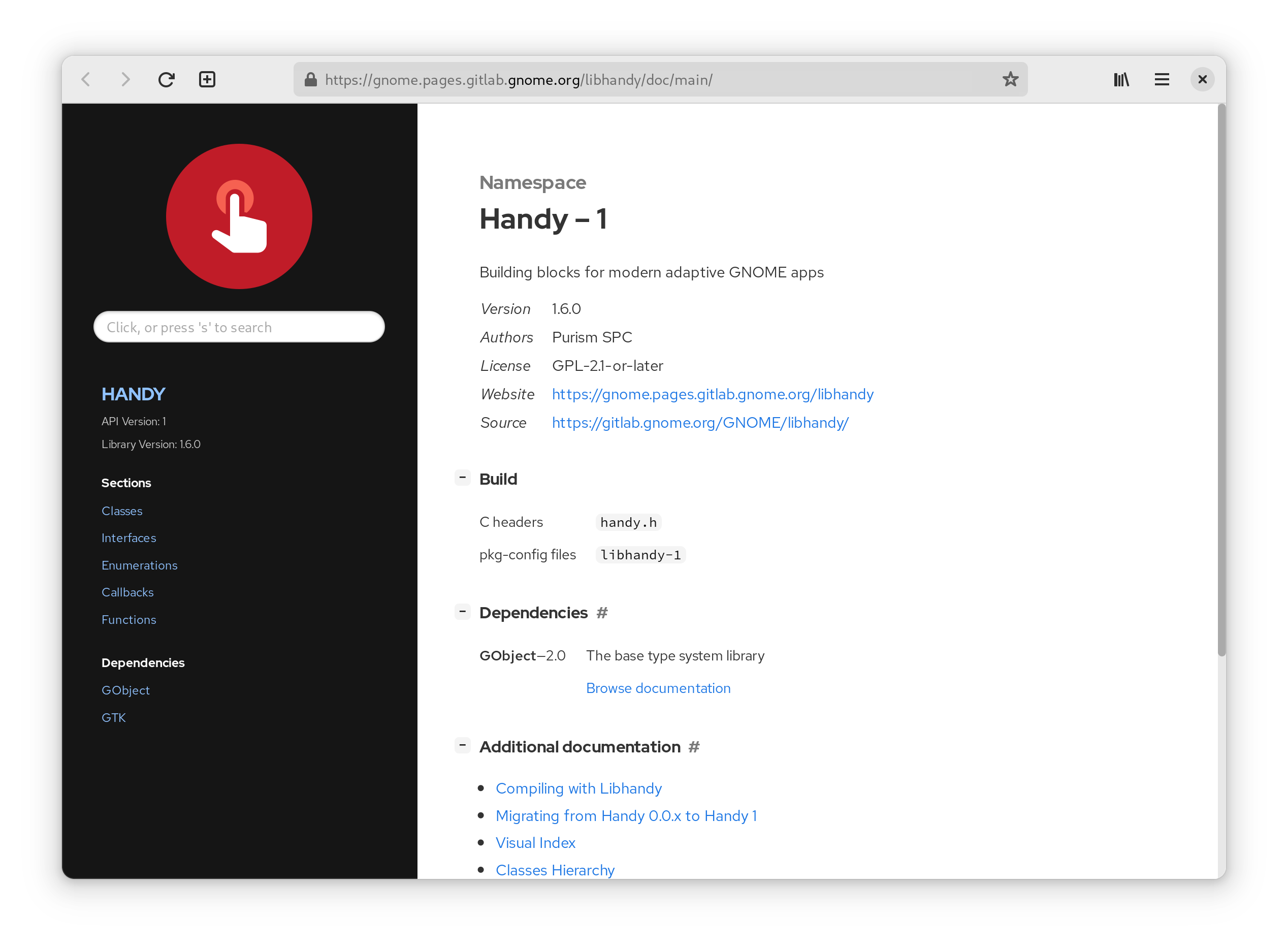
Maximiliano ported the documentation to gi-docgen and significantly cleaned it up. The new documentation can be found here.
Unlike in Libadwaita, HdyStyleManager is not initialized unless the application explicitly uses it, and defaults to the FORCE_LIGHT color scheme instead of PREFER_LIGHT. This means that applications have to actively opt-in to support the preference, and nothing changes for existing applications.
File Roller and Files following the dark preference
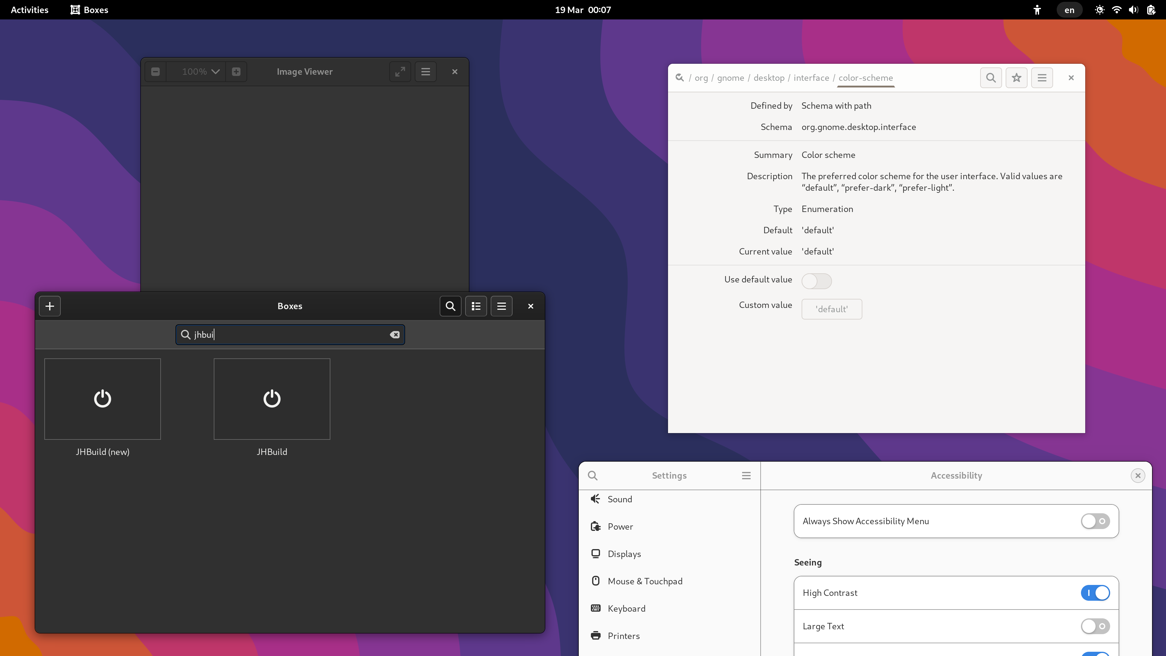
Initializing HdyStyleManager also changes how the high contrast mode is handled to make it consistent with the regular style as well as Libadwaita: it does not make dark applications unconditionally light. Instead, it follows the application and system color schemes the same way as it does for the regular style. This way applications can be both dark and high contrast at the same time, i.e. the preferences can work together. Even though it’s not exposed in Settings, the prefer-light color scheme can be used to ask apps to still be light, regardless of whether high contrast is enabled.
Eye of GNOME and Boxes with the light color schemeEye of GNOME and Boxes with the light color scheme and high contrast enabledEye of GNOME and Boxes with the default color scheme and high contrast enabled
Misc Changes
It also backports a lot of bug fixes from Libadwaita, and features a much cleaner and significantly faster CI pipeline. The development branch has been renamed to main.
Overall neither release is very exciting, but they provide a closure to this cycle. Thanks to all the contributors!
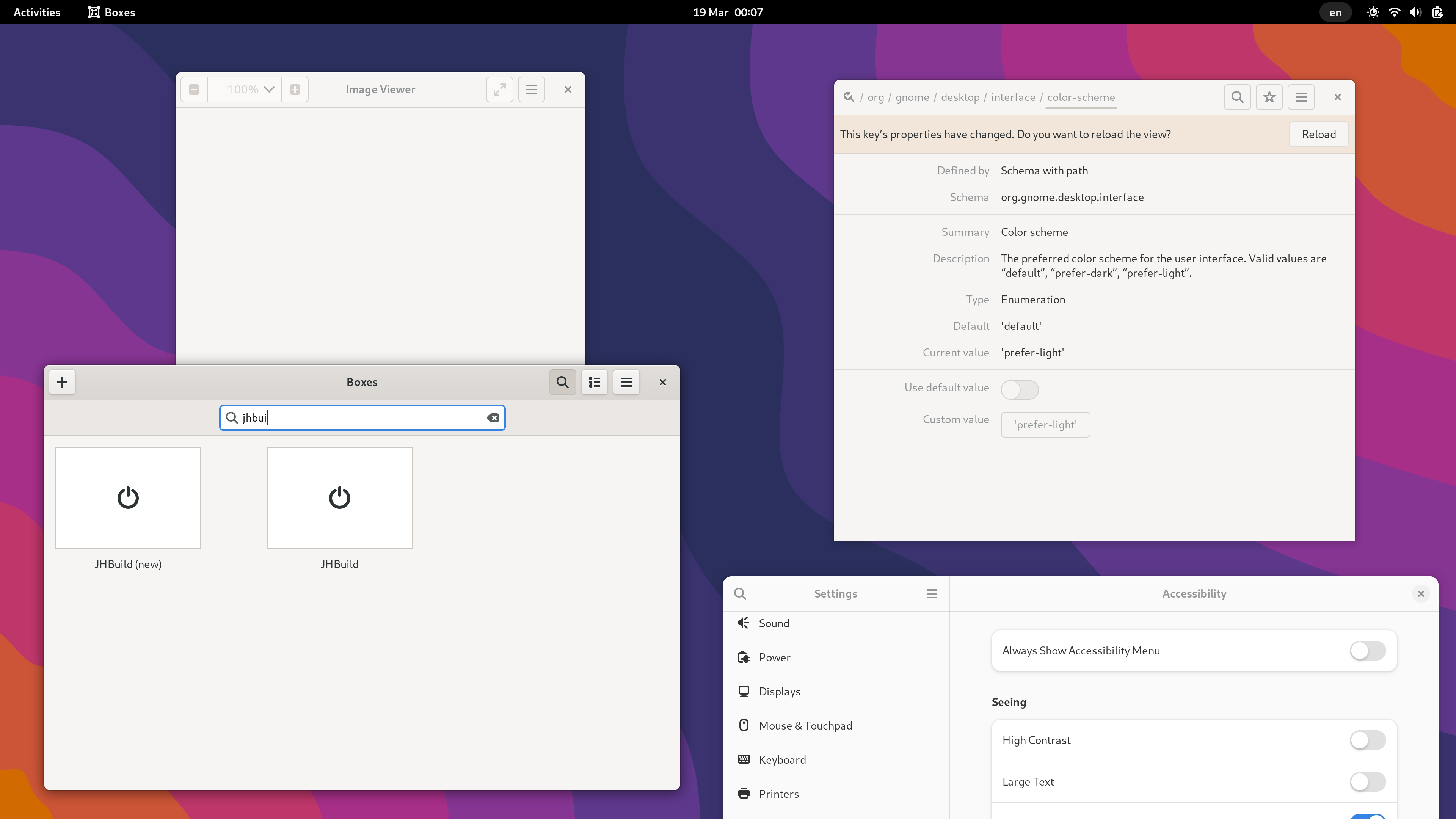
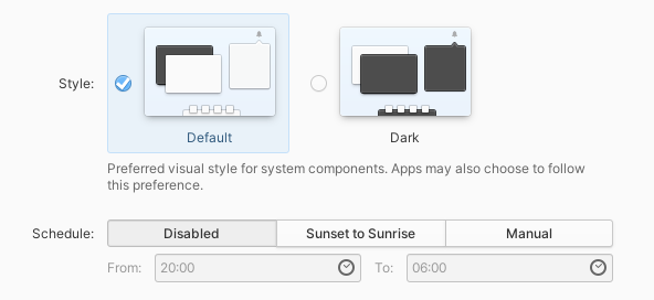
TL;DR GNOME will have a system-wide dark style preference in 42. Please update your apps to support it, see the instructions.
Dark style preference in GNOME 42. Separate dark and light screenshots
Lately, I’ve been working on having a proper dark style preference in GNOME. It’s a frequently requested feature, but also hard to get right. elementary UX architect Cassidy James Blaede did a good write-up about this, please read it if you haven’t yet (or watch his GUADEC talk if you prefer a video).
That was more than two years ago. Since then, elementary OS has started shipping an elementary-specific implementation designed in a way that it could be standardized later without many changes. While I could introduce another preference in GNOME, it was a good excuse to standardize it instead.
How does it work?
The idea is more or less exactly same as what elementary OS is doing: there’s a system preference, a tri-state with values: no-preference, prefer-dark, prefer-light. All 3 are just hints — apps are free to follow or not follow them as appropriate. The no-preference and prefer-dark values are exposed in settings, while the prefer-light value is reserved for future use.
xdg-desktop-portal-gnome already implements this key (in the main branch, not in 41), and there are work-in-progress elementary and KDE implementations.
This way it’s not tied to any particular desktop or toolkit — any application can access the settings portal via DBus and read the preference — so applications like Firefox have a canonical location to access the preference from instead of trying to guess it from GTK theme name. Being in the portal also means it’s accessible to Flatpak apps without opening any sandbox holes.
API
Manually accessing the portal is a bit tedious, and so we wrap it into an easy to use API. Here’s where things differ more from the original elementary preference.
elementary exposes the preference in Granite (right now it only works with the elementary preference, there’s a pull request to make it use the portal), and leaves everything else to apps, so using the API looks like this:
var gtk_settings = Gtk.Settings.get_default ();
var granite_settings = Granite.Settings.get_default ();

gtk_settings.gtk_application_prefer_dark_theme = (
    granite_settings.prefers_color_scheme == DARK
);

granite_settings.notify["prefers-color-scheme"].connect (() => {
    gtk_settings.gtk_application_prefer_dark_theme = (
        granite_settings.prefers_color_scheme == DARK
    );
});
It works, but that’s quite verbose, and most apps do either that or prefers_color_scheme != LIGHT, and maybe vary other parts of the UI such as GtkSourceView color schemes.
For GNOME the API is in libadwaita and libhandy, and is vaguely inspired by CSS. The equivalent Vala code using libhandy looks like this:
The other color schemes are FORCE_LIGHT, PREFER_DARK and FORCE_DARK, as follows:
system \ app
force-light
prefer-light
prefer-dark
force-dark
prefer-light
light
light
light
dark
default
light
light
dark
dark
prefer-dark
light
dark
dark
dark
There’s also a read-only boolean property dark that corresponds to whether the UI currently appears dark.
There are also properties to check if the system has a system-wide color scheme preference, to allow apps to keep their dark style switches when running on GNOME 41, but drop them for 42; and, somewhat unrelated, a property to check if the system is currently using high contrast mode instead of it being a theme.
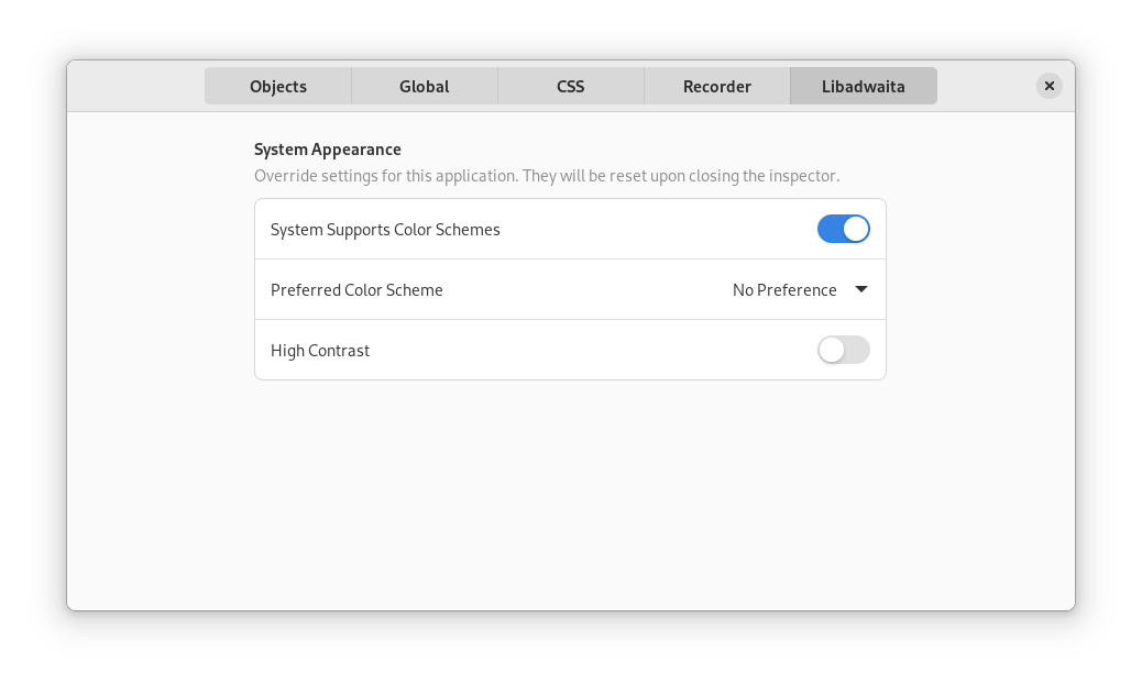
Libadwaita also provides a GtkInspector page to test all of this without changing the system preferences, though there’s no libhandy equivalent.
The libadwaita API is already available in alpha 3, the libhandy one is not released yet.
Another difference is — the dark style preference is supported by default if you’re using libadwaita. While in libhandy the default is keeping the previous behavior — apps that were always light remain always light – libadwaita goes ahead and makes following the preference the default. Since it’s not API-stable yet, it’s an acceptable behavior break, same way as macOS and iOS support it automatically when building against new enough platform libraries, but don’t do it otherwise in order to keep existing apps working.
When porting from GTK3 and libhandy to GTK4 and libadwaita, apps are expected to start supporting this or otherwise opt out. When already using older versions of libadwaita, apps are expected to start supporting this when updating to alpha 3. When using libhandy, apps don’t get the support by default, but can explicitly opt in.
Transitions
Another thing libhandy and libadwaita do when switching appearance is they try very hard to block the CSS transitions that would usually occur. These transitions can take a long time and are inconsistent between widgets. For widgets with custom drawn content such as WebKitWebView this can’t work at all, so no point in trying.
An approach that yields much better results is doing the transition on the compositor side — then it works for any content automatically:
It’s still not perfect: GTK3 apps can take a pretty long time when doing this, and it will be noticeable: for example the GTK4 Patterns window on the video changes its appearance immediately while Settings and Web lag behind. The video was recorded in a VM though, and the transition should be smoother on bare metal.
When is it coming?
Most likely GNOME 42 – most of the plumbing has already landed, the main remaining things are:
The actual switch in Settings — I made a very simple UI for testing, shown in the video above; but it’s obviously not good enough to be used as is;
A switch in gnome-shell, similarly to how Android and iOS have one in Quick Settings or Control Center respectively;
The aforementioned compositor-side transition; I have a mostly working implementation shown in the video, but it still needs some work;
Day/night scheduling;
Synchronizing wallpaper with the preference when possible – for example, forcing the night version for the default timed wallpaper.
Supporting it from the applications.
How can you help?
The main area that needs work is the last item.
For core apps, we have an initiative, the goal is to port as many of them before 42 as possible.
This applies to non-GTK apps as well — the instructions have an example of accessing the portal manually and following the preference from an SDL app.
Finally, if you maintain a GNOME-adjacent website, it would be nice if it followed the system preference. Some of the webpages do that, e.g. the GNOME 41 release notes or GTK documentation, but most don’t. Incl. this blog, yes.
So, let’s make it happen. For now, happy hacking.
I want to thank elementary folks for kick-starting all of this — it’s unlikely it would have happened otherwise.
In GNOME 40, Epiphany will feature a new tab bar. This isn’t just a restyling of the old one, but a ground-up rewrite. But why was this needed?
Static vs dynamic
GNOME apps use tabs in a lot of different ways, but they can be roughly divided into two categories. I will refer to them as static and dynamic tabs.
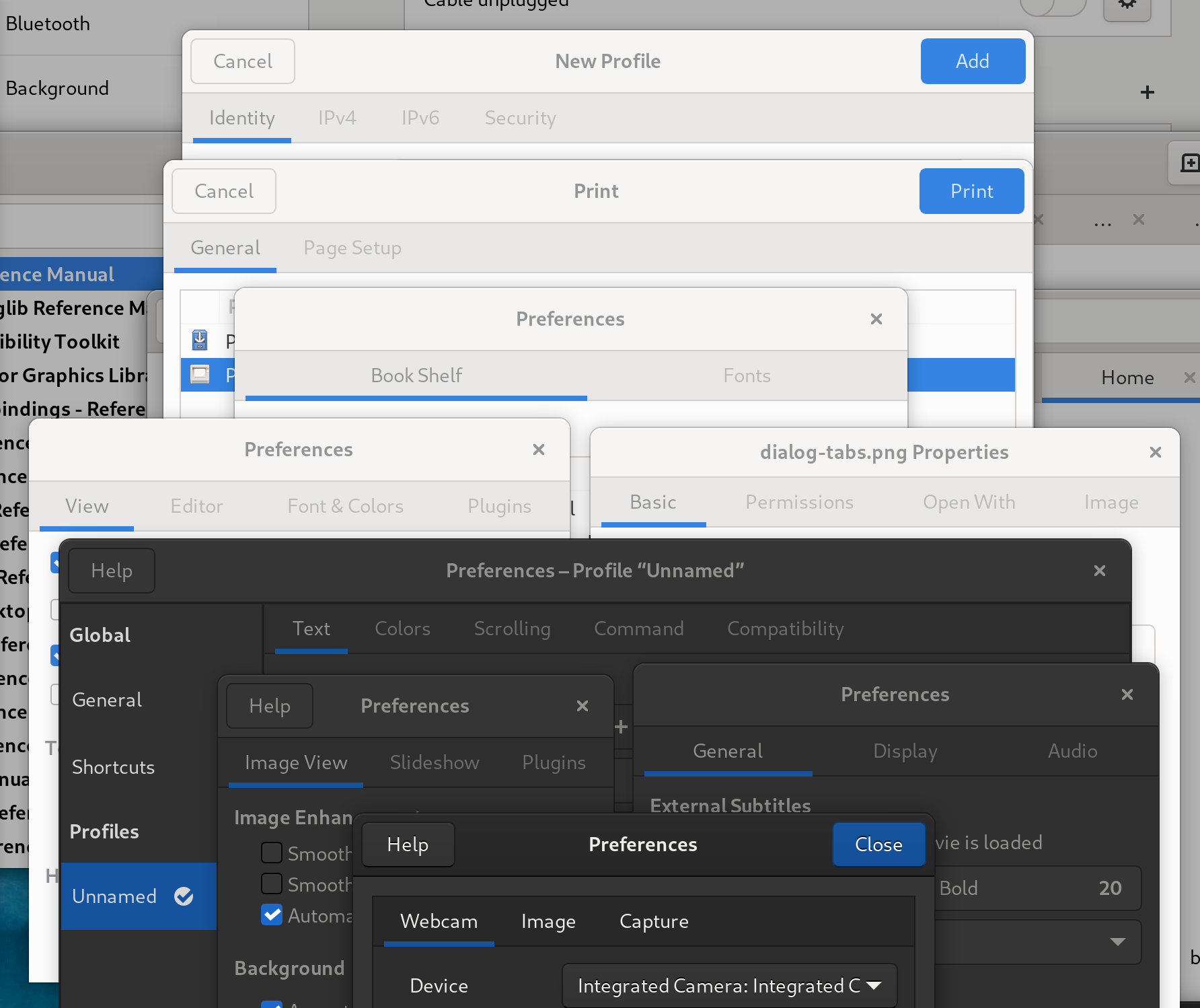
Static tabs
They are completely immutable, each tab contains a title label and they usually don’t scroll. They are usually used in dialogs, but, for example, can also be used in a ribbon toolbar. Modern GNOME apps often use GtkStackSwitcher or HdyViewSwitcher instead, but tabs are still quite common.
Static tabs in various dialogs
Dynamic tabs
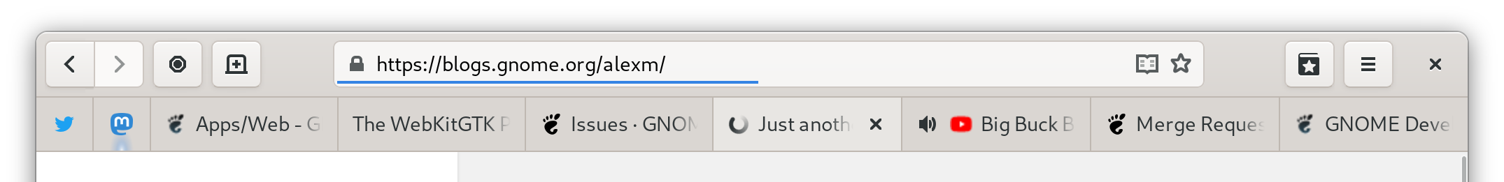
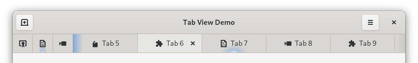
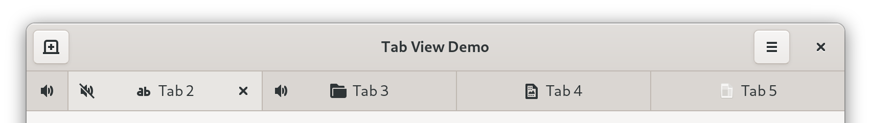
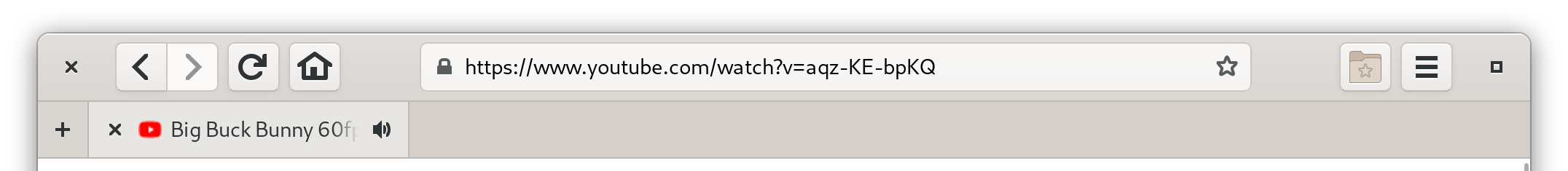
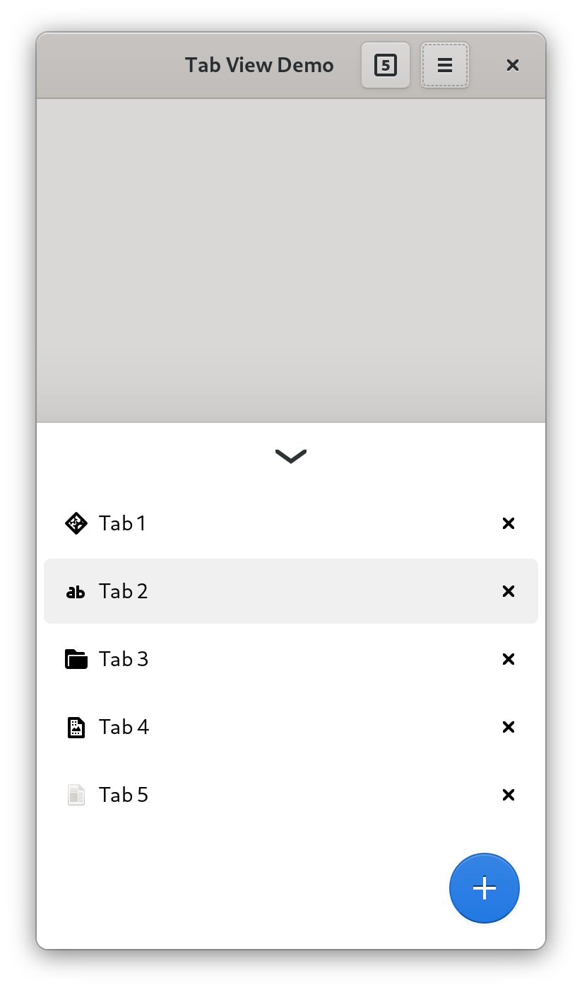
These tabs are used in multi-window apps such as web browsers, text editors, file managers or terminal emulators. They are opened and closed by the user, they can be reordered, dragged between windows or into new windows by dropping them on desktop. They need scrolling. They always have a title and a close button, sometimes an icon and/or a spinner. They hide when only one tab is present. They can be closed by middle clicking, they have context menus. Sometimes they can be pinned or have an extra icon, for example an audio playback indicator. Sometimes they need confirmation on closing.
Top to bottom: gedit, GNOME Terminal, Nautilus, GNOME Text Editor, Devhelp, Sysprof, Epiphany
While static tabs are pretty uniform across GNOME, dynamic tabs in every application look and feel very different. For example:
GNOME Text Editor has close buttons on selected and/or hovered tabs only, other apps have them on all tabs.
Some apps allow tabs to shrink to a very small size before scrolling, others start scrolling earlier.
Devhelp doesn’t scroll at all and just overflows tabs off the window.
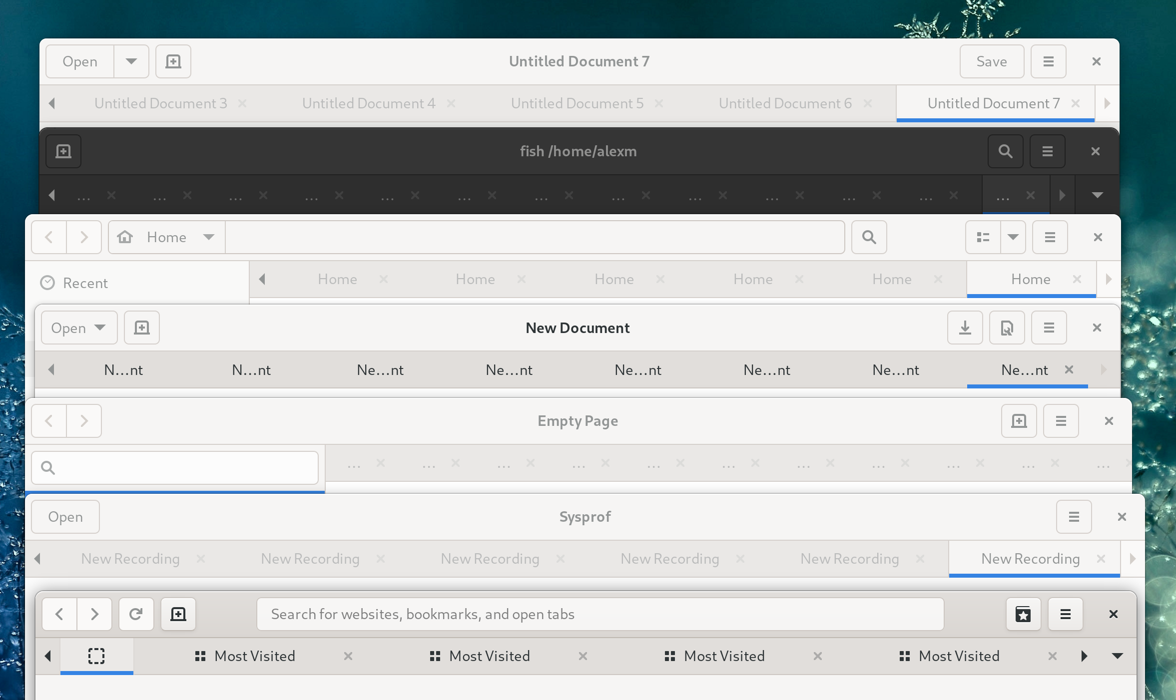
Epiphany and GNOME Terminal have popovers showing all tabs; GNOME Terminal is using GtkMenu while Epiphany is using a GtkPopover.
While not visible on the screenshot, only Epiphany and gedit support dragging tabs between windows.
It’s possible to drag files onto tabs in Epiphany and Nautilus. In Nautilus, hovering over a tab while dragging a file will automatically switch to that tab, but not in Epiphany.
In gedit and GNOME Terminal it’s not possible to focus the active tab by clicking it again.
In GNOME Text Editor and Epiphany, moving to another tab when focusing the active tab will select the page instead.
But why such a difference?
GtkNotebook
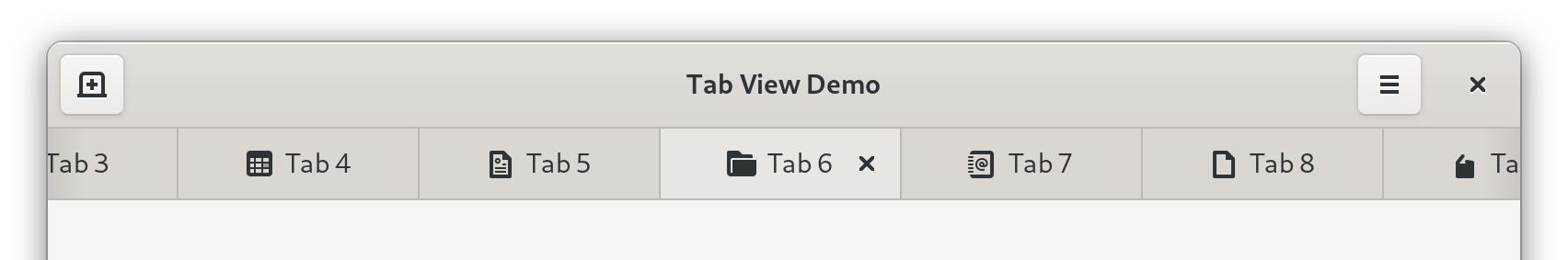
All of those apps are using a widget called GtkNotebook. It implements a generic tabbed view and shows tabs on one of the sides, and each tab has a label that can be replaced with an arbitrary widget.
By default, GtkNotebook doesn’t scroll, has a simple title label on each tab, doesn’t expand tabs, doesn’t allow any kind of drag-n-drop.
In other words, it’s geared squarely for static tabs. It doesn’t mean it’s impossible to use it for dynamic tabs, but you will have to manually implement:
A tab layout with a close button, a title, an icon, and maybe a mute indicator, and set a reasonable minimum width for scrolling.
Shortcuts such as Ctrl+Tab or Alt+[1 – 9] for switching between tabs.
Context menu handling, including the keyboard shortcut and a long press gesture for touchscreens.
Middle click closing.
Tab opening/closing logic — for example, which tab to select when the active tab is closed.
If you need to drop data on tabs, a handler for that. You also need to be careful to not accidentally break the hover timeout in process, like Epiphany does in 3.38.x.
Hiding when only one tab is present.
Of course, every app ends up implementing these things slightly differently. And then on top of that there are issues that cannot be fully fixed from the app side, such as:
Tab scrolling is discrete. This looks confusing and introduces other issues:
Dynamic tabs can have a lot of tabs. Pressing arrows to scroll one tab at a time doesn’t really scale for this.
Related, it’s not possible to take a tab and reorder it over long distances, you’ll have to reorder it a few tabs forward, press the scroll buttons a few times, reorder it again etc.
When opening a new tab, it can end up offscreen with no indication whatsoever.
Minimum tab width changes depending on the window size.
There are no pinned tabs.
The UI in general isn’t very polished — for example, there’s no animation when opening or closing tabs.
Some of that can be papered over though:
Epiphany fakes pinned tabs via force reordering them at the beginning, using a compact layout, not expanding them and not allowing to close them, but they can still be scrolled away and the fact the tab width changes based on the window size affects these tabs especially badly:
It manually highlights arrows when a tab has been opened offscreen.
It provides a popover to quickly switch between tabs when they don’t fit on the screen. This doesn’t help with reordering though.
elementary’s DynamicNotebook implements a resize delay after closing a tab, but it’s not very reliable, for example it jumps when the scroll arrows disappear. It also can only work when tabs aren’t expanded like in GNOME apps.
Additionally, GtkNotebook contains both view and tabs, and they are inseparable, so it’s impossible to have tabs in fullscreen, autohiding with the header bar, or to put them in the header bar, away from the content.
Finally, it’s not adaptive and Epiphany currently has an in-tree implementation of a mobile tab switcher that every app that wants an adaptive tabbed UI would have to copy.
A rewrite
So, with all of this, I believe the cleanest way forward is a completely new widget, implementing specifically dynamic tabs. While we’re there, we can also separate the tab view and tab bar into separate widgets just like GtkStack and GtkStackSwitcher are separate.
I started implementing it shortly before GUADEC 2020, and had mostly completed it by the end of September, when I joined Purism. In January me and Adrien finally took the time to finish, review and land it.
HdyTabView contains a GtkStack and provides an API more suitable for tabs: for example, pages are strictly ordered, there’s API for tab reordering, but not transition or child names, etc. Additionally, because each page has a large amount of metadata, it uses GTK 4-like page objects (HdyTabPage) even in GTK 3, instead of child properties, which would be pretty annoying to use without property bindings etc.
Meanwhile, HdyTabBar is a tab bar that connects to a HdyTabView and shows its pages, implementing this design.
What it provides
Tabs have an icon, a title, a tooltip, a close button, a context menu, and they can show a loading spinner instead of the icon.
Pinned tabs. They are compact, placed at the beginning of the tab bar and don’t scroll along with the rest of the tabs; they also affect the behavior of shortcuts such as Ctrl+Home/End.
Unread indicators, including when the unread tab is scrolled offscreen.
Indicator icons: every page can have one indicator icon on its tab, optionally clickable. Epiphany currently uses it as an audio playback indicator/mute button. Indicators are located on the left side of the tab in order to not conflict with close buttons.
When the tab is pinned, the indicator is displayed instead of the icon and not next to it like previously in Epiphany. To make sure the tab can be easily selected, it’s only clickable if the tab is already selected, so the first click selects the tab, the second click activates the indicator.
Autohide when only one tab is present.
When closing tabs with a pointer, they don’t fill the empty space immediately, instead they resize so that the next tab’s close button moves exactly where the last one was, allowing to close multiple tabs in a row without moving the pointer.
Automatic positioning for new tabs, though there is also API to insert tabs in arbitrary positions if needed.
Fully working drag-n-drop: tabs can be reordered, moved between windows, dropped on desktop to create a new window, tabs can accept arbitrary data being dropped. If a tab bar only has one tab, it will be automatically shown when a drag starts and hidden when it ends, so it’s still possible to drop another tab into it.
Tabs can also be dropped on the tab view; in that case they are appended at the end of the tab bar.
Touchscreen support: drag the tab bar to scroll it, long press and drag to reorder a tab, longer press to open context menu.
Close confirmation API.
Tab opening, closing, reordering, drag-n-drop, showing and hiding of the tab bar are all animated.
Shortcuts:
Ctrl+Tab and Shift+Ctrl+Tab — switch between tabs, with wrapping.
Ctrl+PageUp/PageDown/Home/End — same, but without wrapping.
Alt+[1 – 9] — switching to one of the first 9 tabs.
The fact they are separate allows Epiphany to keep its tab bar in fullscreen in 40.
What it doesn’t provide
It doesn’t allow to set an arbitrary widget as a tab layout. The layout is fixed and managed exclusively through HdyTabPage properties.
It doesn’t allow to toggle reordering and detaching for different tabs separately. Tabs are always reorderable and detachable, there’s no way to disable that.
Similarly, there’s no way to make certain tabs expand or not expand. All tabs (except pinned) are expanded by default.
All tabs (except when pinned) have close buttons. They cannot be removed, although it’s possible to delay and/or reject a close request, for example if the app wants to show a confirmation dialog upon closing a tab.
Close buttons are visible on selected and/or hovered tabs. There’s no option to show them on all tabs.
Vertical tabs. HdyTabBar is strictly horizontal and its layout wouldn’t make sense vertical. However, it does have API to observe its pages through a GListModel (GtkSelectionModel in GTK 4), so it’s very easy to make a vertical list instead.
However, since Epiphany is also used on elementary OS, HdyTabBar does provide API to disable autohide and tab expansion, and to swap the close button and indicator. All those options in Epiphany still work as before.
Epiphany in “elementary mode”
Adaptiveness and future
However, HdyTabBar isn’t adaptive either. Epiphany still ships the same mobile UI in 40. However, it makes it a lot easier to implement alternative switchers. For example, a HdyFlap-based bottom sheet:
A work-in-progress mobile tab switcher
However, this is very basic. Mobile tab switchers are often very elaborate, for example using 3D stacks of cards, grids, carousels or lists with previews. Unfortunately, all of that is off limits in GTK 3. However, with GTK 4 it’s not, and we can do things such as this:
Having a proper overview would also allow to finally remove the tab popover from Epiphany, which is still there in 40, but only shows when the tab bar starts scrolling.
A GTK 4 port of HdyTabView and HdyTabBar is complete and fully working and just needs code review, though the overview is not a reusable widget yet.
Thanks to GNOME Design Team for designing it and answering my endless questions about how tiny and unimportant things should work, and Thibault Martin and Jordan Petridis for testing it.
Recently, I’ve been working on a few widgets for libhandy to provide applications more flexibility with how to handle their titlebars.
But doesn’t GTK already allow this? Let’s take a look.
First, GTK has a widget called GtkHeaderBar. It looks like a titlebar, has a close button, a title, a subtitle and allows to add widgets at the left or right sides, or to replace title and subtitle with a custom widget.
Second, there’s gtk_window_set_titlebar() function that allows to set a widget as a custom titlebar. GTK will place that widget above the main window area, and then it can be dragged to move the window, and will handle right click menu, double click and middle click. Additionally, GTK will draw client-side window border and/or shadows and provide an area to resize the window with. Naturally, GtkHeaderBar is a perfect fit for it, although nothing is preventing other widgets from being titlebars.
If nothing is set, GtkWindow will use a GtkHeaderBar with a special style class (.default-decoration) as a titlebar on Wayland, or legacy decorations on X11.
This approach works well if an application just wants to have a titlebar with some widgets in it. However, in many cases it’s more complex. Let’s take a look at some cases that are difficult or impossible to implement right now.
Split headerbars
Settings 3.36, using a split headerbar
A very common case is for dual-pane applications to have a separate titlebar for each pane, also known as split headerbars. To do this, you have to create a horizontal box with the panes divided by a separator, and put it into the window. Then you create another box containing two headerbars and another separator, and set that box as a titlebar. Then you need to ensure the width of the headerbars matches the content panes, either by hardcoding it or using a horizontal GtkSizeGroup. And then there’s the whole problem of ensuring the window controls show up on the correct headerbars.
Fast forward to 2020, now we have libhandy and HdyLeaflet. Now instead of two boxes you use two leaflets, and now it’s necessary to use a GtkSizeGroup for each pane, to ensure the folding animation doesn’t go out of sync. For window controls libhandy provides HdyHeaderGroup, so at least that’s simple. Also, you wrap the titlebar leaflet into a HdyTitleBar.
And then leaflet gained support for back/forward swipe gestures. Since we have two leaflets, their swipe progress has to be synchronized via a HdySwipeGroup, so that brings the number of the helper “group” objects to four.
Stack navigation
Software 3.36 showing Software 3.36
Somewhat related, many applications have multiple views, with a separate GtkHeaderBar for each view. This includes the split headerbar case on mobile, where the two leaflets shows only one view at a time.
It’s implemented via GtkStack. One stack in the window has the views, and another stack in titlebar has headerbars, then you always change their visible child at the same time. libhandy 1.0 will have HdyDeck allowing back/forward swipes the same way HdyLeaflet does, and so the two decks must be synchronized via a HdySwipeGroup too.
Stack navigation and split headerbars can be combined, with some views having split headerbars, and others having just one headerbar. Either way, you have to duplicate the whole hierarchy between the window and titlebar and keep it in sync, however complex it might be.
In both cases you might want to animate the transition. With swipes it’s pretty much necessary. And doing that breaks the window corners during the transition.
libhandy has a workaround for that called HdyTitleBar. It’s a simple GtkBin subclass that looks like a headerbar. Combined with the fact Adwaita CSS specifies transparent background for any nested headerbars, it means you can put a stack/box/leaflet/deck/anything with headerbars into a HdyTitleBar and animate them without moving the background, working around the corners issue. It’s not perfect, as tall content (such as a separator) would still overlap the corners, but it works in most cases.
Autohiding headerbar
Some applications want to hide headerbar to focus on the content. The easiest way to do it is to fade out the headerbar and just have a blank space there.
UberWriter 2.1.5
Since the titlebar is a separate area from the window, there’s no content behind it, so fading it out leaves an unsightly blank area.
There are ways to mitigate that. For example, one could hide the titlebar widget completely. That’s what UberWriter, now Apostrophe, does in the latest development version:
Apostrophe, development version
It works, but the code is not pretty. It uses two headerbars: one in the titlebar area, another one in the window area in a GtkOverlay. To hide the titlebar, it immediately hides the headerbar in the titlebar area, then shows the headerbar inside the window and fades it out. Then it adds some CSS to add round corners on the window instead of headerbar, and makes sure nothing overlaps them. Oh, and it also shifts the scroll position so that the text doesn’t jump.
Another way is to use a revealer with a slide transition inside the headerbar area. Then it’s possible to shift scroll position on each frame of the transition, although it leads to a visual glitch with window corners.
So there is no way right now to do it cleanly and without glitches, although you can get pretty close.
Fullscreen
Web 3.36, in fullscreen
I said above that Apostrophe uses two headerbars. Well, I lied! It uses three, the third one for fullscreen mode.
Like the titlebars drawn by X11 window managers, GtkWindow‘s titlebar area is hidden in fullscreen. At the same time, our HIG recommends to still have a headerbar in fullscreen, but to autohide it. The easiest way for apps to implement this is to have another headerbar inside a GtkRevealer in GtkOverlay in the window content area, that’s normally hidden and only shows up in fullscreen mode. Then it can be shown and hidden by application whenever wanted.
However, this means you have to have two (or more!) headerbars, or to reparent it from titlebar to the revealer when entering fullscreen and then back to titlebar when exiting it, like DzlApplicationWIndow from libdazzle does.
Showing content behind the headerbar
A camera app mockup, by Tobias Bernard
What, you were expecting a screenshot? Since the titlebar area is completely separate from the window, it’s impossible to show content behind it.
Similarly, things such as showing scrolling content behind titlebar, like macOS and Windows do, are impossible.
Window/titlebar split
All of these problems are caused by the fact titlebar is separate from the window. If that wasn’t the case, it would all be a lot simpler:
For split headerbars and stack navigation you would be able to use a single box/stack/leaflet/deck spanning the whole window, no need to duplicate the hierarchy in the titlebar.
Autohiding would be a matter of using GtkRevealer and/or GtkOverlay, just like in fullscreen.
The headerbar wouldn’t be hidden in fullscreen, so it would be possible to reuse the widget without reparenting or duplicating it.
Similarly, showing content behind the headerbar would be perfectly possible with just GtkOverlay.
So, how do we eliminate the split? Obviously, it’s not an option for GTK3. There’s GTK4, but it would be nice to have something working in the meantime. This means libhandy.
HdyWindowHandle
HdyWindowHandle example
The first thing we need to have headerbar inside the window hierarchy is to make it act like a titlebar. GtkHeaderBar isn’t enough: while it has the overall layout and window controls, it doesn’t handle dragging, or right-click menu, or double click, or middle click. All of this is provided automatically for the titlebar widget, whatever that widget is, and that’s it.
To solve that, libhandy now has a HdyWindowHandle widget. It’s a GtkBin subclass that acts as a “titlebar area”. Dragging it will move the window, right clicking will produce a menu etc.
So, when a headerbar is used inside a window, it can be wrapped into a HdyWindowHandle and it will just work. It can also be used to easily make the whole window draggable. Or a random part of it for whatever reason.
HdyHeaderBar
However, the HdyWindowHandle has a downside of being easy to forget when creating a headerbar. If it’s not used, the window looks exactly the same, but the headerbar can’t be dragged. It’s especially easy to miss if you’re testing your app on a phone, where the window can’t be moved, or usually move windows while holding the Super key.
And it just so happened that (for unrelated reasons), libhandy has had a fork of GtkHeaderBar called HdyHeaderBar. It now features the same draggability and right/double/middle click handling as HdyWindowHandle, so can be used as is.
HdyWindow
One thing about the headerbars being in a separate area from the window content is that they can easily have round corners. While the window background can have round corners via CSS (and in fact that’s what elementary OS has been doing with the .rounded style class), nothing prevents the window content from overlapping them. This is true for the titlebar as well (see HdyTitleBar), but there’s a lot less chance of that happening.
However, if we want to display content behind the headerbar, or to autohide the headerbar, it’s pretty much guaranteed to happen.
One way to prevent that is to mask the corners. This guarantees nothing can ever overlap them. And that’s exactly what HdyWindow and HdyApplicationWindow are doing.
Coincidentally, GTK has no public API to inspect border-radius CSS property for each corner separately, so these windows also have round bottom corners.
They also draw a sheen on top of the window, which is normally on the headerbar. It looks the same way if a headerbar is used on top of the window, but still looks good if it’s hidden.
Limitations
However, the corners come at a cost: they cause an overhead when OpenGL is used. Normally GTK has a fast path for when nothing is overlapping OpenGL drawing (such as inside a GtkGLArea). However, masking corners requires a redirection, so the gains from that are negated.
On my machine the only place I was able to notice it is in GNOME Games running particularly “heavy” games on a workspace with lots of windows.
At the same time I wasn’t able to notice any differences with Web or Boxes when using HdyApplicationWindow.
Additionally, in maximized, tiled or fullscreen mode, or simply with border-radius: 0; there’s no need to mask anything, so there should be no difference compared to regular GtkWindow.
Future
These widgets have already landed in libhandy master, and can be seen in action in nightly builds of GNOME Games. However, there are some pieces of the puzzle missing right now.
While the same headerbar can be used in windowed and fullscreen modes, there’s no widget to show it next to the content in windowed mode like in a GtkBox, and on top of the content in fullscreen mode like in a GtkOverlay. Right now I have such a widget implemented in Games, but it will need to be in libhandy so that each application doesn’t have to reimplement it.
Currently HdyHeaderGroup only supports GtkHeaderBar, but not HdyHeaderBar, so for split headerbars you still have to use GtkHeaderBar and HdyWindowHandle.
Additionally, the headerbar in the window won’t automatically have .titlebar style class, so won’t pick up styles such as the .devel cog and gradient, so either everybody must manually add it, or HdyHeaderBar could have it by default.
And most importantly, it needs to be implemented for GTK4.
Last time I wrote about adding a back/forward swipe gesture to HdyLeaflet. That work has been finished and is available in libhandy 0.0.12.
Porting apps
To enable the gesture in an application using leaflets, the following needs to be done:
1. Syncing leaflet animation
Currently apps that use leaflets in both titlebar and content area just change their visible-child or visible-child-name property values synchronously. Libhandy 0.0.12 introduces HdySwipeGroup for this. It takes care of automatically switching children, and also of animating swipes. It’s used similarly to HdyHeaderGroup and GtkSizeGroup:
Leaflets often include separators between pages. By default the gesture will switch to any widget, and the separators should be excluded from that. It can be done using the new allow-visible child property. It’s set to TRUE by default and can be changed like this:
HdyLeaflet in 0.0.12 has can-swipe-back and can-swipe-forward properties. Setting one or both of them to TRUE enables the gesture:
<property name="can-swipe-back">True</property>
Most of the time, apps will want only back gesture, but it’s possible to have back/forward or forward only if wanted. This should only be done for the content leaflet, and not for the title one. Enabling dragging in headerbar will conflict with window dragging on touchscreens!
4. Transitions
0.0.12 brings some changes to HdyLeaflet mode and child transitions. Separate mode and child transition types have been deprecated in favor of a unified transition-type property. It can take 4 values: none, slide, over, under. Crossfade doesn’t make much sense spatially and was deprecated as well, though it’s still works if used via child-transition-type property. Additionally, over and under transitions have a subtle shadow now, similar to the WebKit gesture.
It’s recommended that the apps using the gesture use over transition.
<property name="transition-type">over</property>
And that’s it! The libhandy commit that adapts the demo app can serve as an example. It also shows that nested swipeable widgets aren’t handled well, and require manual special casing. Most of the time that won’t be an issue though.
Shortly after the WebKit gesture was merged, I started experimenting with making this gesture more widely available. The first step was porting it to Vala and decoupling from WebKit. Since I wrote this part of the gesture tracker from scratch anyway, it was simple and straightforward. The resulting playground project was also used as a convenient place to quickly iterate on the WebKit gesture itself. Later I also reimplemented rendering to match the WebKit one. Here’s how it looked at various points of time:
Other than that, I used the swipe tracker to make a fewmore demos for Tobias Bernard:
Phosh overview mockup
Back gesture mockup
Check out his GUADEC talk showcasing the second demo! :)
At the same time, I started integrating it into libhandy by supporting back/forward swipe in HdyLeaflet. And there I hit four problems:
1. Transitions and visible-child
A folded HdyLeaflet, just like GtkStack, shows one of its children at any given moment, even during child transitions. The second visible child during transitions is just a screenshot. But which child is “real” and which is a screenshot? Turns out the real child is the destination one, meaning the widget switches its visible child when the animation starts. It isn’t a problem if the animation is quick and time-based, but becomes very noticeable with a gesture. Additionally, it means that starting and cancelling a gesture switches the visible child two time.
One solution would be only switching the visible child at the end of the animation (or not at all if it was canceled). The problem is that it’s a major behavior change: applications that listen to visible-child to know when to update the widgets, or sync the property between two leaflets will break.
Another solution would be to draw both children during transitions, but it still means that visible-child changes two times if the gesture was canceled. The problem here is similar: applications wouldn’t expect the other child to still be drawn, but at least it’s just a visual breakage. And it still means that starting and canceling the gesture would mean two visible-child changes.
The second solution may sound better, and yet the current WIP code uses the first one.
2. Visuals
Leaflet had many issues in this area, such as over transition not making sense spatially and bottom widget being visible through the top widget. Additionally, Adrien liked the drop shadow and dimming in WebKit and the demo and wanted to have it in leaflet as well. :)
The first issue was solved by splitting the transition into over and under and clipping the bottom child. Similarly, I implemented shadow and dimming, though it’s pending on those transition types for mode transitions being merged first, so that the shadow can also be added to those, so that it’s consistent.
I’m also not happy with how the dimming and shadow are implemented, neither here nor in WebKit: it’s custom drawing with hardcoded values. Ideally, this needs to be controlled from CSS somehow. GTK itself uses gadgets for things like this (for example, the overshoot effect in GtkScrolledWindow), but that API is private. Having dimming and drop shadow widgets is an overkill, at least until GTK 4 arrives and makes GtkWidget instantiable. Maybe foreign drawing could work…
3. Syncing animation
Often, GTK applications have two leaflets: one in the window’s content area and one in titlebar. Their visible child is always changed at the same time, so it looks like they are one tall leaflet spanning both titlebar and content. This still needs to work with the gesture. And while it’s easy to make nice-looking throwaway demos that do this, syncing actual HdyLeaflets has to be a proper API.
Initially I suggested what I thought was a nice solution with having swipe tracker as a public object and connecting multiple widgets to it. Benjamin Otte and other people immediately pointed out many problems with it, so I researched how other platforms do it. The answer is simple: most platforms don’t. :)
Android has a rather silly way to sync multiple widgets together, but it’s rarely needed, as app bars are just widgets, so they can be packed into a ViewPager without a need to sync two pagers together.
Another constraint is that the solution must not expose animation progress as a write-able property, so it must not be possible to set this value to something arbitrary and get the transition stuck.
4. Interaction with GtkScrolledWindow
GTK event propagation works in two phases: capture and bubble. Widgets can connect to event signal and receive events on bubble phase. Then they return a value to either stop the event or propagate it further. More recently, GTK added various event controllers that allow choosing the phase where they run. With GTK_PHASE_CAPTURE it’s possible to handle events on the capture phase… But their signals don’t support fine-grained stopping/propagation, i.e. don’t have return values (they do in GTK4 though).
All in all, it means that there’s no way to get an event on capture phase and stop it atbitrarily…
Except there is, it’s private and it’s used by GtkScrolledWindow. This widget captures scroll events and stops some of them. For example, if the scrolled window has a vertical scrollbar, but not horizontal, it stops vertical scrolling events and propagates horizontal scrolling. This is harmless, but it also always stops events with is_stop set to TRUE, meaning a leaflet containing a GtkScrolledWindow will get stuck at the end of the gesture. So every single way of receiving events fails in a different and exciting way.
This last issue made me hate life and put the project on a long hiatus.
More demos
A while later while doing another demo (more on that in the next post) I discovered the horrible workaround: the private function for capturing events in GTK has a very simple implementation, so it’s easy to set this handler manually. And of course, with this workaround it just works. This solves the issue #4.
For the issue #3 I made a crude solution similar to already existing HdyHeaderGroup: HdySwipeable and HdySwipeGroup. It’s an RFC at this point, so criticism is welcome.
That allowed me to make a fully working (though still buggy) prototype of swipeable leaflet:
(Yes, that’s a bug there on 0:21)
Another visible problem in the video is that HdyHeaderGroup showing and hiding buttons doesn’t really work with the gesture. One possible solution here would be to show all buttons on all headerbars when folded, but that would once again involve an API break.
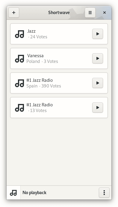
The (still very messy) code is here. Even though it’s not ready yet, Shortwave app already makes use of it:
This also uncovered a crash when a leaflet is created in unfolded state. Oops.
Thanks Felix Haecker for testing, and once again Tobias Bernard for feedback and suggestions while iterating on it.


