In GNOME 40, Epiphany will feature a new tab bar. This isn’t just a restyling of the old one, but a ground-up rewrite. But why was this needed?
Static vs dynamic
GNOME apps use tabs in a lot of different ways, but they can be roughly divided into two categories. I will refer to them as static and dynamic tabs.
Static tabs
They are completely immutable, each tab contains a title label and they usually don’t scroll. They are usually used in dialogs, but, for example, can also be used in a ribbon toolbar. Modern GNOME apps often use GtkStackSwitcher or HdyViewSwitcher instead, but tabs are still quite common.
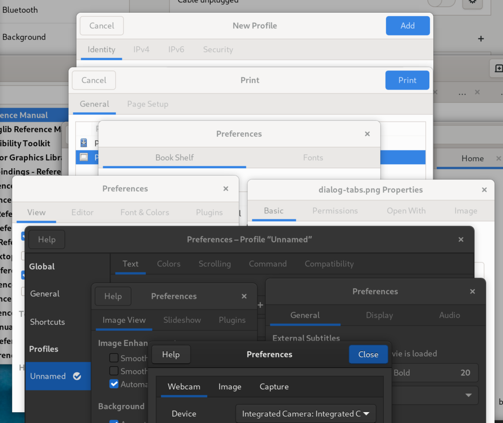
Dynamic tabs
These tabs are used in multi-window apps such as web browsers, text editors, file managers or terminal emulators. They are opened and closed by the user, they can be reordered, dragged between windows or into new windows by dropping them on desktop. They need scrolling. They always have a title and a close button, sometimes an icon and/or a spinner. They hide when only one tab is present. They can be closed by middle clicking, they have context menus. Sometimes they can be pinned or have an extra icon, for example an audio playback indicator. Sometimes they need confirmation on closing.
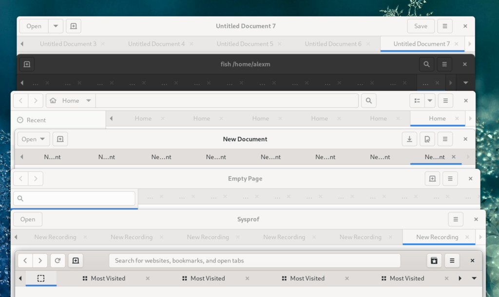
While static tabs are pretty uniform across GNOME, dynamic tabs in every application look and feel very different. For example:
- GNOME Text Editor has close buttons on selected and/or hovered tabs only, other apps have them on all tabs.
- Some apps allow tabs to shrink to a very small size before scrolling, others start scrolling earlier.
- Devhelp doesn’t scroll at all and just overflows tabs off the window.
- Epiphany and GNOME Terminal have popovers showing all tabs; GNOME Terminal is using
GtkMenuwhile Epiphany is using aGtkPopover. - While not visible on the screenshot, only Epiphany and gedit support dragging tabs between windows.
- It’s possible to drag files onto tabs in Epiphany and Nautilus. In Nautilus, hovering over a tab while dragging a file will automatically switch to that tab, but not in Epiphany.
- In gedit and GNOME Terminal it’s not possible to focus the active tab by clicking it again.
- In GNOME Text Editor and Epiphany, moving to another tab when focusing the active tab will select the page instead.
But why such a difference?
GtkNotebook
All of those apps are using a widget called GtkNotebook. It implements a generic tabbed view and shows tabs on one of the sides, and each tab has a label that can be replaced with an arbitrary widget.
By default, GtkNotebook doesn’t scroll, has a simple title label on each tab, doesn’t expand tabs, doesn’t allow any kind of drag-n-drop.
In other words, it’s geared squarely for static tabs. It doesn’t mean it’s impossible to use it for dynamic tabs, but you will have to manually implement:
- A tab layout with a close button, a title, an icon, and maybe a mute indicator, and set a reasonable minimum width for scrolling.
- Shortcuts such as Ctrl+Tab or Alt+[1 – 9] for switching between tabs.
- Context menu handling, including the keyboard shortcut and a long press gesture for touchscreens.
- Middle click closing.
- Tab opening/closing logic — for example, which tab to select when the active tab is closed.
- If you need to drop data on tabs, a handler for that. You also need to be careful to not accidentally break the hover timeout in process, like Epiphany does in 3.38.x.
- Hiding when only one tab is present.
Of course, every app ends up implementing these things slightly differently. And then on top of that there are issues that cannot be fully fixed from the app side, such as:
- Tab scrolling is discrete. This looks confusing and introduces other issues:
- Dynamic tabs can have a lot of tabs. Pressing arrows to scroll one tab at a time doesn’t really scale for this.
- Related, it’s not possible to take a tab and reorder it over long distances, you’ll have to reorder it a few tabs forward, press the scroll buttons a few times, reorder it again etc.
- When opening a new tab, it can end up offscreen with no indication whatsoever.
- Minimum tab width changes depending on the window size.
- There are no pinned tabs.
- The UI in general isn’t very polished — for example, there’s no animation when opening or closing tabs.
Some of that can be papered over though:
- Epiphany fakes pinned tabs via force reordering them at the beginning, using a compact layout, not expanding them and not allowing to close them, but they can still be scrolled away and the fact the tab width changes based on the window size affects these tabs especially badly:
- It manually highlights arrows when a tab has been opened offscreen.
- It provides a popover to quickly switch between tabs when they don’t fit on the screen. This doesn’t help with reordering though.
- elementary’s
DynamicNotebookimplements a resize delay after closing a tab, but it’s not very reliable, for example it jumps when the scroll arrows disappear. It also can only work when tabs aren’t expanded like in GNOME apps.
Additionally, GtkNotebook contains both view and tabs, and they are inseparable, so it’s impossible to have tabs in fullscreen, autohiding with the header bar, or to put them in the header bar, away from the content.
Finally, it’s not adaptive and Epiphany currently has an in-tree implementation of a mobile tab switcher that every app that wants an adaptive tabbed UI would have to copy.
A rewrite
So, with all of this, I believe the cleanest way forward is a completely new widget, implementing specifically dynamic tabs. While we’re there, we can also separate the tab view and tab bar into separate widgets just like GtkStack and GtkStackSwitcher are separate.
I started implementing it shortly before GUADEC 2020, and had mostly completed it by the end of September, when I joined Purism. In January me and Adrien finally took the time to finish, review and land it.
The result of this are two widgets called HdyTabView and HdyTabBar, available in the recently released libhandy 1.2.
HdyTabView contains a GtkStack and provides an API more suitable for tabs: for example, pages are strictly ordered, there’s API for tab reordering, but not transition or child names, etc. Additionally, because each page has a large amount of metadata, it uses GTK 4-like page objects (HdyTabPage) even in GTK 3, instead of child properties, which would be pretty annoying to use without property bindings etc.
Meanwhile, HdyTabBar is a tab bar that connects to a HdyTabView and shows its pages, implementing this design.
What it provides
- Tabs have an icon, a title, a tooltip, a close button, a context menu, and they can show a loading spinner instead of the icon.
- Pinned tabs. They are compact, placed at the beginning of the tab bar and don’t scroll along with the rest of the tabs; they also affect the behavior of shortcuts such as Ctrl+Home/End.
- Unread indicators, including when the unread tab is scrolled offscreen.
- Indicator icons: every page can have one indicator icon on its tab, optionally clickable. Epiphany currently uses it as an audio playback indicator/mute button. Indicators are located on the left side of the tab in order to not conflict with close buttons.
When the tab is pinned, the indicator is displayed instead of the icon and not next to it like previously in Epiphany. To make sure the tab can be easily selected, it’s only clickable if the tab is already selected, so the first click selects the tab, the second click activates the indicator.
- Autohide when only one tab is present.
- When closing tabs with a pointer, they don’t fill the empty space immediately, instead they resize so that the next tab’s close button moves exactly where the last one was, allowing to close multiple tabs in a row without moving the pointer.
- Automatic positioning for new tabs, though there is also API to insert tabs in arbitrary positions if needed.
- Fully working drag-n-drop: tabs can be reordered, moved between windows, dropped on desktop to create a new window, tabs can accept arbitrary data being dropped. If a tab bar only has one tab, it will be automatically shown when a drag starts and hidden when it ends, so it’s still possible to drop another tab into it.
Tabs can also be dropped on the tab view; in that case they are appended at the end of the tab bar. - Touchscreen support: drag the tab bar to scroll it, long press and drag to reorder a tab, longer press to open context menu.
- Close confirmation API.
- Tab opening, closing, reordering, drag-n-drop, showing and hiding of the tab bar are all animated.
- Shortcuts:
- Ctrl+Tab and Shift+Ctrl+Tab — switch between tabs, with wrapping.
- Ctrl+PageUp/PageDown/Home/End — same, but without wrapping.
- Ctrl+Shift+PageUp/PageDown/Home/End — tab reordering.
- Alt+[1 – 9] — switching to one of the first 9 tabs.
- The fact they are separate allows Epiphany to keep its tab bar in fullscreen in 40.
What it doesn’t provide
- It doesn’t allow to set an arbitrary widget as a tab layout. The layout is fixed and managed exclusively through
HdyTabPageproperties. - It doesn’t allow to toggle reordering and detaching for different tabs separately. Tabs are always reorderable and detachable, there’s no way to disable that.
- Similarly, there’s no way to make certain tabs expand or not expand. All tabs (except pinned) are expanded by default.
- All tabs (except when pinned) have close buttons. They cannot be removed, although it’s possible to delay and/or reject a close request, for example if the app wants to show a confirmation dialog upon closing a tab.
- Close buttons are visible on selected and/or hovered tabs. There’s no option to show them on all tabs.
- Vertical tabs.
HdyTabBaris strictly horizontal and its layout wouldn’t make sense vertical. However, it does have API to observe its pages through aGListModel(GtkSelectionModelin GTK 4), so it’s very easy to make a vertical list instead.
However, since Epiphany is also used on elementary OS, HdyTabBar does provide API to disable autohide and tab expansion, and to swap the close button and indicator. All those options in Epiphany still work as before.

Adaptiveness and future
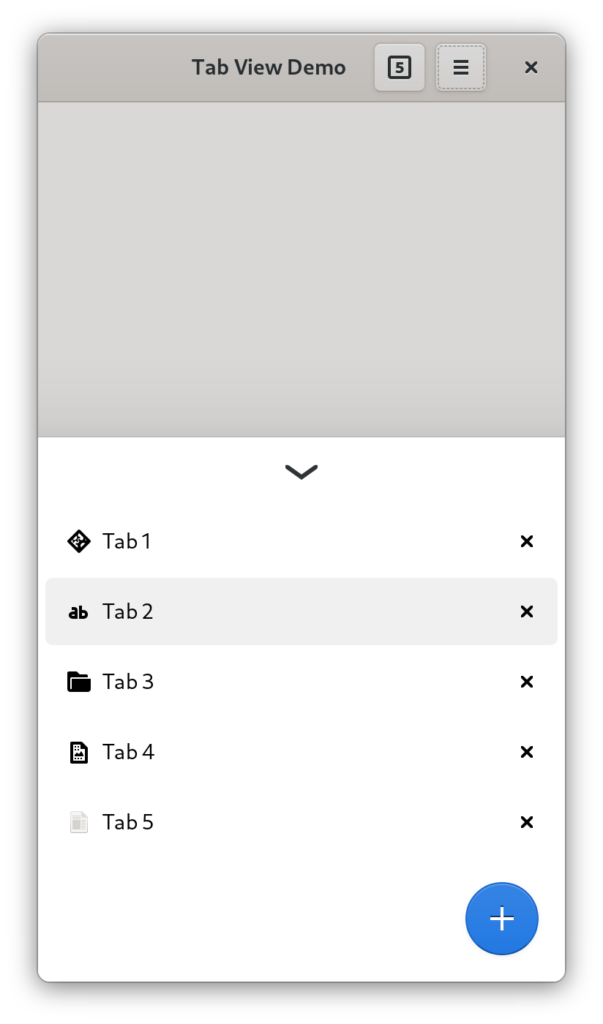
However, HdyTabBar isn’t adaptive either. Epiphany still ships the same mobile UI in 40. However, it makes it a lot easier to implement alternative switchers. For example, a HdyFlap-based bottom sheet:
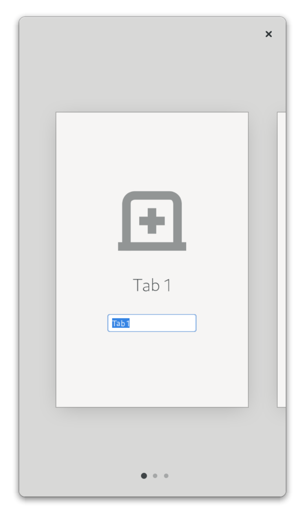
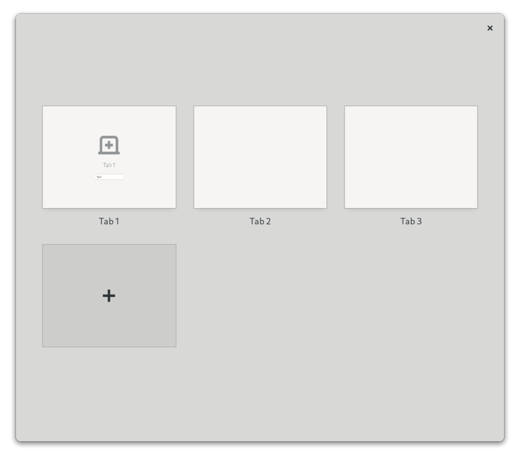
However, this is very basic. Mobile tab switchers are often very elaborate, for example using 3D stacks of cards, grids, carousels or lists with previews. Unfortunately, all of that is off limits in GTK 3. However, with GTK 4 it’s not, and we can do things such as this:
|
|
Having a proper overview would also allow to finally remove the tab popover from Epiphany, which is still there in 40, but only shows when the tab bar starts scrolling.
A GTK 4 port of HdyTabView and HdyTabBar is complete and fully working and just needs code review, though the overview is not a reusable widget yet.
Thanks to GNOME Design Team for designing it and answering my endless questions about how tiny and unimportant things should work, and Thibault Martin and Jordan Petridis for testing it.


