You might have noticed that a lot of icons in GNOME 41 have been redrawn to be larger. They are still 16×16, but take up more of the space within the canvas. Compare:
This was a preparation for a larger change that has just landed in the main branch in libadwaita: buttons in header bars and a few other widgets have no background now, matching this mockup.
For example, this is how the recent GTK4 branch of GNOME Software looks like now:
Making the style feel lighter and reducing visual noise is a major goal for the style refresh we’re doing for libadwaita. While we’ve done lots of smaller changes and cleanups across the stylesheet to bring us closer to that goal, this is probably the highest-impact part of it due to how prominent header bars are in GNOME apps.
This is not a new idea either — pretty much everyone else is doing it, e.g. macOS, Windows, iOS, Android, elementary OS, KDE.
In fact, we’ve been doing this for a long time in view switchers. So this just extends it to the whole header bar.
However, if applied carelessly, it can also make certain layouts ambiguous. For example, a text-only button with no background would look exactly same as a window title. To prevent that, we only remove background from buttons that we can be confident won’t look confusing without it — for example, buttons containing a single icon.
While we avoid ambiguous situations, it also means that apps will need changes to have consistent buttons. In my opinion this is a better tradeoff: since the API is not stable yet, we can break behavior, and if an app hasn’t been updated, it will just get inconsistent look and not accessibility issues.
Details
The exact rules of what has background and what doesn’t are as follows:
The following buttons get no background:
- Buttons that contain icons (specifically the
.image-buttonstyle class). - Buttons that contain an icon and a label, or rather, the
.image-text-buttonstyle class. - Buttons with the
.flatstyle class. - UPDATE: Any
GtkMenuButtons with a visible arrow (the.arrow-buttonstyle class). - UPDATE: Any split buttons (more on that later).
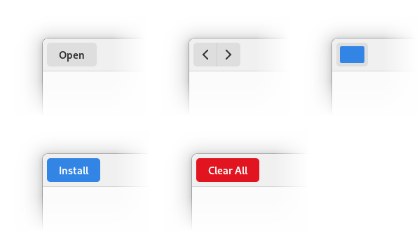
The following buttons keep their default appearance:
- Text-only buttons.
- Buttons with custom content.
- Buttons with
.suggested-actionor.destructive-actionstyle classes. - Buttons inside a widget with the
.linkedstyle class. - A new addition: buttons with the
.raisedstyle class, as inspired by the elementary OS stylesheet.
The appearance of GtkMenuButton and AdwSplitButton (more on that later) is decided as if they were regular buttons.
UPDATE: menu buttons with visible arrows and split buttons don’t have a background anymore regardless of their content.
This may look a lot like the old GtkToolbar, and in a way it is. While GTK4 doesn’t have GtkToolbar, it has the .toolbar style class to replace it, and this style is now shared with header bars and also GtkActionBar.
Special cases
While the simple icon-only buttons are easy, a lot of applications contain more complex layouts. In that case we fall back to the default appearance and apps will need changes to opt into the new style for them. Let’s look at some of those patterns and how to handle them:
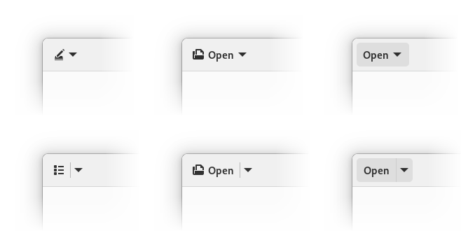
Menu buttons with icons and dropdown arrows
This case works as is if you use the standard widgets — namely, GtkMenuButton with an icon set via icon-name and always-show-arrow set to TRUE.
The only reason this case is special is because always-show-arrow is relatively new, having only been added in GTK 4.4, so a lot of apps will have custom menu buttons, or, if porting from GTK3, GtkMenuButton containing a GtkBox with an icon and an arrow. Since we don’t remove backgrounds from buttons with custom content, both of them will have backgrounds.
Text-only buttons
This is the most common case outside icon-only buttons. For these buttons the solution, rather counter-intuitively, is to add an icon. Since the icon has a label next to it, it doesn’t have to be very specific, so if an action is hard to describe with an icon, an only tangentially related icon is acceptable. If you still can’t find anything fitting — open an issue against the GNOME icon development kit.
With GTK widgetry, the only way to create such buttons is to pack a GtkBox inside, and create the icon and the label manually. Then you’ll also have to add the .image-button and .text-button style classes manually, and will need to set the mnemonic-widget property on the label so that mnemonics work.
Since this is tedious and parts like connecting the mnemonic are easy to miss, libadwaita now provides AdwButtonContent widget to do exactly that. It’s intended to be used as a child widget of GtkButton, GtkMenuButton or AdwSplitButton (more on that below), as follows:
<object class="GtkButton">
  <property name="child">
    <object class="AdwButtonContent">
      <property name="icon-name">document-open-symbolic</property>
      <property name="label" translatable="yes">_Open</property>
      <property name="use-underline">True</property>
    </object>
  </property>
</object>
If it’s a GtkMenuButton, it would also make sense to show a dropdown arrow, as follows:
<object class="GtkMenuButton">
  <property name="menu-model">some_menu</property>
  <property name="always-show-arrow">True</property>
  <property name="child">
    <object class="AdwButtonContent">
      <property name="icon-name">document-open-symbolic</property>
      <property name="label" translatable="yes">_Open</property>
      <property name="use-underline">True</property>
    </object>
  </property>
</object>
UPDATE:Menu buttons with visible arrows don’t have background by default anymore, the step above is not necessary.
Note: the child property in GtkMenuButton is fairly new, and is not in a stable release as of the time of writing. It should land in GTK 4.6.
Notice we didn’t have to add any style class to the buttons or to connect mnemonics like we would have with GtkLabel. AdwButtonContent handles both automatically.
Split buttons
This is a fairly rare case, but also a difficult one. Historically, these were implemented as 2 buttons in a .linked box. Without a background, it’s easy to make it look too similar to a regular menu button with a dropdown arrow, resulting in an ambiguous layout.
While existing split buttons will keep their background thanks to the .linked style class, we now have a way to make consistent split buttons – AdwSplitButton.
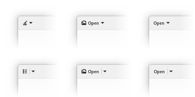
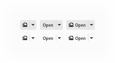
Whether they get a background or not depends on the content of their button part, while the dropdown part follows the suit – they will have background if it has only a label, will have no background if it has an icon, and will keep their default appearance outside header bars or toolbars. If it has no background, a separator is shown between them and they gain a shared background when hovered, pressed, or the dropdown is open:
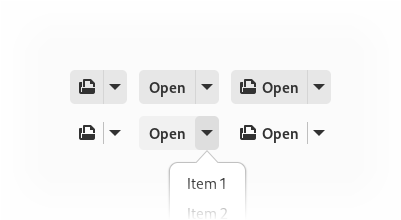
They can be adapted the same way as regular buttons — via AdwButtonContent:
<object class="AdwSplitButton">
  <property name="menu-model">some_menu</property>
  <property name="child">
    <object class="AdwButtonContent">
      <property name="icon-name">document-open-symbolic</property>
      <property name="label" translatable="yes">_Open</property>
      <property name="use-underline">True</property>
    </object>
  </property>
</object>
UPDATE: split buttons with text or custom content don’t get background by default anymore, so the step above is not necessary.
Meanwhile, buttons like the list/grid selector in Files are as simple as:
<object class="AdwSplitButton">
  <property name="menu-model">some_menu</property>
  <property name="icon-name">view-list-symbolic</property>
</object>
Otherwise, AdwSplitButton API is mostly a union of GtkButton and GtkMenuButton – the button part can have a label, an icon or a custom child, an action name and target, and a clicked signal if you prefer to use that. Meanwhile, the dropdown part has a menu model or a popover, and a direction that affects where the popover will be shown, as well as where the dropdown arrow will point.
Finally, in a lot of cases layouts that were using split buttons can be redesigned not to use them – for example, to use a simple menu button for opening files like in Text Editor instead of a split button in Apostrophe).
Linked buttons
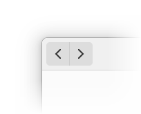
With visible frames, linking buttons is a nice way to visually group them. For example, we commonly do that for back/forward buttons, undo/redo buttons, mode switching buttons. We also use multiple groups of linked buttons to separate them from each other.
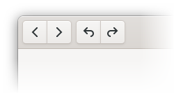
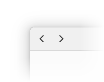
For the most part linked buttons can, well, stop being linked. For example, back/forward buttons like this:
can become this:
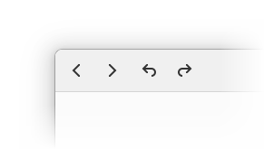
However, when multiple linked groups are present, just unlinking will remove the separation altogether:
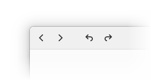
In that case, additional spacing can be used. It can be achieved with a GtkSeparator with a new style class .spacer:
<object class="GtkSeparator">
  <style>
    <class name="spacer"/>
  </style>
</object>
Action dialog buttons
This special case is less special than other special cases (or more special, if you prefer), in that apps don’t need to handle it, but I’ll mention it for the sake of completeness.
The two primary buttons in an action dialog or a similar context (for example, when changing display resolution in Settings, or the Cancel button in selection mode) should keep their current style — that is, they don’t have icons and keep their background. Meanwhile any extra buttons follow the new style.
In most situations this will already be the case so no changes are needed.
Other
There will undoubtedly be cases not covered here. The .flat and .raised style classes can always be used to override the default appearance if need be.
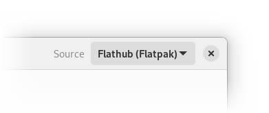
Finally, not everything has to have no background. For example, the remote selector in Software is probably best kept as is until it’s redesigned to also make it adaptive.
And in rare cases, the existing layout just doesn’t work and may need a redesign.
Bundled icons
In addition to all of that, if you bundle symbolic icons, there’s a good chance there are updated larger versions in the icon library. It would be a good idea to update them to match the new system icons.
Examples
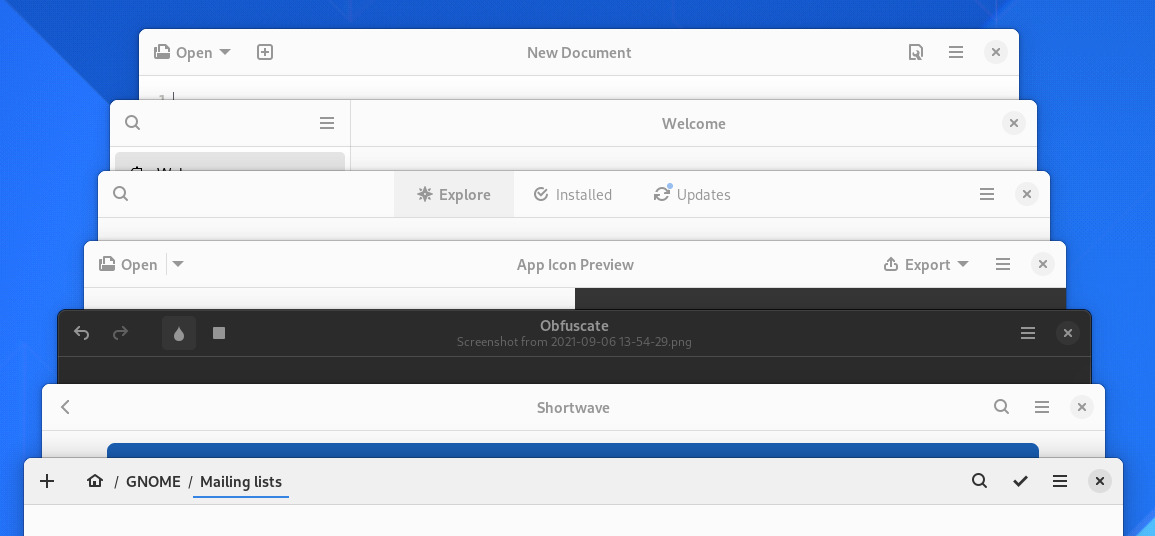
Let’s update a few apps. App Icon Preview and Obfuscate should show off most of the edge cases.
App Icon Preview
The version on Flathub is still using GTK3 as of the time of writing, but it’s GTK4 in main. So let’s start from there.
App Icon Preview has 2 windows, each with its own header bar — the main window and the "New App Icon" dialog.
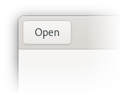
After the libadwaita update, the dialog hasn’t changed, meanwhile the main window looks like this:
It has a custom split button, as well as a text-only Export button when a file is open.
First, let’s replace the split button with an AdwSplitButton:
<object class="GtkBox">
  <child>
    <object class="GtkButton">
      <property name="label" translatable="yes">_Open</property>
      <property name="use_underline">True</property>
      <property name="tooltip_text" translatable="yes">Open an icon</property>
      <property name="action_name">win.open</property>
    </object>
  </child>
  <child>
    <object class="GtkMenuButton" id="recents_btn">
      <property name="tooltip_text" translatable="yes">Recent</property>
      <property name="icon_name">pan-down-symbolic</property>
    </object>
  </child>
  <style>
    <class name="linked"/>
  </style>
</object>
This will become:
<object class="AdwSplitButton" id="open_btn">
  <property name="label" translatable="yes">_Open</property>
  <property name="use_underline">True</property>
  <property name="tooltip_text" translatable="yes">Open an icon</property>
  <property name="action_name">win.open</property>
</object>
Since we’ve changed the class and the GtkBuilder id, we also need to update the code using it. Hence this:
#[template_child]
pub recents_btn: TemplateChild<gtk::MenuButton>,
becomes this:
#[template_child]
pub open_btn: TemplateChild<adw::SplitButton>,
and the other recents_btn occurences are replaced accordingly.
UPDATE: after the menu button and split button change, the Open and Export buttons don’t get background anymore, so only the previous step is necessary.
Now we need to actually remove the background. For that we’ll add an icon, and it’s going to be just document-open-symbolic.
So we’ll remove the label and use-underline and instead add an AdwButtonContent child with the same lines together with icon-name inside it:
<object class="AdwSplitButton" id="open_btn">
  <property name="tooltip_text" translatable="yes">Open an icon</property>
  <property name="action_name">win.open</property>
  <child>
    <object class="AdwButtonContent">
      <property name="icon_name">document-open-symbolic</property>
      <property name="label" translatable="yes">_Open</property>
      <property name="use_underline">True</property>
    </object>
  </child>
</object>
Now, let’s look at the Export button. It needs an icon as well, but adwaita-icon-theme doesn’t have anything fitting for it. So instead, let’s check out Icon Library (which doesn’t have a lot of edge cases itself).
While it doesn’t have icons for export either, it has a share icon instead:
So that’s what we’ll use. We’ll need to bundle it in the app, and let’s rename it to export-symbolic while we’re here. Now we can do the same thing as for the Open button:
<object class="GtkMenuButton" id="export_btn">
  <property name="always_show_arrow">True</property>
  <child>
    <object class="AdwButtonContent">
      <property name="icon_name">export-symbolic</property>
      <property name="label" translatable="yes">_Export</property>
      <property name="use_underline">True</property>
    </object>
  </child>
</object>
So far so good. See the merge request for the complete changes.
Obfuscate
This app has only one header bar, but it can change its state depending on if there’s a file open:
After building with newer libadwaita, we see there’s quite a lot to update.
First, we need to add an icon to the Open button. It’s done exactly the same way as in App Icon Preview, so I won’t repeat it.
Instead, let’s look at the other buttons:
Here we have two groups of linked buttons — so .linked is used both to group related actions together, and to separate the 2 groups.
So, first we need to unlink those buttons. Since it’s just removing the 2 GtkBox widgets and instead putting the buttons directly into a header bar, I won’t go in details.
However, now we’ve lost the separation between the undo/redo group and the tools. So let’s add some spacing:
<object class="GtkSeparator">
  <style>
    <class name="spacer"/>
  </style>
</object>
And the end result is the following:
This information is also present in the libadwaita migration guide, and will be in the stylesheet documentation once all changes are finalized.
For now, happy hacking!
UPDATE (on the same day as published): Menu buttons with visible arrows and split buttons don’t get background by default anymore. The steps and examples have been updated accordingly.







Flat buttons are a big mistake, they reduce usability a lot. Usability should matter as much as style. Gnome designers are not prioritizing correctly here.
We’ve used flat buttons on toolbars since GNOME 1.x days. This one is not any different.
I don’t think that the fact that flat buttons were used in the past will improve their usability…
Agree with this. “Because everyone else is doing it” or “Because iOS and Android did it” is not a sufficient reason to make this type of a change.
Flat UI are clearly less accessible then UIs where buttons are actually separated out with some kind of contrast.
I feel like this can only work because there are only a few buttons, and even then you need space to group them sometimes. Just look at Plasma, no borders and many icons – looks like shit. (sorry KDE guys, I love you really and all that you do)
I don’t know if flatter is better, but flatter with borders for buttons would make more sense to me rather than removing all sense of a button. Right now an unfocused GNOME app (which makes it look flat) is a thing of beauty.
Also I don’t know how the back/forward now give you the information that, for example, there is no going forward (like in the first pictures). And I have to say making the icons larger looks fantastic.
I’d really like to see some comparisons with flat borders versus no borders. I actually think borders – when nicely aligned – in reality help declutter the space, while with no borders there’s not that much the sense of proper alignment and guidance to the user.
Insensitive == 0.5 opacity atm.
There are some comparisons in the blog post – for linked buttons specifically. Though really talk to designers – I just implemented it. :)
Also yes, we only use a few icons, and space is what the blog post recommends for grouping.
To be precise, the UX advantage of having borders is that borders make it clear where clicking will have an effect, and where clicking will not.
I ran into this type of problem recently with a new program, where the transition from headerbar (the click moves the window) to internal pane (the click drags some list element) was hard to see, and I got it wrong the first time when I tried to move the window.
There are similar ideas from website design:
https://www.nngroup.com/articles/clickable-elements/
https://www.nngroup.com/articles/flat-design-long-exposure/
Now, having assumed borders, one may as well add shading to make it even clearer what the inside and outside of the region of screen space you can interact with are…
> the transition from headerbar (the click moves the window) to internal pane (the click drags some list element) was hard to see, and I got it wrong the first time when I tried to move the window.
That border is there – and when it’s not we make the whole window draggable. The change is only about toolbar buttons – which again were already flat in
GtkToolbarin GTK3 (even more so – a text-only button _would_ turn into a plain label there), this just extends it to header bars as well.Sorry about the confusion, I should have explained that “new program” I mentioned wasn’t a GTK app or even running on Linux.
Removing linked buttons are a mistake in my opinion
I absolutely agree. The new buttons group design is crap. Absolutely crap. In every regard. The old design with a touch of flat already looks amazing. Why do you need to disconnect buttons like that? It doesn’t serve any good. It’s not even beatiful. It’s just bulky.
Not only that. This one is funny: First they disconnect the buttons – because flat, right? – and then they add space between, because they realized they don’t have clear separation of groups anymore. “Creating a problem and then solving it” – what an amazing way to push the design forward.
Also, the border around windows should be at least 2px wide, otherwise it looks like crap on 1080p resolution and below. You aren’t shipping for the same screens, that macOS is being shipped for, so please make sure that everyone gets the ‘good’ experience.
Talk to designers if you don’t like it. My blog post is targeted at app developers.
> because they realized they don’t have clear separation of groups anymore
Or because having 2 separate steps each doing one thing in a tutorial is easier to understand than one step doing 2 things. But hey, let’s read between the lines instead. :p
> looks like crap on 1080p resolution and below
Having used 1080p and 768p screens for years, no idea what you’re talking about.
It’s clear you all put a lot of thought into this. In some instances I really like how it looks and in others I could see how it could be problematic, so I appreciate the attention to detail. It’s a good decision to allow developers to choose the raised option, and to keep the background on text only buttons. Overall, I’m looking forward to seeing some of my favorite apps look a little cleaner and simpler.
Please don’t get rid of borders/backgrounds. Space is precious. And the more expert you get in a program, the more controls you want to have at hand. If space separates things, then soon you will get short of screen.
The buttons here are actually slightly smaller than before – 34×34 instead of 36×34. The only place where you’d use more space is when replacing multiple
.linkedgroups, which is fairly rare. And that’s horizontal space – vertical hasn’t changed.Please test this with a variety of vision problems, especially vision problems that cannot follow implied straight lines. This creates real problems for about 1% of the population, and it gets worse with age.
That visual noise you’re talking about is visual signal.
These are the exact same problems that everyone else creates, because everyone else does it, and 1% of the population is drowned out.
Source? That sounds like you would also not be able to read text.
Sorry, Alexander but these are important and deep changes that should be evaluated in a bigger context.
Removing visual clues (like perceived “depth” or other visual clues in actionable items like borders) and only relying on seemingly subtle contrast/color differences seems to be a rather user hostile move.
This is a great article with a lot of good information, but would probably be way better to also make the argument of what’s pushed to do this sort of changes in the first place.
From my perspective – design team had asked to change it. :) For the design side of the question ask them, I can talk about the API and implementation side – which is what my blog post is about.
> From my perspective – design team had asked to change it.
is there a blog post from the design team bout these changes so we can post our negative feedback there?
The mockup the blog post links to is in a GitLab repo. Open an issue there?
They’re asking for proper user testing, so I think your reply is a little dismissive. I’m actually in favour of nearly all design changes Gnome has made in recent years but this one seems like a clear regression. I hope that Gnome has the grace to see when something should be abandoned even when clearly a lot of work and thought has been put into it. I always felt that Gnome had found just the right balance between clean and practical, so it’s a shame to see that going away.
The thing is that I’m not the one who designed this change – I just implemented what design team had asked. So you probably want to talk to them instead.
That’s fair and I am sure it feels like a thankless task at times. So thanks for all the work you do even if I disagree with this particular design change (which I understand is not yours).
>This is not a new idea either — pretty much everyone else is doing it, e.g. macOS, Windows, iOS, Android, elementary OS, KDE.
Notably Windows 11 seems to move away from it again, featuring clear clickable buttons from what I can tell from screenshots. It should not be surprising, removing outlines just makes the user experience worse as it becomes harder to tell what buttons to click. Yeah it might look more nice on a screenshots, but computers are for working with, not for looking at :-(
https://www.intowindows.com/wp-content/uploads/2021/07/Windows-11-File-Explorer.png nope, regular flat toolbars.
Last time Windows had borders on toolbar buttons was in 2000/ME, and many apps started going flat before that – e.g. Explorer in 98, ME and 2000 is flat – or Office 97 compared to 95.
Compare:
Office 95: https://winworldpc.com/res/img/screenshots/0afcc9a86d28a42e24a817f8c4d3746a8b5b8d7d88ea5c42a0663464cc23e259.png
Office 97: https://winworldpc.com/res/img/screenshots/97-98-11f3805bab5fd5b644b1d1bbd72dcdca-w98-2014-09-13-22-20-41.png
Hey,
Please, please, please, please, please, please, please don’t. One of the things I love so much about GNOME is the design that values function over form. The recent GTK3 Adwaita theme is already both aestethically pleasing AND usable, in fact I would say it’s the best GTK3 theme. Every other one manages to sacrifice usability in favor of design trends. What’s wrong, GNOME? You used to understand this…
Please don’t do this. The GTK3 Adwaita is already perfect.
Talk to designers then – I just implemented what they had asked.
Where exactly does one go to “talk to the designers”?
https://blogs.gnome.org/alicem/2021/09/10/cleaning-up-header-bars/#comment-9227
And is really isn’t that I’m afraid of change! I welcome most additions in the GNOME releases with open arms, and the previous theme upgrade was really great. With GNOME 3 you’ve done something truly unique, but this is in a large part cargo-culting.
I am not sure about this :(. I think there should be more mockups and testing before commiting to it. I loved all recent changes, but I am not sure about this one:(. Seems like you have cases “with background” and “no background” and those needing “spacer”… feels really inconsistent.
I mean consider that the blog post is specifically showcasing edge cases, given it’s targeted at developers and explains how to handle those cases. :)
Edit: also it’s not like we haven’t been using extra spaces already. Look at e.g. Builder.
Is there any plans when it will support dark mode out-of-the-box?
There are, but it’s not exactly related to the blog post.
I really like the overall approach. I think progress works hand in hand with change and this is a good step taken from where Gnome is standing. I’m sure like any change, there will be problems and the next steps will be to overcome them. Once enough change has occured and enough problems have been solved, evolution will be achieved. I congratulate the Gnome team for their effort and courage in all their process.
I really like this. Looks so modern and clean.
I really don’t like this change. :( To me, the current Adwaita is perfect, beautiful, and accessible. This new design is inferior, both in form and function. :( I’m someone that’s always used GNOME without extensions and have largely been very happy with design decisions from the GNOME team. But with the recent switch to horizontal workspaces, and now this theme regression, that’s starting to change. Feels bad man.
Can’t please everyone. :)