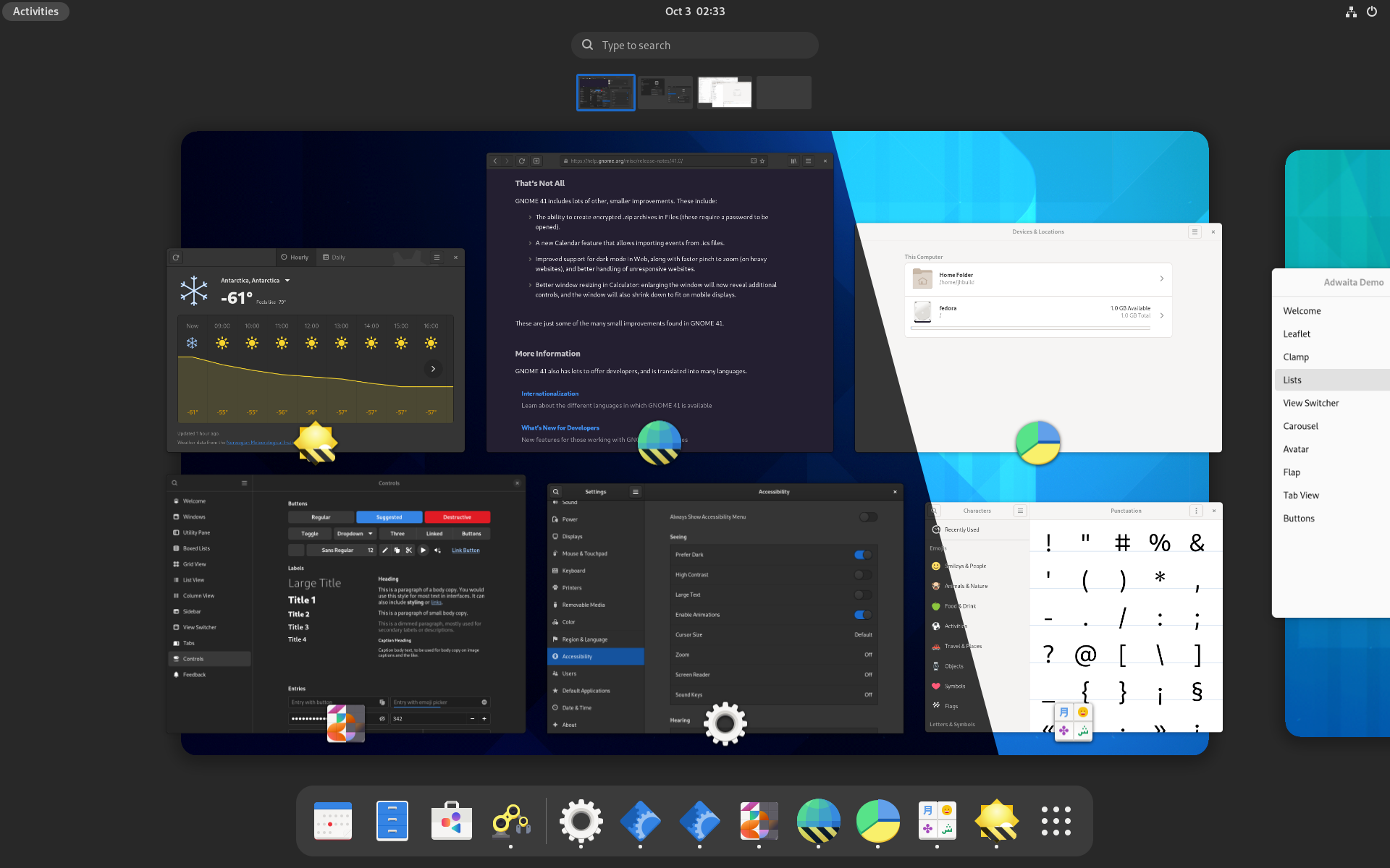
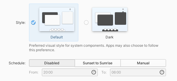
TL;DR GNOME will have a system-wide dark style preference in 42. Please update your apps to support it, see the instructions.

Lately, I’ve been working on having a proper dark style preference in GNOME. It’s a frequently requested feature, but also hard to get right. elementary UX architect Cassidy James Blaede did a good write-up about this, please read it if you haven’t yet (or watch his GUADEC talk if you prefer a video).
That was more than two years ago. Since then, elementary OS has started shipping an elementary-specific implementation designed in a way that it could be standardized later without many changes. While I could introduce another preference in GNOME, it was a good excuse to standardize it instead.
How does it work?
The idea is more or less exactly same as what elementary OS is doing: there’s a system preference, a tri-state with values: no-preference, prefer-dark, prefer-light. All 3 are just hints — apps are free to follow or not follow them as appropriate. The no-preference and prefer-dark values are exposed in settings, while the prefer-light value is reserved for future use.

The new preference is defined in the settings portal as the org.freedesktop.appearance.color-scheme key.
xdg-desktop-portal-gnome already implements this key (in the main branch, not in 41), and there are work-in-progress elementary and KDE implementations.
This way it’s not tied to any particular desktop or toolkit — any application can access the settings portal via DBus and read the preference — so applications like Firefox have a canonical location to access the preference from instead of trying to guess it from GTK theme name. Being in the portal also means it’s accessible to Flatpak apps without opening any sandbox holes.
API
Manually accessing the portal is a bit tedious, and so we wrap it into an easy to use API. Here’s where things differ more from the original elementary preference.
elementary exposes the preference in Granite (right now it only works with the elementary preference, there’s a pull request to make it use the portal), and leaves everything else to apps, so using the API looks like this:
var gtk_settings = Gtk.Settings.get_default ();
var granite_settings = Granite.Settings.get_default ();

gtk_settings.gtk_application_prefer_dark_theme = (
    granite_settings.prefers_color_scheme == DARK
);

granite_settings.notify["prefers-color-scheme"].connect (() => {
    gtk_settings.gtk_application_prefer_dark_theme = (
        granite_settings.prefers_color_scheme == DARK
    );
});
It works, but that’s quite verbose, and most apps do either that or prefers_color_scheme != LIGHT, and maybe vary other parts of the UI such as GtkSourceView color schemes.
For GNOME the API is in libadwaita and libhandy, and is vaguely inspired by CSS. The equivalent Vala code using libhandy looks like this:
Hdy.StyleManager.get_default ().color_scheme = PREFER_LIGHT;
The other color schemes are FORCE_LIGHT, PREFER_DARK and FORCE_DARK, as follows:
| system \ app | force-light | prefer-light | prefer-dark | force-dark |
| prefer-light | light | light | light | dark |
| default | light | light | dark | dark |
| prefer-dark | light | dark | dark | dark |
There’s also a read-only boolean property dark that corresponds to whether the UI currently appears dark.
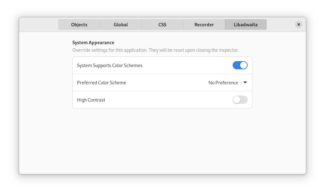
There are also properties to check if the system has a system-wide color scheme preference, to allow apps to keep their dark style switches when running on GNOME 41, but drop them for 42; and, somewhat unrelated, a property to check if the system is currently using high contrast mode instead of it being a theme.
Libadwaita also provides a GtkInspector page to test all of this without changing the system preferences, though there’s no libhandy equivalent.
The libadwaita API is already available in alpha 3, the libhandy one is not released yet.
Another difference is — the dark style preference is supported by default if you’re using libadwaita. While in libhandy the default is keeping the previous behavior — apps that were always light remain always light – libadwaita goes ahead and makes following the preference the default. Since it’s not API-stable yet, it’s an acceptable behavior break, same way as macOS and iOS support it automatically when building against new enough platform libraries, but don’t do it otherwise in order to keep existing apps working.
When porting from GTK3 and libhandy to GTK4 and libadwaita, apps are expected to start supporting this or otherwise opt out. When already using older versions of libadwaita, apps are expected to start supporting this when updating to alpha 3. When using libhandy, apps don’t get the support by default, but can explicitly opt in.
Transitions
Another thing libhandy and libadwaita do when switching appearance is they try very hard to block the CSS transitions that would usually occur. These transitions can take a long time and are inconsistent between widgets. For widgets with custom drawn content such as WebKitWebView this can’t work at all, so no point in trying.
An approach that yields much better results is doing the transition on the compositor side — then it works for any content automatically:
It’s still not perfect: GTK3 apps can take a pretty long time when doing this, and it will be noticeable: for example the GTK4 Patterns window on the video changes its appearance immediately while Settings and Web lag behind. The video was recorded in a VM though, and the transition should be smoother on bare metal.
When is it coming?
Most likely GNOME 42 – most of the plumbing has already landed, the main remaining things are:
- The actual switch in Settings — I made a very simple UI for testing, shown in the video above; but it’s obviously not good enough to be used as is;
- A switch in gnome-shell, similarly to how Android and iOS have one in Quick Settings or Control Center respectively;
- The aforementioned compositor-side transition; I have a mostly working implementation shown in the video, but it still needs some work;
- Day/night scheduling;
- Synchronizing wallpaper with the preference when possible – for example, forcing the night version for the default timed wallpaper.
- Supporting it from the applications.
How can you help?
The main area that needs work is the last item.
For core apps, we have an initiative, the goal is to port as many of them before 42 as possible.
The instructions from the initiative also apply to third party apps, although they can update at their own pace.
This applies to non-GTK apps as well — the instructions have an example of accessing the portal manually and following the preference from an SDL app.
Finally, if you maintain a GNOME-adjacent website, it would be nice if it followed the system preference. Some of the webpages do that, e.g. the GNOME 41 release notes or GTK documentation, but most don’t. Incl. this blog, yes.
So, let’s make it happen. For now, happy hacking.
I want to thank elementary folks for kick-starting all of this — it’s unlikely it would have happened otherwise.

This is just a random guys opinion, but I don’t think that forcing the dark version of a wallpaper is a good thing to do. Not atleast without making it an option.
Otherwise I can’t wait to try this out!
Not necessarily forcing, but in general having a way for wallpapers to have automatic dark versions. Obviously a regular jpg/whatever wallpaper won’t do this, same as you can manually add the images composing the timed wallpaper and they won’t be timed.
I see, that is a great idea!
Keep up the good work!
These are welcome developments. Once the accent colors and dark theme are properly supported, our distro can finally stop theming gnome apps. We currently use adwaita-dark with green accent color, and it will be a lot less maintenance if this is supported upstream.
Will this be supported on macOS and Windows as well or do I have to implement an in-app switch if I port my app to those platforms?
It should be possible to implement, but I probably won’t be the one implementing it. :) Right now you should get
falseinAdwStyleManager:system-supports-color-schemesand can treat it same as e.g. GNOME 40/41.you def need to include the ability to have colored windows border, so when using dark themed windows over dark themed apps -eg web- the dark windows wont blend with the other apps. You may think is bs, but when you use light-themed windows thy have a dark shadow behind them, it makes sense to have some light shadow behind dark themed windows , or , alternative let them have some light colored border.
There is a light colored border, yes.
Hopefully this will remain only an option? Dark mode is useful for certain apps where you want the chrome to fade into the background – video players, photo viewers – but I absolutely loathe it for general use, because I find light-on-dark text very hard on my eyes.
Hi,
Just FYI, I’ve used this article (a translation) and images here as base for our Czech Fedora Community blog. If that’s a problem, feel free to reach us out.
Thanks for the job done and for the blog post!
https://mojefedora.cz/tmavy-rezim-v-gnome-42
Not a problem at all, thanks for mentioning. :)
Great work!
I’m curious how the compositor transition works. Surely the compositor isn’t rendering widgets, so how can it transition their colors smoothly?
TLDR take a screenshot, fade it out – same as macOS or iOS.