TL;DR: The current adaptive widgets have significant problems and have all been replaced and deprecated. You may want to port your apps, the migration guide is here.
Over the past year, I’ve been working on replacing the old adaptive widgets in libadwaita, and as of a few days ago the last pieces have landed.
The Problems
(kgx:356880): Gtk-WARNING **: 16:38:18.039: Allocating size to AdwFlap 0x1e25c50 without calling gtk_widget_measure(). How does the code know the size to allocate?

(epiphany:91138): Gtk-WARNING **: 10:49:35.638: Allocating size to EphyWindow 0x15f8b70 without calling gtk_widget_measure(). How does the code know the size to allocate?
Ever seen an app print a warning like that on resize? If you’re unlucky, also flicker at the same time. This happens when a widget causes a resize during another resize. That’s one of the things that GTK prohibits, and yet almost every adaptive app currently does it, and most of the time it only works by accident.
Take AdwLeaflet, for example. People often use it for managing a sidebar. That’s fine, because leaflet will handle its own resize correctly. However, sidebar also implies other changes, like showing/hiding window controls and a back button. All of these changes cause resizes, and we do them when already inside a leaflet’s resize. Oops.
To an extent libadwaita widgets work around that, e.g. by emitting property notifications when they’re least likely to cause problems, but it’s never perfect. The simple truth is that this system is inherently fragile, depending on a number of things like whether the widget you’re changing is allocated before or after the leaflet (which is an implementation detail).
Flexibility
Another problem with the current approach is that while we provide premade widgets for specific cases, like a sidebar turning into stack navigation, any other kinds of adaptivity are basically unsupported.
For example, maybe your app has a header bar with a lot of widgets, and you want to move some of them into a separate bottom bar on mobile? There’s no premade widget for this, so the only way you can do it is by overriding the size_allocate() virtual function on some widget (typically the window) yourself and doing it there.
This is very finicky and easy to get wrong, and once again you’re setting yourself up for warnings and flicker — the Epiphany warning above is from doing exactly this, for example.
And it can’t even be abstracted as a widget either.
And really… a lot of apps need to do things besides what leaflet and friends provide. Even the libadwaita demo has to (ab)use GtkFlowBox for its style classes demo, while any adaptive app using AdwTabBar has to deal with size_allocate(). And the apps that don’t need tricks like that often have to compromise their design to make sure they don’t use anything unsupported. For example, at one point there was a GNOME Software design using a sidebar at desktop sizes and a view switcher at mobile sizes. That’s not possible with existing widgetry, so it never shipped.
Transition Animations
Widgets like AdwLeaflet provide an animation when switching between modes. This is cool, but also it causes the following bug when starting an app:
Notice the sidebar being briefly visible and then disappearing? This shouldn’t happen. And yet, it does and it’s not fixable.
Even when the transitions work, they are inconsistent. Sure, the leaflet itself animates, but the back button you add? It doesn’t. Even if you use a GtkRevealer to animate the button too, you’ll have to show/hide it at some point to avoid double spacing in the header bar if you have any other buttons next to it. And you can’t use a revealer for window buttons anyway.
Natural width
One thing the current approach (mostly) avoids is apps explicitly defining the size thresholds for layout changes. Instead, all of the existing adaptive widgets use natural widths of child widgets as implicit thresholds. While it avoids magic numbers, it doesn’t work very well in practice:
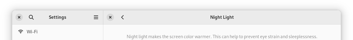
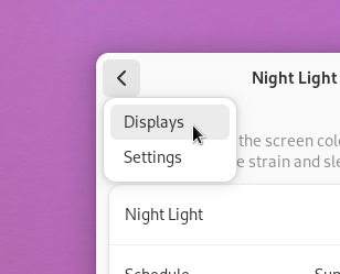
- The widths can change on the fly. For example, this often happens in Settings, where you may very well have the sidebar collapse or reappear when you switch between different panels:
Another example is Fractal, where a similar thing was happening because of long room topics. Because of that, AdwLeaflet actually defaults to using minimum widths as its threshold and not natural widths.
- Natural widths are hard to control. Apps have no direct control over them, and often have to resort to tricks, like putting labels into
GtkScrolledWindow with scrolling disabled to prevent natural width from propagating. (That’s what Fractal did to work around long room topics at first, for example)
- If your application does more than just show/hide the sidebar — say, toggle the sidebar and also move a view switcher from the top of the window to the bottom, these changes will not happen at the same time. In fact, they may even happen in different order depending on the locale, font, etc., leading to hard to debug issues.
- Since we’re adding and removing back buttons and window controls, the threshold actually changes between wide and narrow states. If an app does the opposite and removes widgets on narrow sizes, it can even lead to infinite loops:
- The widgets are too wide, folding the leaflet.
- Leaflet is now folded, removing buttons.
- The widgets are narrow enough that they can fit side by side now, unfolding the leaflet.
- The leaflet is unfolded, adding the buttons back.
- The widgets are too wide, folding the leaflet.
- … and so on.
- Finally, there are cases where we always want narrow layout, even when the widgets fit otherwise. For example, on mobile we always want view switchers to be at the bottom, and yet there are quite a few cases where they would still fit at the top. And so,
AdwViewSwitcherTitle has a hack where it monitors the window’s width and forcefully disables its view switcher when it’s below or equal to 360px, on top of artificially limiting its natural size to try and control the threshold.
While fixed thresholds present a different set of problems and are very much a tradeoff, at the end of the day you’re designing your layout to fit into a fixed resolution screen anyway.
All of that is already really bad, but the problems go even further.
API
Leaflet
Let’s look at AdwLeaflet. Most apps use this widget in one of the following two ways:
- The leaflet has three children: a sidebar, a separator and content. The separator is marked as non-navigatable. The leaflet has swipe to go back enabled, but not swipe to go forward. Sidebar and content both have header bars, with window buttons hidden in the middle when unfolded, and content has a back button when folded, that goes back to sidebar.
- The leaflet has the
can-unfold property set to FALSE, and is used basically as a GtkStack with swipe gestures.
However, what is the actual purpose of this widget? Well, it acts as a GtkBox when unfolded and as a GtkStack when folded. As in, it has an unspecified number of children, shows all of them when unfolded and one of them when folded. That’s it.
For the first case we always want a separator. However, AdwLeaflet cannot automatically add it because it doesn’t know if it’s going to be used for a sidebar or not. There’s also no way to know what even is a sidebar: it’s just a leaflet child, so there’s no way to automatically style it. It can’t add a back button for you for the same reason, and so on.
Now let’s look at the second case. It works fine if you have 2 pages and just want to switch between them. You will still have to manage the back button on the second widget manually, but otherwise it’s okay — basically the same as GtkStack.
Now what if we want to have page 1 that leads to page 2 and page 3, both of which lead back to the page 1? Well, now we run into a problem.
If we simply add all three pages into the leaflet, going back from page 3 will lead to page 2 and not page 1.
There are two possible workarounds:
- Toggle the page visibility dynamically.
- Use a
GtkStack with pages 2 and 3, and add that to the leaflet along with page 1.
Neither approach is particularly great.
So, AdwLeaflet is not very well suited for either case. Or more specifically, it tries to be low level and generic like GtkBox and such, while it’s primarily used for much more specific cases.
Flap
AdwFlap is not nearly as bad, as at least it has a fixed number of clearly defined children. But even then it can be used for multiple things that aren’t sidebars, like bottom sheets (even though I’m not aware of any apps actually using it as such now that Console switched to AdwTabOverview) or even for handling the window titlebar in fullscreen.
This means that it’s still too generic to be nice to use in any of these cases:
- Just as with leaflet, you have to add a separator yourself. Many apps do it wrong and have it on the sidebar instead of a separate child.
- The sidebar has no background because what if your use case needs it to be transparent?
And so on.
Or to summarize it: just like AdwLeaflet, flap is too generic. It tries to be a box/overlay widget and not, say, a sidebar widget.
Squeezer
AdwSqueezer is mostly used for handling view switchers in header bars. It contains multiple children and shows the largest one that can fit. So other than doing unsupported things for its most common use case, it works fine.
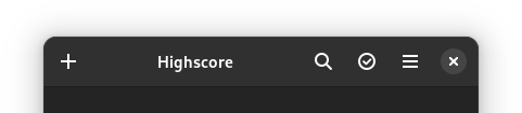
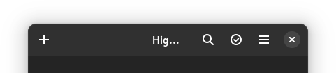
It still has a problem though. Since you put a view switcher and a title inside a squeezer, the header bar will center both at once. If the view switcher is too wide to fit, we show the window title, and since the whole widget is not centered at this point, the title will be off-center:
AdwHeaderBar has a centering-policy property to work around this, but it also introduces another problem:
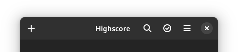
What we actually want is this though:
But that cannot be accomplished when the view switcher and the title are in a single widget (squeezer’s natural width is that of its largest child — in this case, the view switcher — and if it doesn’t fit, the squeezer is still expanded to fit the remaining space, then the title is centered within that and not within the header bar), but we rely on that to make it adaptive. Not good.
OK, What Now?
So now that we’ve established that the existing widgetry has significant problems, what can we do differently?
Well, lets look at how other platforms handle it.
- The Web has CSS and media queries. One can define a media query that matches a range of screen sizes (as well as many other things), and CSS rules inside its block would only apply within that range. Since CSS controls layout, people can rearrange their layout using media queries.
Most web frameworks just use media queries or provide a similar API. This is often referred to as breakpoints.
-
Windows/UWP has AdaptiveTrigger and visual states. One can create a visual state that activates depending on the window size and toggle properties on the widgets in that window using setters.
- Android has an elaborate resource system that allows for defining different layouts (UI files), dimensions or really any values only for specific screen size buckets or size ranges (as well as many other conditions), and when those conditions change (e.g. when the screen changes orientation), the toolkit just rebuilds the whole UI. Additionally, apps can factor out the common parts of their UI into different fragments, and then the activity (window) layouts can just arrange them in different ways, avoiding duplication.
(This may be outdated though, I wasn’t able to find any information about how Android does adaptive layouts nowadays and my own knowledge is from Android 4.x, so about a decade old at this point)
- UIKit uses a constraint layout, and constraints can be marked to only apply depending on screen orientation or size. While it avoids specific size values, instead preferring to target specific devices, iOS has the benefit of only running on a few select devices and can afford that. And before that system was introduced, apps could (and still can) just have different storyboards for different devices or screen sizes.
Additionally, UIKit provides controllers like UISplitViewController that rearrange their layout automatically.
So… it’s all over the place, but let’s try to come up with something that combines the best parts of the above and hopefully avoid their pitfalls.
Breakpoints
First, we’ll need a way to do arbitrary changes to the UI based on the window size, there’s no way around that.
So let’s implement a window that can do arbitrary layout changes for its contents.
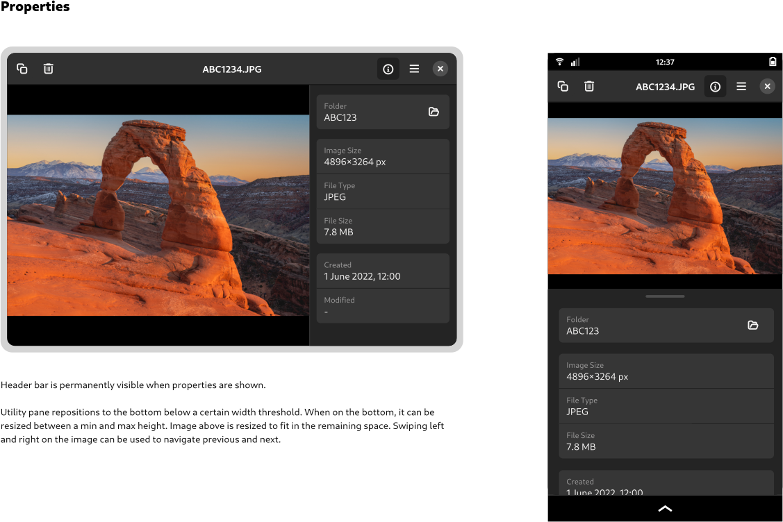
That’s hard, but not impossible. It involves temporarily hiding the contents, applying changes and showing it again on the next frame. To avoid flicker, a snapshot of the child from the last frame can be shown while it’s hidden. It also involves a special case for when mapping the child for the first time.
A hard problem here is sizing. Widgets like leaflet know what their layout will be when it’s folded and unfolded (as long as apps don’t add random back buttons or do other changes, anyway) and can expose correct minimum and natural sizes regardless of their current state. This is important because otherwise you wouldn’t be able to resize them to smaller sizes in the first place.
But we’re talking about arbitrary changes, so there’s no way to predict the size for our window unless it’s already at the smallest possible state. So, the only thing we can do is to disable the minimum size entirely and require apps to specify it, and clip the child if it doesn’t actually fit (or alternatively scale it down).
Another problem is transitions. Since we don’t know what exactly will change between different states, there’s no way to animate it beyond a global crossfade. But considering transitions were already inconsistent, I don’t think it’s a big loss.
And since libadwaita already has AdwWindow and AdwApplicationWindow, we can just reuse them and have all of this logic in there.
Now that we have this functionality we need to figure out good API for control it.
CSS in GTK doesn’t support media queries. And even if it did, they wouldn’t be useful, since CSS in GTK doesn’t control layout beyond widget margins/paddings/borders, minimum widths/heights and sometimes spacing. The overall concept is still attractive though, but we can’t use CSS for this.
However, we can still use UI files, like the UWP system does. What if our widget was defining “visual states” with a size-based condition and property setters? Following the web, let’s call them breakpoints.
GtkBuilder supports custom tags, so we can actually replicate this system in its entirety.
It looks like this:
<object class="AdwWindow">
  <property name="width-request">360</property>
  <property name="height-request">200</property>
  <property name="child">
    <!-- ... -->
  </property>
  <child>
    <object class="AdwBreakpoint">
      <condition>max-width: 500px</condition>
      <setter object="my_object" property="some-property">value</setter>
      <setter object="my_object" property="some-property">value</setter>
      <!-- ... -->
      <setter object="my_object" property="some-property">value</setter>
    </object>
  </child>
</object>
Pretty close, isn’t it? Of course, only being able to change properties is rather limiting, so each breakpoint also has apply and unapply signals.
Now we need to figure out how to deal with child overflow. In an ideal world, apps will just pick the widths where it doesn’t happen, but in practice that won’t work. Even if the widgets fit in English locale, it may not necessarily fit in German. Or with Large Text enabled.
This process isn’t really any different from just adapting an app for small screen sizes. You need it to fit into 360 pixels horizontally, at any cost. So, if you have a long label and you can’t make it shorter or rearrange your UI, you wrap it, ellipsize it or use a smaller font or letter spacing.
One addition on GTK side here is the GtkButton:can-shrink property (as well as GtkMenuButton:can-shrink). Buttons are the main source of labels outside of apps’ control, and now there’s a an easy way to deal with them.
And to deal with different text scales, we can introduce support for units other than pixels to breakpoints.
Currently three units are supported: pixels, points and scale-independent pixels. The last unit is lifted directly from Android and is basically points, but normalized to match pixels at default text scale. See the docs for the exact values.
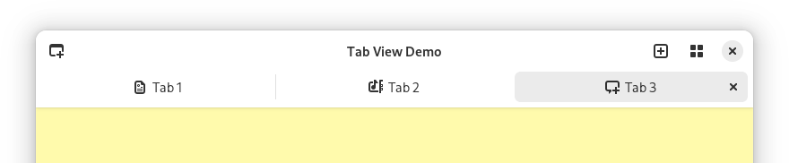
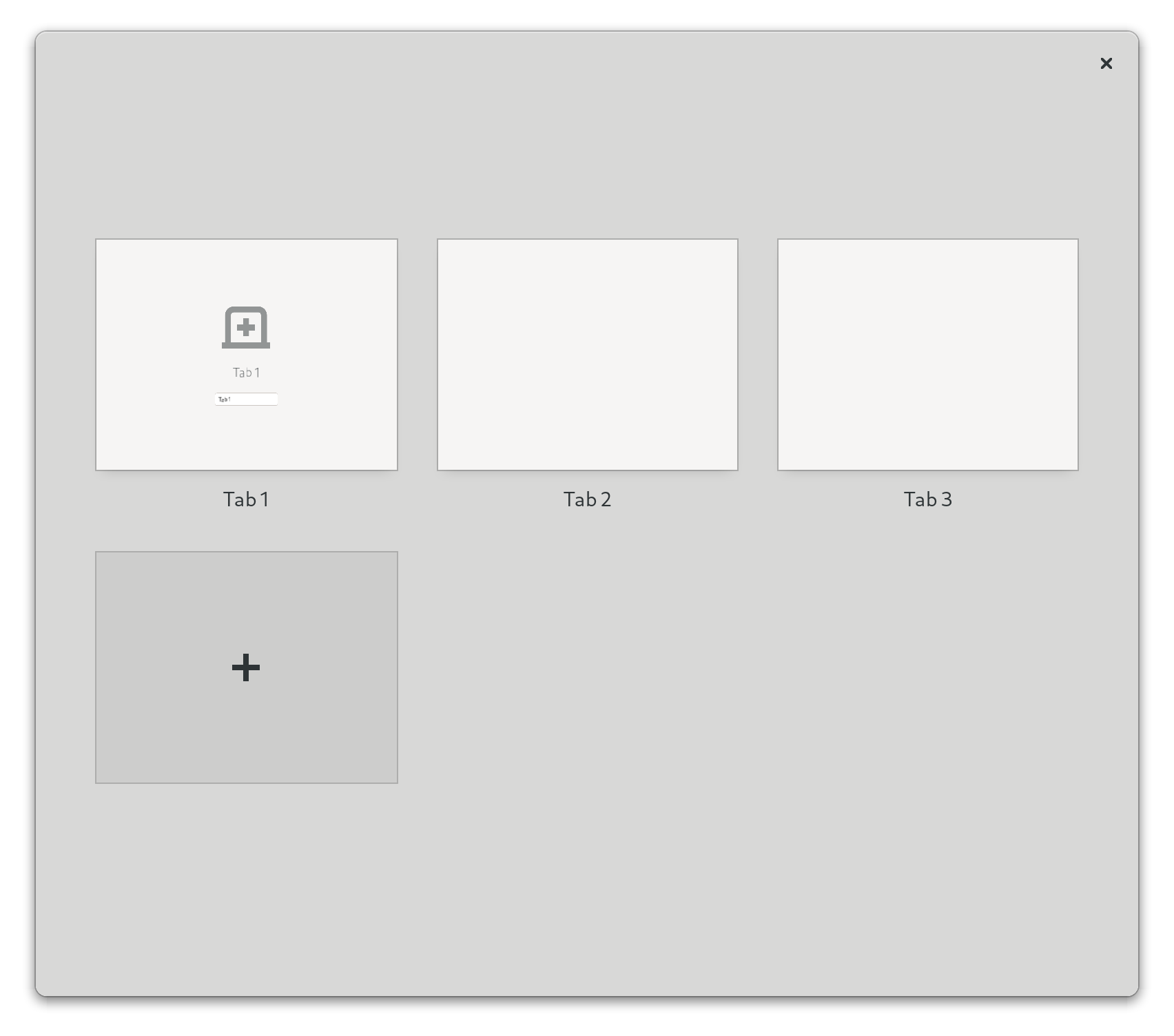
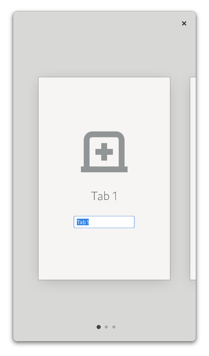
Finally, in some cases it can be nice to be able to use breakpoints on a more localized area of the UI, for example, a specific page. And so, all of this machinery is also available as a standalone widget: AdwBreakpointBin.
Replacing Squeezer and AdwViewSwitcherTitle
Next, we need to figure out how to adapt existing patterns for this new system.
Some of them, like bottom toolbars or hiding tabs on mobile are doable as is and don’t need any additional support — you can simply toggle their visibility from your breakpoint.
And that includes view switchers: simply add an AdwViewSwitcher into your header bar, a hidden AdwViewSwitcherBar at the bottom of the window, and a breakpoint that removes the view switcher and shows the view switcher bar on narrow sizes.
One problem is that unfortunately AdwViewSwitcher defaults to the narrow policy, while for header bar you really want wide instead, so apps have to change it manually.
The new system also avoids the misaligned title problem, since in narrow state we remove the view switcher entirely and let header bar use its default title, so the view switcher’s width doesnt’t get in the way.
This was the only place libadwaita was using AdwSqueezer for, so we don’t need that widget anymore either.
Replacing Leaflet
AdwLeaflet, on the other hand, cannot be replicated with breakpoints alone and needs a replacement widget. For example, because it provides things like gestures for stack navigation, unlike GtkStack and similar widgets.
Rethinking leaflets has led to a surprising number of other improvements along the way, so let’s run through them.
Toolbar View
Long ago, before libadwaita 1.0, there was this mockup:
Unfortunately, at the time it wasn’t really possible to implement it, not least because of leaflet limitations. However, if we’re redoing it anyway, might as well implement that style, especially when newer apps like Amberol and Emblem use a similar style anyway.
But the flat headers present a problem. What about scrolling content? This has been a long-standing problem with flat header bars, and in fact the .flat style class for header bars has been deprecated along with the old widgets.
Thankfully, GtkScrolledWindow has a mechanism for displaying undershoot indicators, and libadwaita has new style classes for controlling them.
However, manually managing them can be tricky. Sure, it’s easy when you just have a header bar and add the .undershoot-top style class to scrolled window, but what about bottom bar in an app like Contacts? Manually managing .undershoot-bottom in sync with the reveal animation is tricky, and in fact not even possible if you’re using GtkActionBar without wrapping it into another GtkRevealer.
But what if we had a widget for managing it instead? And so that’s what AdwToolbarView does. It replaces GtkBox for cases like this, providing a slot for content, and allowing for adding one or multiple top and bottom bars. Then, it manages the undershoot styles on scrolled windows inside it.
However, having a widget just for that would be silly, so it also does a number of other things:
- It allows for visually merging multiple toolbars together and remove their border and vertical spacing, making it possible to implement yet another mockup that wasn’t possible before:
- For the raised style (like on the screenshot above) it makes it possible to have a shadow instead of a border. This is yet another thing that wasn’t possible before, because while
GtkWindow’s titlebar is special cased to be drawn before content, that’s not the case in GtkBox, and the shadow would end up behind content. In AdwToolbarView we can make sure the content is drawn last and avoid this problem.
- It automatically makes all toolbars draggable, including
GtkSearchBar etc.
- It allows extending the content behind top or bottom bars, and to reveal or hide toolbars with an animation. This means that it can be used instead of
AdwFlap to manage fullscreen titlebar, and we don’t need to worry about that use case when replacing flap anymore.
Header bars are now also white in light variant instead of darker grey — mostly so that there’s more contrast against their shadow and it looks better with utilty panes using the new styling. The grey color header bars were previously using is now reserved for sidebars and utility panes instead.
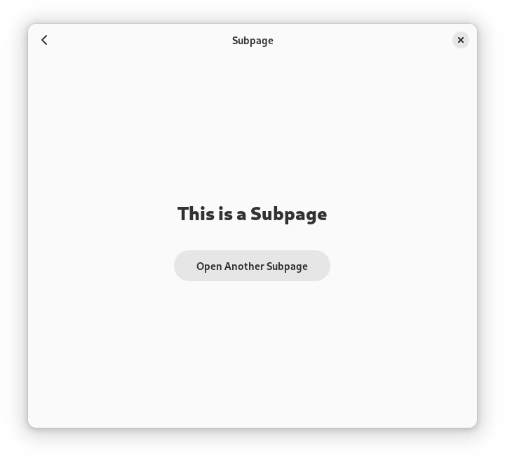
Navigation View
The first of the leaflet replacements is AdwNavigationView.
One of the things I wanted to avoid was having a single widget for both sidebars and stack navigation. This is a large part of what made AdwLeaflet so cumbersome, and it was this way to avoid code duplication, as well as due to historical reasons: leaflet first came to exist back when everyone just used GtkStack for this, and provided a version that can also do sidebars, then gradually got improved to be more attractive than GtkStack even for stack navigation.
In fact, libhandy 1.x provides a variant of leaflet that never expands, called HdyDeck. While in theory it was a good idea to separate these two widgets, they had almost identical API, so it still didn’t make any sense. As such, for libadwaita I merged them back and essentially replaced deck with the can-unfold property.
So, as shown earlier, leaflet API is not well suited for this task. So, once again, let’s look at other platforms for inspiration.
Some of them don’t have any nice ways to handle this pattern — for example, in UWP it’s surprisingly involved. Others do, however, such as UIKit and its UINavigationController. In fact, let’s go ahead and use it as inspiration because it’s very well thought out.
A noticeable difference between UINavigationController and AdwLeaflet is that the former has a stack-like API. As in, stack the data structure, not GtkStack (wow, this is confusing, not helped by the fact UIKit calls a stack what GTK calls a box 😵💫). So, you have a navigation stack, push pages into it and pop pages off it, and it’s dynamic. For comparison, leaflet has a statically ordered list of children, and you move back and forward in that list.
However, we can’t make AdwNavigationView 100% dynamic: we still need some way to use it from UI files. It took a lot of iteration, but at the end I came up with the following scheme:
- Pages can be pushed directly into the navigation stack using
push(). Once they are popped, they will be automatically removed.
- Pages can be statically added using
add() or from UI files. Then, they can be pushed and popped and will stay in the widget and can be reused later. The first added page becomes the root of the navigation stack.
- If a page was pushed without having been added and then later
add() is called for it, it won’t be autoremoved.
- If
remove() is called for a page currently in the navigation stack, it won’t be automatically removed and is simply marked for removal, same as if add() had never been called.
- The whole navigation stack can be replaced using
replace(), including removing any pages currently in the navigation stack if they are marked for autoremoval.
In other words, add() and remove() act a bit like pinning and unpinning the pages. The navigation stack itself is fully dynamic.
Pages also have tags and all of the functions for managing navigation stack have versions that work with tags, and pushing pages this way requires adding them first.
Tags also allow for another thing: GActions for managing the navigation stack. AdwNavigationView exposes two actions: navigation.push and navigation.pop. The first one takes a page tag as parameter, and this allows defining fairly complex structures, such as the one found in AdwAboutWindow entirely from UI files, without any code.
Unlike AdwLeafletPage, navigation view children — AdwNavigationPage — are widgets instead of auxiliary objects. Not only that, they are also derivable, so it’s possible to use templates with them. That’s why the tags are called tags and not names, otherwise there’s a name clash with GtkWidget:name.
Historically, GNOME apps have managed their back buttons themselves, no matter whether they are using GtkStack, HdyDeck or AdwLeaflet. But isn’t that silly? AdwLeaflet manages shortcuts and gestures for going back to the previous page, but not back buttons? Meanwhile UINavigationController automatically provides back buttons, so why can’t we?
Well, no reason really. While our situation is a bit different since header bars are just a widget instead of a part of the navigation controller, header bars already automatically show window controls for the window they are in. And so… AdwHeaderBar can now also automatically show a back button if it’s inside an AdwNavigationView. This is opt-out, same as for window buttons.
AdwHeaderBar has also learned to pull titles out of navigation pages same as how it does with window titles, since changing titles on header bars is a bit painful in GTK4, even with AdwWindowTitle. And since we have titles, they also double as accessible labels, as well as tooltips for back buttons. In fact, if we wanted to add labels to back buttons, like in iOS or elementary OS, we have means to do so now as well.
AdwNavigationView also supports a way to go forward, unlike UINavigationController — using the get-next-page signal. Meanwhile, AdwNavigationPage has signals for tracking its visibility, which can be used to create and destroy its contents on demand. With this apps like Nautilus can hopefully use this widget for content navigation, while with leaflet it just wasn’t feasible.
Finally, while AdwNavigationView hopefully reduces the number of situations where people have to nest them, it still works with nesting, including actions and back button integration. This will come in handy for the next widget.
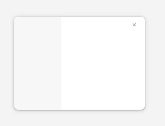
Navigation Split View
And finally, now that the navigation case is well covered and flat header bars are doable in a robust way, we can reimplement sidebars with a widget called AdwNavigationSplitView.
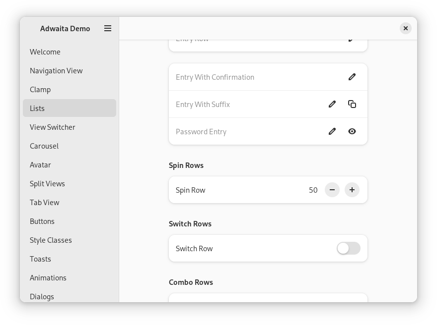
Compared to AdwNavigationView, this widget is very simple. It has two children: sidebar and content, both of which are required to be AdwNavigationPage. By default, it shows them side by side. When the collapsed property is set to TRUE, it just reparents both into a navigation view. And that’s pretty much it… Add a breakpoint to your window, toggle the collapsed property from it and you have an adaptive sidebar.
Well OK, it does a few more things, but this is still a stark contrast with how complex AdwLeaflet was.
For example, AdwHeaderBar gains yet another feature. When used inside AdwNavigationSplitView, it automatically hides redundant window buttons, hopefully getting rid of bugs like this for good:
Actually, two features. The other one is a property for hiding the title — it’s common to have header bars without titles for split layouts, and having to put an invisible widget into the header bar just to get rid of its title is not ideal.
AdwNavigationSplitView also provides its own navigation.push and navigation.pop actions, so that they still work when not collapsed. They work exactly same as in AdwNavigationView.
Instead of inheriting the push/pop API of AdwNavigationView, split view provides a single show-content boolean property.
Since the sidebar child is now clearly defined, we can style it and implement that mockup from long ago, and if people use toolbar views, they get automatic undershoot shadows.
Moreover, there’s a special styling for triple pane layouts:
This can be achieved just by nesting two split views together, see the docs for more details.
Finally, it implements dynamic sizing for sidebars. This is probably the most complex part of this widget: instead of using the sidebar’s natural width it attempts to give the sidebar a specified fraction of the total width, which is additionally limited by a minimum and a maximum value (as well as the minimum width of the sidebar child). On top of that, the minimum and maximum widths can use the same units as breakpoints, and in fact AdwNavigationSplitView defaults to using the sp unit, so that sidebars scale with Large Text.
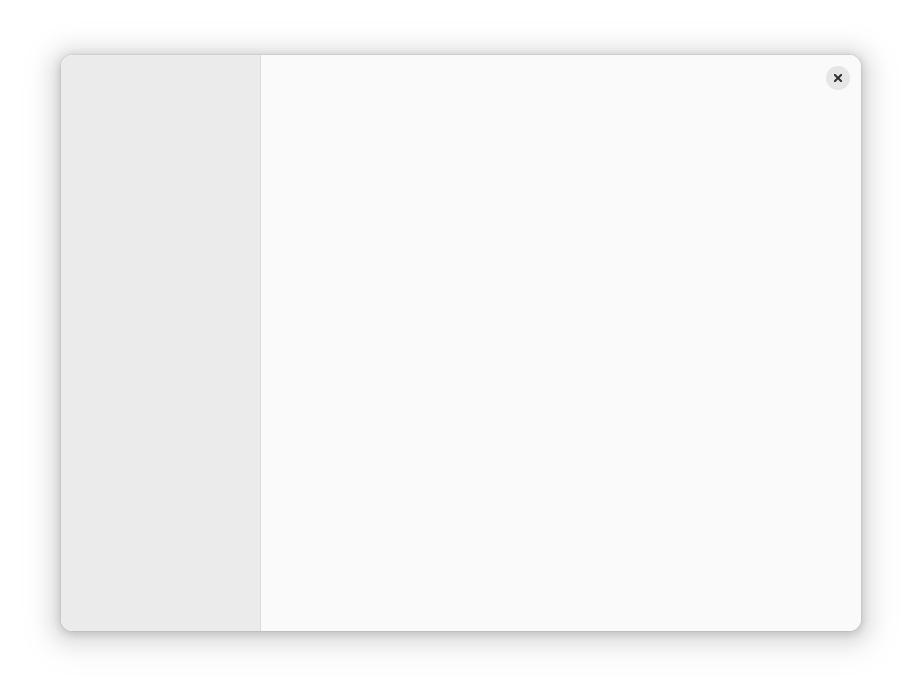
Replacing Flap
Unlike leaflet, AdwFlap doesn’t need a ground-up overhaul. We’ve already covered the fullscreen toolbar use case with AdwToolbarView, and flap is basically never used for bottom sheets — and even if it were, we’re going to have a specialized bottom sheet widget later anyway. So, the only case we need to care about is overlay sidebars and utility panes (which are basically the same thing as sidebars, but with a single header bar, so the widget doesn’t need to care about this distinction).
So, AdwOverlaySplitView is actually heavily based on AdwFlap, trimming it down and simplifying it API to match AdwNavigationSplitView. It also enjoys the same styling, dynamic sizing and AdwHeaderBar window button integration:
Yes, it looks exactly same as AdwNavigationSplitView when it’s not collapsed. What did you expect? Unlike that widget though, it does allow moving the sidebar to the right, as well as showing and hiding it, same as flap. (AdwNavigationSplitView doesn’t allow either because it would break the navigation model)
Unlike AdwNavigationSplitView, it doesn’t require children to be AdwNavigationPage, though it doesn’t prevent it either — it will work fine and you may still want to do that because of header bar title integration.
It also removes touchpad swipes. While it still has swipes on touchscreen, combining edge swipes on touchscreen with swipes anywhere on touchpad has never worked well and it has caused no end of problems for apps like Loupe. With touchpad swipes being partially broken in GTK4, it’s just not worth it. AdwNavigationView still supports touchpad swipes, but this widget does not.
Migrating
The old widgets have been deprecated and apps using libadwaita from main are encouraged to migrate to the new widgetry. Libadwaita also provides a migration guide for doing so.
The adaptive layouts page also uses the new widgets now.
Future
Dynamic Layouts
Even with all of that, there’s always room for improvement.
For example, while breakpoints allow rearranging the UI by setting properties, it’s still fairly limited and one needs widgets like split views for more complex layout changes. And while anything is possible with enough work, doing complex layout changes is rather painful (though less so than with the old widgets) and it has to be done programmatically.
However, we can take a bit of inspiration from Android, with its resource system and rebuilding the UI to change screen orientation etc.
As such, another thing I’ve been prototyping is a yet-to-be-named widget that does a similar thing to what AdwNavigationSplitView is doing, but generically:
- You provide it multiple different UI files, each of them contains tagged slots.
- You also provide it children with matching tags.
- It creates UI from one of the UI files and inserts the children into those slots.
- Which layout it uses is controlled by a property.
When you change its value, it unparents the tagged children, destroys the rest of the layout, creates the other layout and reparents the children there.
To better explain it, let’s take a look at this mockup of Loupe:
Here properties are presented in a sidebar at desktop sizes, and in a bottom sheet at mobile sizes. We obviously don’t have a widget that transforms between a sidebar and a bottom sheet (nor do we have a bottom sheet widget, but we will in future, so let’s assume we do), so there are two ways of implementing it:
- Have both a sidebar and a bottom sheet, each containing a copy of the properties view, and only have one of them visible at a time. In case of Loupe, it will work fine, since the properties view is reasonably small, but it doesn’t scale in the general case.
- Reparent them manually. This works, but is pretty fiddly and can’t be done declaratively.
With this new widget though? Define two layouts: one with a split view with two slots as its content and sidebar children, the other one a bottom sheet view with the same two slots. Add two children: an image view and a properties view, matching those slots. Then toggle the layout from your breakpoint. That’s it.
One downside of how Android does it is that apps have to thoroughly save widget state before rebuilding the UI and restore it afterwards, or it will be lost. But, since we’re reusing both widgets, there’s no need to save state here, it will just work.
We can still go a step further and do even that declaratively for state not covered by the children within the slots: have a list of object/property/tag triplets in each layout, and map each of them to the matching object/property on the other layout.
There are a few obstacles to solve here, but I have a working prototype, and maybe can even finish it this cycle.
Dialogs
Speaking of bottom sheets, one thing that’s still missing from libadwaita is support for adaptive dialogs. That’s coming too, but probably not this cycle. It needs cooperation with the compositor — especially for portals, where the dialog and its parent window are in different processes and can’t communicate. But we have a design and a tentative plan for how to get there.
I’d like to say thanks to:
- Naiara for pointing me towards UWP
AdaptiveTrigger and answering UWP questions.
- Chris for porting a lot of apps to try out and test the new API.
- Tobias Bernard and Sam Hewitt for UI design and answering my countless questions about tiny and unimportant details.
As always, thanks to my employer, Purism, for letting me work on all of this.
