It’s that time of year again, so let’s look at what’s new.
New Adaptive Widgets
I’ve already talked about them in my last blog post, so I won’t go into details this time.
Breakpoints
Libadwaita 1.4 introduces a breakpoint system, allowing to change UI in arbitrary ways depending on the window size. Breakpoints can be used with AdwWindow, AdwApplicationWindow, or with AdwBreakpointBin if you need more control.
Breakpoints can be used in a fully declarative way from UI files, for example:
<object class="AdwBreakpoint">
  <condition>max-width: 500sp</condition>
  <setter object="split-view" property="collapsed">True</property>
</object>
As a tradeoff, you have to manually specify the window’s or bin’s minimum size and ensure its contents actually fit, same as you do on a small screen.
To help with that, GtkButton, GtkMenuButton, AdwSplitButton and AdwButtonContent now all include a :can-shrink property to enable text ellipsizing, while widgets like AdwBanner automatically enable it for their buttons in order to not get uncontrollably wide.
For breakpoint conditions one can use pixels (px), points (pt) or a new sp unit (scalable pixels, name lifted from Android), which is equivalent to pixels with default text scale, but scales with it: 1sp is equivalent to 1.25px with Large Text enabled and so on. To accommodate different text scale factors better, it is recommended to use sp whenever it’s feasible.
Navigation View
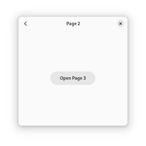
AdwNavigationView is an integrated widget implementing the browsing pattern, replacing AdwLeaflet with can-unfold=false. It provides a navigation stack that can be populated statically (e.g. from a UI file) or dynamically, and automatically provides gestures and shortcuts.
It also provides the navigation.push and navigation.pop actions, allowing to push pages directly from a UI file:
<object class="AdwActionRow">
  <property name="title" translatable="yes">_Details</property>
  <property name="use-underline">True</property>
  <property name="activatable">True</property>
  <property name="action-name">navigation.push</property>
  <property name="action-target">"details"</property>
  <child>
    <object class="GtkImage">
      <property name="icon-name">go-next-symbolic</property>
      <property name="accessible-role">presentation</property>
    </object>
  </child>
</object>
To further simplify using it, AdwHeaderBar can automatically show the correct title for each navigation page, as well as a back button to pop the current page when appropriate.
Automatic back buttons also provide a context menu that allows to pop multiple pages at once:
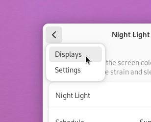
This still works with nested navigation views, as well with navigation views combined with split views.
Split Views
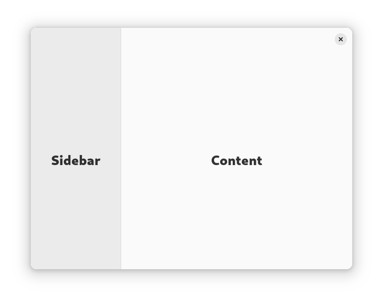
While AdwNavigationView replaces the can-unfold=false case of AdwLeaflet, AdwNavigationSplitView replaces the other one.
It has two children: sidebar and content, and it displays them side by side. When the :collapsed property is set to TRUE, it literally turns into an AdwNavigationView. It doesn’t set it automatically though – you are supposed to do it from your breakpoints as needed.
It also provides a more sophisticated sizing for the sidebar, based on the percentage of the split view’s total width.
Meanwhile, AdwOverlaySplitView is similar, but instead of turning into a navigation view when collapsed, it overlays the sidebar over content, not unlike AdwFlap. As such, AdwFlap is what it replaces.
It has a few extra features compared to navigation split view, such as an ability to move the sidebar to the right and show or hide it even when not collapsed, but the two widgets have extremely similar API.
And, like with AdwNavigationView, AdwHeaderBar can integrate with split views: when put inside one, it will automatically hide redundant window buttons, so there’s no need to show or hide them manually like with AdwLeaflet or AdwFlap.
Toolbar View
The new split view styles really need flat header bars to work well. While we’ve had the .flat style class since libadwaita 1.0, in practice it’s quite limited, especially with scrolling content.
As such, there’s a new widget called AdwToolbarView. It contains a content widget and a number of top and bottom bars (for example, AdwHeaderBar, AdwTabBar, GtkSearchBar, GtkActionBar, or GtkBox with the .toolbar style class). Then it will automatically manage the correct styles for the toolbars, for example making them flat and managing undershoot shadows on scrolling content (though this can be changed using the :top-bar-style and :bottom-bar-style properties), as well as collapsing spacing between them:

It’s recommended to always use it instead of GtkBox when you have header bars or other toolbars, regardless of whether you’re using split views.
Deprecations
With breakpoints and the new widgets, a number of older widgets have been deprecated, namely AdwLeaflet, AdwFlap, AdwSqueezer and AdwViewSwitcherTitle, as well as the old subpage API in AdwPreferencesWindow and the .flat style class for header bars. Refer to the migration guide for how exactly to replace them.
List Rows
There has been a number of boxed list additions this cycle.
Switch Row

Joshua Lee added AdwSwitchRow – a simple AdwActionRow subclass containing a GtkSwitch. While it’s easy to implement manually, it’s a very common case and so it’s nice to have a shortcut.
Spin Row

Chris added AdwSpinRow – a list row with an embedded GtkSpinButton, similar to AdwEntryRow.
Property Row

While it’s not a widget, the new .property style class, also by Chris, can swap styles on AdwActionRow‘s title and subtitle to emphasize the latter. This can be useful when displaying, say, EXIF properties in an image viewer.
Misc Changes
- Jamie added
adw_about_window_new_from_appdata()to simplify creating about windows. AdwClampcan now scale with text scale factor, via the:unitproperty, incl. defaulting to thespunit.- Yuri Izmer implemented search in
AdwComboRow, matchingGtkDropDown.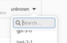
- Maksym Hazevych added
AdwPreferencesPage:descriptionproperty, allowing to show a description at the top of the page. - Corey Berla fixed another bunch of drag-n-drop issues to make sure it works as expected in Nautilus.
- The way
AdwTabOverviewhandles thumbnails has been significantly reworked to make it work better withWebKitWebView. - Xenia added the
AdwToast:use-markupproperty to allow disabling markup in toasts (it’s enabled by default). - A lot of accessibility issues throughout different widgets have been fixed – special thanks goes to Lukáš Tyrychtr and Maximiliano.
- Header bars and other toolbars are now white instead of darker grey in the light variant, while the previous grey is now used for sidebars instead. Header bars set as
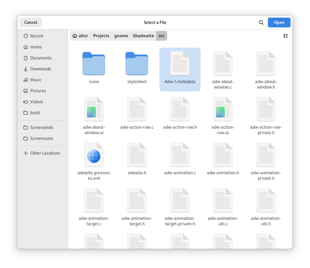
GtkWindowtitlebar now also have a shadow, same as when used in a toolbar view withtop-bar-style=raised - While default GTK dialogs cannot use the new widgets, they have been styled to look similar anyway.
As always, thanks to all the contributors who helped to make this release happen.