Well, it’s time for another release.
Last cycle wasn’t particularly exciting, only featuring the new dialogs and a few smaller changes, but this one should be more interesting. So let’s look at what’s new.
Bottom sheet
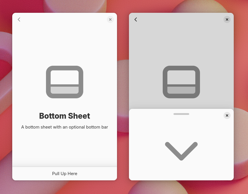
Last cycle libadwaita got new dialogs, which can be presented as bottom sheets on mobile, and I mentioned that they will also be available as a standalone widget in future – so AdwBottomSheet exists and is public now.
As a standalone widget, bottom sheets work a bit differently from dialogs – they are persistent instead of being destroyed upon closing, more like the sidebar of AdwOverlaySplitView.
They also have a few new features, such as a drag handle, or a bottom bar presentation. This is useful for apps like music players.
AdwHeaderBar also integrates with bottom sheets – it hides the title when used in a bottom sheet with a drag handle.
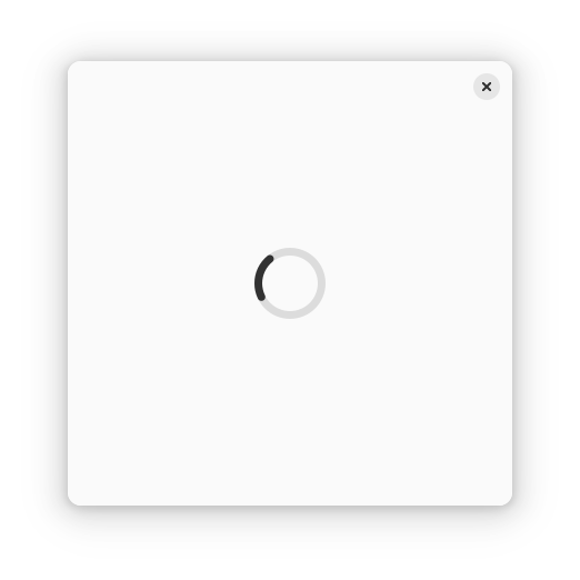
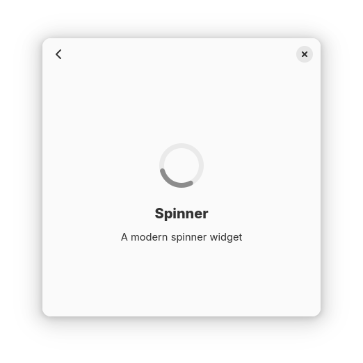
Spinner

Libadwaita also has a new spinner widget – AdwSpinner. It both refreshes visuals and addresses various problems with GtkSpinner.
GtkSpinner is a really simple widget. Both the spinner itself and the animation are set in CSS. The spinner is just a symbolic icon, and the animation is a CSS animation. This approach has a few problems, however.
First, the old spinner has a gradient. Symbolic icons don’t actually support gradients, so it has to resort to dithering, as Jakub Steiner explained in his blog a few years ago. This works well if the spinner is small enough (16×16 – 32×32), but becomes very noticeable at larger sizes. This means that the spinner didn’t work well for loading screens, or status pages.
Meanwhile, CSS animations are entirely disabled when system animations are off. Usually that makes sense, except here it means the spinner freezes, defeating the entire point of having it (indicating that the app isn’t frozen during long operations).
And, while CSS animations are pretty sophisticated, you can only do so much with a single element – so it’s literally a spinning icon. elementary OS does a more interesting thing – it spins it in steps, while the icon consists of 12 dashes, so it looks like they change color instead. Even then, more complex animations are impossible.
AdwSpinner avoids all of these issues. Since it’s in libadwaita and not in GTK, it can be more opinionated with regard to styling, so instead of using an icon and CSS, it’s just custom drawing. And since it’s not using CSS animations, it can keep spinning with animations off, and can animate in a more involved way than a simple spinning icon.
It still has a size limit – 64×64 pixels. While it can scale further, we don’t really need larger sizes and capping the size makes it easier to use – to make a loading screen using GtkSpinner, you have to set the :halign and :valign properties to CENTER, as well as :width-request and :height-request properties to 32. If you fail to do these steps, the spinner will either be too large, or too small respectively:
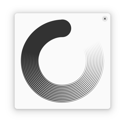
Meanwhile if you just put an AdwSpinner into a large bin, it will look right by default.
Oh, and GtkSpinner is invisible by default and you have to set the :spinning property to true as well. This made sense back in the age of foot and dinosaur spinners, where the spinner would stay in place when not animating, but that’s not really a thing anymore.
(though Nautilus wasn’t actually using GtkSpinner)
It also didn’t help that until this cycle, GtkSpinner would continue to consume CPU cycles even when not visible if the :spinning property is left enabled, so you had to start the spinner in the ::map signal and stop it in ::unmap. That is fixed now, but it was a major source of lag in, say, Epiphany in the past (which had a spinner in every tab, another spinner in every mobile tab switcher row and another one in the floating bar that shows URLs on hover, copied from Nautilus).
Spinner paintable
In addition to AdwSpinner, there’s also AdwSpinnerPaintable. It can be used with GtkImage, any other place that accepts paintables (such as status pages) or just manually drawn. It is a bit more awkward to use than the widget, as it needs to reference another widget in order to animate (since paintables cannot access the frame clock on their own), but it allows to use spinners in contexts that wouldn’t be possible otherwise.
AdwStatusPage even has a special style for spinner paintable – similar to the .compact style, but applied automatically.
Button row
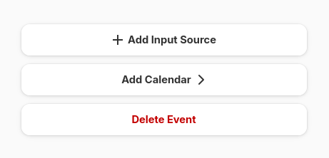
Another widget we have now is AdwButtonRow – a list row that looks more or less like a button. It has a label, optionally icons on either side, and can use destructive and suggested style classes.
This pattern isn’t new – it has been used in mockups for a while (at least as early as 2021) – but it varied quite a bit between different mockups and implementations and so having a standard widget for it wasn’t viable. This cycle Jamie Gravendeel and kramo took time to standardize the existing designs into a tangible proposal – so it exists as a standard widget now.
Most of the time these rows aren’t meant to be linked together, so AdwPreferencesGroup has a new property :separate-rows. When enabled, the rows within will appear separately. This is mostly useful for button rows, but also e.g. entry rows. When not using AdwPreferencesGroup, the same effect can be achieved by using the .boxed-list-separate style class instead of .boxed-list.
Multi-layout view
Libadwaita 1.4 introduced AdwBreakpoint, which allowed to easily set properties on window size changes. However, a lot of apps need layout changes that can’t be expressed via simple properties – say, switching between a sidebar and a bottom sheet. While it is possible to do it programmatically anyway, it’s fairly involved and not a lot of apps went to those lengths.
Back then I also prototyped a widget for automatically reparenting children between different layouts via using a property mentioned a future widget for automatically reparenting children between different layouts, and now it’s finished and available for use as AdwMultiLayoutView.
It has changed somewhat since the prototype, e.g. it doesn’t dynamically create or destroy layouts anymore, just parents/unparents them, but the gist is still the same:
- Put multiple
AdwLayouts into a multi-layout view - Put one or more
AdwLayoutSlotinto each layout, give them IDs - Define children matching those IDs
Then those children will be placed into the slots for the current layout. When you switch the layout, they will be reparented into slots from that layout instead.
So now it’s possible to define completely different layouts for desktop and mobile entirely via UI files.
CSS variables and colors
I’ve already talked about this in a lot of detail in my last blog post, but GTK has a lot of new CSS goodies, and libadwaita 1.6 makes full use of them.
To recap: GTK now supports CSS variables, as well as color-mix(), relative colors, as well as new color spaces, most importantly Oklab and Oklch.
Libadwaita now provides CSS variables for all of its old named colors, with a docs page to go with it, as well as new variables: --dim-opacity, --disabled-opacity, --border-opacity and --window-radius.
This also allowed to have matching focus ring color on .destructive-action buttons, as well as matching accent color for the .error, .warning and .success style classes. And because overriding accent color for a specific widget is now possible, .opaque button style class has been deprecated in favor of overriding accent colors on .suggested-action. Meanwhile, the white accent color of .osd is now more reliable and automatically works for custom widgets, instead of trying (and often failing) to manually override it for every standard widget.
I mentioned that it might be possible to generate standalone accent/error/etc colors from their respective background colors. However, the question was how to make that automatic, so at the time we didn’t actually integrate that. Now it is integrated, though it’s not completely automatic – only for :root.
Specifically, there’s a new variable: --standalone-color-oklab, corresponding to the correct color transformation for the current style.
So, when overriding accent color for a specific widget, there is a bit of boilerplate to copy:
my-widget {
  --accent-bg-color: var(--accent-purple);
  --accent-color: oklab(from var(--accent-bg-color) var(--standalone-color-oklab));
}
It’s still an improvement over calculating the color manually, both for light and dark styles (which a lot of apps didn’t do at all, resulting in poor contrast), so still worth it. Maybe one day we’ll be able to make it completely automatic – e.g. by ensuring that using variables with wildcards doesn’t regress performance.
Meanwhile adw_rgba_to_standalone() allows to do the same thing programmatically.
Accent colors
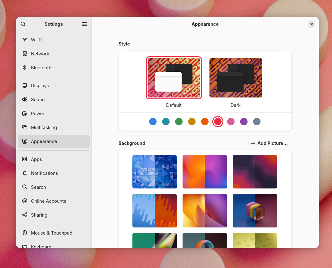
Another big feature is system accent color support. While it’s not a strictly libadwaita change, this is the developer-facing part, so it makes sense to talk about it here.
Behind the scenes it’s using the settings portal which provides a standardized key for the system accent color. Many other environments support it as well, so libadwaita apps will follow their accent color preferences too, while non-GNOME apps that follow the preference will follow it on GNOME too. Note that while the portal exposes arbitrary sRGB colors, libadwaita will pick the closest color from a list of nine colors, as visible on the screenshot above. This is done in the Oklch color space, mostly based on hue, so should work even for really dull colors.
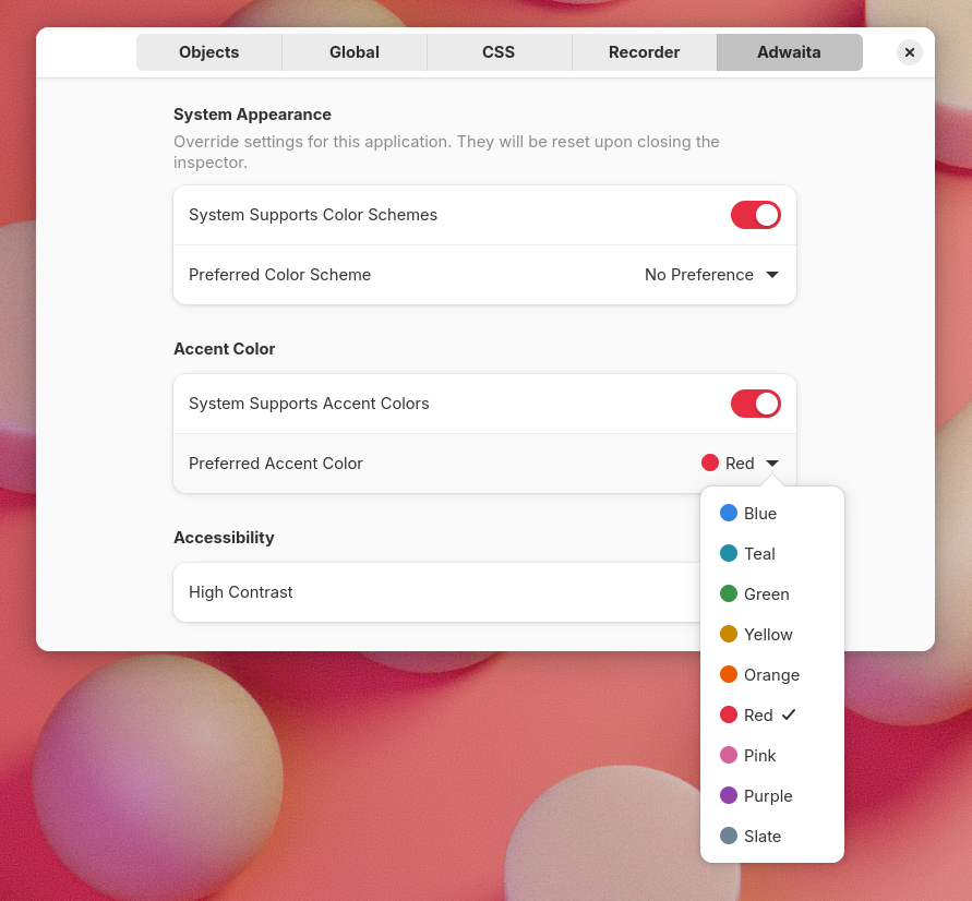
Accent colors are also supported when running on Windows and macOS, and like with the color scheme and high contrast, the libadwaita page in GTK inspector allows to toggle the system accent color now.
Apps are still free to set their own accent color. CSS always takes priority over the system accent.
A lot of people helped push this over the finish line, with particular thanks to Jamie Murphy, kramo and Jamie Gravendeel.
API
AdwStyleManager provides new properties for fetching the system color – :accent-color and :accent-color-rgb, as well as :system-supports-accent-colors for querying whether the system has accent color preferences – same as for color scheme.
The :accent-color property returns a color from the AdwAccentColor enum, so that individual colors can be special cased (say, when using bitmap assets). This color can be converted both to background color RGBA (using adw_accent_color_to_rgba()) and to standalone color (adw_accent_color_to_standalone_rgba()).
All of these colors use white foreground color, so there’s no API for fetching it, at least for now.
Note that :accent-color-rgba will still return the system color even if the app overrides its accent color using CSS. It only exists for convenience and is equivalent to calling adw_accent_color_to_rgba() on the :accent-color value.
While we still don’t have a general replacement for deprecated gtk_style_context_lookup_color(), the new accent color API can replace at least some of its uses.
On CSS side, there are new variables corresponding to each accent color: --accent-blue for blue and so on. Additionally, every system color, along with their standalone colors for both light and dark, is documented and can be used as a reference.
Destructive buttons
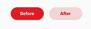
Having accent color that’s not always blue means having to rethink other style choices. In particular, .destructive-action buttons were just a red version of .suggested-action, same as in GTK3. This was already questionable from accessibility perspective, but breaks entirely with accent colors, since suggested buttons would look exactly same as a destructive ones with red accent. And so .destructive-action has a distinct style now, less prominent than suggested.
Alert dialogs
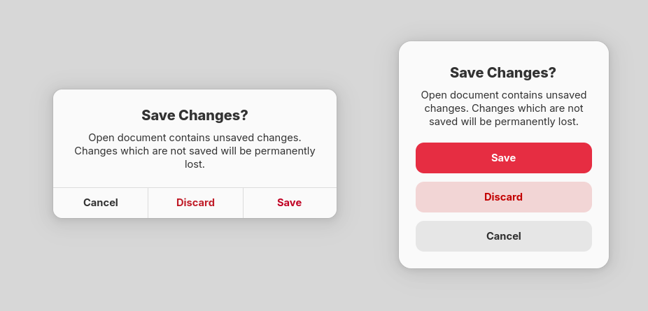
Another area that needed updates was AdwAlertDialog – it was also using color for differentiating suggested and destructive buttons.
Coincidentally, the alert dialog style went almost unchanged from GTK3 days, and looked rather out of place with the rest of the platform. So kramo came up with an updated design.
AdwMessageDialog and GtkAlertDialog received the same style, or at least an approximation – it’s not possible to replicate it entirely in GTK dialogs. Even though neither is recommended for use (when using libadwaita, anyway – nothing wrong with using GtkAlertDialog in plain GTK), regressing apps that aren’t fully up to date with the platform wouldn’t be very good.
Adapting apps
Accent colors are supported automatically, and in most cases apps don’t need any changes to make use of them. However, here’s a checklist to ensure it works well:
- Make use of the accent color variables in custom CSS, like
--accent-bg-color. Using the old named colors like@accent_bg_colorworks as well. Don’t assume accent color will be blue. - Conversely, don’t use accent color when you mean blue. We have variables like
--blue-3for that – or even--accent-blue. - When using accent color in custom drawing (say, drawing a graph), make sure to redraw it when
AdwStyleManager:accent-colorvalue changes – same as for color scheme and high contrast. AdwWindowandAdwApplicationWindownow have a default minimum size (360×200 px), meaning you don’t have to set it manually to use breakpoints or dialogs anymore. Apps can still override it if they need a different size, but it works out of the box now.AdwComboRownow has the:header-factoryand:search-match-modeproperties, followingGtkDropDown. So it’s now possible to, say, have separators in the dropdown list.AdwEntryRowgot the:max-lengthproperty, matchingGtkEntry.AdwPreferencesPagedescription now can be centered, using the:description-centeredproperty.- Documentation now lists available style classes for each widget, in addition to the centralized list of style classes.
- Markus Göllnitz made the
.navigation-sidebarstyle class supportGtkFlowBoxandGtkGridView, as seen in Papers. - Property rows now support the
.monospacestyle class. GtkTextViewnow supports the.inlinestyle class, removing its background and resetting its foreground color. This allows to use it in contexts like cards.
Deprecations
Last cycle we introduced new dialog widgets that are based on AdwDialog rather than GtkWindow. However, that happened right at the end of the cycle, without giving apps a lot of time to port their existing dialogs. Because of that, the old widgets (AdwMessageDialog, AdwPreferencesWindow, AdwAboutWindow) weren’t deprecated and I mentioned that they will be deprecated in future instead. So, they are now.
If you haven’t migrated to the new dialogs yet, see the migration guide for how to do so.
Other changes
As always, there are smaller changes that don’t warrant their own sections, so let’s look at those:
Future
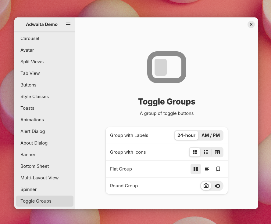
As usual, there are changes that didn’t make it this cycle and will land the next cycle instead. Most notably, the old toggle groups branch by Maximiliano is finally finished and will land early next cycle.
Big thanks to STF for funding a lot of this work (GTK CSS improvements, bottom sheets, finishing multi-layout view and toggle groups, general maintenance), as well as people organizing the initiative and all contributors who made this release happen.
Just wanted to leave a shout-out for the importance of this item under Destructive Buttons:
“This was already questionable from accessibility perspective, but breaks entirely with accent colors, since suggested buttons would look exactly same as a destructive ones with red accent.”
Major thank you on this one, as someone with red-green color anomalous vision, the color red having meaning often flies right over my head, but intensity levels of colors stand out very strongly – so hopefully it’s a good change for all, but the example of the new design is SOOOOOO much easier to quickly parse!
Thanks for the update, great summary of changes. And it looks awesome as well
it is the the most beautiful UI for apps, libadwaita. thanks for all your hard work to build such a nice interface.
I’m just a casual Fedora Gnome user for many years, and even though I’m not a coder I do enjoy reading all these updates on all the progress being made. Things are looking great! Looking forward to seeing more and more apps adopt these new features in the near future. And thanks to everyone’s hard work making this all possible too!