Mobile testing in libadwaita

Screenshot of Highscore, an emulator frontend running Doom 64 with touch controls, inside libadwaita adaptive preview, emulating a small phone (360x720), in portrait, with mobile shell (26px top bar, 18px bottom bar) and no window controls

Lately I’ve been working on touch controls overlays in Highscore1, and quickly found out that previewing them across different screen sizes is rather tedious.

Currently we have two ways of testing UIs on a different screen size – resize the window, or run the app on that device. Generally when developing, I do the former since it’s faster, but what dimensions do I resize to?

HIG lists the 360×294px dimensions, but that’s the smallest total size – we can’t really figure out the actual sizes in portrait and landscape with this. Sure, we can look up the phone sizes, check their scale factor, and measure the precise panel sizes from screenshots, but that takes time and that’s a lot of values to figure out. I did make such a list, and that’s what I used for testing here, but, well, that’s a lot of values. I also discovered the 294px height listed in HIG is slightly wrong (presumably it was based on phosh mockups, or a really old version) and with older phosh versions the app gets 288px of height, while with newer versions with a slimmer bottom bar it gets 313px.

Now that we know the dimensions, the testing process consists of repeatedly resizing the window to a few specific configurations. I have 31 different overlay, each with 7 different layouts for different screen sizes. Resizing the window for each of them gets old fast, and I really wished I had a tool to make that easier. So, I made one.

View switcher dialog in libadwaita demo, running in adaptive preview, emulating large phone (360x760),  in landscape, with mobile shell and window controls turned off

This is not a separate app, instead it’s a libadwaita feature called adaptive preview, exposed via GTK inspector. When enabled, it shrinks the window contents into a small box and exposes UI for controlling its size: specifically, picking the device and shell from a list. Basically, same as what web browsers have in their inspectors – responsive design mode in Firefox etc.

Adaptive Preview row on the libadwaita page in GTK inspector

It also allows to toggle whether window controls are visible – normally they are disabled on mobile, but mobile gnome-shell currently keeps them enabled as not everything is using AdwDialog yet.

It can also be opened automatically by specifying the ADW_DEBUG_ADAPTIVE_PREVIEW=1 environment variable. This may be useful if e.g. Builder wants to include it into its run menu, similar to opening GTK inspector.

If the selected size is too large and doesn’t fit into the window, it scrolls instead.

What it doesn’t do

It doesn’t simulate fullscreen. Fullscreen is complicated because in addition to hiding shell panels almost every app that supports it changes the UI state – this is not something we can automatically support.

It also doesn’t simulate different scale factors – it’s basically impossible to do with with how it’s implemented.

Similarly, while it does allow to hide the window controls, if the app is checking them manually via GtkSettings:gtk-decoration-layout, it won’t pick that up. It can only affect AdwHeaderBar, similarly to how it’s hiding close button on the sidebars.

Future plans

It would be good to display the rounded corners and cutouts on top of the preview. For example, the phone I use for testing has both rounded corners and a notch, and we don’t have system-wide support for insets or safe area just yet. I know the notch dimensions on my specific phone (approximately 28 logical pixels in height), but obviously it will vary wildly depending on the device. The display panel data from gmobile may be a good fit here.

We may also want to optionally scale the viewport to fit into the window instead of scrolling it – especially for larger sizes. If we have scaling, it may also be good to have a way to make it match the device’s DPI.

Finally, having more device presets in there would be good – currently I only included the devices I was testing the overlays for.


Adaptive preview has already landed in the main branch and is available to apps using the nightly SDK, as well as in GNOME OS.

So, hopefully testing layouts on mobile devices will be easier now. It’s too late for me, but maybe the next person testing their app will benefit from it.


1. gnome-games successor, which really deserves a blog post of its own, but I want to actually have something I can release first, so I will formally announce it then. For now, I’m frequently posting development progress on the Fediverse

Steam Deck, HID, and libmanette adventures

Screenshot of gamepad preferences in Highscore, showing Steam Deck gamepad

Recently, I got a Steam Deck OLED. Obviously, one of the main reasons for that is to run a certain yet to be announced here emulation app on it, so I installed Bazzite instead of SteamOS, cleaned up the preinstalled junk and got a clean desktop along with the Steam session/gaming mode.

For the most part, it just works (in desktop mode, at least), but there was one problematic area: input.

Gamepad input

Gamepads in general are difficult. While you can write generic evdev code dealing with, say, keyboard input and be reasonably sure it will work with at least the majority of keyboards, that’s not the case for gamepads. Buttons will use random input codes. Gamepads will assign different input types for the same control. (for example, D-pad can be presented as 4 buttons, 2 hat axes or 2 absolute axes). Linux kernel includes specialized hid drivers for some gamepads which will work reasonably well out of the box, but in general all bets are off.

Projects like SDL have gamepad mapping databases – normalizing input for all gamepads into a standardized list of inputs.

However, even that doesn’t guarantee they will work. Gamepads will pretend to be other gamepads (for example, it’s very common to emulate an Xbox gamepad) and will use incorrect mapping as a result. Some gamepads will even use identical IDs and provide physically different sets of buttons, meaning there’s no way to map both at the same time.

As such, apps have to expect that gamepad may or may not work correctly and user may or may not need to remap their gamepad.

Steam controllers

Both the standalone Steam Controller and Steam Deck’s internal gamepad pose a unique challenge: in addition to being gamepads with every problem mentioned above, they also emulate keyboard and pointer input. To make things more complicated, Steam has a built-in userspace HID driver for these controllers, with subtly different behavior between it and the Linux kernel driver. SteamOS and Bazzite both autostart Steam in background in desktop mode.

If one tries to use evdev in a generic way, same as for other gamepads, the results will not be pretty:

In desktop mode Steam emulates a virtual XInput (Xbox) gamepad. This gamepad works fine, except it lacks access to Steam and QAM buttons, as well as the 4 back buttons (L4, L5, R4, R5). This works perfectly fine for most games, but fails for emulators where in addition to the in-game controls you need a button to exit the game/open menu.

It also provides 2 action sets: Desktop and Gamepad. In desktop action set none of the gamepad buttons will even act like gamepad buttons, and instead will emulate keyboard and mouse. D-pad will act as arrow keys, A button will be Enter, B button will be Esc and so on. This is called “lizard mode” for some reason, and on Steam Deck is toggled by holding the Menu (Start) button. Once you switch to gamepad action set, gamepad buttons will act as a gamepad, with the caveat mentioned above.

Gamepad action set also makes the left touchpad behave differently: instead of scrolling and performing a middle click on press, it does a right click on press while moving finger on it does nothing.

hid-steam

Linux kernel includes a driver for these controllers, called hid-steam, so you don’t have to be running Steam for it to work. While it does most of the same things Steam’s userspace driver does, it’s not identical.

Lizard mode is similar, the only difference is that haptic feedback on the right touchpad stops right after lifting finger instead of after the cursor stops, while left touchpad scrolls with a different speed and does nothing on press.

The gamepad device is different tho – it’s now called “Steam Deck” instead of “Microsoft X-Box 360 pad 0” and this time every button is available, in addition to touchpads – presented as a hat and a button each (tho there’s no feedback when pressing).

The catch? It disables touchpads’ pointer input.

The driver was based on Steam Deck HID code from SDL, and in SDL it made sense – it’s made for (usually fullscreen) games, if you’re playing it with a gamepad, you don’t need a pointer anyway. It makes less sense in emulators or otherwise desktop apps tho. It would be really nice if we could have gamepad input AND touchpads. Ideally automatically, without needing to toggle modes manually.

libmanette

libmanette is the GNOME gamepad library, originally split from gnome-games. It’s very simple and basically acts as a wrapper around evdev and SDL mappings database, and has API for mapping gamepads from apps.

So, I decided to add support for Steam deck properly. This essentially means writing our own HID driver.

Steam udev rules

First, hidraw access is currently blocked by default and you need an udev rule to allow it. This is what the well known Steam udev rules do for Valve devices as well as a bunch of other well known gamepads.

There are a few interesting developments in kernel, logind and xdg-desktop-portal, so we may have easier access to these devices in future, but for now we need udev rules. That said, it’s pretty safe to assume that if you have a Steam Controller or Steam Deck, you already have those rules installed.

Writing a HID driver

Finally, we get to the main part of the article, everything before this was introduction.

We need to do a few things:

1. Disable lizard mode on startup
2. Keep disabling it every now and then, so that it doesn’t get reenabled (this is unfortunately necessary and SDL does the same thing)
3. Handle input ourselves
4. Handle rumble

Both SDL and hid-steam will be excellent references for most of this, and we’ll be referring to them a lot.

For the actual HID calls, we’ll be using hidapi.

Before that, we need to find the device itself. Raw HID devices are exposed differently from evdev ones, as /dev/hidraw* instead of /dev/input/event*, so first libmanette needs to search for those (either using gudev, or monitoring /dev when in flatpak).

Since we’re doing this for a very specific gamepad, we don’t need to worry about filtering out other input devices – this is an allowlist, so we just don’t include those. So we just match by vendor ID and product ID. Steam Deck is 28DE:1205 (at least OLED, but as far as I can tell the PID is the same for LCD).

However, there are 3 devices like that: the gamepad itself, but also its emulated mouse and keyboard. Well, sort of. Only hid-steam uses those devices, Steam instead sends them via XTEST. Since that obviously doesn’t work on Wayland, there’s instead a uinput device provided by extest.

SDL code tells us that only the gamepad device can actually receive HID reports, so the right device is the one that allows to read from it.

Disabling lizard mode

Next, we need to disable lizard mode. SDL sends an ID_CLEAR_DIGITAL_MAPPINGS report to disable keyboard/mouse emulation, then changes a few settings: namely, disables touchpads. As mentioned above, hid-steam does the same thing – it was based on this code.

However, we don’t want to disable touchpads here.

What we want to do instead is to send a ID_LOAD_DEFAULT_SETTINGS feature report to reset settings changed by hid-steam, and then only disable scrolling for the left touchpad. We’ll make it right click instead, like Steam does.

This will keep the right touchpad moving pointer, but the previous ID_CLEAR_DIGITAL_MAPPINGS report had disabled touchpad clicking, so we also need to restore it. For that, we need to use the ID_SET_DIGITAL_MAPPINGS report. SDL does not have an existing struct for its payload (likely because of struct padding issues), so I had to figure it out myself. The structure is as follows, after the standard zero byte and the header:

  • 8 bytes: buttons bitmask
  • 1 byte: emulated device type
  • 1 byte: a mouse button for DEVICE_MOUSE, a keyboard key for DEVICE_KEYBOARD, etc. Note that the SDL MouseButtons struct starts from 0 while the IDs Steam Deck accepts start from 1, so MOUSE_BTN_LEFT should be 1, MOUSE_BTN_RIGHT should be 2 and so on.

Then the structure repeats, up to 6 times in the same report.

ID_GET_DIGITAL_MAPPINGS returns the same structure.

So, setting digital mappings for:

  • STEAM_DECK_LBUTTON_LEFT_PAD, DEVICE_MOUSE, MOUSE_BTN_RIGHT
  • STEAM_DECK_LBUTTON_RIGHT_PAD, DEVICE_MOUSE, MOUSE_BTN_LEFT

(with the mouse button enum fixed to start from 1 instead of 0)

reenables clicking. Now we have working touchpads even without Steam running, with the rest of gamepad working as a gamepad, automatically.

Keeping it disabled

We also need to periodically do this again to prevent hid-steam from reenabling it. SDL does it every 200 updates, so about every 800 ms (update rate is 4 ms), and the same rate works fine here. Note that SDL doesn’t reset the same settings as initially, but only SETTING_RIGHT_TRACKPAD_MODE. I don’t know why, and doing the same thing did not work for me, so I just use the same code as detailed above instead and it works fine. It does mean that clicks from touchpad presses are ended and immediately restarted every 800 ms, but it doesn’t seem to cause any issues in practice, even with e.g. drag-n-drop)

Handling gamepad input

This part was straightforward. Every 4 ms we poll the gamepad and receive the entire state in a single struct: buttons as a bitmask, stick coordinates, trigger values, but also touchpad coordinates, touchpad pressure, accelerometer and gyro.

Right now we only expose a subset of buttons, as well as stick coordinates. There are some very interesting values in the button mask though – for example whether sticks are currently being touched, and whether touchpads are currently being touched and/or pressed. We may expose that in future, e.g. having API to disable touchpads like SDL does and instead offer the raw coordinates and pressure. Or do things on touch and/or click. Or send haptic feedback. We’ll see.

libmanette event API is pretty clunky, but it wasn’t very difficult to wrap these values and send them out.

Rumble

For rumble we’re doing the same thing as SDL: sending an ID_TRIGGER_RUMBLE_CMD report. There are a few magic numbers involved, e.g. for the left and right gain values – originated presumably in SDL, copied into hid-steam and now into libmanette as well ^^

Skipping duplicate devices

The evdev device for Steam Deck is still there, as is the virtual gamepad if Steam is running. We want to skip both of them. Thankfully, that’s easily done via checking VID/PID: Steam virtual gamepad is 28DE:11FF, while the evdev device has the same PID as the hidraw one. So, now we only have the HID device.

Behavior

So, how does all of this work now?

When Steam is not running, libmanette will automatically switch to gamepad mode, and enable touchpads. Once the app exits, it will revert to how it was before.

When Steam is running, libmanette apps will see exactly the same gamepad instead of the emulated one. However, we cannot disable lizard mode automatically in this state, so you’ll have to hold Menu button, or you’ll get input from both the gamepad and keyboard. Since Steam doesn’t disable touchpads in gamepad mode, they will still work as expected, so the only caveat is needing to hold Menu button.

So, it’s not perfect, but it’s a big improvement from how it was before.

Mappings

Now that libmanette has bespoke code specifically for Steam Deck, there are a few more questions. This gamepad doesn’t use mappings, and apps can safely assume it has all the advertised controls and nothing else. They can also know exactly what it looks like. So, libmanette now has ManetteDeviceType enum, currently with 2 values: MANETTE_DEVICE_GENERIC for evdev devices, and MANETTE_DEVICE_STEAM_DECK, for Steam Deck. In future we’ll likely have more dedicated HID drivers and as such more device types. For now though, that’s it.


The code is here, though it’s not merged yet.

Big thanks to people who wrote SDL and the hid-steam driver – I would definitely not be able to do this without being able to reference them. ^^

CSS Happenings

This cycle GTK got a lot of updates to its CSS engine.

I started this work as part of the Sovereign Tech Fund initiative, and later on Matthias Clasen joined in and we ended up splitting the work on colors.

Let’s go through the changes, as well as how they affect GTK, libadwaita and apps.

Variables

The most notable addition is CSS variables, more correctly known as custom properties.

Since before GTK switched to CSS for styles, it has had named colors, a non-standard addition providing a similar functionality. You could define a color, then refer to it by name. Unfortunately, they had big limitations. First, they are global. You can only define colors for the whole stylesheet, and if you want to override them for a single widget subtree – you’re out of luck. Second, they were obviously only for colors.

The only option to have them local to a widget was to use gtk_style_context_add_provider() on a GtkStyleContext obtained via gtk_widget_get_style_context. However, it had an even bigger problem: being local to a widget, it didn’t propagate to children, which made it practically useless. Even for widgets that seemingly don’t have children: for example, if you add a provider to a GtkEntry, it won’t affect its text, or the icons, or the progress bar – they are all separate widgets within the entry. So, it shouldn’t be a big surprise that this API is deprecated.

Variables, meanwhile, don’t have any of these limitations. They can be defined anywhere, propagate to children, and they can be anything – colors, numbers, dimensions, etc. For example, we can override them for a specific widget as follows:

:root {
  --some-color: red;
}

my-widget {
  --some-color: green;
}

After defining, they can be accessed with the var() function:

my-widget {
  color: var(--some-color);
}

This function also allows to specify a fallback in case a variable doesn’t exist, as follows:

my-widget {
  color: var(--some-color, var(--some-other-color, red));
}

Here it will try, in order, --some-color, then --some-other-color, and if neither exists, red.

The standard place to declare global variables is the :root selector, and so it’s now supported too. While GTK root widgets usually have the window selector, that’s not always the case. For example, GtkCheckButton within a GtkTreeView are their own toplevels and targeting window would not include them. While tree view is deprecated and hopefully on its way out, we have to support it anyway for now, and who knows what other root widgets appear in future, and having :root solves it all nicely.

Variables can even be animated, though that’s not particularly useful: since they can be anything and you may potentially be animating red into 2px, the only way to interpolate them is to have a jump from the initial value to final value at 50%. Either way, the spec allows that and we implement it. You can still use them within another property’s value and animate that property instead – that will work as expected.

There are some things we don’t support at the moment, like the @property at-rule. It allows to declare variable types, optionally prevent inheriting, and specify the default value. Having a type not only provides type checking (and hence more informative error messages), but also allows to actually interpolate variables in animations. See, if a variable can be anything, we can’t interpolate it other than with a jump in the middle. But if we can guarantee it’s a color, or a dimension, or a number, or whatever, at every keyframe, then we can. But, while that would be neat to have, it’s really niche compared to having variables themselves, and so not very important.

Another thing is that it’s not possible to use variables within named colors, like this:

@define-color my_color var(--something); /* this is an error */

Since named colors will be going away in future, that’s not a big deal, but it is worth mentioning anyway. The other way around does work though:

@define-color something red;

:root {
  --my-color: @something; /* this is perfectly fine */
}

(and that’s fairly important, as it allows us to switch to variables without breaking backwards compatibility)

Colors

Next, colors. A lot of features from CSS Color Module Level 4 and Level 5 were implemented as well.

Modern syntax

In the past, CSS has used the following syntax for defining colors:

rgb(255, 0, 0)
rgba(255, 0, 0, 0.5)
hsl(0, 100%, 50%)
hsla(0, 100%, 50%, 0.5)

That’s still supported, but modern CSS also has a simpler and more flexible syntax:

rgb(255 0 0)
rgb(255 0 0 / 50%)
hsl(0 100 50)
hsl(0 100 50 / 50%)

It allows to freely mix percentages and numbers, and makes alpha an optional parameter separated by solidus instead of having separate functions. And now GTK supports it too.

Modern syntax also supports specifying missing components, for example: hsl(none 100% 50%). In most situations they behave same as 0, but they make a difference for interpolation, so we’ll talk about that in more details later.

Additionally, it supports specifying hue in hsl() as an angle instead of a number (meaning that it’s possible to use units like turn instead of degrees), as well as calc() anywhere within these functions:

hsl(calc(0.5turn - 10deg) 100% 50% / calc(1 / 2))

More color spaces

GTK also supports a bunch more color spaces now, all using the modern syntax:

Color space CSS
Linear sRGB color(srgb-linear 1 0 0)
HWB hwb(0deg 0 0)
Oklab oklab(62.8% 0.22 0.13)
Oklch oklch(62.8% 0.25 29)

    I won’t be describing the color spaces in detail, but that information can be easily found online. For example, Oklab and Oklch are very well described in their creator’s blog post.

    color() also supports sRGB, but it works same as rgb(), except the channels have 0-1 range instead of 0-255.

    color() in the spec supports a lot more color spaces, for example Display P3, but since we don’t have HDR support in GTK just yet, supporting them wouldn’t be of much use at the moment, so that’s omitted. Also omitted are Lab, LCh and various XYZ color spaces for now. Oklab/Oklch work better than Lab/LCh for UI colors anyway, and XYZ is fairly niche and not widely used in this context.

    However, just defining colors in different color spaces isn’t that interesting to me. What’s more interesting is deriving new colors from from existing ones in those color spaces, so let’s look at that.

    Color mixing

    First, we have support for the color-mix() function. While GTK has had a non-standard mix() function for more than a decade, color-mix() is not only standard CSS, but also a whole lot more flexible. Most important is the fact it allows to mix colors in different color spaces instead of just sRGB – all of the ones mentioned above:

    color-mix(in oklch, red, green)
    

    For HSL, HWB and Oklch, it’s possible to specify the hue interpolation mode too – for example, color-mix(in hsl longer hue, red, green).

    color-mix() also allows more sophisticated mixing via missing components. They allow some channels to be taken from one of the colors without taking the other one into account at all. For example, the following mix:

    color-mix(in srgb, rgb(100% none 100%), rgb(none 50% 0))
    

    takes the red channel from the first color, the green channel from the second color, and mixes the blue channel from both colors, resulting in the following color: color(srgb 1 0.5 0.5).

    For comparison, the same mix but with none replaced by 0:

    color-mix(in srgb, rgb(100% 0 100%), rgb(0 50% 0))
    

    mixes every channel and produces color(srgb 0.5 0.25 0.5).

    While mix() specifies a single fraction for the mix, color-mix() specifies two percentages. Usually they are normalized so that they add up to 100%, but if their sum is lower than that, it’s used as an alpha multiplier, allowing to add transparency to the mix:

    color-mix(in srgb, red 30%, blue 20%)
    /* color(srgb 0.6 0 0.4 / 0.5) */
    

    Percentages are optional though. When one is omitted, it’s assumed to be the other one subtracted from 100%. When both are omitted, they are assumed to be 50%/50%.

    Relative colors

    GTK now also supports relative colors. Unlike mixing, these take one color and change its individual channels. For example, we can create a complementary color by inverting the hue:

    hsl(from var(--some-color) calc(h + 0.5turn) s l)
    

    Change a color’s lightness to a given value:

    oklab(from var(--some-color) 0.9 a b)
    

    Or add transparency to a color, like the SASS transparentize() function:

    rgb(from var(--some-color) r g b / calc(alpha - 25%))
    

    Combined with calc() and variables, this is a very flexible system, and I’m really curious to see how it will get used in future.

    Math functions

    There’s also support for a lot of math functions:

    • min(), max(), clamp()
    • round()
    • rem()
    • mod()
    • sin(), cos(), tan(), asin(), acos(), atan(), atan2()
    • pow(), sqrt(), hypot(), log(), exp()
    • abs(), sign()
    • e, pi, infinity, NaN

    They can also be used in calc(), of course. I already found an interesting use case for two of them in libadwaita.

    Misc changes

    The opacity property can now accept percentages in addition to numbers. This wouldn’t matter much, but it means it can accept the same values as color-mix().

    Now let’s look at other changes all of this allowed.

    GTK deprecations

    GTK has a bunch of non-standard additions to CSS, related to colors: most notably, @define-color and named colors, but also the alpha(), mix(), shade(), lighter() and darker() functions. They allow to manipulate colors. Some are more useful than others, but, for example, alpha() is used extensively in libadwaita and modern GNOME apps – especially in combination with currentColor. For example, libadwaita buttons have the following background color: alpha(currentColor, 0.1); and can work with both light and dark background – they just follow the text color.

    As useful as they are, CSS now has standard ways to replace every single one of them, and apps are encouraged to do so.

    Named colors

    @define-color and named colors can be replaced with variables. For example, this snippet:

    @define-color my_color red;
    
    my-widget {
      color: @my_color;
    }
    

    becomes:

    :root {
      --my-color: red;
    }
    
    my-widget {
      color: var(--my-color);
    }
    

    mix()

    This is straightforward. color-mix() works exactly same when using the sRGB color space.

    /* mix(red, blue, .3) */
    color-mix(in srgb, red 30%, blue)
    

    alpha()

    There are multiple ways to replace it. Both color-mix() and relative colors will do the job:

    /* alpha(currentColor, 0.15); */
    color-mix(in srgb, currentColor 15%, transparent)
    rgb(from currentColor r g b / calc(alpha * 0.15))
    

    Note that only the latter works for factors larger than 1.

    alpha() is also often used with hardcoded colors, usually black. In that case just defining the color as is is sufficient:

    /* alpha(black, .8) */
    rgb(0 0 0 / 80%)
    

    shade()

    Shading is less obvious. One might assume that it would work same as mixing with black or white color, but… not quite. It was converting the colors to HSL, multiplying lightness and saturation, and converting back to sRGB. As such, mixing wouldn’t exactly work here, it will produce close but subtly different results, even when done in the HSL color space. For some color/factor combinations it would be same, but other times it will be different.

    Relative colors, meanwhile, allow to manipulate each channel separately, and together with calc() we can do exactly same thing:

    /* shade(red, 1.1) */
    hsl(from red h calc(s * 1.1) calc(l * 1.1))
    

    This is a lot more verbose, but it produces the same result as shade() for any color and factor. Of course, one could go further and use color spaces like Oklch or Oklab instead, and have more consistent results due to their perceptual nature. More on that later.

    lighter() and darker()

    Well, these are simple. They are just shade() with hardcoded factor parameter: 1.3 for lighter() and 0.7 for darker(). As such, they are replaced the same way:

    /* lighter(red) */
    hsl(from red h calc(s * 1.3) calc(l * 1.3))
    
    /* darker(red) */
    hsl(from red h calc(s * 0.7) calc(l * 0.7))
    

    Libadwaita changes

    This has allowed to clean up a lot of things in libadwaita styles too.

    Named colors?

    First of all, all of the existing named colors are available as variables too now. For backwards compatibility reasons their defaut values reference the old colors, for example:

    :root {
      --window-bg-color: @window_bg_color;
      --window-fg-color: @window_fg_color;
    }
    

    They are named the same way as for the old colors, but with dashes in the names instead of underscores. One exception is that @borders became --border-color instead, for consistency with other colors.

    However, being variables they can still be overridden per widget, have fallbacks and so on.

    NOTE: since they reference named colors, using these variables will produce deprecation warnings with GTK_DEBUG=css. This is a known issue, but there isn’t much that can be done here, other than breaking compatibility for all existing apps with custom styles.

    Also, overriding these variables won’t affect styles that use the old named colors directly. This isn’t a big issue if you’re porting your app (because you can replace both definitions and mentions at once), but may be a problem with libraries like libpanel which provide their own styles and use a lot of named colors. Once those libraries are ported though, it will work fine for both apps that have and haven’t been updated.

    All of the available CSS variables are documented on their page, just like the old named colors. If you’re using libadwaita 1.5 or below, the old docs are still where they were.

    It should be noted that compability colors like @theme_bg_color don’t have equivalent variables. Those colors only exist for compatibility, and apps using libadwaita shouldn’t be using them in the first place – specifically that color can be replaced by --window-bg-color, and so on. This can be a problem for libraries like WebKitGTK, however, so maybe there should be an agreed upon set of variables too. For now though, named colors still exist and won’t go away until GTK5, but this is something that needs be figured out at some point.

    New variables

    There are a few additions as well:

    • The opacity used for borders is also available separately now, as --border-opacity.
    • The opacities used for the .dim-label style class and disabled widgets are available as well, as --dim-opacity and --disabled-opacity respectively.
    • --window-radius refers to the window’s current corner radius. Normally it’s 12px, but it becomes 0 when the window is maximized, tiled and so on. It can be used for things like rounding focus rings near window corners only for floating windows, instead of using a long and unwieldy selector like this:

      window:not(.maximized):not(.tiled):not(.tiled-left):not(.tiled-right):not(.tiled-top):not(.tiled-bottom):not(.fullscreen):not(.solid-csd) my-widget {
        /* yikes */
      }
      

    Style changes

    There were a few things that we wanted to do for a while, but that needed variables to be feasible. Now they are feasible, and are implemented.

    Screenshot of a toolbar with .osd style class. It's dark, with light text. It has a GtkScale in it, which is light grey instead of blue.

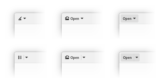
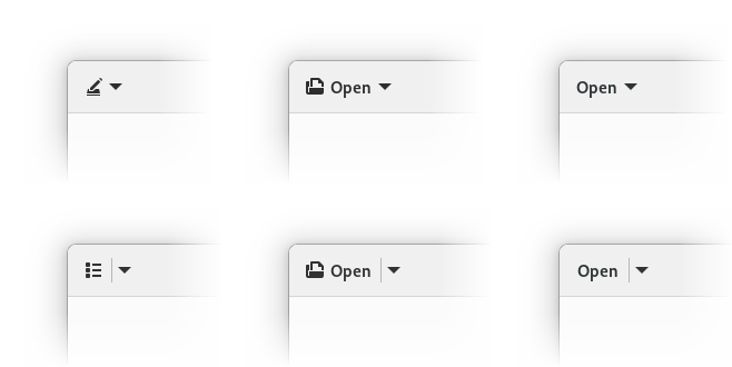
    For example, the .osd style overrides accent color to be light grey. Previously this was done with separate overrides for every single widget that uses accent, and in some cases blue accents sneaked through anyway. It also didn’t work with custom widgets defined in apps, unless they special cased it themselves. Now it just overrides the accent color variables and is both much simpler and actually consistent.

    Screenshot of a destructive button saying "Destructive Button". It's focused, and the focus ring is red.

    Destructive buttons previously had blue focus rings, and now they are red, matching the buttons themselves. Moreover, apps can easily get custom-colored widgets like this themselves, with matching focus rings.

    Since previously we couldn’t override accent color per-widget, the way to recolor buttons (as well as checks, switches etc) was to just set background-color and color properties manually. It worked, but obviously didn’t affect focus rings, and focus rings are complicated, so doing it manually wouldn’t be feasible. They have a very specific color with a specific opacity, a different opacity for the high contrast mode, and the actual selector changes a lot between widgets. In case of buttons it’s button:focus:focus-visible, for entries it’s entry:focus-within and so on. Not very good, so we didn’t encourage apps to change focus rings, and didn’t change them on destructive buttons either.

    But now that we have variables, people can just override the accent color, and focus rings will follow the suit. For example, to make a green button, an app can just apply .suggested-action and override accent on it to green:

    Screenshot of a green pill button saying "Very Green Button" on top of a light background. It's focused and the focus ring is green.Screenshot of a green pill button saying "Very Green Button" on top of a dark background. It's focused and the focus ring is green.

    So, for example, Calculator can now make its big orange result button orange and have matching focus ring on it without changing accent color in the whole app.

    Because of that, the .opaque style class has been deprecated. Instead, apps are encouraged to use .suggested-action like above.

    Meanwhile, GtkEntry with .error, .warning and .success style classes have had red focus rings, as an exception. Later, AdwEntryRow gained the same styles, but that was messy overall. But now these style classes just set accent color in addition to text color, so these styles aren’t special cases anymore – they will work with any widget.

    Deriving accent colors

    Since 1.0, libadwaita has had two separate accent colors: --accent-bg-color and --accent-color. The former is suitable for use as a background on widgets like buttons, checks and switches, but usually has too low contrast to be used as a text color. The latter has a higher contrast, suitable for use as text, but it doesn’t work well as a background.

    That’s a bit confusing, and I’ve seen a lot of apps misusing them. Some apps set a custom accent color and just set them to the same value, so they don’t have enough contrast. Some apps mix up the colors and use the wrong one. And so on.

    It would be really nice if we could generate one from the other one. Previously this was firmly in the realm of pipe dreams, but now that we have relative colors, it’s a lot more feasible.

    For example, the following functions produce consistently good colors for light and dark styles respectively:

    /* light style */
    --accent-color: oklab(from var(--accent-bg-color) min(l, 0.5) a b);
    
    /* dark style */
    --accent-color: oklab(from var(--accent-bg-color) max(l, 0.85) a b);
    

    Here are some examples, for both light and dark style:

    Screenshot of a window with its left half being light and right half being dark. Each half has 7 rows, each row has a button, a label and an entry. The row colors are as follows, top to bottom: neutral, red, orange, yellow, green, blue, purple

    Unlike the HSL color space, Oklab is perceptual and lightness stays uniform regardless of other channels. So, as simple as it sounds, just limiting the lightness does the job. In fact, we could even do this:

    /* light style */
    --accent-color: oklab(from var(--accent-bg-color) 0.5 a b);
    
    /* dark style */
    --accent-color: oklab(from var(--accent-bg-color) 0.85 a b);
    

    The downside is that --accent-bg-color: black; in light style would produce a dark gray --accent-color instead of black, and --accent-bg-color: white; in dark style would produce a light gray accent instead of white. This may be fine, but the goal here is to ensure minimum contrast, not to prevent too much contrast.

    These functions are also in the docs, but there’s one problem.

    So why not do it automatically?

    Say, we define these variables at :root, as follows:

    :root {
      --accent-bg-color: var(--blue-3);
      --accent-color: oklab(from var(--accent-bg-color) min(l, 0.5) a b);
    }
    

    Then, we override accent color for a specific widget:

    my-green-widget {
      --accent-bg-color: var(--green-3);
    }
    

    But --accent-color would still be blue, so the we would need to re-declare it – not very good.

    There is a way to get around that – use a wildcard:

    * {
      --accent-color: oklab(from var(--accent-bg-color) min(l, 0.5) a b);
    }
    

    But that has its own downsides – it may impact performance and memory use, like wildcards in CSS tend to do. That said, I haven’t profiled it and maybe it’s not that bad.

    Either way, for now we’re keeping --accent-color separate, but apps overriding it are welcome to use the above functions themselves, instead of picking the color by hand. Maybe in future we’ll figure something out.

    Future

    There are a lot more things we could do if we didn’t need to care about backwards compatibility. For example, instead of having colors like --shade-color that are always supposed to be partially-transparent black, we could just provide the opacity as a variable. (or maybe even derive it from background color lightness?) We could specify accent color as a hue and/or chroma in the Oklch color space, while keeping the lightness consistent. And so on.

    Can we drop SCSS entirely?

    A lot of people asked this or assumed that these additions were the few missing pieces for dropping it.

    As much as I’d like to, not yet. While this helps with reducing dependency on it a bit, there are still a lot of things that cannot be replicated, like @mixin and @extend. It also allows us to have private variables and control what gets exposed as API, which is pretty important for a library.

    In fact, there are situations where we had to add more SASS-specific things, tho mostly because we’re using the older (and unmaintained) sassc compiler instead of dart-sass. Being old and unmaintained, sassc doesn’t support the modern rgb() syntax, and errors out. There is a way to placate it, by using RGB() instead, but that’s a hack. It also doesn’t like the slash symbol (well, solidus) and thinks it’s division. This can be worked around with string interpolation, but it’s a hack too.

    So, instead of this:

    rgb(0 0 0 / if($contrast == 'high', 80%, 5%))
    

    we have to do this:

    RGB(0 0 0 / #{if($contrast == 'high', 80%, 5%)})
    

    (and then keep in mind that SASS won’t see this as a color, so you can’t use functions like transparentize() on it, not that we really need to)

    Finally, the opacity() function (used within the filter property) kept getting replaced with alpha(), but only when it contained a variable instead of a literal:

    filter: opacity(55%);
    /* SASS output: filter: opacity(55%); */
    
    filter: opacity(var(--disabled-opacity));
    /* SASS output: filter: alpha(var(--disabled-opacity)); */
    

    I worked around this by once again manipulating case. opacity() was affected, but Opacity() wasn’t.

    All of this could be solved by migrating to dart-sass. This is difficult, however – GNOME SDK doesn’t have any Dart components at the moment, and it would need to build that first. A lot of manifests I’ve seen on Flathub just use pre-built SASS compiler, but I doubt this would be acceptable for the SDK. So, for now we’re stuck with sassc. Help is very much welcome, particularly with the SDK side of things.

    Programmatic API?

    Another question I see fairly often: is it possible to read variables programmatically?

    The short answer is: no.

    The longer answer is: variables can be anything. The only way to read them would be as a string. At that point, you’d need to have a CSS parser in your app to actually parse them into a useful value.

    For example, let’s say we have a variable declaring a color, like red. One might think: so what, just use gdk_rgba_parse(). Now, what about rgb(0 0 0 / 50%), the modern syntax? gdk_rgba_parse() doesn’t support that, but one might argue it should. Alright, what about this:

    color-mix(in oklab, currentColor, var(--something) calc(var(--base-percentage) * 0.5))
    

    This is a potentially valid color, and yet there’s no way gdk_rgba_parse() would be able to parse this – how would it know what currentColor is when you don’t supply it a widget? It would need to resolve other variables somehow. And it would also need a full-blown calc() parser. Yeah, colors get complicated fast. It’s fine when we’re already inside a CSS parser, but gdk_rgba_parse() isn’t one.

    Now, could we have a function to get a variable value specifically as a color? Sure, except variables don’t have to be colors. You might also get 3px, 0 or asjdflaskjd. They don’t even have to be valid values, they can also be parts of the values, or even random gibberish. CSS doesn’t even try to compute variables on their own, only insert them into other values when you reference them with var() and then parse and compute that once every reference is resolved. The following is perfectly valid:

    my-widget {
      --space: srgb-linear;
      --r: 100%;
      --gb: 0 0;
      color: color(var(--space) var(--r) var(--gb) / 50%);
    }
    

    So, with that in mind, would API for fetching them be useful? IMO not really. There are very specific cases where it may work (e.g. if you define a variable containing an integer and then treat it as pixels in your code), but they are far too limited, break easily, and arguably are a misuse of CSS anyway.

    It would be a bit more feasible if we had @property, as then you can at least guarantee the variable type. Even then the type system is very flexible and one can define things like <color># | <integer>#. The valid variables with this type would be comma-separated lists of colors, and comma-separated lists of integers, so good luck with that. And we don’t even need to go that far: take a look at <image>. It can be a gradient (linear (possibly repeating), radial or conic), a URL, image() which produces a solid color image from a given color, or many other things. At best I can see getters being limited to, say, colors, numbers and dimensions.


    Many thanks to:

    • Matthias Clasen for reviews and implementing HWB, Oklch and Oklab color spaces, relative colors, color interpolation and math functions.
    • STF for funding this work.
    • Sonny Piers and Tobias Bernard for organizing everything.

Rethinking Adaptivity

TL;DR: The current adaptive widgets have significant problems and have all been replaced and deprecated. You may want to port your apps, the migration guide is here.


Over the past year, I’ve been working on replacing the old adaptive widgets in libadwaita, and as of a few days ago the last pieces have landed.

The Problems

(kgx:356880): Gtk-WARNING **: 16:38:18.039: Allocating size to AdwFlap 0x1e25c50 without calling gtk_widget_measure(). How does the code know the size to allocate?

(epiphany:91138): Gtk-WARNING **: 10:49:35.638: Allocating size to EphyWindow 0x15f8b70 without calling gtk_widget_measure(). How does the code know the size to allocate?

Ever seen an app print a warning like that on resize? If you’re unlucky, also flicker at the same time. This happens when a widget causes a resize during another resize. That’s one of the things that GTK prohibits, and yet almost every adaptive app currently does it, and most of the time it only works by accident.

Take AdwLeaflet, for example. People often use it for managing a sidebar. That’s fine, because leaflet will handle its own resize correctly. However, sidebar also implies other changes, like showing/hiding window controls and a back button. All of these changes cause resizes, and we do them when already inside a leaflet’s resize. Oops.

To an extent libadwaita widgets work around that, e.g. by emitting property notifications when they’re least likely to cause problems, but it’s never perfect. The simple truth is that this system is inherently fragile, depending on a number of things like whether the widget you’re changing is allocated before or after the leaflet (which is an implementation detail).

Flexibility

Another problem with the current approach is that while we provide premade widgets for specific cases, like a sidebar turning into stack navigation, any other kinds of adaptivity are basically unsupported.

For example, maybe your app has a header bar with a lot of widgets, and you want to move some of them into a separate bottom bar on mobile? There’s no premade widget for this, so the only way you can do it is by overriding the size_allocate() virtual function on some widget (typically the window) yourself and doing it there.

This is very finicky and easy to get wrong, and once again you’re setting yourself up for warnings and flicker — the Epiphany warning above is from doing exactly this, for example.

And it can’t even be abstracted as a widget either.

And really… a lot of apps need to do things besides what leaflet and friends provide. Even the libadwaita demo has to (ab)use GtkFlowBox for its style classes demo, while any adaptive app using AdwTabBar has to deal with size_allocate(). And the apps that don’t need tricks like that often have to compromise their design to make sure they don’t use anything unsupported. For example, at one point there was a GNOME Software design using a sidebar at desktop sizes and a view switcher at mobile sizes. That’s not possible with existing widgetry, so it never shipped.

Transition Animations

Widgets like AdwLeaflet provide an animation when switching between modes. This is cool, but also it causes the following bug when starting an app:

Notice the sidebar being briefly visible and then disappearing? This shouldn’t happen. And yet, it does and it’s not fixable.

Even when the transitions work, they are inconsistent. Sure, the leaflet itself animates, but the back button you add? It doesn’t. Even if you use a GtkRevealer to animate the button too, you’ll have to show/hide it at some point to avoid double spacing in the header bar if you have any other buttons next to it. And you can’t use a revealer for window buttons anyway.

Natural width

One thing the current approach (mostly) avoids is apps explicitly defining the size thresholds for layout changes. Instead, all of the existing adaptive widgets use natural widths of child widgets as implicit thresholds. While it avoids magic numbers, it doesn’t work very well in practice:

  • The widths can change on the fly. For example, this often happens in Settings, where you may very well have the sidebar collapse or reappear when you switch between different panels:

    Another example is Fractal, where a similar thing was happening because of long room topics. Because of that, AdwLeaflet actually defaults to using minimum widths as its threshold and not natural widths.

  • Natural widths are hard to control. Apps have no direct control over them, and often have to resort to tricks, like putting labels into GtkScrolledWindow with scrolling disabled to prevent natural width from propagating. (That’s what Fractal did to work around long room topics at first, for example)
  • If your application does more than just show/hide the sidebar — say, toggle the sidebar and also move a view switcher from the top of the window to the bottom, these changes will not happen at the same time. In fact, they may even happen in different order depending on the locale, font, etc., leading to hard to debug issues.
  • Since we’re adding and removing back buttons and window controls, the threshold actually changes between wide and narrow states. If an app does the opposite and removes widgets on narrow sizes, it can even lead to infinite loops:
    • The widgets are too wide, folding the leaflet.
    • Leaflet is now folded, removing buttons.
    • The widgets are narrow enough that they can fit side by side now, unfolding the leaflet.
    • The leaflet is unfolded, adding the buttons back.
    • The widgets are too wide, folding the leaflet.
    • … and so on.
  • Finally, there are cases where we always want narrow layout, even when the widgets fit otherwise. For example, on mobile we always want view switchers to be at the bottom, and yet there are quite a few cases where they would still fit at the top. And so, AdwViewSwitcherTitle has a hack where it monitors the window’s width and forcefully disables its view switcher when it’s below or equal to 360px, on top of artificially limiting its natural size to try and control the threshold.

While fixed thresholds present a different set of problems and are very much a tradeoff, at the end of the day you’re designing your layout to fit into a fixed resolution screen anyway.

All of that is already really bad, but the problems go even further.

API

Leaflet

Let’s look at AdwLeaflet. Most apps use this widget in one of the following two ways:

  1. The leaflet has three children: a sidebar, a separator and content. The separator is marked as non-navigatable. The leaflet has swipe to go back enabled, but not swipe to go forward. Sidebar and content both have header bars, with window buttons hidden in the middle when unfolded, and content has a back button when folded, that goes back to sidebar.
  2. The leaflet has the can-unfold property set to FALSE, and is used basically as a GtkStack with swipe gestures.

However, what is the actual purpose of this widget? Well, it acts as a GtkBox when unfolded and as a GtkStack when folded. As in, it has an unspecified number of children, shows all of them when unfolded and one of them when folded. That’s it.

For the first case we always want a separator. However, AdwLeaflet cannot automatically add it because it doesn’t know if it’s going to be used for a sidebar or not. There’s also no way to know what even is a sidebar: it’s just a leaflet child, so there’s no way to automatically style it. It can’t add a back button for you for the same reason, and so on.

Now let’s look at the second case. It works fine if you have 2 pages and just want to switch between them. You will still have to manage the back button on the second widget manually, but otherwise it’s okay — basically the same as GtkStack.

Now what if we want to have page 1 that leads to page 2 and page 3, both of which lead back to the page 1? Well, now we run into a problem.

If we simply add all three pages into the leaflet, going back from page 3 will lead to page 2 and not page 1.

There are two possible workarounds:

  1. Toggle the page visibility dynamically.
  2. Use a GtkStack with pages 2 and 3, and add that to the leaflet along with page 1.

Neither approach is particularly great.

So, AdwLeaflet is not very well suited for either case. Or more specifically, it tries to be low level and generic like GtkBox and such, while it’s primarily used for much more specific cases.

Flap

AdwFlap is not nearly as bad, as at least it has a fixed number of clearly defined children. But even then it can be used for multiple things that aren’t sidebars, like bottom sheets (even though I’m not aware of any apps actually using it as such now that Console switched to AdwTabOverview) or even for handling the window titlebar in fullscreen.

This means that it’s still too generic to be nice to use in any of these cases:

  • Just as with leaflet, you have to add a separator yourself. Many apps do it wrong and have it on the sidebar instead of a separate child.
  • The sidebar has no background because what if your use case needs it to be transparent?

And so on.

Or to summarize it: just like AdwLeaflet, flap is too generic. It tries to be a box/overlay widget and not, say, a sidebar widget.

Squeezer

AdwSqueezer is mostly used for handling view switchers in header bars. It contains multiple children and shows the largest one that can fit. So other than doing unsupported things for its most common use case, it works fine.

It still has a problem though. Since you put a view switcher and a title inside a squeezer, the header bar will center both at once. If the view switcher is too wide to fit, we show the window title, and since the whole widget is not centered at this point, the title will be off-center:

AdwHeaderBar has a centering-policy property to work around this, but it also introduces another problem:

What we actually want is this though:

But that cannot be accomplished when the view switcher and the title are in a single widget (squeezer’s natural width is that of its largest child — in this case, the view switcher — and if it doesn’t fit, the squeezer is still expanded to fit the remaining space, then the title is centered within that and not within the header bar), but we rely on that to make it adaptive. Not good.

OK, What Now?

So now that we’ve established that the existing widgetry has significant problems, what can we do differently?

Well, lets look at how other platforms handle it.

  • The Web has CSS and media queries. One can define a media query that matches a range of screen sizes (as well as many other things), and CSS rules inside its block would only apply within that range. Since CSS controls layout, people can rearrange their layout using media queries.

    Most web frameworks just use media queries or provide a similar API. This is often referred to as breakpoints.

  • Windows/UWP has AdaptiveTrigger and visual states. One can create a visual state that activates depending on the window size and toggle properties on the widgets in that window using setters.

  • Android has an elaborate resource system that allows for defining different layouts (UI files), dimensions or really any values only for specific screen size buckets or size ranges (as well as many other conditions), and when those conditions change (e.g. when the screen changes orientation), the toolkit just rebuilds the whole UI. Additionally, apps can factor out the common parts of their UI into different fragments, and then the activity (window) layouts can just arrange them in different ways, avoiding duplication.

    (This may be outdated though, I wasn’t able to find any information about how Android does adaptive layouts nowadays and my own knowledge is from Android 4.x, so about a decade old at this point)

  • UIKit uses a constraint layout, and constraints can be marked to only apply depending on screen orientation or size. While it avoids specific size values, instead preferring to target specific devices, iOS has the benefit of only running on a few select devices and can afford that. And before that system was introduced, apps could (and still can) just have different storyboards for different devices or screen sizes.

    Additionally, UIKit provides controllers like UISplitViewController that rearrange their layout automatically.

So… it’s all over the place, but let’s try to come up with something that combines the best parts of the above and hopefully avoid their pitfalls.

Breakpoints

First, we’ll need a way to do arbitrary changes to the UI based on the window size, there’s no way around that.

So let’s implement a window that can do arbitrary layout changes for its contents.

That’s hard, but not impossible. It involves temporarily hiding the contents, applying changes and showing it again on the next frame. To avoid flicker, a snapshot of the child from the last frame can be shown while it’s hidden. It also involves a special case for when mapping the child for the first time.

A hard problem here is sizing. Widgets like leaflet know what their layout will be when it’s folded and unfolded (as long as apps don’t add random back buttons or do other changes, anyway) and can expose correct minimum and natural sizes regardless of their current state. This is important because otherwise you wouldn’t be able to resize them to smaller sizes in the first place.

But we’re talking about arbitrary changes, so there’s no way to predict the size for our window unless it’s already at the smallest possible state. So, the only thing we can do is to disable the minimum size entirely and require apps to specify it, and clip the child if it doesn’t actually fit (or alternatively scale it down).

Another problem is transitions. Since we don’t know what exactly will change between different states, there’s no way to animate it beyond a global crossfade. But considering transitions were already inconsistent, I don’t think it’s a big loss.

And since libadwaita already has AdwWindow and AdwApplicationWindow, we can just reuse them and have all of this logic in there.

Now that we have this functionality we need to figure out good API for control it.

CSS in GTK doesn’t support media queries. And even if it did, they wouldn’t be useful, since CSS in GTK doesn’t control layout beyond widget margins/paddings/borders, minimum widths/heights and sometimes spacing. The overall concept is still attractive though, but we can’t use CSS for this.

However, we can still use UI files, like the UWP system does. What if our widget was defining “visual states” with a size-based condition and property setters? Following the web, let’s call them breakpoints.

GtkBuilder supports custom tags, so we can actually replicate this system in its entirety.

It looks like this:

<object class="AdwWindow">
  <property name="width-request">360</property>
  <property name="height-request">200</property>
  <property name="child">
    <!-- ... -->
  </property>
  <child>
    <object class="AdwBreakpoint">
      <condition>max-width: 500px</condition>
      <setter object="my_object" property="some-property">value</setter>
      <setter object="my_object" property="some-property">value</setter>
      <!-- ... -->
      <setter object="my_object" property="some-property">value</setter>
    </object>
  </child>
</object>

Pretty close, isn’t it? Of course, only being able to change properties is rather limiting, so each breakpoint also has apply and unapply signals.

Now we need to figure out how to deal with child overflow. In an ideal world, apps will just pick the widths where it doesn’t happen, but in practice that won’t work. Even if the widgets fit in English locale, it may not necessarily fit in German. Or with Large Text enabled.

This process isn’t really any different from just adapting an app for small screen sizes. You need it to fit into 360 pixels horizontally, at any cost. So, if you have a long label and you can’t make it shorter or rearrange your UI, you wrap it, ellipsize it or use a smaller font or letter spacing.

One addition on GTK side here is the GtkButton:can-shrink property (as well as GtkMenuButton:can-shrink). Buttons are the main source of labels outside of apps’ control, and now there’s a an easy way to deal with them.

And to deal with different text scales, we can introduce support for units other than pixels to breakpoints.

Currently three units are supported: pixels, points and scale-independent pixels. The last unit is lifted directly from Android and is basically points, but normalized to match pixels at default text scale. See the docs for the exact values.

Finally, in some cases it can be nice to be able to use breakpoints on a more localized area of the UI, for example, a specific page. And so, all of this machinery is also available as a standalone widget: AdwBreakpointBin.

Replacing Squeezer and AdwViewSwitcherTitle

Next, we need to figure out how to adapt existing patterns for this new system.

Some of them, like bottom toolbars or hiding tabs on mobile are doable as is and don’t need any additional support — you can simply toggle their visibility from your breakpoint.

And that includes view switchers: simply add an AdwViewSwitcher into your header bar, a hidden AdwViewSwitcherBar at the bottom of the window, and a breakpoint that removes the view switcher and shows the view switcher bar on narrow sizes.

One problem is that unfortunately AdwViewSwitcher defaults to the narrow policy, while for header bar you really want wide instead, so apps have to change it manually.

The new system also avoids the misaligned title problem, since in narrow state we remove the view switcher entirely and let header bar use its default title, so the view switcher’s width doesnt’t get in the way.

This was the only place libadwaita was using AdwSqueezer for, so we don’t need that widget anymore either.

Replacing Leaflet

AdwLeaflet, on the other hand, cannot be replicated with breakpoints alone and needs a replacement widget. For example, because it provides things like gestures for stack navigation, unlike GtkStack and similar widgets.

Rethinking leaflets has led to a surprising number of other improvements along the way, so let’s run through them.

Toolbar View

Long ago, before libadwaita 1.0, there was this mockup:

Unfortunately, at the time it wasn’t really possible to implement it, not least because of leaflet limitations. However, if we’re redoing it anyway, might as well implement that style, especially when newer apps like Amberol and Emblem use a similar style anyway.

But the flat headers present a problem. What about scrolling content? This has been a long-standing problem with flat header bars, and in fact the .flat style class for header bars has been deprecated along with the old widgets.

Thankfully, GtkScrolledWindow has a mechanism for displaying undershoot indicators, and libadwaita has new style classes for controlling them.

However, manually managing them can be tricky. Sure, it’s easy when you just have a header bar and add the .undershoot-top style class to scrolled window, but what about bottom bar in an app like Contacts? Manually managing .undershoot-bottom in sync with the reveal animation is tricky, and in fact not even possible if you’re using GtkActionBar without wrapping it into another GtkRevealer.

But what if we had a widget for managing it instead? And so that’s what AdwToolbarView does. It replaces GtkBox for cases like this, providing a slot for content, and allowing for adding one or multiple top and bottom bars. Then, it manages the undershoot styles on scrolled windows inside it.

However, having a widget just for that would be silly, so it also does a number of other things:

  • It allows for visually merging multiple toolbars together and remove their border and vertical spacing, making it possible to implement yet another mockup that wasn’t possible before:

  • For the raised style (like on the screenshot above) it makes it possible to have a shadow instead of a border. This is yet another thing that wasn’t possible before, because while GtkWindow’s titlebar is special cased to be drawn before content, that’s not the case in GtkBox, and the shadow would end up behind content. In AdwToolbarView we can make sure the content is drawn last and avoid this problem.
  • It automatically makes all toolbars draggable, including GtkSearchBar etc.
  • It allows extending the content behind top or bottom bars, and to reveal or hide toolbars with an animation. This means that it can be used instead of AdwFlap to manage fullscreen titlebar, and we don’t need to worry about that use case when replacing flap anymore.

Header bars are now also white in light variant instead of darker grey — mostly so that there’s more contrast against their shadow and it looks better with utilty panes using the new styling. The grey color header bars were previously using is now reserved for sidebars and utility panes instead.

Navigation View

The first of the leaflet replacements is AdwNavigationView.

One of the things I wanted to avoid was having a single widget for both sidebars and stack navigation. This is a large part of what made AdwLeaflet so cumbersome, and it was this way to avoid code duplication, as well as due to historical reasons: leaflet first came to exist back when everyone just used GtkStack for this, and provided a version that can also do sidebars, then gradually got improved to be more attractive than GtkStack even for stack navigation.

In fact, libhandy 1.x provides a variant of leaflet that never expands, called HdyDeck. While in theory it was a good idea to separate these two widgets, they had almost identical API, so it still didn’t make any sense. As such, for libadwaita I merged them back and essentially replaced deck with the can-unfold property.

So, as shown earlier, leaflet API is not well suited for this task. So, once again, let’s look at other platforms for inspiration.

Some of them don’t have any nice ways to handle this pattern — for example, in UWP it’s surprisingly involved. Others do, however, such as UIKit and its UINavigationController. In fact, let’s go ahead and use it as inspiration because it’s very well thought out.

A noticeable difference between UINavigationController and AdwLeaflet is that the former has a stack-like API. As in, stack the data structure, not GtkStack (wow, this is confusing, not helped by the fact UIKit calls a stack what GTK calls a box 😵‍💫). So, you have a navigation stack, push pages into it and pop pages off it, and it’s dynamic. For comparison, leaflet has a statically ordered list of children, and you move back and forward in that list.

However, we can’t make AdwNavigationView 100% dynamic: we still need some way to use it from UI files. It took a lot of iteration, but at the end I came up with the following scheme:

  1. Pages can be pushed directly into the navigation stack using push(). Once they are popped, they will be automatically removed.
  2. Pages can be statically added using add() or from UI files. Then, they can be pushed and popped and will stay in the widget and can be reused later. The first added page becomes the root of the navigation stack.
  3. If a page was pushed without having been added and then later add() is called for it, it won’t be autoremoved.
  4. If remove() is called for a page currently in the navigation stack, it won’t be automatically removed and is simply marked for removal, same as if add() had never been called.
  5. The whole navigation stack can be replaced using replace(), including removing any pages currently in the navigation stack if they are marked for autoremoval.

In other words, add() and remove() act a bit like pinning and unpinning the pages. The navigation stack itself is fully dynamic.

Pages also have tags and all of the functions for managing navigation stack have versions that work with tags, and pushing pages this way requires adding them first.

Tags also allow for another thing: GActions for managing the navigation stack. AdwNavigationView exposes two actions: navigation.push and navigation.pop. The first one takes a page tag as parameter, and this allows defining fairly complex structures, such as the one found in AdwAboutWindow entirely from UI files, without any code.

Unlike AdwLeafletPage, navigation view children — AdwNavigationPage — are widgets instead of auxiliary objects. Not only that, they are also derivable, so it’s possible to use templates with them. That’s why the tags are called tags and not names, otherwise there’s a name clash with GtkWidget:name.

Historically, GNOME apps have managed their back buttons themselves, no matter whether they are using GtkStack, HdyDeck or AdwLeaflet. But isn’t that silly? AdwLeaflet manages shortcuts and gestures for going back to the previous page, but not back buttons? Meanwhile UINavigationController automatically provides back buttons, so why can’t we?

Well, no reason really. While our situation is a bit different since header bars are just a widget instead of a part of the navigation controller, header bars already automatically show window controls for the window they are in. And so… AdwHeaderBar can now also automatically show a back button if it’s inside an AdwNavigationView. This is opt-out, same as for window buttons.

AdwHeaderBar has also learned to pull titles out of navigation pages same as how it does with window titles, since changing titles on header bars is a bit painful in GTK4, even with AdwWindowTitle. And since we have titles, they also double as accessible labels, as well as tooltips for back buttons. In fact, if we wanted to add labels to back buttons, like in iOS or elementary OS, we have means to do so now as well.

AdwNavigationView also supports a way to go forward, unlike UINavigationController — using the get-next-page signal. Meanwhile, AdwNavigationPage has signals for tracking its visibility, which can be used to create and destroy its contents on demand. With this apps like Nautilus can hopefully use this widget for content navigation, while with leaflet it just wasn’t feasible.

Finally, while AdwNavigationView hopefully reduces the number of situations where people have to nest them, it still works with nesting, including actions and back button integration. This will come in handy for the next widget.

Navigation Split View

And finally, now that the navigation case is well covered and flat header bars are doable in a robust way, we can reimplement sidebars with a widget called AdwNavigationSplitView.

Compared to AdwNavigationView, this widget is very simple. It has two children: sidebar and content, both of which are required to be AdwNavigationPage. By default, it shows them side by side. When the collapsed property is set to TRUE, it just reparents both into a navigation view. And that’s pretty much it… Add a breakpoint to your window, toggle the collapsed property from it and you have an adaptive sidebar.

Well OK, it does a few more things, but this is still a stark contrast with how complex AdwLeaflet was.

For example, AdwHeaderBar gains yet another feature. When used inside AdwNavigationSplitView, it automatically hides redundant window buttons, hopefully getting rid of bugs like this for good:

Actually, two features. The other one is a property for hiding the title — it’s common to have header bars without titles for split layouts, and having to put an invisible widget into the header bar just to get rid of its title is not ideal.

AdwNavigationSplitView also provides its own navigation.push and navigation.pop actions, so that they still work when not collapsed. They work exactly same as in AdwNavigationView.

Instead of inheriting the push/pop API of AdwNavigationView, split view provides a single show-content boolean property.

Since the sidebar child is now clearly defined, we can style it and implement that mockup from long ago, and if people use toolbar views, they get automatic undershoot shadows.

Moreover, there’s a special styling for triple pane layouts:

This can be achieved just by nesting two split views together, see the docs for more details.

Finally, it implements dynamic sizing for sidebars. This is probably the most complex part of this widget: instead of using the sidebar’s natural width it attempts to give the sidebar a specified fraction of the total width, which is additionally limited by a minimum and a maximum value (as well as the minimum width of the sidebar child). On top of that, the minimum and maximum widths can use the same units as breakpoints, and in fact AdwNavigationSplitView defaults to using the sp unit, so that sidebars scale with Large Text.

Replacing Flap

Unlike leaflet, AdwFlap doesn’t need a ground-up overhaul. We’ve already covered the fullscreen toolbar use case with AdwToolbarView, and flap is basically never used for bottom sheets — and even if it were, we’re going to have a specialized bottom sheet widget later anyway. So, the only case we need to care about is overlay sidebars and utility panes (which are basically the same thing as sidebars, but with a single header bar, so the widget doesn’t need to care about this distinction).

So, AdwOverlaySplitView is actually heavily based on AdwFlap, trimming it down and simplifying it API to match AdwNavigationSplitView. It also enjoys the same styling, dynamic sizing and AdwHeaderBar window button integration:

Yes, it looks exactly same as AdwNavigationSplitView when it’s not collapsed. What did you expect? Unlike that widget though, it does allow moving the sidebar to the right, as well as showing and hiding it, same as flap. (AdwNavigationSplitView doesn’t allow either because it would break the navigation model)

Unlike AdwNavigationSplitView, it doesn’t require children to be AdwNavigationPage, though it doesn’t prevent it either — it will work fine and you may still want to do that because of header bar title integration.

It also removes touchpad swipes. While it still has swipes on touchscreen, combining edge swipes on touchscreen with swipes anywhere on touchpad has never worked well and it has caused no end of problems for apps like Loupe. With touchpad swipes being partially broken in GTK4, it’s just not worth it. AdwNavigationView still supports touchpad swipes, but this widget does not.

Migrating

The old widgets have been deprecated and apps using libadwaita from main are encouraged to migrate to the new widgetry. Libadwaita also provides a migration guide for doing so.

The adaptive layouts page also uses the new widgets now.

Future

Dynamic Layouts

Even with all of that, there’s always room for improvement.

For example, while breakpoints allow rearranging the UI by setting properties, it’s still fairly limited and one needs widgets like split views for more complex layout changes. And while anything is possible with enough work, doing complex layout changes is rather painful (though less so than with the old widgets) and it has to be done programmatically.

However, we can take a bit of inspiration from Android, with its resource system and rebuilding the UI to change screen orientation etc.

As such, another thing I’ve been prototyping is a yet-to-be-named widget that does a similar thing to what AdwNavigationSplitView is doing, but generically:

  • You provide it multiple different UI files, each of them contains tagged slots.
  • You also provide it children with matching tags.
  • It creates UI from one of the UI files and inserts the children into those slots.
  • Which layout it uses is controlled by a property.

When you change its value, it unparents the tagged children, destroys the rest of the layout, creates the other layout and reparents the children there.

To better explain it, let’s take a look at this mockup of Loupe:

Here properties are presented in a sidebar at desktop sizes, and in a bottom sheet at mobile sizes. We obviously don’t have a widget that transforms between a sidebar and a bottom sheet (nor do we have a bottom sheet widget, but we will in future, so let’s assume we do), so there are two ways of implementing it:

  • Have both a sidebar and a bottom sheet, each containing a copy of the properties view, and only have one of them visible at a time. In case of Loupe, it will work fine, since the properties view is reasonably small, but it doesn’t scale in the general case.
  • Reparent them manually. This works, but is pretty fiddly and can’t be done declaratively.

With this new widget though? Define two layouts: one with a split view with two slots as its content and sidebar children, the other one a bottom sheet view with the same two slots. Add two children: an image view and a properties view, matching those slots. Then toggle the layout from your breakpoint. That’s it.

One downside of how Android does it is that apps have to thoroughly save widget state before rebuilding the UI and restore it afterwards, or it will be lost. But, since we’re reusing both widgets, there’s no need to save state here, it will just work.

We can still go a step further and do even that declaratively for state not covered by the children within the slots: have a list of object/property/tag triplets in each layout, and map each of them to the matching object/property on the other layout.

There are a few obstacles to solve here, but I have a working prototype, and maybe can even finish it this cycle.

Dialogs

Speaking of bottom sheets, one thing that’s still missing from libadwaita is support for adaptive dialogs. That’s coming too, but probably not this cycle. It needs cooperation with the compositor — especially for portals, where the dialog and its parent window are in different processes and can’t communicate. But we have a design and a tentative plan for how to get there.


I’d like to say thanks to:

  • Naiara for pointing me towards UWP AdaptiveTrigger and answering UWP questions.
  • Chris for porting a lot of apps to try out and test the new API.
  • Tobias Bernard and Sam Hewitt for UI design and answering my countless questions about tiny and unimportant details.

As always, thanks to my employer, Purism, for letting me work on all of this.

Introducing Elastic

Elastic is a new spring animation editor app.

Screenshot of Elastic

Ever since 1.0, libadwaita has had spring animations. These animations aren’t controlled with a duration and an easing function, but instead with physical properties: damping ratio (or optionally damping), mass, stiffness and initial velocity, as well as epsilon. While this allows for a lot of control over the animation, it can be pretty hard to understand if you’re not familiar with physics involved, and to be truly useful it needs an editor.

So, Elastic is that editor. It provides a way to tweak each parameter, explains what they do, allows to preview the animation in various ways, and generates the code to create that animation.

Screenshot of the animation graph in Elastic

Backstory

This app has a pretty convoluted history.

At one point of time, before 1.0, me and Tobias wanted to rework libadwaita demo and Tobias made new mockups for it. At about the same time, I was experimenting to see how feasible spring animations would be and needed some playground. Since it was understood that this will eventually be in libadwaita, Tobias made this design a part of the new demo:

Spring animation demo mockups

So I implemented it about as closely as I could at the time, but since then a few things happened:

  • We decided that the new demo was too design-focused to work well as, well, a demo (one of the purposes of which is using it as a test case for libadwaita itself). So, instead, we decided to make the new design a separate app called Patterns. That app is stalled for other reasons as it needs features that libadwaita doesn’t provide at the moment. Hopefully, next cycle we should have everything needed to finish it.
  • We decided that the spring animation page was too involved for a demo and was better off separately. So I split that code out and ported it to Vala instead of C.
  • As part of his GSoC project, Manuel Genovés implemented proper spring animations instead of a hacky prototype, and I ported the editor to that.

And then… everyone kinda forgot about it – Patterns was still blocked on other things, Manuel implemented a simpler animation demo for libadwaita and this one was left out.

Fast forward two years, Tobias was reviewing an app in Circle and needed a way to play with spring animations. We realized we never did anything with the editor, so I turned it into a proper app, fixed the remaining bugs and made it generate code instead of just previewing animations. We named it Spring Editor (imaginative, I know) and my impression was that design tools were covered by the new app inclusion process, so I submitted it to incubator.

It turned out more complicated than expected, so I decided to ignore it and try and get it into GNOME Circle instead. So now the Spring Editor name is too generic, so the app got renamed again, this time to Elastic (thanks Christopher Davis for that name) and it’s on Flathub now.


Anyway, the app is finally out, it’s on Flathub, so have fun. :)

Download on Flathub

UPDATE: It’s in Circle now.

Cleaning up header bars

Examples of app header bars after the redesign

You might have noticed that a lot of icons in GNOME 41 have been redrawn to be larger. They are still 16×16, but take up more of the space within the canvas. Compare:

Examples of symbolic icons in GNOME 40 and 41

This was a preparation for a larger change that has just landed in the main branch in libadwaita: buttons in header bars and a few other widgets have no background now, matching this mockup.

For example, this is how the recent GTK4 branch of GNOME Software looks like now:

GNOME Software using GTK4 and libadwaita

Making the style feel lighter and reducing visual noise is a major goal for the style refresh we’re doing for libadwaita. While we’ve done lots of smaller changes and cleanups across the stylesheet to bring us closer to that goal, this is probably the highest-impact part of it due to how prominent header bars are in GNOME apps.

This is not a new idea either — pretty much everyone else is doing it, e.g. macOS, Windows, iOS, Android, elementary OS, KDE.

In fact, we’ve been doing this for a long time in view switchers. So this just extends it to the whole header bar.

However, if applied carelessly, it can also make certain layouts ambiguous. For example, a text-only button with no background would look exactly same as a window title. To prevent that, we only remove background from buttons that we can be confident won’t look confusing without it — for example, buttons containing a single icon.

While we avoid ambiguous situations, it also means that apps will need changes to have consistent buttons. In my opinion this is a better tradeoff: since the API is not stable yet, we can break behavior, and if an app hasn’t been updated, it will just get inconsistent look and not accessibility issues.

Details

The exact rules of what has background and what doesn’t are as follows:

The following buttons get no background:

  • Buttons that contain icons (specifically the .image-button style class).
  • Buttons that contain an icon and a label, or rather, the .image-text-button style class.
  • Buttons with the .flat style class.
  • UPDATE: Any GtkMenuButtons with a visible arrow (the .arrow-button style class).
  • UPDATE: Any split buttons (more on that later).

Flat button examples: icon buttons; buttons with icons and text

The following buttons keep their default appearance:

  • Text-only buttons.
  • Buttons with custom content.
  • Buttons with .suggested-action or .destructive-action style classes.
  • Buttons inside a widget with the .linked style class.
  • A new addition: buttons with the .raised style class, as inspired by the elementary OS stylesheet.

Raised button examples: text buttons, linked buttons, custom buttons, suggested and destructive buttons

The appearance of GtkMenuButton and AdwSplitButton (more on that later) is decided as if they were regular buttons.

Icon-only, icon+text and text-only arrow and split buttons

UPDATE: menu buttons with visible arrows and split buttons don’t have a background anymore regardless of their content.

Icon-only, icon+text and text-only arrow and split buttons, updated. Text buttons are flat too now

This may look a lot like the old GtkToolbar, and in a way it is. While GTK4 doesn’t have GtkToolbar, it has the .toolbar style class to replace it, and this style is now shared with header bars and also GtkActionBar.

Special cases

While the simple icon-only buttons are easy, a lot of applications contain more complex layouts. In that case we fall back to the default appearance and apps will need changes to opt into the new style for them. Let’s look at some of those patterns and how to handle them:

Menu buttons with icons and dropdown arrows

A menu button with an icon, GTK3

This case works as is if you use the standard widgets — namely, GtkMenuButton with an icon set via icon-name and always-show-arrow set to TRUE.

A menu button with an icon

The only reason this case is special is because always-show-arrow is relatively new, having only been added in GTK 4.4, so a lot of apps will have custom menu buttons, or, if porting from GTK3, GtkMenuButton containing a GtkBox with an icon and an arrow. Since we don’t remove backgrounds from buttons with custom content, both of them will have backgrounds.

Text-only buttons

A button with text, GTK3

This is the most common case outside icon-only buttons. For these buttons the solution, rather counter-intuitively, is to add an icon. Since the icon has a label next to it, it doesn’t have to be very specific, so if an action is hard to describe with an icon, an only tangentially related icon is acceptable. If you still can’t find anything fitting — open an issue against the GNOME icon development kit.

With GTK widgetry, the only way to create such buttons is to pack a GtkBox inside, and create the icon and the label manually. Then you’ll also have to add the .image-button and .text-button style classes manually, and will need to set the mnemonic-widget property on the label so that mnemonics work.

Since this is tedious and parts like connecting the mnemonic are easy to miss, libadwaita now provides AdwButtonContent widget to do exactly that. It’s intended to be used as a child widget of GtkButton, GtkMenuButton or AdwSplitButton (more on that below), as follows:

<object class="GtkButton">
  <property name="child">
    <object class="AdwButtonContent">
      <property name="icon-name">document-open-symbolic</property>
      <property name="label" translatable="yes">_Open</property>
      <property name="use-underline">True</property>
    </object>
  </property>
</object>

A button with an icon and text

If it’s a GtkMenuButton, it would also make sense to show a dropdown arrow, as follows:

<object class="GtkMenuButton">
  <property name="menu-model">some_menu</property>
  <property name="always-show-arrow">True</property>
  <property name="child">
    <object class="AdwButtonContent">
      <property name="icon-name">document-open-symbolic</property>
      <property name="label" translatable="yes">_Open</property>
      <property name="use-underline">True</property>
    </object>
  </property>
</object>

A menu button with an icon and text

UPDATE:Menu buttons with visible arrows don’t have background by default anymore, the step above is not necessary.

Note: the child property in GtkMenuButton is fairly new, and is not in a stable release as of the time of writing. It should land in GTK 4.6.

Notice we didn’t have to add any style class to the buttons or to connect mnemonics like we would have with GtkLabel. AdwButtonContent handles both automatically.

Split buttons

Split buttons in GTK3: with text and icon

This is a fairly rare case, but also a difficult one. Historically, these were implemented as 2 buttons in a .linked box. Without a background, it’s easy to make it look too similar to a regular menu button with a dropdown arrow, resulting in an ambiguous layout.

While existing split buttons will keep their background thanks to the .linked style class, we now have a way to make consistent split buttons – AdwSplitButton.

Examples of split buttons

Whether they get a background or not depends on the content of their button part, while the dropdown part follows the suit – they will have background if it has only a label, will have no background if it has an icon, and will keep their default appearance outside header bars or toolbars. If it has no background, a separator is shown between them and they gain a shared background when hovered, pressed, or the dropdown is open:


They can be adapted the same way as regular buttons — via AdwButtonContent:

<object class="AdwSplitButton">
  <property name="menu-model">some_menu</property>
  <property name="child">
    <object class="AdwButtonContent">
      <property name="icon-name">document-open-symbolic</property>
      <property name="label" translatable="yes">_Open</property>
      <property name="use-underline">True</property>
    </object>
  </property>
</object>

A split button with an icon and text

UPDATE: split buttons with text or custom content don’t get background by default anymore, so the step above is not necessary.

Meanwhile, buttons like the list/grid selector in Files are as simple as:

<object class="AdwSplitButton">
  <property name="menu-model">some_menu</property>
  <property name="icon-name">view-list-symbolic</property>
</object>

A split button with an icon

Otherwise, AdwSplitButton API is mostly a union of GtkButton and GtkMenuButton – the button part can have a label, an icon or a custom child, an action name and target, and a clicked signal if you prefer to use that. Meanwhile, the dropdown part has a menu model or a popover, and a direction that affects where the popover will be shown, as well as where the dropdown arrow will point.

Finally, in a lot of cases layouts that were using split buttons can be redesigned not to use them – for example, to use a simple menu button for opening files like in Text Editor instead of a split button in Apostrophe).

Linked buttons

Linked buttons, GTK3

With visible frames, linking buttons is a nice way to visually group them. For example, we commonly do that for back/forward buttons, undo/redo buttons, mode switching buttons. We also use multiple groups of linked buttons to separate them from each other.

For the most part linked buttons can, well, stop being linked. For example, back/forward buttons like this:

Linked buttons

can become this:

Unlinked buttons

However, when multiple linked groups are present, just unlinking will remove the separation altogether:

Unlinked buttons without spacing, not grouped

In that case, additional spacing can be used. It can be achieved with a GtkSeparator with a new style class .spacer:

<object class="GtkSeparator">
  <style>
    <class name="spacer"/>
  </style>
</object>

Unlinked buttons with spacing, grouped

Action dialog buttons

A dialog, GTK3

This special case is less special than other special cases (or more special, if you prefer), in that apps don’t need to handle it, but I’ll mention it for the sake of completeness.

The two primary buttons in an action dialog or a similar context (for example, when changing display resolution in Settings, or the Cancel button in selection mode) should keep their current style — that is, they don’t have icons and keep their background. Meanwhile any extra buttons follow the new style.

In most situations this will already be the case so no changes are needed.

A dialog

Other

There will undoubtedly be cases not covered here. The .flat and .raised style classes can always be used to override the default appearance if need be.

Finally, not everything has to have no background. For example, the remote selector in Software is probably best kept as is until it’s redesigned to also make it adaptive.

And in rare cases, the existing layout just doesn’t work and may need a redesign.

Bundled icons

In addition to all of that, if you bundle symbolic icons, there’s a good chance there are updated larger versions in the icon library. It would be a good idea to update them to match the new system icons.

Examples

Let’s update a few apps. App Icon Preview and Obfuscate should show off most of the edge cases.

App Icon Preview

The version on Flathub is still using GTK3 as of the time of writing, but it’s GTK4 in main. So let’s start from there.

App Icon Preview, before libadwaita update

App Icon Preview, New App Icon dialog

App Icon Preview has 2 windows, each with its own header bar — the main window and the "New App Icon" dialog.

After the libadwaita update, the dialog hasn’t changed, meanwhile the main window looks like this:

App Icon Preview, no adjustments

It has a custom split button, as well as a text-only Export button when a file is open.

First, let’s replace the split button with an AdwSplitButton:

<object class="GtkBox">
  <child>
    <object class="GtkButton">
      <property name="label" translatable="yes">_Open</property>
      <property name="use_underline">True</property>
      <property name="tooltip_text" translatable="yes">Open an icon</property>
      <property name="action_name">win.open</property>
    </object>
  </child>
  <child>
    <object class="GtkMenuButton" id="recents_btn">
      <property name="tooltip_text" translatable="yes">Recent</property>
      <property name="icon_name">pan-down-symbolic</property>
    </object>
  </child>
  <style>
    <class name="linked"/>
  </style>
</object>

This will become:

<object class="AdwSplitButton" id="open_btn">
  <property name="label" translatable="yes">_Open</property>
  <property name="use_underline">True</property>
  <property name="tooltip_text" translatable="yes">Open an icon</property>
  <property name="action_name">win.open</property>
</object>

Since we’ve changed the class and the GtkBuilder id, we also need to update the code using it. Hence this:

#[template_child]
pub recents_btn: TemplateChild<gtk::MenuButton>,

becomes this:

#[template_child]
pub open_btn: TemplateChild<adw::SplitButton>,

and the other recents_btn occurences are replaced accordingly.

App Icon Preview, using AdwSplitButton

UPDATE: after the menu button and split button change, the Open and Export buttons don’t get background anymore, so only the previous step is necessary.

Now we need to actually remove the background. For that we’ll add an icon, and it’s going to be just document-open-symbolic.

So we’ll remove the label and use-underline and instead add an AdwButtonContent child with the same lines together with icon-name inside it:

<object class="AdwSplitButton" id="open_btn">
  <property name="tooltip_text" translatable="yes">Open an icon</property>
  <property name="action_name">win.open</property>
  <child>
    <object class="AdwButtonContent">
      <property name="icon_name">document-open-symbolic</property>
      <property name="label" translatable="yes">_Open</property>
      <property name="use_underline">True</property>
    </object>
  </child>
</object>

App Icon Preview with an icon on the open button

Now, let’s look at the Export button. It needs an icon as well, but adwaita-icon-theme doesn’t have anything fitting for it. So instead, let’s check out Icon Library (which doesn’t have a lot of edge cases itself).

While it doesn’t have icons for export either, it has a share icon instead:

Icon Library showing the share icon

So that’s what we’ll use. We’ll need to bundle it in the app, and let’s rename it to export-symbolic while we’re here. Now we can do the same thing as for the Open button:

<object class="GtkMenuButton" id="export_btn">
  <property name="always_show_arrow">True</property>
  <child>
    <object class="AdwButtonContent">
      <property name="icon_name">export-symbolic</property>
      <property name="label" translatable="yes">_Export</property>
      <property name="use_underline">True</property>
    </object>
  </child>
</object>

App Icon Preview with an icon on the export button

So far so good. See the merge request for the complete changes.

Obfuscate

This app has only one header bar, but it can change its state depending on if there’s a file open:

Obfuscate, with no open file, before libadwaita update

Obfuscate, with an open file, before libadwaita update

After building with newer libadwaita, we see there’s quite a lot to update.

First, we need to add an icon to the Open button. It’s done exactly the same way as in App Icon Preview, so I won’t repeat it.

Obfuscate, with no open file, adapted

Instead, let’s look at the other buttons:

Obfuscate, with an open file, after libadwaita update

Here we have two groups of linked buttons — so .linked is used both to group related actions together, and to separate the 2 groups.

So, first we need to unlink those buttons. Since it’s just removing the 2 GtkBox widgets and instead putting the buttons directly into a header bar, I won’t go in details.

Obfuscate, with an open file, with unlinked buttons, no spacing

However, now we’ve lost the separation between the undo/redo group and the tools. So let’s add some spacing:

<object class="GtkSeparator">
  <style>
    <class name="spacer"/>
  </style>
</object>

And the end result is the following:

Obfuscate, with an open file, with unlinked buttons and spacing


This information is also present in the libadwaita migration guide, and will be in the stylesheet documentation once all changes are finalized.

For now, happy hacking!


UPDATE (on the same day as published): Menu buttons with visible arrows and split buttons don’t get background by default anymore. The steps and examples have been updated accordingly.