A couple of years ago, I bemoaned the inconsistency of our presentation of bookmarks and places.
Last week I had cause to revisit the issue (for much the same reason as before—updating the OpenSolaris UI spec), hoping that things would have improved and I wouldn’t have to suggest too many tweaks to the OpenSolaris layout to keep things nice and consistent.
Unfortunately, it doesn’t look like much has changed though, really, which is kind of disappointing. (Especially as seeing this bug marked as resolved had built up my hopes a little…)
Caveat: as in my original post, the latest release of Ubuntu (8.10, GNOME 2.24.1) was the closest I had to a community build when I was doing the comparison. So things may really be a little better or worse than they appear here, or may have been fixed in 2.25/2.26.
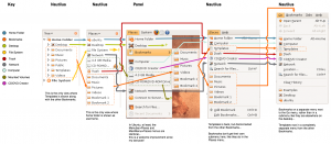
So I hacked up a quick diagram showing all the menus and sidebars where bookmarks and places appear, and aligned them on the “Home Folder” entry since that was about the only one that was consistently placed. Here’s what I came up with:

The plusses:
- The two Places menus on the panel (one in the menubar applet, one in the main menu applet) are now identical, at least in Ubuntu. This is good to see, although most users won’t see both at the same time anyway.
- The Go and Places menus in Nautilus (browser mode and spatial mode respectively) are pretty consistent with each other too.
The minuses:
- Inconsistent appearance/placement of mounted media, Computer, Desktop, Templates, File System, and CD/DVD Creator between sidebars and menus.
Of course, it would be wrong to complain without offering any proposals, and I’ll get to that—just haven’t got time today. The current draft of the OpenSolaris 2009.04 UI spec does include my first quick attempt, but that’s currently based more on “least amount of work to fix” rather than “what might be most useful”… and we all know that’s not really the way to do it, right kids? 🙂
You forgot the GTK file chooser, which also has another layout.
Other inconsistances:
– Some go to the selected place with one click, other needs double click. That could already be fixed maybe…
– The context menu on right-click is totally different.
– Some mount the drive when clicking on it, others don’t or give an error.
– Nautils has a button to unmount, gtk file chooser don’t.
+1 for fixing that!
You forgot the pane on the left hand side of GtkFileChooser…
Also take a look at the GTK FileChooser and its bookmarks. There’s quite a few inconsistencies there, too (compared to either nautilus or the panel, or sometimes both). Especially mounts tend to show differently on either of the three (sometimes staying as they are, sometimes changing icon and/or text?)
Yeah, you’re all quite right about the file chooser of course… I didn’t really forget it as such, just thought the panel and nautilus would be enough to be going on with 🙂 I’ll be sure to include the file chooser in any proposal I come up with, though.
Tree view shows folders, Places shows bookmarks. Templates is a folder but not a bookmark (the remaining default folders are both), so it does not seem inconsistent to me.
I *really* wish somebody would take a look at the code that forces bookmarks and drives into another level.
It’s ridiculous. I’ve got 1200px of screen height but any more than five bookmarks and there’s no space to show them in-line? Please…
I understand that some people don’t have the benefit of 1080p+ displays but perhaps the point at which they’re folderatised should be worked out on boot (or click) or the value should be moved from being hard-coded and into a setting where end users can actually get to it.
@jpv: I take your point about Templates. However, IMHO, the fact that the Templates folder sometimes appears in a list that very much resembles the list of bookmarks certainly isn’t helping things here.
Perhaps if everything else *was* more consistent, the role of Templates would just be more obvious. Putting the Templates folder somewhere else in the user’s home directory by default might help a bit too (OpenSolaris already does this in fact– we have it inside the Documents directory). Or just make Templates a default bookmark as well, although I understand why that might not be such a great idea.
ludicrous! similar in some ways to my irritation over panel-ditem-editor vs. nautilus editing a .desktop file…
Why are these things different?
Here’s a hymn sheet guys, now lets all sing in time…