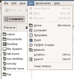
A couple of years ago, I bemoaned the inconsistency of our presentation of bookmarks and places.
Last week I had cause to revisit the issue (for much the same reason as before—updating the OpenSolaris UI spec), hoping that things would have improved and I wouldn’t have to suggest too many tweaks to the OpenSolaris layout to keep things nice and consistent.
Unfortunately, it doesn’t look like much has changed though, really, which is kind of disappointing. (Especially as seeing this bug marked as resolved had built up my hopes a little…)
Caveat: as in my original post, the latest release of Ubuntu (8.10, GNOME 2.24.1) was the closest I had to a community build when I was doing the comparison. So things may really be a little better or worse than they appear here, or may have been fixed in 2.25/2.26.
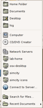
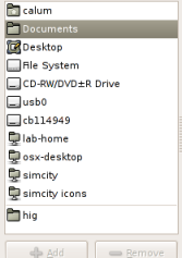
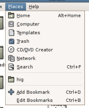
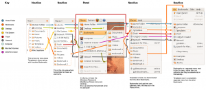
So I hacked up a quick diagram showing all the menus and sidebars where bookmarks and places appear, and aligned them on the “Home Folder” entry since that was about the only one that was consistently placed. Here’s what I came up with:
The plusses:
- The two Places menus on the panel (one in the menubar applet, one in the main menu applet) are now identical, at least in Ubuntu. This is good to see, although most users won’t see both at the same time anyway.
- The Go and Places menus in Nautilus (browser mode and spatial mode respectively) are pretty consistent with each other too.
The minuses:
- Inconsistent appearance/placement of mounted media, Computer, Desktop, Templates, File System, and CD/DVD Creator between sidebars and menus.
Of course, it would be wrong to complain without offering any proposals, and I’ll get to that—just haven’t got time today. The current draft of the OpenSolaris 2009.04 UI spec does include my first quick attempt, but that’s currently based more on “least amount of work to fix” rather than “what might be most useful”… and we all know that’s not really the way to do it, right kids? 🙂
