Ok, next blog post was supposed to be about multitouch and such as I promised, but that will have to wait a bit, let’s see why:
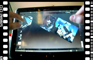
Today’s history is about N-trig, HP, and lots of idiotic behavior around. In order to have a better insight about multitouch, and seeing that the Thinkpad was aging, I decided to get a HP Touchsmart TX2 tablet. All in all, a nice computer, quite better than the old one, and there has been work lately on getting the N-Trig multitouch+stylus device working on linux, all fine! but wait…
WTF #1 (N-Trig)
After I started experimenting with the Linux multitouch input interface, I promptly realized I wasn’t getting multitouch events at all, why? turns out the N-Trig device had a firmware meant for Vista, and that I should install Windows 7 drivers in order to get the newer firmware that would allow multitouch events.
Yes, right, drivers and firmware are bundled in a single installer, so when you install such thing you must plug your laptop, remove it from the expansion base and cross your fingers (away from the screen of course), could something go wrong? of course, and it did for me, leaving me with a “N-Trig hardware not detected” message whenever I try to reinstall or uninstall the driver, so no reflashing will happen, leaving the touchscreen completely unusable under any OS.
In conclusion: Hardware manufacturers should stay away from hardware unless they hold a soldering iron, seriously, leave software to others.
WTF #2 (HP)
After this, the only feeling of relief I had was due to the laptop being under warranty, easy, ain’t it? It isn’t. After several long calls to their customer service, they still insist that I must purchase a recovery kit DVD set (I wiped the recovery partition out, no DVDs were shipped with the laptop) for 40€, so they can check remotely themselves (eek) that it’s actually a hardware issue. There are several problems with this:
- According to Spanish law, enjoying any product warranty must imply no cost at all to the customer. I told them so and they dared me to sue them, I’m already looking into doing that.
- They stated that they can only support a computer warranty with the pre-installed OS. However, in the booklet shipped with the laptop, it is mentioned that they don’t guarantee at all any shipped software. They’re just supposed to offer limited technical support the first 90 days (which already expired).
I’m currently trying to bypass phone customer service with the e-mail one, they at least seem more indifferent to me having other OSs, let’s see if I succeed.
In conclusion: looks like HP customer service’s only target is to cause grief and frustration, you don’t only deserve being sued, you deserve to die young, in pain and alone.
</rant>
XInput2 GTK+
Sadly the only thing preventing me from sending a preliminar patch is polishing XInput 1 support, it was mostly readapted to GdkDeviceManager and the event handling refactor, but there are some glitches here and there. All this is now stalled by having the tablet functionality broken, if anyone wants to pick this up, please tell me (garnacho at #gtk+, etc) and I’ll try to help you through the code.
Likewise, non-X11 backends are completely untamed land, these need readapting to GdkDeviceManager and _gdk_windowing_* API changes, contributions there are more than welcome.


