You may have read my recent blog entry dealing with a patch adding recursive permission caps to Nautilus. I got some very helpful comments which pointed out why the last approach failed.
The combo box that was added to the permissions grid was too confusing for newbies. It doesn’t mean anything to them. For nerds however, it doesn’t provide enough caps because they want to edit the permissions of files and folders at the same time (cf. chmod -R +rX). So obviously – although usability experts usually don’t like the idea – a basic/advanced mode separation was needed. This was also necessary because for common computer users only binaries can be executed, and they don’t easily grasp that the x flag for a directory means listability, while not providing this implementation detail to experienced users will confuse those.
So how would the new approach look like? This might be very disappointing for those of you expecting a creative approach, but I simply replicated the GUI concept from MacOS that was also adopted by KDE. For reducing the complexity of the involved GUI descriptions, one cannot select files and folders at the same time and edit their permissions. It will simply cause too much headache, because “Read” means rx for directories and r for files, which is the reason why in basic mode, there is no “Execute” terminology used for directory permissions. Furthermore, un advanced mode it would cause many strings like “Apply foo to the selected files and the files in the selected folders and their subfolders”, requiring the user to scan the help text again and again to get what he is actually doing.
Note that the screenshots shown in this entry are not HIG-compliant, because the dialog helpers weren’t modified to respect it. I’ve filed a bug report against this issue which has some screenshots and is waiting for your usability-related comments.
Use case 1: Joe Doe downloads a binary and wants to make it executable.
He brings up the “Access Rights” tabs and sees the following:
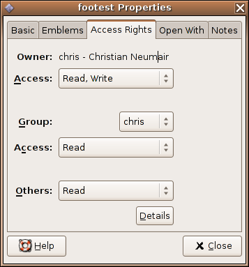
He then clicks the first “Access” combo box, and selects “Read, Execute” or “Read, Write, Execute” from the list.
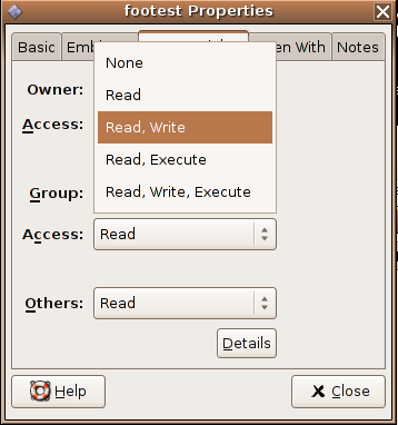
Note that if a particular permission combination (like wx) is not available, the combo box has no preselected entry, and allows you to set the permissions to any of the “sane” permission combinations in the combo. When modifying folder permissions in basic mode, you’re asked for confirmation (and are offered cancellation, recursive application and toplevel application). For the sake of sanity, +X is always added to “Read”/”Write” folder permissions, but it is taken care to not mess up with the +x flag of the files in the folder while still setting them [+-][rw] as desired.
Use case 2: Foo (too lazy to open a shell and use chmod) wants to apply g+rX to a directory hierarchy.
He brings up the “Access Rights” tabs and sees basically the same as Joe Doe:
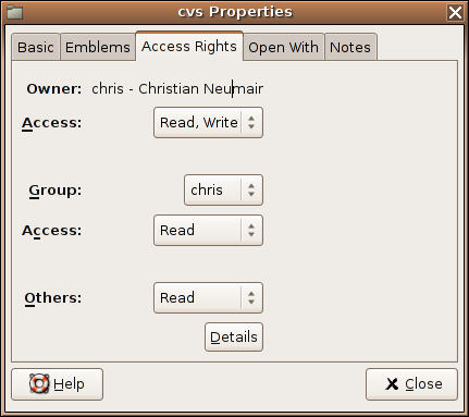
“What the hell”, he thinks. This dialog doesn’t offer anything! Goddamnit, the GNOME morons even removed the last useful feature from GNOME.
He is pissed off by the fact that the combo box just offers the crap it offered to Joe Doe – but wait, it even offers *less*. Just three shitty items, and where is my +X?
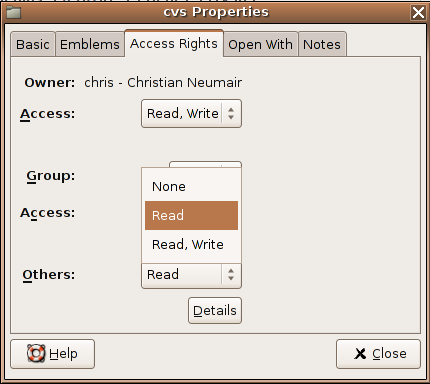
OK, so he toggles the “Details” button expecting that he’ll soon use apt-get to remove that crappy GNOME shit from his and all his clients’ computers.
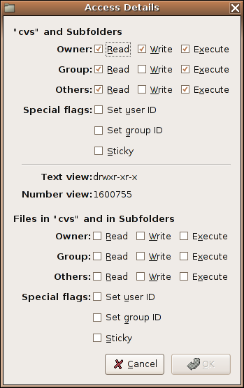
Hah, now THAT’S what I call a chmod GUI. While he is a bit disappointed that they didn’t yet figure out how to properly do keynav (more buttons than possible accels) and that he has to press “Execute” and “Read” twice in the folder section and additionally “Read” once in the file section, he does it.
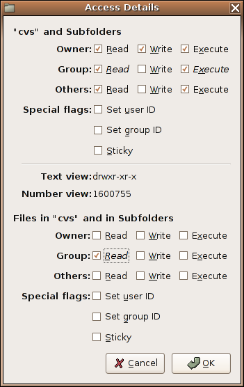
Next, he presses OK – and voila – g+rX is done.
Note that the file details dialog looks like the folder section of the folder dialog of the folder details dialog, and error handling is still not yet done. The patch also lacks some cleanup, but it’s too late for that.
I know, nowadays people demand ACLs, sudo caps when there are unresolvable permission problems and such, but I really think we’re making some decent progress.
Comments are again welcome, and don’t forget to grab the patch and play with it.
First, I agree that getting rid of the grid-o-checkboxes is a good thing. And that dealing with permissions for files and folders at the same time is probably icky. But I think (and I’m going to get lumped in with “usability experts” here) the simple/advanced thing is a bad idea, because the advanced version still offers things that don’t even make sense to me.
Now, in the same vein as Havoc’s lightbulb joke, I question the need to solve “Joe Doe downloads a binary and wants to make it executable”.
If Joe Doe downloaded a program, and has used Windows or a Mac at all (or even Linux with a decent distribution), he won’t know why the program won’t run, or that he has to “make it executable”. Why isn’t the correct answer to this “Let’s create first-class applications, so Joe doesn’t *need* to do something as silly as ‘make it executable'”? (I know to do this, but that doesn’t mean I like doing it.)
Showing “Execute” as a type of “Access” is just dumb. I’ve used Unix for most of my life, I know why it’s there, but that doesn’t make it any less dumb.
I don’t want to sound disapproving. There’s good ideas here and overall this design is *much* better than what Gnome has today. Keep it up!
I like the basic screen, it handles 90% of use cases. I also agree that a details dialogue is needed (if only to accomodate later things like extended attibutes), but splitting between “cvs and subdirs” and “files in cvs and subdirs” makes the dialogue very busy and rather ugly (sry).
The whole purpose of having a commandline interface is that some operations (usually the complex ones) are easiest to express in words. Trying to get a gui dialogue to cover the last 0.1% of use cases is not worth the effort.
However if you have your heart set on it, can I recommend you replace the two grids with one, and add a combo that says “Apply to: (1) cvs and subdirs (2) files in cvs and subdirs” which makes the dialogue represent an action of the files/dirs instead of the current state of the files/dirs.
Great work, this really is a huge improvement over what currently exists. I can’t wait to see this in gnome.
As for the example on joe doe downloading a binary, I totally agree with Ken, joe doe should never have to go in to set the permissions for something like this. However this isn’t your issue, as this needs to be resolved seperatley (I think). It’s just too bad you have to include execute since it won’t make a lot of sense to anyone except those who understand *nix file permissions.
First, I really love that someone took its time and rethought permissions dialog, because well, it needs serious upgrade.
But I like to point out that current mockups looks some how frustrating and confusing to me and I would like to see less drop down boxes. My pick is that simple user will NEVER need to mess with permissions. So if basic is such confusing, I better suggest in default regime to just to SHOW permissions. Because well, give a thought to situation when casual user just messes with preferences dialog and changes accidentaly some permissions to file. Any error messages, warnings would be confusing to him, so I suggest to get rid of possibility to change owners and permissions and put a button “change owner & settings” or something like that.
I am not good in mockups, in fact, I never have done them for GNOME apps, but I will try to create some and get them attached to bug.
Looks nice. Well, the details dialog is a bit biggish, and I don’t see how I could express “please remove write permissions recursively, but leave read/execute permissions untouched”.
Marius: You toggle the “Write” checkboxes of both sections in “Details” so that they’re off and press “Apply”.
Another weakness of my proposed dialog is that it does not yet offer a non-recursive permission change, but this should be easily doable with an additional checkbutton.
Maybe I should drop the whole “Details” approach and replace it by a *real* chmod GUI, i.e. an entry with some helpful suggestions and tooltips, parsing the user’s input?
http://www.advogato.org/person/Manny
I don’t like it. It’s a little confusing, you have to stop and think about what are you doing. You have to actually stop, look at the screen and try to understand the combinations. The difference between the top and the bottom of the details screen is not very visually clear. I would not use it, because it’s easier to just fire gnome-terminal and type it. A user would not use it too because it’s too confusing. I don’t like the selection boxes, i think it would be better if you change it with checkboxes. I think the current approach is nice, it just have to have a way to recursively apply the permissions or to only apply for the selected contents. One idea is to verify the user selection, folowing the cases:
1 – The user selected just a folder, a dialog would pop up and ask if he wants to recursively apply to it’s children.
2 – The user selected just a file, no popup is shown.
3 – The user selected file and folders, just do like 1.
The label “Number view” should just say “Octal”.. an stupid user would not know how to read the number anyway.. and a advanced user, like Linus for example would think this label is just stupid.
Complementing, the recursive function is not suitable for the Details screen (read Advanced screen) because a normal user would want to do it but would not understand the Details screen. An advanced user would think the details screen is just stupid and would use the terminal. So, this approach is not good for any type of user. The first screen should suit the “stupid” user, and the details should suit the “kernel hacker” 🙂
To me this seems pretty usable, much better then the previous version.
I don’t think “none” makes sense as an option for the owner’s rights. As a regular user you’d at least want to be able to read your own files 🙂
What about making the labels more verbose? “read only” (instead of “read”), “readable and writable” (read, write) or even “opening and saving”.
What about “Everyone else” instead of “others”? (okay, that’s nitpicking 🙂 I like the basic dialog very much)
Also, AFAIK OSX doesn’t have the executable bit in the file properties. Why’s that? Can someone shed some light on it?
I think that the layout is a bit confusing. The distinction from User to Group to All is not visually clear at all.
Also, I think recursive permissions do belong on this page, not on the “Advanced” page.
you must have been reading https://wiki.ubuntu.com/UsabilityWishlist#head-bd6d83c197d2ae66a172d2931f3d9eb3d97ba0f5
good stuff. i like the recursive by default. you might want to add a ‘drop box’ write only folder for people doing fancy file sharing (we used to submit our IT home work to a shared dropbox at school).
hope this make it to 2.14
I also like your approach to handling file and dir permissions. Maybe replacing the Details button with some sort of entry field for entering directly a chmod command (or just its options, don’t know) would be simpler (or at least easier to do, again not sure), as you say above.
However I’ve noted your main dialog would look (even) better with some sort of icons representing each section the dialog has: Owner, Group, Others and Details.
So I have made a mockup from your dialog adding to it some icons at left of each of Owner, Group and Others sections, and organizing the whole a bit like in the “Removable Drives and Media Preferences” dialog box of Gnome. It’s like this:
————————————————-
footest Properties
——- ——- =============== ———- ——
Basic Emblems Access Rights Open with Notes
————————————————–
Owner
o Name: asdfsdf – qwerty
O Rights: [Read, Write v]
Group
o o Name: [asdf v]
O O Rights: [Read v]
Others
o Rights: [Read v]
o 0
————————————
Details
* Edit permissions directly
* [Details…]
[Help] [Close]
————————————————–
The actual icons for owner, group and others (the “o”s in the text mockup above) are made from some gaim-like icons I see in planet Gnome (shamelessly stolen by me) but I think they convey the idea of what each section is for (one big guy for Owner, two slightly smaller guys for Group and three small guys scattered for Others). The section for Details has two gears as icon (again shamelessly stolen from Gnome Launch Box).
Sorry I can’t point you to some web page to see the *real* mockup, I don’t have a personal web page -why am I still using an ISP that doesn´t gives some free web space?-. Anyway if you are curious I can send it to you by e-mail or something.
And yes, your work is very good and needed, go ahead with it.
Flicking a listbox option brings up a dialogue box immediately? Owwwwch.
– Chris
first if all: Christian, you have my respect touching this code! I agree the best rights dialog at moment is the kde one. Dont be shy and copy it 1:1 !
From that point start improving, i like your way of choosing executability inside the boxes rather than the checkbox.
Move the ownership field kde has above the access permissions.
The feature of recursive application should be a box as you had in your first patch. Please dont ask it in the confirmation dialog, this would somewhat be a wizard. Either you build a complete GUI or a complete wizard, warning is okay since nautilus doesnt support undo, but i dont think asking for recursion at that moment is good.
Spend time on the basic dialog so it acts logical, e.g. if one chooses rw- for “others” he should see that this impacts groups as well as the owner permission itself.
The “Details” aka “Advanced” mode is complete but so slow no one would use imho. Especially because one needs 4 clicks before he can access it, i would _try_ to remove the r w x checkboxes and build three comboboxes for u,g,o with [rw- rwx r-x r–] (does -w- make any sense?) and leave the rest as the old gnome dialog has been.
br, Sven
Unless I am not misunderstood, you are only asking about recursive application after the OK button is pressed, in the confirmation dialog.
That is a mistake IMHO. It is too late: when he pressed OK, the user has already been looking for the recursive application option, and failed to find it. But then, he is already angry and frustrated. 🙂 You should not allow him to get to that point. What do you think?
Here‘s what we use for Xfce now (also Finder-like). Whenever you change folder permissions, you’ll be asked whether to apply the changes recursively or not (with a flag “[x] Do not ask me again”, of course). It doesn’t mess up the GUI, but still provides all the options (well, except Sticky, SUID and SGID, but that’s another story). You could do something similar for Nautilus.
Benedikt