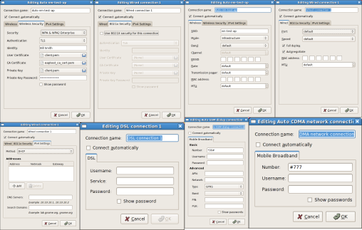
When we were adding multiple active device support to NetworkManager 0.7, Bryan Clark and Mike Langlie redesigned much of the applet and kicked out some great mock-ups. Turns out GtkMenu doesn’t work well for multiple connections or multiple active devices. While it’s served us well, the applet’s GtkMenu-based code should be sent to the slaughterhouse and rendered down into tasty, tasty animal fat. Even though the new design work was done in January 2008, I only blogged about the mock-ups in June last year because I suck. I’ve had them sitting in my inbox for 18 months, because between getting NM 0.7 out, mobile broadband, and all the rest of the awesomeness that 0.7.1 brought, there hasn’t been any time to sit down and actually do the redesign. But that shouldn’t stop discussions about how excellent nm-applet can become.
In the Operating Room
Ignore the title bar. These are old; we don’t want a title-bar any more. Instead, just a custom widget like the Volume applet. So here you go:
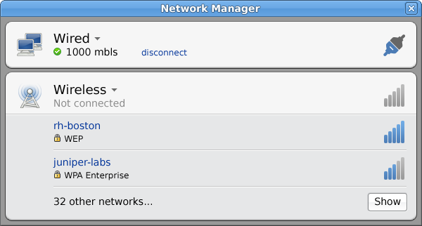
The user has an active wired connection, and an inactive wireless device. Note that only your favorite wifi networks (ie, ones you’ve explicitly connected to before) appear in the list. People often see 10 or 20 wifi networks, and list all those in the menu is mostly useless. There’s a tradeoff between the easy first-time wifi network discovery, which would now take one more click (of “Show”), but only listing the networks you actually use makes the UI a lot cleaner. And nicer for netbooks. The new design also shows more relevant detail, like security settings, in plain language.
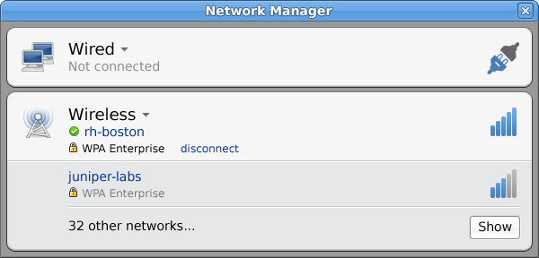
Here the user has connected to a favorite network, and the wired interface is now inactive. Grouping the security information, the SSID, and the actions the user can perform gives a certain focus the old applet could not. Irrelevant information simply doesn’t show up.
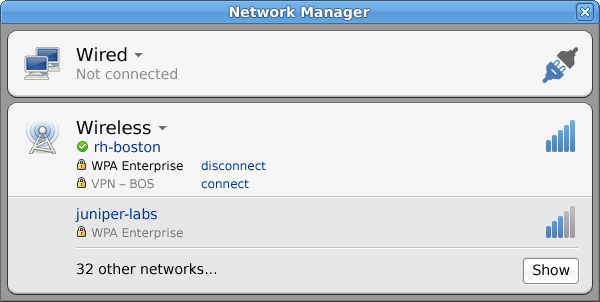
If you’ve used a VPN with this network before (or tied it to the wifi network) it should probably show up too. This part needs more thought, because VPNs are really independent of the underlying network connection, but often should be “tied” them to a specific connection or two. But what it gets right is to group the things you probably want to do near each other.
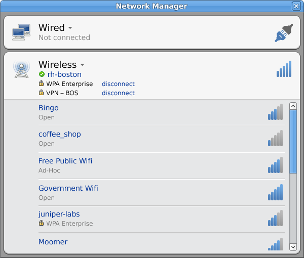
So what if you do want to see everything? Well, hit the “Show” button and you get the list of course. We can probably do better than a scrollbar here, but whatever; they’re mockups. Maybe we can be more intelligent about scanning too.
An Updated Face for 2009
2008 is not 2009. And that’s why Jon McCann and I sat down a few weeks ago and worked through things people care about now. Hot off the whiteboard after a trip through the Gimp:
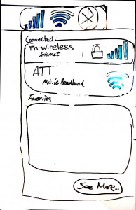 Immediately you’ll notice the strong resemblance Bryan and Mike’s work from over a year ago. To their credit, Jon and I think the same core concepts still hold. We took a look at how mobile broadband would fit in. We split out the icons to show each device type individually, though this needs more thought too, since you don’t care that much what your wifi signal strength is when you’re on 3G. But you do care how good your 3G is when it’s not connected, since you want to know whether you can even hop onto 3G or not in the first place. Thoughts? Comments? Flames?
Windows 7++?
Much to our surprise, Windows 7 looks a lot like what Bryan and Mike sketched out over 18 months ago. Sooo ahead of their time. Yeah, the coloring is different, and yeah it’s got a bunch of questionable Microsoft bling, but Windows 7’s network applet looks and feels a lot like the nm-applet mockups from January 2008. But I think we can do better, by making networking clearer and more concise. Apple’s Airport applet is probably too minimal, but Microsoft’s is probably too complex. Somewhere in the middle is where nm-applet was planning to be and should be: get you connected with a minimum of steps, and put what you need in one convenient place.
Everyday Simplicity
Sounds like something Martha Stewart would sell at K-Mart, but it’s what software should aim for. Let the users do what they came to do, then get the hell out of the way and let them do it. Don’t show options that the users don’t need on a daily basis, but make them available elsewhere in a click or two. Keep the interaction streamlined, simple, and clean. Don’t clutter it up with unnecessary options. If it’s not used on a daily basis, it probably shouldn’t be seen on a daily basis. That’s what nm-applet should do.
So let’s make it do that. Prototyping the concepts in a Python applet would be a great first step. After being kicked around the court a few times, we implement them in nm-applet. Debuting NetworkManager 0.8 with a sexy new interface would make your momma proud. Any takers?


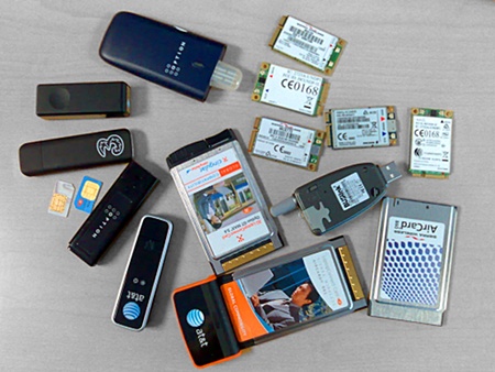
 HUAWEI (PHEAR THE DRAGON)
 Qualcomm Gobi (NEW HOTNESS ALERT)
 Modern Sierra (MAGICALLY DELICIOUS)
 Option “HSO” (THE NEED FOR SPEED)
 Ericsson F3507g (SWEDISH INVASION)
 BUSlink SCWi275u (DEAR GOD DON’T BUY THIS)


