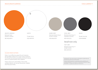
Exhibit #1 — screenshot of the page with new color palette for Ubuntu branding, taken from the PDF available here.
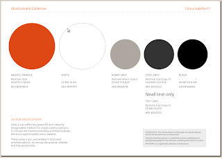
Exhibit #2 — Same as above, edited in GIMP to use colors reported as HEX value.
Exhibit #3 — Same screenshot, similar editing in GIMP, but using CMYK values.
Doubt: which one is the correct one?? 😉
Notes:
- not sure CMYK could render in a proper way on a screen, it’s for printing
- the right one should be #2 (the same used for new ubuntu.com website) – while I prefer #1
- where is aubergine?!?!?!?!? 🙂


I would guess for a writing mishap.
#DD4814 is obviously wrong.
#DD7814, which is a close one on the number block, is almost exactly the color Pantone 1665 represents.
My closest guess.
But judging from the CMYK values it should be much more red than it looks like…
Aubergine is for canonical , Ubuntu is still orange 😉
The orange in original.png is how i wish it rendered for me, but I see all the oranges as the one in CYMK, which is IMHO horrible and eye bleeding.
@vish
I was sure aubergine was for a generic “commercial”, as opposite of “community”; for instance, if we’ll add in ubuntu-it.org website an area listing companies that provide commercial support in Italy, this could/should be aubergine. Or it could be used as alternate color here and there.
Am I wrong?