
We, as a community, have been making significant improvements to the GNOME 3 experience over the past couple years. With the new shell and new core applications we’ve been working hard to provide you with immediately useful defaults, more powerful ways to find your stuff, simpler and more natural workflows using direct manipulation, universal access, and a more coherent, effective, and beautiful experience.
Unfortunately, our favorite file organizer and manager has been a bit left behind. So, lately, a few of us have been trying to give Nautilus some much needed love, to bring it up to speed.
There are number of fairly high level objectives in this effort. I’ll attempt to describe a few of them. We want to…
Be Immediately Useful
The initial view of the application should present me with things I can take immediate action on. Things that are likely relevant to what I am doing or what I have been doing recently. Something that serves a reminding function for things that I have yet to do. Something that helps me establish context. Something that doesn’t require me to do additional work or navigation every single time it starts.
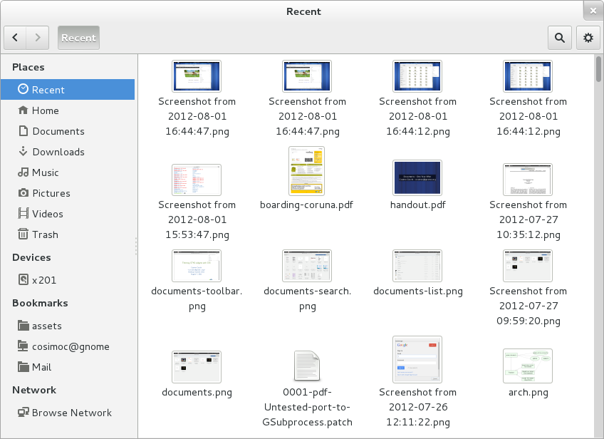
One way to achieve this is by displaying a list of recently created, modified, or used files.
This is what we have, now, in git master and it feels pretty nice. Though we’ll continue to refine and improve.
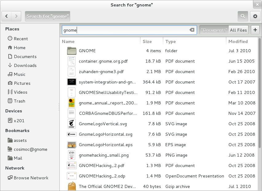
Have a Functional Search
We don’t even need to get fancy. Even a barely functional search would be a huge improvement. If you haven’t noticed, search was completely broken. You either had Tracker search support or you didn’t. If you compiled Nautilus with Tracker support then we would only show you results from the small subset of your files that Tracker was configured to index. If you tried to search a removable USB drive you would see nada search results. If you happened to turn Tracker off we would happily display nothing at all. If you did not compile with Tracker support we would do something amazing like crawl your entire filesystem looking for a filename match every time you updated the search terms, and nothing would be displayed until it was done – something on the order of “a long time.” Remember when I mentioned Nautilus was left behind? Not kidding.
So, yeah, who needs to search in a file manager anyway, right? Um.
Turns out quite a few of you do. And a good number of you want to be able to find your files from the GNOME 3 Activities Overview as well. And this requires there be an application providing those results. Which app should do that?
That’s actually a good question. I think ideally we’d have a number of more specialized applications providing the search results (and viewing experience) for the types of files they handle natively. New applications like Documents, and Photos, and Music. However, something should be providing the fallback for when these applications do not exist or until they exist. I think this application should be the one where you find your files.
So when you think about adding working search to Nautilus you really want to use the emerging GNOME 3 design pattern for search. Something that has been discussed quite a lot recently. Including most recently at the UX Hackfest last week.
This implies a few things. That searching be: fast, performed as you type, have results ordered by relevance, quickly converge on what you want, and allow quick activation of the top hit. This should hopefully reduce or obviate the need for scrolling, intensive visual scanning, unnecessary navigation. Allowing you to quickly grasp what you want and maintain your focus on your ultimate goal rather than a series of intermediate and tedious tasks. A better time.
Have Simpler and More Natural Workflows
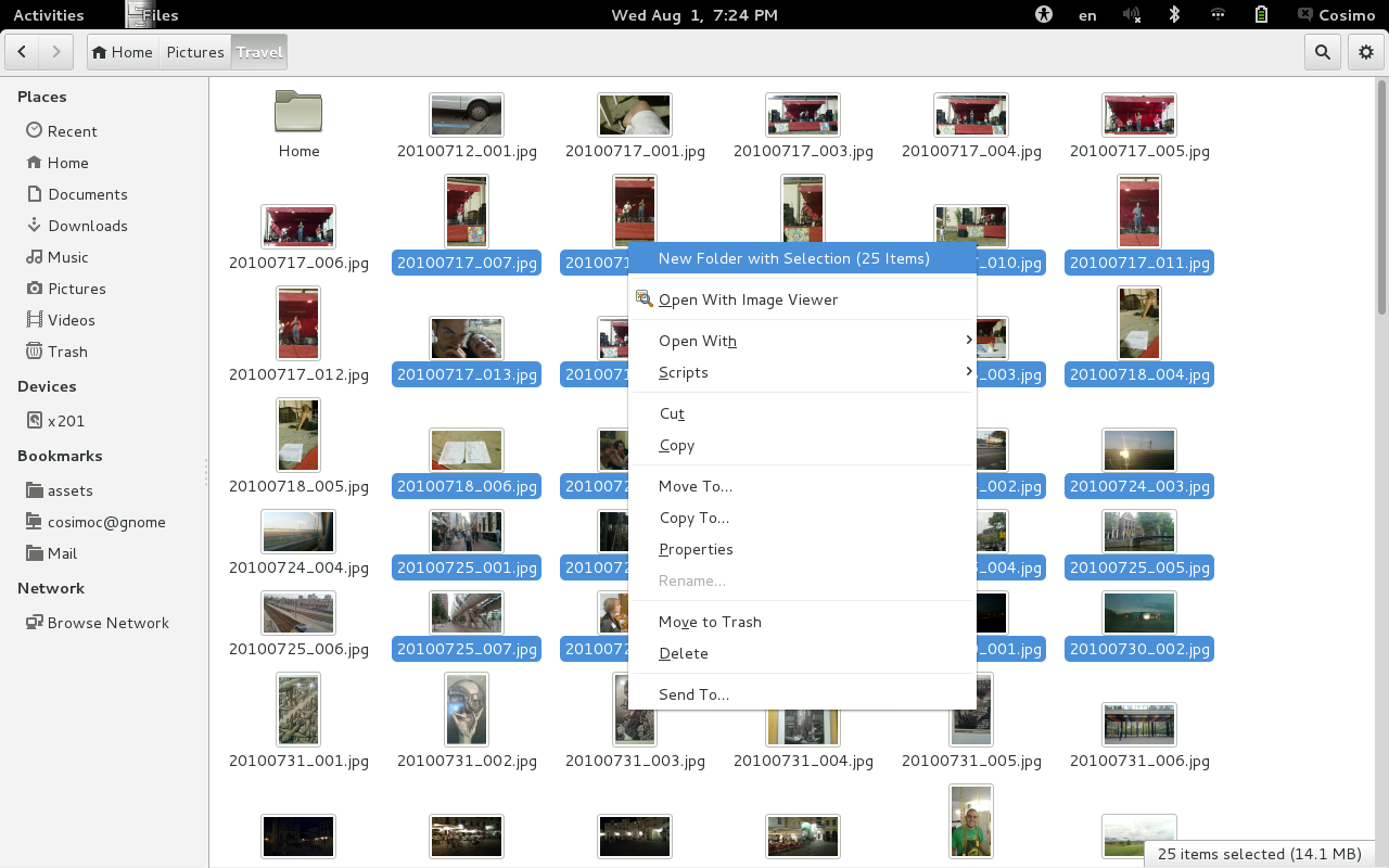
In GNOME 3 we’ve been trying to allow you to work with, manipulate, or act on content directly. Actions that make sense in the situation you happen to be in. Contextual and relevant to the environment. Rather than require you to proactively create the conditions needed for an action, we allow you to select or identify the things you are interested in and then say what you want them to do. For example, I have a set of files I would like to collect, organize to be together. How does that work? Previously, in Nautilus I could identify where I would like this prospective collection to live, perform the action create a New Folder, then go look for content to fill it. What is wrong with that? In some situations that works just fine, especially if you are a “frequent filer.” But it could go wrong. In the case where I had already identified the things I wanted to organize I am forced to leave them, take on an intermediate task in order to set up preconditions for the primary task. What if I am interrupted during this intermediate task? What if I change my mind? Shouldn’t all this stuff just be done for me?
One way we can do better is not rely on our ability to predict the future. We are pretty awful at it most of the time. Exhibit A: How good did we think Prometheus was going to be?
Can we do better? Fortunately, yes. And not just better but faster and more reliably. It is better to do defer decision making and action. Identify the stuff and then select what you want to do with it. So, back to our example where I have a set of files I want to collect or associate. I think it is better to add a new action for the selection that allows me to create a New Folder with Selection. Boom. Done.
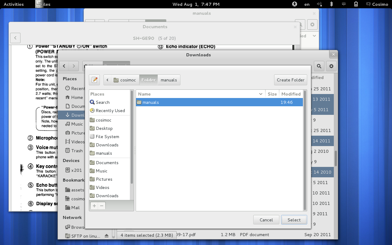
Hold on mister. I’m not done. I wanted to put that new folder somewhere else!
Righto. Got you covered. Let’s add a new action on that Folder called Move To and ask you to just pick where you want it to go. How would that be? I think I heard you said “straightforward, quick, and powerful.” Cool, because all that is in git master. Check it out.
A couple of you just said, “but I wanted to email it not move it!” Ok yeah good point. That is going to require some fixes to the Send To functionality and it is on the roadmap.
Be More Coherent
You may have noticed that the file selection dialog in the example above isn’t very consistent with the patterns used in Nautilus. Good catch. Turns out this has been confusing the heck out of our users for years. The problem seems really obvious once you see the two together. Fortunately we have plans to fix it and make it easier and better for everyone.
Nautilus was a bit of black sheep among the GNOME 3 core applications. It had a design that grew organically over many years and didn’t really seem to fit in any more. In bringing it back up to par we now have things like a much improved and space efficient maximized window state, a more consistent menu layout and behavior, more consistent use of icons, and a more GNOME 3 style pathbar and toolbar.
Be More Effective
We’ve heard the complaints loud and clear. They’ve been ringing out on the mailing lists and piling up in bugzilla. We’ve gotten a little bloated a little too lax in tending the way our application operates by default. The context menus were running out of control and finding the option I wanted was too hard. The list view of files was crowded and noisy and hard to focus on the most important part: the filename. The default icon view started with a small icon, had a very inefficient layout for large icons, and generally sucked at browsing for content. We worked around this in various ways but we should really do better by default. This is work in progress with much more to do but we’re on the way.
Be More Beautiful
Every detail matters. We want every corner of GNOME to be delightful and well cared for. The little things. Like how the calm stability of the sidebar reassures and anchors me. Or how the way automatically updating the name of my computer in the sidebar, when it changes, delights me. Or the way the application allows me to focus on my goal shows me respect. This is what we want.
So how do we get there?
Trading Spaces
Sometimes is just not possible to add new functionality without first making some room. This doesn’t always mean you need to remove something. Nor does it always mean you should remove something. But sometimes you will. This is never done lightly. For Nautilus we spent a long time trying to figure out what is the minimum we’d need to do in order to accomplish the objectives discussed above. It is a very difficult trade off.
But in the end we decided that the responsible thing to do, in order to maintain the high quality of the user experience and the high quality of the code, was to remove a few things.
Extra Pane
This was removed for a couple of reasons. The first reason was that it was undiscoverable. Not all undiscoverable interfaces are bad but this one also stood in the way of providing a better alternative. Even if you never used the Extra Pane you always had useless Move To and Copy To items in the menus. We wanted to create a better Move and Copy workflow and really these items had to go. Once you remove all user facing ways to use the feature you have to ask yourself (as a good maintainer) whether the trade is worth it. Should we keep the feature for which we have a new and better alternative in Nautilus, a very similar and easily enhanced feature available in the Shell side by side view, and a pile of bugs getting no attention in bugzilla? We decided it was better for the project to remove it. This hasn’t pleased everyone but remember we still have some ways to go to make the experience complete.
Compact View
This is a tricky one. A lot of reasons people have been using this view are due to the other two views sucking for various reasons. We want to fix the root problems. We intend to have more effective list views for identifying files by name, more effective grid or icon views for finding files by content, and more effective search for finding anything based on name, textual content, or metadata regardless of where it is. This is consistent with the other core GNOME 3 applications. Working around the default isn’t going to do it.
The role for compact view is unclear. Our research suggests that it is something like: the only view that works for browsing a lot of files at once. This is really hard to reconcile with providing good defaults that just work and having consistency with the file chooser.
The view itself was not without problems and we would rather focus on making icon and list rock. I won’t dwell on the reasons here since they have been discussed at length already.
It was in the way of a better solution.
Type Ahead Find
One of our primary objectives was to add powerful search that is available by just typing. This is a great feature that has been demonstrated to be highly effective and loved by users. Unfortunately, this is in direct conflict with so called Type Ahead Find. What to do? Which is better? Tough call. We think we can serve all the existing use cases of type ahead find and more with our new found search capability. Is it perfect? No. Type ahead find was not without serious problems either. Even after many many years of efforts to improve it.
Problems like how difficult it is to continually scan all the items in the view and yet follow the selected item as it suddenly jumps to new items, or the requirement that you know the exact case sensitive prefix of the file or folder you are looking for, tricky popup search entry placement that covers the floating status bar or data in the item view, unfortunately interactions with the GNOME message tray, strange iteraction with other windows, awkward interactions with scrolling views. etc.
So, What’s Next?
Obviously there is still much more work to do here. As you can see from the Nautilus 3.6 roadmap. We have a ton of new features that I didn’t have time to cover here. This is going to be awesome and, here’s the good news…
You Can Help!
So pitch in. Patches to any of the roadmap item bugs would be greatly appreciated. Don’t hesitate to ask for help on the nautilus mailing list, or on IRC in #nautilus or #gnome-design. Meet you there!
Nautilus looks beautiful, really. But remove features don’t looks to be a good direction, most people start to be tired of this “feature removal”.
About Extra Pane, not only me but lots of GNOME user and community members use it and disagree that Shell side by side is better. Again,
Normally I don’t make comments on blog posts, specially when I have critics but… man, really, we can’t loose features that we use every day just because some few people don’t use it. GDM did the same in the past and now due to lack of features (present in early versions) people are moving to lightdm.
Hi there,
I’m a sysadmin and I’ve been using gnome/gnu/linux for a long time. I really liked gnome2, but after a few weeks, and a dozen extensions, I am mostly happy with gnome3 (F17).
Please don’t break my precious nautilus. I am happy that you want to improve it, but please don’t remove any features! Maybe certain features aren’t “discoverable”, and that’s too bad, but leave them in for the people that *have* already discovered them.
I don’t know what needs fixing with sendto (in F17) at the moment, but it works for me, so don’t break it.
If you must remove (F3) split pane from nautilus then, change it so that when you press F3, a separate nautilus spawns in gnome shell and tiles it self next to first nautilus. If two nautilus-es are tiled next to each other in shell, then F3 in one should remove the other. Simple? Smart? Fits in with the shell? I’d really appreciate hearing from you if you like this idea: james@shubin.ca
I don’t use the compact view, so I don’t care, but I really don’t understand: “Sometimes is just not possible to add new functionality without first making some room”.
Sorry for all the haters on the internet, I’m not one of them.
Thanks and happy hacking!
James
Great overview – and it’s nice to see some explanation/reasoning given for some of the more… controversial removals.
Does “Type Ahead Find” activate automatically if you start typing in any folder (without having explicitly clicked the Search button) ?
Each time I see the word “Recent” I think in privacy. Will there be a way to hide folders and files from that view? I think it’s important, cause not everybody wants to share what he/she has been doing recently to those who are looking.
Thank you!
This all looks really nice, though I might miss the extra pane.
The shell side by side view isn’t the same, as you got yourself an extra sidebar and even on my widescreen monitor, that is noticable.
I have on request though: https://bugzilla.gnome.org/615183
It also seems to be present here: https://live.gnome.org/Nautilus/Future
It seems like a purely visual thing, but would really help to get a more polished feeling.
I can’t check at the moment, but is the space between the text and the icon part of the “icon hitbox” at the moment?
If it isn’t, this would also dramatically boost usability (assuming that is changed too)
Great post. Nautilus is going the right way, I think that’s better to remove some functionality than ending up with a super frankenstein.
Keep doing this kind of text, it helps the non-designers like me understanding some of the decisions made. Thank you for the time you spent on this one!
I just wanted to thank you (and the rest of the community) for all the work you are putting into taking GNOME to the next level. After all the flak GNOME has been getting recenty, I believe it’s important for us happy users to show you our appreciation 🙂 I just wished I had more time to contribute to GNOME in a more meaningful way, though.
Keep on rocking!
P.S.: and more blog posts like this one, please!
Hold on — did you really remove type ahead find? That was the @#$§ thing that enabled speedy and productive keyboard navigation. There was never a problem with it. And as being a part of basic keyboard navigation it was certainly more common than a full-blown search where you have to separately examine the results.
Could you explain the removal of Backspace as “Back” action? I find it very useful, especially since the “Up” button was removed from the toolbar.
What is this initial view? Do people really open a file browser instead of opening a folder? If they do, isn’t that a problem? One to be fixed in gnome-shell — remove and add appropriate launchers?
Is there a way to get home directly instead of recently used on default? My files are well sorted. I’m normally looking for a project instead of a given file and keep the related ones open. I’m sure showing recently used files are a good thing in the average case, however I’m always annoyed when my Gnome shows people my private files (insert whatever you want) when I open an application or saving/opening a file or when I have to click on home just to open a related file in gedit. I’m also used to create a lot of test files I don’t want to throw away but I do not want to see again. However, having recently used in our pane is a good thing.
I love the “new folder with selection” option. It sounds so natural that I can’t believe that I never thought at it. I’m not sure why we have a counter in the context menu. The information is already displayed at the bottom.
Thank you a lot for working on nautilus and your great blog post. I’m looking forward to use it.
I also couldn’t find any information on “Don’t sort directories first by default” commit. This has been a standard in file managers for decades, and for good reasons.
Hell, yes. That was working quite nicely in earlier Gnome 3 versions, but in current form, it opens everything in the new Documents app. And with all respect to the developers of that app, it’s utterly worthless as a PDF reader. I’ve had to stop using the activities function, and just track down the directory in Nautilus so I can open the files in Evince.
So, you couched your most egregious manipulations of Nautilus to date in quite well-crafted sentences, which are certainly soothing to read, and it is most welcome to see what is being done expounded for once. This is something we rarely see indeed.
However, reading attentively you cannot fail to note the internal contradictions. Blow-by-blow it certainly sounds nice, but when principles laid out to defend one action go counter to what was all too lightly dismissed in other sections it evokes frustration.
The Hippocratic oath is »First, do no harm«. Perhaps Gnome should require something along that line.
Well, you seem to think you can replace all the removed functionality with better workflows; I’m eager to see what you come up with, and definitely willing to try it.
I very much like where Gnome >3 is going (well, I do need “Dash Click Fix” and “Windows Alt Tab” extensions for Gnome Shell), but I have to admit I’m looking at these Nautilus changes with quite some trepidation.
– the extra pane was something I’ve found extremely useful, and seems to have been imported from Orthodox File Managers. Use case goes a little like this: a lot of file operations happen between two directories; navigating to these directories involves building up a lot of state (sftp: location f.e.). Having to recreate that state multiple times for different operations is a pain. By using separate windows instead, you lose the binding between them – both physical (windows can end up on other workspaces), and functional (“copy to”/”move to” stops working).
– dropping compact view/sort directories first: yep, like you said, this is the “deal with truckload of files” use case. Curious to see what you’re going to replace it with. But I sure hope the current screenshots (list/grid view) aren’t it.
Finally, one thing I’d like to ask is this: while I like where Gnome has been going, one anti-pattern I’ve seen happen quite often since 3.0 is that things get removed, only to be replaced by a better workflow 6 or 12 months later with the next releases. Please, don’t leave us hanging for half a year with removed-but-not-properly-replaced features. Remove them when the replacements are ready, please.
So, I’m actually looking forward to this. Nice effort trying to clean up Nautilus 🙂
Two bits of the design strike me as odd:
– Removing the title bar for a maximized app, along with the close button and the window title, just seems completely bizarre to me. I know it’s happening across GNOME 3, so it isn’t really your problem, but has this had any usability testing?
– Do symbolic icons really fit here? Typically we have symbolic icons for actions, but I have not seen them used for places. There’s a nice distinction between verb icons and noun / adjective icons right now. All of those folder icons, for example, continue to be the colourful noun style. So, what does that mean for the sidebar? Are those all thought of a actions now, instead of places? Are you concerned about the effect for a user who bookmarks a folder — perhaps with a custom icon — and ends up with a completely different icon in the sidebar? And what about the icon in the bookmarks menu and the places search in the shell?
I remember reading somewhere about different apps providing content selection dialogs, so when you choose to open a file, instead of instantly seeing the file chooser, you get a choice of Files and Photos and Documents. Each option brings up its respective application. Is that correct, and if so is that a part of the work going on here with Files? Any guess when it might start to come together?
(I’m curious because decentralized content selection dialogs is something I have been meaning to work on, so I’d be interested in poking around and lending code / ideas).
Okay, I think I’ve asked enough questions 🙂
Keep up the good work!
Could I throw another request in there? “Be faster.” I really feel that a file manager should start up and display files instantly, it’s such a basic tool for most of us. Nautilus has never really achieved that for me: I get about a 10 second startup time on my 6 year old laptop. In other ways it is a very good file manager and will surely get even better with these changes.
i’m still running an older setup however i wonder… is nautilus still using double-click by default? (to enter a folder/open a file).
i think moving to single click would be a progress, especially with the touch-driven present.
and AFAIK it’s even impossible to *configure* the file picker to be single click…
I’m a bit concerned about the prevalence of the context menu — right-click actions aren’t as discoverable as if they were presented visually in a toolbar somewhere, especially if a user is working on a tablet. What about the contextual toolbar that’s part of the new Gnome experience? Is this revision just an intermediate step to convert the application to the new HIG, like with Web?
Nice job! I’m waiting a better integration with avahi too for network browsing.
Remove feature that are not visible is not the answer.
Eg: “No one uses the car lighter!” “Where we put it?” “In the trunk!”
WTH! Of course it’s not visible! Make it visible! =)
With one keystroke I can have “two nautilus”. But if you remove it I have to sidepane nautilus, launch nautilus again and sidepane nautilus (again)… I really can’t see efficency or simplicity…
If it’s too bugged, ok I can understand. Otherwise, I’m sorry but no.
@emmanuel: I’ve been running with single-click for a couple of weeks, and I can honestly say: it’s not there yet. it will take some work to do selection (e.g. for simple viewing through Sushi) and activation with single click/touch.
I think all this work looks wonderful. I mean, the app itself now looks beautiful and having Tracker integrated will be amazing. Can’t wait to try it (sadly, Fedora nightly builds don’t work anymore. I don’t think this bodes well for the F18 release quality, but anyway…).
My mom uses Fedora 16 right now and her home directory is a mess. She finds and saves a lot of recipes from the internet, and never knows how to find them back, so I set up a shortcut for tracker-search-tool on the Dash. GNOME 3.6 with Nautilus tracker searching, as well as those search results being provided in the Shell will be a fantastic step up.
Anyway, I don’t care about any of the feautures being removed. I don’t use either of them, and I can totally see why they’re being removed. Yet I think they should be kept in 3.6 at least. Why? Simple. I think at this particular time GNOME has more to gain by not cultivating the image of senselessly removing features than not. Even if that’s not what happening, it’s how a lot of people are going to perceive this change. Will the negative impact with the “Slashdot audience” outweigh the positives? I don’t know.
Also worth weighing in is that, as you mention, the file manager is a power user tool. The ideal setup for my mom is to be using Music, Photos, Documents… not Files directly. So it doesn’t hurt to keep a few power users and preferences around in the app. I know you’re working on a completely revamp of Nautilus, and you’ve done amazing work, but keep in mind you don’t have to accomplish everything this cycle. It’d be nice if all this work didn’t get overlooked by a pet feature of some people being removed when 3.6 is finally released.
about single-click, i’ve been using single click in gnome basically since 2.0 and still to this day (but i’m not running gnome-shell yet, my hardware can’t take it).
to me double click is a complete UI mess, it’s a bit baffling to me that gnome is still requiring (by default in nautilus, completely in the file picker). i’m using control-click and rubber-banding selection, but selection of multiple items is a very rare event compared to actually browsing or opening files. for work on single items the right-click menu is fine.
so it’s only selection of multiple items which is a problem. maybe all we need is a “selection mode” toggle button in the toolbar…
kde has a solution and last i checked is single click by default but i agree their solution is not the best (you must hover to get an offer to select/unselect IIRC).
in any case, if a specification comes up, to which UI designers in gnome would agree, that would enable a single click mode, i think that would be a great progress. i would consider trying to code it personally (when i upgrade my hardware which should be soon).
for the file picker it’s even more shocking IMHO, because it doesn’t allow rename, delete and probably not even multiple selection so… I just don’t get it.
No explanation about the removal of Tree view?
Why not having it optionally (as it was before anyway)?
As a software developer, I simply cannot live without it.
You are forcing users to an unsuitable workflow. Keeping some things optional (until the vision of the shell is complete) would not hurt anybody. So the only option is to look for another file manager. You call it “love” and “cleanup”, I call it unnecessary and completely irresponsible axing.
Thanks for the post. I love the ‘Recent’ section, much needed. Any chance of including recent directories too? 🙂
It’s really looking good. But you should state that it’s almost an exact copy of OS X Finder (like almost entire GNOME 3 is of OS X). It’s not a bad thing, but it would be better if you could give some credits.
I don’t want to sound rude, but besides improving (really improving, thanks) this is definitelly a copy.
I am with Dylan McCall in his opinion about the title bar, I understand the need to save vertical space, and until now I am liking the changes brought by GNOME 3, with the exception of the removal of the close window button on maximized windows. With that awful UI change in order to close a window the user need to restore the size of it and click close or click the top menu and close, closing a window has become a 2 step process and that isn’t right. Or the WM is adapted to merge their buttons with the toolbar, or the toolbar the act as a fake titlebar when miximized must add an application drawn close button.
It is inconsistent that a no maximized window that covers nearly all the screen has a close button and a maximized one doesn’t
I remember when I first tried Gnome3 on Fedora 15, I could just type the 3 first letters of my commonly used blendfile and there it showed on the overview, sadly on every newer version (16, 17..) it stopped happening.
I think you might take a cue from Dolphin/Konq on move to and copy to. I find this much faster than evoking a second pane and dragging stuff, however only including home and desktop in the move to and copy to options was just plain short-sighted. Even in the scripts available, it took far too many clicks to move or copy a file. Simply list the folders in the home directory in that context menu and let the file be moved or copied to that folder….no gui with the directory representation popping up then choosing the directory. Just list them and let one click do the job.
Hi,
your work definitely rocks. I would love to get a great search! At the moment I often find myself resorting to the terminal and “locate” and “find” to find content, but a useful way to search in nautilus would be most appreciated!
Your other work sounds good, too. When reading about the “Folder from selection” option I honestly wondered why it doesn’t exist today? Maybe you should get a patent on it and become rich. (-;
No, really. For some years I am doing file management in the terminal mostly, but your improvements sound like nautilus could soon be just so much more useful that I’ll switch. (-:
Thanks + Cheers,
Mika
Pingback: A quick revisit on Files | woGue
If you want to implement a feature in Nautilus that will give it a more natural workflow, how about mass file renames?
If I select multiple files at one time, I should still be able to right click, select rename, and then have Nautilus rename all of the selected files, and then simply number them to prevent dup file names. Windows can do this. I bet OS X can too, but I haven’t tried recently.
It’s a feature that, if I remember correctly has been asked for in the past, and in typical open source fashion marked as, “won’t do, don’t care/if you submit a patch I’ll consider it.”
I just want to say that these changes look good. Ignore the non-contructive criticism. Gnome bashing has become popular amongst the GNU/Linux community, and yet, everyone who forces themself to use it for a few weeks falls in love. Its inevitable.
I absolutely LOVE Gnome3 on my Gentoo install, as do my Grandmother and 5 year old daughter on their Ubuntu boxes. It works for everyone, efficiently, quickly and it is as fast as a scared cat.
It is without a shadow of a doubt the best DE extant today. Not really too much to comment on the post but I just on the blog post, but I just wanted to show some support for you guys.
Hey Jon;
I’m probably a bit biased here (a bit?), but I really believe Tracker is the best tool to provide search results; it has limitations but it also has great advantages. I see no point in letting applications feed search results in Nautilus, if that is what was being suggested, when Tracker already has all the search results that applications may suggest; actually all those applications would be feeding themselves from Tracker ideally. Just try tracker-needle, the search UI we provide, to get a look at how we do it. There’s also a Tracker search extension for the shell already, btw.
For a proper handling of all possible locations the user may want, including removable media, the UI should need a proper way of letting the user identify which are the locations to get indexed. For the specific case of removable media, the shell popup saying what to do with the already mounted volume could have a switch to “Index this media” or similar. Tracker knows how to effectively re-index media that was previously indexed, so the next times the same volume gets mounted the switch in the popup will be shown with the proper state. For other locations, Settings could have the list of locations to index, same as we do in tracker-preferences. Nautilus right-click menu could also have a “Index this location” action for files/directories. There must be a balance between the default locations being indexed and the ones the users may want.
Another idea would be to have the ‘fast’ search using Tracker and if you really want more detail provide the crawl-whatever-directory-you-want dialog to launch the slow search anywhere.
I have been using computers for the biggest part of my life.
I have no problems whatsoever with context menus, deeply nested folder hierarchies.
I generally remember where I store my files, and use the search functionality very seldom.
I work on different projects every day, and I never ever used the “recently used files” feature since it was introduced in windows 95 start menu.
As far as I can tell from this post, and the general direction Gnome is going, the whole desktop experience is getting optimized AGAINST my workflows.
Luckily there will still be a few tools left around that can be used by “professional” users.
Long live Total Commander.
Thanks for giving Nautilus some much needed attention! I especially appreciate the efforts going into search. I myself and most people in my department don’t use search because we have huge projects that are hierarchically ordered. But I no many people that do and ache for a nicely integrated search.
I’m also looking forward to your alternative for the extra pane which everyone I know uses a lot. I’m sad to see it go. But if you have something better, I’ll gladly use that. I just hope it won’t be two windows displayed side by side. I’m saying that because I think it’ll take quite some time to perfect the workflow with two side-by-side windows, they way it was possible with the extra pane. You’d want to open a second nautilus on F3 and display it side-by-side. But can you go back to that when you want to do something else in the meantime? Can you leave that side-by-side open (like local and remote location of a project you’re working on). Right now you just need to hit a single button to go back to that window. I’m 100% sure you’ll figure it out, but can’t you leave us with F3 (or another combo) until you do?
On type-ahead-find: I think you are missing the point of this being a means for navigation and not search. This navigation feature seems to be gone now. What’s wrong with turning on search with a button or key-combo?
Hi,
Nautilus need a clean-up & large modification but i don’t understand why we should remove theses 2 important features ? :
– Turn off sort directories first (why not “Turn off sort directories first by default” but please keep a option to turn on this !)
– If you thing the “Remove Extra Pane” is too much, why not disable by default but let it available via a option in the configure (let the choice per OS maintener to use it or not)
Thank-you for the very good post. Explanations like this help me to trust that the changes being made are well thought out. The initial reason that I heard for the removal of the split pane was that it didn’t work on a touch screen. I don’t consider that a valid reason to remove functionality so this blog post was good to read.
I appreciate the work on gnome3, once i figured out that middle clicking windows sends to back the workflow is quite smooth.
I’d echo that a clever batch rename with sensible defaults would be very useful. Batch renaming is something lots of people need but ordinary users rarely know how to.
I’d just caution about the function of Documents and Nautilus overlapping. Make nautilus the best looking and most usable file *browser* and let other apps deal with the clever ‘I know what you want but you don’t know it yet’ stuff.
“The initial view of the application . . .”
The file manager isn’t supposed to be an application any more than the kernel, the window system, the window manager, the session manager, or similar things are supposed to be applications.
Yes. You can certainly have an application which is a file manager. Maybe you have some special kind of work that isn’t well served by the basic file manager, so you really need the two-
pane style or a hyperbolic tree or something with a command line in it. (I suspect if that’s really the case, the basic file manager was either too basic, or the rest of the system was
somehow poorly made.)
A special purpose file manager can always run on top of the basic file manager, which should have a small footprint if it’s rarely used. A good system will blend in the special purpose file
manager so it seems like just another view of the basic file manager.
“One way to achieve this is by displaying a list of recently created, modified, or used files.”
This is something that has for almost two decades been readily available from some sort of quick access interface like the Windows Start menu or the Mac Apple menu. The file manager is not
so pretty that I’m going to take the long route for the scenery.
By the way, for people not poisoned by the launcher laden desktop of Windows, the desktop is where the stuff you’re working on goes. I would say the inbox is another place for it, but I’ve
not noticed an email program that lets me work that way; it would have to let me work on attachments “in place”. This would harken back to the old inbox and outbox paper pushing desktop for
which many GUIs are a metaphor.
Also, with proper session management, there’s less need to go looking for what you were working on. I think Apple started moving toward this in Lion, where you can turn the computer off
then turn it back on as you left it. (I understand their implementation has problems, and I know it doesn’t do all I want it to do.)
“Have a Functional Search”
It’s fine with me if the file manager happens to be the program that makes this possible. In fact, I rather like the idea of a file manager that is mostly hidden, like all the other
managers (e.g. window, display, session) should be. It should be like Zeitgeist, locate, Tracker, and some other things rolled into one. Maybe when you first bring a file onto the system
(download, from USB, from email attachment, however) it could offer a chance to provide metadata or something like that. There’s probably a bunch of other butler and janitor and secretary
features that such a file manager could provide.
“I think it is better to add a new action for the selection that allows me to create a New Folder with Selection.”
I agree. I vaguely recall this having been discussed on IRC when Eazel was still around. I’m a little surprised to see it hasn’t been there. Maybe this was in the scripts that used to be
available for Nautilus?
“You may have noticed that the file selection dialog in the example above isn’t very consistent with the patterns used in Nautilus.”
Yeah, back around GNOME 1.9something.
“Extra Pane // This was removed for a couple of reasons.”
Yeah, like, “Didn’t belong in the basic file manager.” Side bar tree or bookmarks, Miller columns, yeah, OK. Extra pane? Get a file manager _application_. Stop complaining when Microsoft
Notepad isn’t Microsoft Word, to use a non-free software analogy. (After all, if Emacs isn’t washing your dishes, it’s probably broken.)
“Compact View // This is a tricky one. . . . It was in the way of a better solution.”
Not so much if you handle extensions or system integration properly. Just like a two-pane file manager can fit in on top of the basic one, a “Compact View” file manager could. With a good
extension system, they don’t need to be separate apps, but it might be better to present them that way. Downloading an “extension” that does something has less appeal to me than downloading
an “application” that does that, even if the “application” is in fact just an extension. I think the “extension” idea feels like it involves more work on my part.
“One of our primary objectives was to add powerful search that is available by just typing.”
Sure. Type something like Super-F then keep typing. Last time I used it, which was a while ago, Type Ahead Find was working just fine. It sounds like somewhere along the way somebody tried
to make it do a lot more than it should.
“As you can see from the Nautilus 3.6 roadmap. . . .”
What I don’t see there it making it possible to drag something from a lower window without having that window come to the top and take keyboard focus, which Mac OS and Windows have had for
many, many years. This is one of those thing that, while I use GNU/Linux with a general purpose GUI myself, keeps me from being able to recommend it for anyone who needs a general purpose
GUI.`(Another reason is the proliferation of menu bars on everything but Ubuntu Unity and EtoileOS, but they have other issues. Anyway . . .)
Thank you for calling it “Nautilus”. If people keep calling it “Files”, I’m going to find a way to resurrect Abbott and Costello and make them do tech support.
Sorry. I don’t know why my formatting got so messed up. I’m running Windows for work at the moment.
I miss the possibility of adding an icon or a mark on a file.
In the past time it was possible to mark a file to know if you have read it or if it’s the good one among thousand of others.
I know that on apple file explorer you can add a color on a file or a folder and this color attribute it’s also shared on the network. It’s a powerful way to classify folders and files and identify the good one.
http://www.pindelski.org/Blog/PanoHDR_01.jpg
Regards
Kao
I find it highly impractival to have search results without giving the folder name. There might be files with the same name in different directories (e.g. README.txt). On the other hand schowing a “folder” column in regular list view is unnecessary as it is clear at waht folder one is.
AFAIK currently it is only possible to define what columns to be shown, and then they are shown for search results as well as at “regular” list view.
PLEASE: there really should be a “folder” column visible for search results only. Thanks!
for all privacy concerned people a relief:
as far as I see nautilus uses tracker and tracker can be configured to exclude files. You even have a wonderful GUI for this (tracker-properties).
But who will find it? No-one!
Because it is hidden in the deep dark text search.
I think it’s absolutely necessary to include important property-editors like tracker-properties in gnome-control-center. People must find such tools to get back control! Make at least links at the bottom of gnome-control-center.
Thanks for putting work into Nautilus!
However, you should rethink your choice of starting of with the “recent documents” view.
Your objectives:
“present me with things I can take immediate action on.”
“Things that are likely relevant to what I am doing or what I have been doing”
“serves a reminding function for things that I have yet to do”
“Something that helps me establish context.”
What does the “recent” view give you:
It presents/reminds me with/of ALL the things I need to act on, with ALL the things that are relevant, and ALL the different contexts, all at once. So, it mixes projects, work and privat, a holiday pic comes up beside my research paper (beside that totally irrelevant document I only checked for someone else and has nothing to do with my work).
You don’t need a psychological background to see that this creates a mess. Of course I will browse through my holiday pictures (only for a second…) instead of opening the research paper.
The starting view should provide an overview (i.e., a starting point). It is much easier to avoid the holiday pictures and start with what you planned to do if you don’t see the pictures and only see a higher order directory (e.g., privat). Yes, that affords some clicking after starting the app, however, it increases the likelyhood of getting to where you wanted to go when opening the app.
One way to achieve what you are trying to do would maybe be a intuitive session manager. That could get you with two clicks to where you really want to go.
Again, thanks for putting effort in this!
best,
Torsten