For some reason, blogs.gnome.org doesn’t let me upload webm or ogv files. Go watch a video of searchable menus on Google+. Some notes on what’s going on:
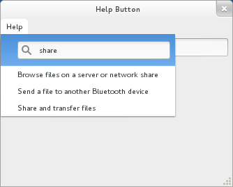
The initial menu items are not specified by Nautilus. The menu is populated with items based on tags in the Mallard help files.
Start typing to search. This is searching on title and desc elements from the GNOME desktop help. The results are filtered to only include pages relevant to Nautilus. The scroll arrows showing momentarily as you type is an unfortunate glitch I hope to iron out.
Click a topic and Yelp opens immediately to that topic.
What’s more, Yelp knows that you arrived there from a menu item you got after searching in a menu, and offers a link at the top to perform a full text search on your search terms.
Earlier today, I gave my talk, Helpful Help, at the Desktop Summit. Unfortunately, there were technical issues with the projector and the video. So nobody saw my slides, and there’s no recording of my talk. My slides are an image-heavy HTML application, but I’ll work on a PDF export for desktopsummit.org. (I am in the business of document tools, after all.) But since there’s no recording, I thought I’d recap the talk in a blog post.
In his keynote session earlier in the morning, Dirk Hohndel related some of his grief in finding documentation. I spent a couple minutes addressing his points. I asked how many in the audience wrote code for GNOME or KDE, and how many of them are professional programmers. Most were. I then asked how many did any documentation work, and how many were professional technical writers. Unsurprisingly, most documentation contributors are not professionals. I have a book’s worth of thoughts on making great documentation with few or no expert writers, but that’s another talk entirely.
I did make the point that single pain points in documentation can leave a worse impression than in software. People don’t usually spend a lot of time looking at the documentation, so if the one experience they had was negative, they’ll have a bad impression, even if the rest of the documentation is stellar. In software, an overall great experience can help users forget about small pain points.
IMG_2291 by Miles Bannan
I went on to tell people to stop thinking about books. There’s an allure to books. Writers aspire to be published. Entire books feel like an accomplishment. And while I think there are places for books, if you approach your help from the book world view, it seriously limits the kind of innovation you can do.
Instead, I encourage people to think in topics.Topics don’t have to be text topics. They don’t have to be in Mallard or DITA or DocBook 5.2. I have three rules for what makes good topic-oriented help: 1) Each topic is self-contained and contains only the information that’s necessary. 2) Topics can be navigated and found using a model that makes sense to the user. Notably, topics need to be able to appear in multiple places in the navigation. 3) Topics are heavily cross-linked so that users can explore if they want to.
With that, I jumped into various hare-brained ideas on things people could be doing with help. Some of these are things I’m actively exploring. Some of them are things I want to explore. Some of them are things I hope others will pick up. I was not giving people solutions. I was trying to plant seeds in people’s minds so they’ll start exploring new ideas in help.
I talked about inlining help. This is the focus of the GLib/GTK+ help API I’ve been working on. See my recent post to gtk-devel-list for details. The idea is to bring the help into the application. Rather than having the help live in a separate viewer, we can make applications fully aware of their help. Help menus and buttons be dynamically populated. Help can be searched directly within the application. We can do super-tooltips much more superly.
I talked about interactive help. I talked about this last year, and it’s a favorite topic of mine. Applications that have a roughly document-like interface lend themselves to doing the help within the interface itself. And when you do that, you can make the help live, so users can explore your application from within the help, rather than using the help passively. The Inkscape tutorials are a great example of this.
I also talked about image and video help. There’s nothing new about using screenshots, and even screencasts are old-hat by now. But they’re still very passive. I talked about how technologies like HTML5 can empower us to create videos that tightly integrate with the text content and the rest of the help.
I then talked about using games as a learning tool. Games are generally not going to be good for on-demand help. But they can be good for exploratory learning. If you make learning fun, people will do it, especially for applications that people consider important to their life or job. I’m not in the habit of promoting Microsoft, but I pointed out Ribbon Hero 2 as a fantastic learning game. Google it.
In every talk I give, I promise the audience two things: They will see XML markup, and they will see pictures of ducks. Without a projector, nobody saw markup or ducks. So go read some Mallard markup, then look at this duck picture:
Whenever possible, I try to test user interfaces with real users. This gives me a much better sense of what people don’t understand, which helps me write better help. I don’t generally have the resources to run concerted usability studies, but even observing a single user can be very enlightening.
After reading Jakub’s “Killing Mode Switch” post, I was concerned about how discoverable this would be. I decided to do a quick test of our current overview. My test subject was a college-educated but non-technical Windows/Office user. I sat her in front of an empty workspace and said “Open the System Monitor application from the Activities overview.” Note that I was very exact in my language, because that’s how we say it in the help. I’m testing our instructions as much as I’m testing the UI. I also intentionally chose an application that you need to scroll to access.
She immediately saw and clicked Activities. She didn’t know about the hot corner. I think that’s OK. A hot corner on a target you click anyway is easily accidentally discovered. She then scrubbed the icons on the dash, reading the tooltips. So there’s a +1 that users readily recognize the dash as where application launchers live. Of course, I didn’t give her an application that’s in the dash, so it wasn’t there.
I watched her mouse and eye/head movement as best I could. She did seem to look off to the right, where the workspace thumbnails live, but she didn’t activate them with the mouse. After looking for a couple seconds, she clicked on Applications. She scanned what was there for a moment, realized she had to scroll, and found and launched System Monitor. I didn’t time it, but it seemed like around ten seconds total.
She said afterwards that she was confused at first because she didn’t realize that Windows and Applications were “tabs” (her word) and that she could click on them. This seems to be a trend. At the Open Help doc sprint, a user didn’t realize she could click the “Account disabled” button next to Password in the Users settings panel. This is even in spite of the fact that she had just read the help instruction telling her to do so. It doesn’t look like a button. It doesn’t look clickable.
Pretty is good. But I fear that some of the prettiness is coming at the cost of discoverability. I realize I’m working with a very small sample size here, but the general notion of affordance of clickability is not new.
I don’t know how discoverable Jakub’s new design will be. The “…” button at least looks clickable, but I don’t know that its meaning is clear. (Phil and I will probably have a long argument about what the heck to call that thing in the help.) I really doubt people will grok the pager dots on the right. In fact, I’m not even sure how they work. But I can only speculate at this point.
I really encourage people to do these kinds of quick tests on real users. Just grab a random person and ask her to do a simple task. It takes a few minutes out of your day. You might be surprised at what people don’t see.
I’ve never been more excited to be a GNOME developer. After years of hard work and planning, GNOME 3 was released yesterday. Check out the Introduction to GNOME from our brand-new help to learn all about it.
GNOME 3 shows the innovation that open source communities can bring. Hundreds of developers, designers, writers, testers, and translators worked hard to deliver an amazing new user experience. Among them are the fantastic people who helped create an all-new help system that rivals anything I’ve seen elsewhere. My release notes list Phil Bull, Jim Campbell, Tiffany Antapolski, Natalia Ruz Leiva, Shaun McCance, Paul Frields, Mike Hill, Aline Bessa, Marina Zhurakhinskaya, and Kelly Sinnott. If I missed anyone, I’m really sorry. It’s hard to keep track of so much awesome.
We tossed out the old manual (who reads those?) and started fresh with topic-oriented help, building on the dynamic Mallard language. The results are amazing. The initial release has 214 pages, carefully organized and cross-linked to help you find the information you need quickly and get back to your life. What is a workspace?Select files by pattern.Enter special characters.
Frederic Peters did amazing work on library.gnome.org so all the new help is available online. But remember that all of this is available from the Help application on your GNOME 3 desktop. The help viewer was completely rewritten for GNOME 3, and I think you’ll really like what we’ve done.
By the way, if you want to meet up and learn about GNOME’s fresh approach to help, you should come to the Open Help Conference this June. At least Phil, Jim, and I will be there, and we’ll be joined by documentation teams from other great open source projects.
We’re not done yet.
Help needs to constantly improve and evolve as we learn more about what our users need. The GNOME documentation team is already hard at work on more pages and revisions to existing pages. We’ll be pushing updates to the help weekly. If you want to get involved, subscribe to our mailing list and send an email to gnome-doc-list@gnome.org.
We also welcome drive-by contributions. One of the really nice things about topic-oriented documents with Mallard is that it’s easy to just write up a page about something without worrying about making revisions to an entire book. If you love using GNOME, a great way to contribute is by writing a short page about an awesome time-saving trick. We’ll put these under Tips & Tricks, and users worldwide will learn something cool because of you.
I’ve been a window shader for a very long time. For those that don’t know, window shading causes the main body of a window to disappear, leaving just the titlebar in place. It’s an alternative to minimizing (GNOME 2, Windows), iconifying (OS X), and hiding (GNOME 3). I shade windows by double-clicking the titlebar. There’s a hidden option to enable this in GNOME 2.
Window shading has been around for a long time. It’s not even exclusive to *nix desktops. It was used in pre-X versions of MacOS. I seem to be one of the few remaining window shaders in the modern desktop world, so I want to share my experience. I’m not trying to debate what’s better, and I’m certainly not demanding that designers cater to my whims. I’m just sharing how I use my desktop.
I have no problems with overlapping windows. In fact, I rely on them. I often read something in one window while writing something in another. Shifting my gaze is much faster than changing windows in a window list. This is important to me, because I do it a lot. I have terrible short-term memory. I can tell you what lot we parked in at Disney World when I was 8, but I can’t tell you what I read five minutes ago. Consequently, I almost never maximize windows. I confess, I really don’t understand maximizing windows on large, wide-screen monitors. (Mine is 1680×1050.) It’s too wide to read. My windows are at their natural size, and that size depends on what’s in them.
But when you have lots of small, overlapping windows, it’s easy to lose track of them. I have a fairly static arrangement of windows. I know my web browser and other document windows cascade from the top left. I know my terminals are flush bottoom. I know my smaller utility windows are somewhere in the middle of the screen. I don’t really think about where the windows are, because I have years of habit ingrained in me. Habit helps me.
When I need to get behind a window, or when I don’t want to look at it, I shade it. I could just as easily minimize it to get it out of my way. There’s no practical difference in the hiding act. The difference comes in when I want that window back. And more often than not, I want it back soon.
Window lists and zoom overviews have little to no spatial resemblence to how your windows are (or were) arranged. But shading leaves your windows where they were, just smaller. Because I have strong window placement habits, I don’t have to hunt for the window I want in some arbitrary list or grid. I go to where the window is. It’s in the same place as I left it. And as a result, I spend almost no time looking for windows.
I’ll probably have to change my habits soon, because modern desktops are moving away from supporting this kind of feature. But with all the innovation that’s happening, I’m hopeful that somebody will come up with a new way of bringing back hidden windows that actually takes advantage of spatial window placement habits.