Quite a lot of things have happened in my life since I last had the occasion to write on this blog…the most important is I moved to Boston last January, to work in the awesome Red Hat Desktop Team. It’s very exciting and inspiring to work together with this great people, and it is even more cool these days when we’re all working hard to delivery the best GNOME 3 experience possible; I think it’s going to be great!
Here’s some of the things I’ve been working on in the last month I want to show you.
Nautilus 3.0
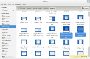
Allan has been doing a great job showing off the mockups for Nautilus 3.0 by the design team; the good news is that now those mockups are mostly implemented in the latest beta tarballs. Here’s how Nautilus from git master looks like
The most outstanding changes are the new streamlined toolbar, a new sidebar design, and the use of “floating” statusbars to reduce the UI chrome. Another important change is that “spatial” mode is now gone for good; we still allow opening new folders in separate windows, but we use a single UI now.
Adwaita
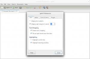
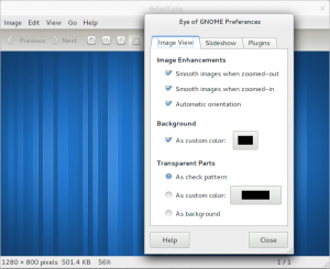
Adwaita is the GNOME 3 default theme, which include themes for GTK+ applications, the window manager, cursors and the background. In the last week I’ve been implementing the gnome design team mockups for the GTK+ theme, and I must say I’m quite pleased with the result. Here are some screenshots of what you get with the current theme (the Nautilus screenshot above uses the new theme too):
The changes are too many to describe them one by one, but notable improvements include toolbars, checkbuttons, radiobuttons, notebook tabs and treeviews.
We’re almost there, April 2011 is around the corner now…


35 comments ↓
this theme is so white that burns my eyes
I’m happy for you but I’m sorry for the mess your team did of Gnome. I’ve been an happy user for 6 years and I recommended it to friends, coworkers and family members, but now I see myself forced to look for a different DE. My only hope now is a huge backslash, so maybe more reasonable people will have a chance to fix things…
I really like this theme! The white background of the notebook tabs should use a different (less light) color though.
Thanks for making the effort. Gnome 3 looks amazing – my only hope is that the distributions don’t botch up the deployment!
It’s a great looking design and you’ve followed it to the letter. Don’t put the keyboard down just yet though… I’ve heard there’s a GnomeOS to create!
This looks promising! What I would do now: Remove all visual clutter (for example merge down all the different shades of grey, remove this thin line on tabs), make the design elements smaller (for example the height of toolbars, the scrollbars, etc…) and clean it up a little (tabs look somehow broken and I dont really like the breadcrumbs).
For the rest: great work!
[…] on how Nautilus 3.0 should look like, but I for one have never seen a screenshot until now. Well, Cosimo posted a screenshot of the new Nautilus 3.0 – currently in […]
Is Fedora really still using the shitty old intra-pixel subpixel rendering?
But spatial mode was a separate entity for a reason. 🙁 I’m afraid this cements my decision to stick with 2.x releases.
Looking very good, I like the clean look.
The bread crumb highlight effect looks a bit out of place with the rest of the theme though.
Also it seems like there is a lot of empty space between the window title and the tabs (e.g. in the gedit preferences)
Really nice!!
Just a minor glitch thought: what about the small grey grey line on nautilus’ bottom? Shouldn’t be out for good?
Thanks for all the work!
What a waste of white space!
Why so much white space around elements?
Why are the elements so big? Look at that buttons!
On one hand the team behind wants to target small size screens and on the other like in this case it wants to target gigantic monitors!
This is great progress. There are a couple of rough edges in the screenshots you’ve posted, but there’s still time to perfect it.
@Gaicombo: If you don’t like the direction of GNOME3, put together a team and fork it. It’s not easy work, and a negative attitude doesn’t make it easier.
The theme looks damn slick! I have a question about themeing though: is it possible to reduce the padding gtk 3 uses? In gtk 2 you could change ythickness and xthickness, but how is it now with css themeing? I personally think the theme has too much vertical padding, especially in the toolbars, so I was wondering how hard it would be to change it. Of course, you probably have reasons for that (or just like it that way) so don’t take it as if I’m bitching, just asking if it’s possible to tweak it.
Looks very good but I see the checkbox and radius buttons misalligned with the labels.
For me I would like much more if the buttons were not so big and the “selected blue hover” wasn’t show until I use the keyboard to move.
Good work.
I have been experiencing Gnome 3.0 thanks mainly to Ferdric Crozat. I must say that there have been great improvements. The theme looks good.
As regards Nautilus, the changes are excellent and very much welcome. As Allan had mentioned you have done extraordinary work. I hope that you will be able to devote time for many more changes in the future.
One thing that I would like to know is whether the there are going to be any changes done for the icon view with the option text besides icon. In the mockups it looked great. If there are going to be changes whether that would happen for Gnome 3.0 or Gnome 3.02 considering that the UI freeze is in place?
[…] 放出了一张还处于开发中的 Nautilus 3.0 Beta 截图,这个新界面就是基于之前 Allan […]
That Nautilus screenshot reminded of this bug:
https://bugzilla.gnome.org/show_bug.cgi?id=615183
On your screenshot, it seems the selected file thumbnails are still obscured by the blue selection overlay.
Am I right? If yes, will it be fixed before April?
Trying this on a netbook is rough. Far too much chrome to the point that opening nautilus only shows a few icons and other windows won’t even work properly because there simply isn’t enough vertical space (system settings). This is partly the theme’s fault and partly the too rigid panel which needs an option to both make it smaller and autohide.
Besides, the theme is a bit derivative of mac’s chrome. Not horrible by any means but a bit boring and definitely chunky (buttons and titlebar, along with padding). The actual sliders are nicely done, however. The size seems appropriate.
I love what you have done with toolbars here. I really do. Judging by Nautilus and Gnome Control Centre, we’re moving to much more helpful toolbars than the conventional (and useless) Save / Open / Copy / Paste thing. I’m hoping Adwaita’s aggressive, task specific styling will help push for change in how developers use certain widgets.
Alas, there are some serious problems with how this theme interacts with text. Those Eye of Gnome preferences pictures show just about everything wrong here. The colour picker is twice the height of its label. With the centre alignment, that forces the label downwards by at least a few pixels compared to the other labels in the UI.
Can you shrink those at all, or is this something EOG should be fixing?
Looks great, except for the massive amount of wasted space. The titlebars are far too big, and there’s way too much padding around elements. This is the main issue I have with GNOME 3 in its current state – I have a 22 inch monitor, yet GNOME 3 manages to make it feel smaller.
[…] Ellenben konkrét képernyőképet eddig nem nagyon láthattunk. Viszont most Cosimo Cecchi blogjában közölt egy képet miképp is néz ki a nem sokára érkező fájlkezelő legfrissebb állapota a […]
New theme is looking good.
But the menu bar should go away. It’s unnecessary.
Thanks Cosimo, really good post.
Just one BIG thing: Adwaita.
I’m not talking about I like it/I don’t.
I talk about a CRAZY waste of space.
Please, try gnome3 on a 10″ netbook and see.
Metacity, buttons, menus, toolbars: way too high!!
scrollbars: way too wide!!
As it is, I cannot switch to gnome3.
Please, oh, please, optimize vertical space.
This is NOT a destructive critic.
Thanks for your job.
You are my GNOME 3 hero, dude. Thank you, thank you, thank you!
Less chrome the better, but we are still having _way_ too much: look at all the screenshots at the title+menu+toolbar+tabs area: what a huge waste of vertical space, for no benefit whatsoever!
This should be the next battleground, merge those areas somehow into one that is no thicker than the title. Checkout what Chrome did, they really get it.
My main issue is with the buttons. Why do we need a gigantic X button to close the application. (Also there is quite a bit of wasted space).
Thanks a bunch for working on this and trying to make things better! I hope you don’t take these opinions as insults to your work but instead as suggestions to make it appeal to a wider audience!
[…] distanza di qualche mese da quella notizia, ecco arrivare un nuovo mockup e un nuovo screenshot di quello che sarà Nautilus 3.0. La bella notizia è che nell’immagine che potete ammirare […]
While I am not too sure about the theme (would have to use it), what I really like is the new Save icon. It’s the first that seems logical to me, it doesn’t show a diskette or a hard drive, but a real world object that is the real-world equivalent to a file system.
[…] meus feeds atrasado no GoogleReader acabei encontrando um post no Cosimo’s blog, em blogs.gnome.org, onde ele falava sobre o Nautilus 3.0 e o tema padrão do Gnome […]
[…] my old feeds in GoogleReader I ran into a post in Cosimo’s blog, in the blogs.gnome.org, where he spoke abou the Nautilus 3.0 and the new default Gnome 3.0 […]
Except for the large amount of wasted space, especially in the titlebars which are way way too big and white, I like it. Buttons are crude and take up too much space.
Well, Adwaita is certainly a step up for the gnome look, but it doesn’t seem to solve many problems that have plagued that look for ever. The first thing i notice is universal lighting or the lack of it to be precise. There is the vertical gradient of the toolbar, and the check/radio buttons that imply that the light source is on top. The buttons on the other hand are completely flat looking and don’t follow the same principle due to their shadows. 2 or even 3 pixel wide shadows with a gradient would do wonders there. The same goes for the scrollbars, as well as the tabs and notebook.
The notebook, besides looking too bright, is also a little bland. A gradient on the notebook surface would allow it to visually pop up from the main window without being too bright. Some thicker and softer shadows would have the same effect. Now that we have location aware widgets, you could try something a little more elaborate with the tabs, like a unified look for example.
Then there are frames and shadows. In some places there are no frames at all (the nautilus scrolled window for example) and in others there are, which is inconsistent. As for the frame shadows themselves, It’s good that you’ve added roundness to them but a 1 px wide shadow looks a little ugly and doesn’t help with lighting.
I think you also have to do something about the Nautilus sidebar. You have the sidebar, the handle and the inside of the nautilus scrolled window, 3 colors in quick succession without any form of frame or shadow differentiating them, it doesn’t look good. An etched out or etched in soft shadow around it would do wonders, and a soft shadow on the scrolled window wouldn’t hurt either.
I hope i didn’t sound overly critical, but i wanted to offer some honest feedback to help you guys improve the visual part of gnome even more.
Thanks for reading, and good luck in your future endeavors 🙂
Just like many other posters here, I find this theme to suffer from terrible waste of space (especially vertically), being too light (it really burns the eyes) but also of an ugly font. I mean, what was wrong with existing default fonts in Gnome 2? They looked polished and professional. The new default font looks flimsy, even pixelated (just look at the screeshots).
Anyway, major issues with space and brightness are probably the worst aspects of the theme.
hi, One big gripe I have with nautilus 3.0 is that the sidebar uses the same color from your theme. Both the sidebar and file view should have their on custom colors.
theming Adwaita is easy, but this has to be the most annoying thing.
and because i cannot change it easily – Nautilus will not match my theme. I think i might downgrade nautlius to Nautilus-elementary until you guys write a proper theme for it, that allows the user to change these 2 variables without having to change your whole theme around to make nautilus look professional.
as is, it looks very shotty compared to gnome2 nautilus
[…] time ago I blogged about a number of improvements which made its way into the GNOME 3.0 theme, thanks to the new GTK3 […]
Leave a Comment