We, as a community, have been making significant improvements to the GNOME 3 experience over the past couple years. With the new shell and new core applications we’ve been working hard to provide you with immediately useful defaults, more powerful ways to find your stuff, simpler and more natural workflows using direct manipulation, universal access, and a more coherent, effective, and beautiful experience.
Unfortunately, our favorite file organizer and manager has been a bit left behind. So, lately, a few of us have been trying to give Nautilus some much needed love, to bring it up to speed.
There are number of fairly high level objectives in this effort. I’ll attempt to describe a few of them. We want to…
Be Immediately Useful
The initial view of the application should present me with things I can take immediate action on. Things that are likely relevant to what I am doing or what I have been doing recently. Something that serves a reminding function for things that I have yet to do. Something that helps me establish context. Something that doesn’t require me to do additional work or navigation every single time it starts.
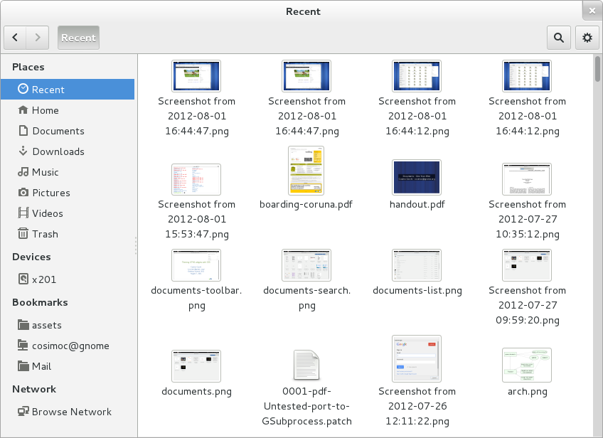
One way to achieve this is by displaying a list of recently created, modified, or used files.
This is what we have, now, in git master and it feels pretty nice. Though we’ll continue to refine and improve.
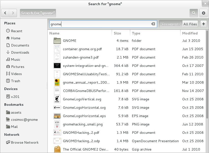
Have a Functional Search
We don’t even need to get fancy. Even a barely functional search would be a huge improvement. If you haven’t noticed, search was completely broken. You either had Tracker search support or you didn’t. If you compiled Nautilus with Tracker support then we would only show you results from the small subset of your files that Tracker was configured to index. If you tried to search a removable USB drive you would see nada search results. If you happened to turn Tracker off we would happily display nothing at all. If you did not compile with Tracker support we would do something amazing like crawl your entire filesystem looking for a filename match every time you updated the search terms, and nothing would be displayed until it was done – something on the order of “a long time.” Remember when I mentioned Nautilus was left behind? Not kidding.
So, yeah, who needs to search in a file manager anyway, right? Um.
Turns out quite a few of you do. And a good number of you want to be able to find your files from the GNOME 3 Activities Overview as well. And this requires there be an application providing those results. Which app should do that?
That’s actually a good question. I think ideally we’d have a number of more specialized applications providing the search results (and viewing experience) for the types of files they handle natively. New applications like Documents, and Photos, and Music. However, something should be providing the fallback for when these applications do not exist or until they exist. I think this application should be the one where you find your files.
So when you think about adding working search to Nautilus you really want to use the emerging GNOME 3 design pattern for search. Something that has been discussed quite a lot recently. Including most recently at the UX Hackfest last week.
This implies a few things. That searching be: fast, performed as you type, have results ordered by relevance, quickly converge on what you want, and allow quick activation of the top hit. This should hopefully reduce or obviate the need for scrolling, intensive visual scanning, unnecessary navigation. Allowing you to quickly grasp what you want and maintain your focus on your ultimate goal rather than a series of intermediate and tedious tasks. A better time.
Have Simpler and More Natural Workflows
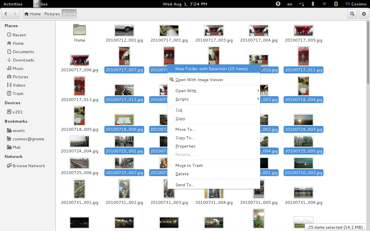
In GNOME 3 we’ve been trying to allow you to work with, manipulate, or act on content directly. Actions that make sense in the situation you happen to be in. Contextual and relevant to the environment. Rather than require you to proactively create the conditions needed for an action, we allow you to select or identify the things you are interested in and then say what you want them to do. For example, I have a set of files I would like to collect, organize to be together. How does that work? Previously, in Nautilus I could identify where I would like this prospective collection to live, perform the action create a New Folder, then go look for content to fill it. What is wrong with that? In some situations that works just fine, especially if you are a “frequent filer.” But it could go wrong. In the case where I had already identified the things I wanted to organize I am forced to leave them, take on an intermediate task in order to set up preconditions for the primary task. What if I am interrupted during this intermediate task? What if I change my mind? Shouldn’t all this stuff just be done for me?
One way we can do better is not rely on our ability to predict the future. We are pretty awful at it most of the time. Exhibit A: How good did we think Prometheus was going to be?
Can we do better? Fortunately, yes. And not just better but faster and more reliably. It is better to do defer decision making and action. Identify the stuff and then select what you want to do with it. So, back to our example where I have a set of files I want to collect or associate. I think it is better to add a new action for the selection that allows me to create a New Folder with Selection. Boom. Done.
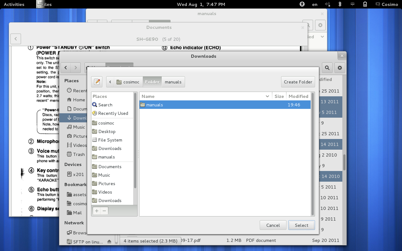
Hold on mister. I’m not done. I wanted to put that new folder somewhere else!
Righto. Got you covered. Let’s add a new action on that Folder called Move To and ask you to just pick where you want it to go. How would that be? I think I heard you said “straightforward, quick, and powerful.” Cool, because all that is in git master. Check it out.
A couple of you just said, “but I wanted to email it not move it!” Ok yeah good point. That is going to require some fixes to the Send To functionality and it is on the roadmap.
Be More Coherent
You may have noticed that the file selection dialog in the example above isn’t very consistent with the patterns used in Nautilus. Good catch. Turns out this has been confusing the heck out of our users for years. The problem seems really obvious once you see the two together. Fortunately we have plans to fix it and make it easier and better for everyone.
Nautilus was a bit of black sheep among the GNOME 3 core applications. It had a design that grew organically over many years and didn’t really seem to fit in any more. In bringing it back up to par we now have things like a much improved and space efficient maximized window state, a more consistent menu layout and behavior, more consistent use of icons, and a more GNOME 3 style pathbar and toolbar.
Be More Effective
We’ve heard the complaints loud and clear. They’ve been ringing out on the mailing lists and piling up in bugzilla. We’ve gotten a little bloated a little too lax in tending the way our application operates by default. The context menus were running out of control and finding the option I wanted was too hard. The list view of files was crowded and noisy and hard to focus on the most important part: the filename. The default icon view started with a small icon, had a very inefficient layout for large icons, and generally sucked at browsing for content. We worked around this in various ways but we should really do better by default. This is work in progress with much more to do but we’re on the way.
Be More Beautiful
Every detail matters. We want every corner of GNOME to be delightful and well cared for. The little things. Like how the calm stability of the sidebar reassures and anchors me. Or how the way automatically updating the name of my computer in the sidebar, when it changes, delights me. Or the way the application allows me to focus on my goal shows me respect. This is what we want.
So how do we get there?
Trading Spaces
Sometimes is just not possible to add new functionality without first making some room. This doesn’t always mean you need to remove something. Nor does it always mean you should remove something. But sometimes you will. This is never done lightly. For Nautilus we spent a long time trying to figure out what is the minimum we’d need to do in order to accomplish the objectives discussed above. It is a very difficult trade off.
But in the end we decided that the responsible thing to do, in order to maintain the high quality of the user experience and the high quality of the code, was to remove a few things.
Extra Pane
This was removed for a couple of reasons. The first reason was that it was undiscoverable. Not all undiscoverable interfaces are bad but this one also stood in the way of providing a better alternative. Even if you never used the Extra Pane you always had useless Move To and Copy To items in the menus. We wanted to create a better Move and Copy workflow and really these items had to go. Once you remove all user facing ways to use the feature you have to ask yourself (as a good maintainer) whether the trade is worth it. Should we keep the feature for which we have a new and better alternative in Nautilus, a very similar and easily enhanced feature available in the Shell side by side view, and a pile of bugs getting no attention in bugzilla? We decided it was better for the project to remove it. This hasn’t pleased everyone but remember we still have some ways to go to make the experience complete.
Compact View
This is a tricky one. A lot of reasons people have been using this view are due to the other two views sucking for various reasons. We want to fix the root problems. We intend to have more effective list views for identifying files by name, more effective grid or icon views for finding files by content, and more effective search for finding anything based on name, textual content, or metadata regardless of where it is. This is consistent with the other core GNOME 3 applications. Working around the default isn’t going to do it.
The role for compact view is unclear. Our research suggests that it is something like: the only view that works for browsing a lot of files at once. This is really hard to reconcile with providing good defaults that just work and having consistency with the file chooser.
The view itself was not without problems and we would rather focus on making icon and list rock. I won’t dwell on the reasons here since they have been discussed at length already.
It was in the way of a better solution.
Type Ahead Find
One of our primary objectives was to add powerful search that is available by just typing. This is a great feature that has been demonstrated to be highly effective and loved by users. Unfortunately, this is in direct conflict with so called Type Ahead Find. What to do? Which is better? Tough call. We think we can serve all the existing use cases of type ahead find and more with our new found search capability. Is it perfect? No. Type ahead find was not without serious problems either. Even after many many years of efforts to improve it.
Problems like how difficult it is to continually scan all the items in the view and yet follow the selected item as it suddenly jumps to new items, or the requirement that you know the exact case sensitive prefix of the file or folder you are looking for, tricky popup search entry placement that covers the floating status bar or data in the item view, unfortunately interactions with the GNOME message tray, strange iteraction with other windows, awkward interactions with scrolling views. etc.
So, What’s Next?
Obviously there is still much more work to do here. As you can see from the Nautilus 3.6 roadmap. We have a ton of new features that I didn’t have time to cover here. This is going to be awesome and, here’s the good news…
You Can Help!
So pitch in. Patches to any of the roadmap item bugs would be greatly appreciated. Don’t hesitate to ask for help on the nautilus mailing list, or on IRC in #nautilus or #gnome-design. Meet you there!

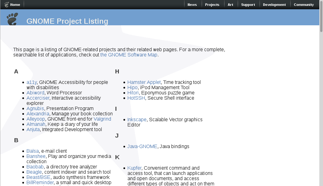 The projects index is out of date and incomplete. Which is understandable since it isn’t dynamically generated and no one maintains it. In order to update it, you need special access to push changes to the large (700 MB) and complicated gnomeweb-wml git module. A bad combination of properties.
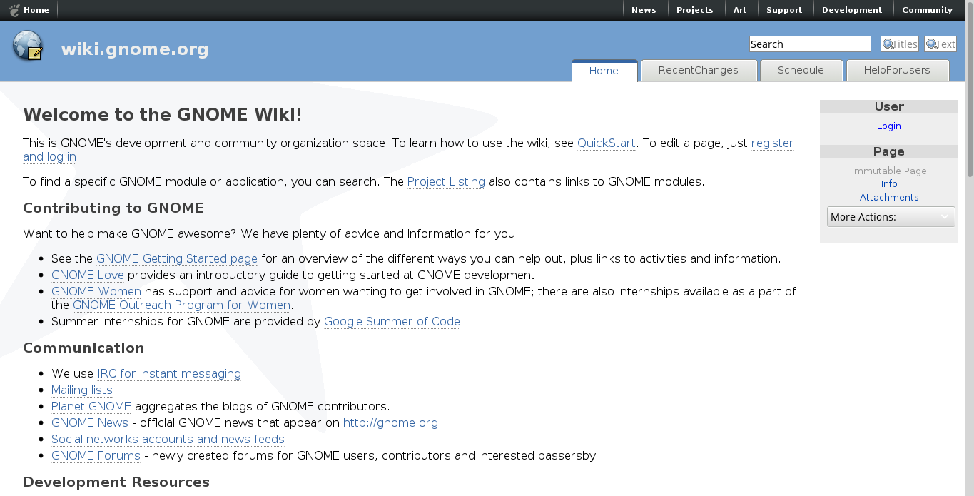
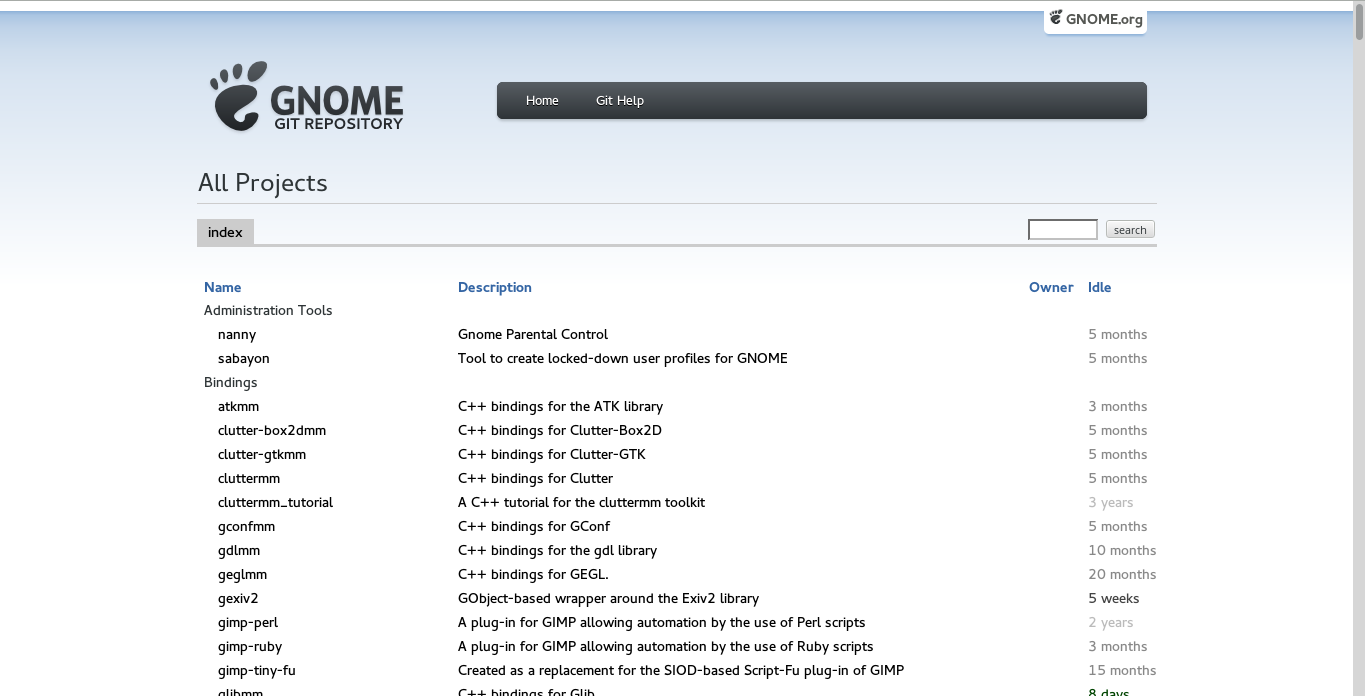 The “All Projects” index on git.gnome.org isn’t really intended to be a user facing project listing. It could be better but it isn’t the face we are hoping to show this new user of yours. Fortunately, the site design template is already up to date and seems to be working pretty well.
 After a couple months of really tedious work I’m happy to say this is pretty much done! With only a few details remaining:


