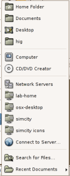
While working on a proposal for desktop defaults for our next version of the Java Desktop System, I’ve been somewhat perturbed by the mess that our concept of “Places” is in.
These screenshots are from Ubuntu Dapper as I’m on my Powerbook at the moment, but IIRC the vanilla community version isn’t significantly different (except for the Documents ‘place’ that Ubuntu has– but we have that in JDS too so that’s part of my problem as well). I have one bookmark and a few network places set up– this is one of my everyday, working desktops, so my experiences are presumably fairly typical.
The user’s first encounter is most likely on the Places menu on the panel:

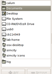
Then when they open a file, they get this collection of Places instead– now their bookmarks are at the bottom, and they can choose from devices that weren’t available on the Places menu:

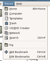
Using nautilus in spatial mode, we get this different content and ordering again– and a third different term for the home folder:

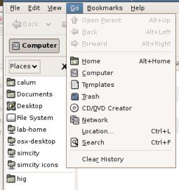
And using nautilus in Browse mode, the Places sidebar and Go menu don’t even agree with each other, let alone anything else:

Now, obviously a wee bit of context sensitivity is appropriate… in the file selector, you’re unlikely to want to open files from the CD Burner or Trash locations for example (although I’d be quite happy to allow opening from Trash– I always get annoyed at OSes that force you to drag things out the trash before you can look at them again). But surely we can do a better job of consistency here overall? My Places are my Places wherever I’m accessing them, and in general I’d expect to see the same ones in the same order.
Or is it just me…?
