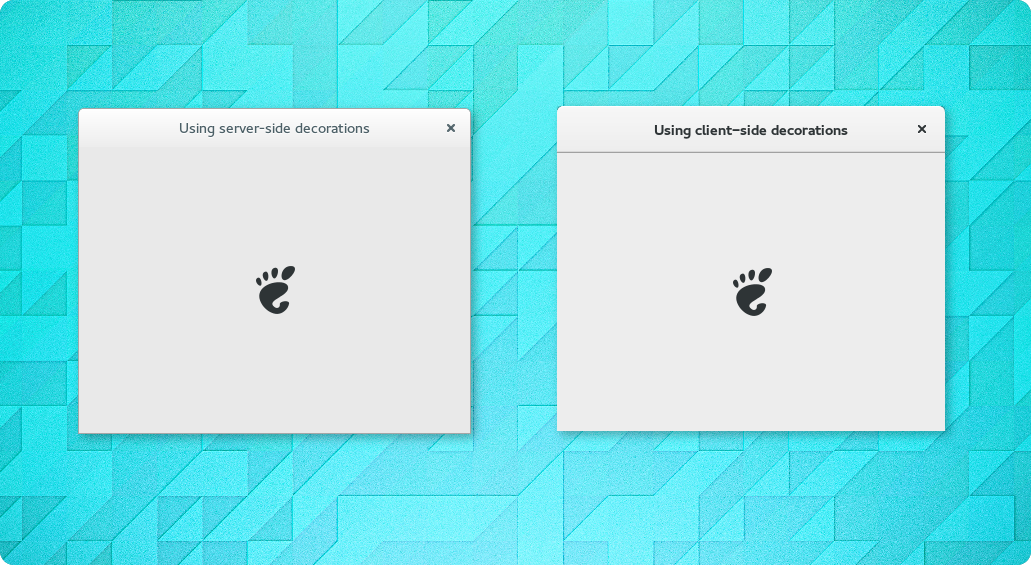
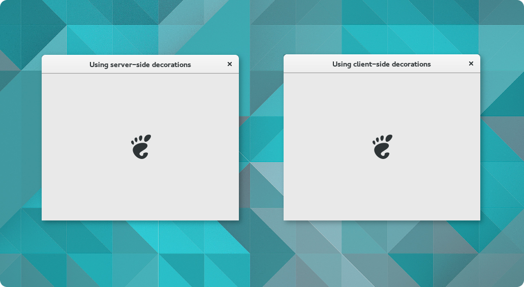
If you have updated to the recently released GNOME development version, you may have noticed that some window decorations look slightly different. Of course it is quite normal for the theme to evolve with the rest of GNOME, but in this case the visual changes are actually the result of some bigger changes under the hood which deserve some more explanation.
It is well-known that GTK+ gained support for client-side decorations a while ago – after all, most GNOME applications were quick in adopting custom titlebars, which have become one of the most distinguished patterns of GNOME 3 applications. However it is less well-known that client-side decorations may also be used for windows with no custom decorations, namely when using GDK’s wayland backend.
Why is this interesting?
It isn’t really. Whether the non-customized decorations are provided by the window manager or by the toolkit is transparent to the application, and there is no reason why users should care either.
Except that on GNOME 3.14, decorations looked like this:
Ouch. There is an all-too-obvious visual difference for something that should be an implementation detail, and the possibility of users encountering both styles in the same session doesn’t help either.
Of course it would be easy to just blame the GNOME design team – after all, while the metacity-1 theme format used by the window manager is hugely different from CSS as used by GTK+, it would still be possible to create a more consistent look from the lowest common denominator of both formats. But if the goal is to have both types of decorations match as closely as possible, using different themes and expecting an already overworked team to put additional work into papering over the differences is hardly the best solution.
Did I mention that the metacity-1 format is also plainly unpleasant?
So from GNOME 3.16 on, the window manager theme will be gone. Instead, window manager decorations will use the same theme information GTK+ uses for its client-side decorations. As you would expect, both types of decorations now look much more consistent as a result:
Besides the improved consistency, using a single theme has some additional benefits:
- users who use a different GTK+ theme no longer need to hunt for a matching window manager theme
- one less (tweak) option that can be a bit hard to explain (“Window decorations. Except not all of them. Oh, and some of the colors may actually come from another theme.”)
- the GNOME design team no longer needs to maintain two different but matching themes
- sharing a theme also means sharing code, we were able to remove a bit over 10,000 lines from mutter
Now it would be dishonest to pretend that there aren’t any downsides – the metacity theme has been around a decade longer than GTK+’s client-side decorations, so it is hardly surprising that there is a greater selection of the former around. And support for window-decorations in 3rd party GTK+ themes is often dodgy, if it exists at all. However with more and more GNOME applications using custom titlebars and the upcoming transition to wayland, it does not get easier to ignore GTK+’s decorations – some broken decorations may be better than all broken decorations, but the correct way forward is of course to fix GTK+ themes. It’s CSS after all, which is much more familiar to most artists than the old format, and quite a bit nicer as well, so here’s hoping that the situation will improve rapidly.
In the meantime, let those of us who stay with the default theme enjoy some nicer-looking decorations for all windows …


This reminds me: the new style windows don’t honor the setting for what to do clicking the title bar, for instance I have it set to’shade’ but they always maximize.
I guess I should go file this as a gtk bug ?
Actually kind of worried to file it, lest it gets bounced with WONTFIX.
At the moment, GTK+ does not have any support for shading windows. There is an open bug report, but I wouldn’t get my hopes too high …
Thanks for the post. One related question, in gnome 3.14, when I snap nautilus to the side (left or right) the opposite border of the app looses the window border shadow and looks ugly. Is this part of the design or a bug?
Using the current development version of GTK+/Adwaita, tiled client-side decorated windows do have shadows. So I’d say your particular issue has been fixed, though there’s still some discussion going on.
I think 3.15 approach is better. I support GNOME. Thank you, Developers!
Does this mean the stock black theme is now usable for gtk2 applications? :O
No, the way the window manager draws decorations does not have any effect on what goes on inside an application.
To have support for dark theme variants in GTK2 applications, that support would need to be added to GTK2 itself and either GTK2 would need to switch to GTK3’s theme format or GTK2 themes would need to support gtkrc-style theme variants. In any case, this is something that will not happen – GTK2 is in maintenance mode, which means that there will be bug fixes, but no feature additions (not to mention API breaks like changing to a different theme format).
As a workaround, you can pick a dark GTK2 theme, but your only realistic hope for real theme variant support is having apps be ported to GTK3.
Does mutter actually draw these with the same code, or are there two different implementations of the same GTK+ theme format now?
The code that determines where a particular element is drawn is very different, but the actual drawing is done entirely by GTK+ (in particular gtk_render_background() and gtk_render_frame()).
Very nice 🙂
Heh, thanks 🙂
How do these work with gtk2 and qt applications? Curious how it affects the look and style of apps like gimp or inkscape?
It doesn’t really affect them at all, the titlebar will just look a little different. From the application’s point of view it’s not in any way different from the user selecting a different window manager theme, or from running in different environments – GNOME, KDE, XFCE etc. all use different window managers that style window decorations differently. If those apps cared about a particular decoration style, they would use client-side decorations …
The rounded corners on the client-side decorations window have a grey border that looks awful. I hope this gets fixed.
That’s actually my fault when I created the images for the post – if you look closely at the screenshots, you will notice that both windows appear focused at the same time (for better comparison). I did this by screenshotting the windows separately (PrintScrn) and then compositing them with the default background in the GIMP – apparently I wasn’t careful enough with the transparent regions in the corners, but this is not how client-side decorated windows appear on the user’s screen.
After this switch the GTK2 decorations are huge more like Windows 7. Is there a way to fix that as this seems to be extensive waste of vertical screen space ?
You can use a different GTK+ theme that is more to your liking, or modify Adwaita to use less whitespace similar to this commit.
I just looked at the screenshots and don’t think that is accurate: actually, the client-side decorations are smaller now and the server-side decrations are as large as they have been since Gnome 3.0 [or at least since ~3.10, when the close buttons were restyled, though I have not checked if that had any effect on the size of the decorations].
(Notably, the Gnome 3.0 decorations were larger than those of most Gnome-2-era decoration themes.)
That is odd – as mentioned in a previous comment, the screenshots are GIMPed to show both windows focused at the same time, but they still use real screenshots of actual windows. The windows actually belong to a small test program, which allows for easy side-by-side comparison of server- and client-side decorations. I’ve just checked again, and the decorations have the same size, which matches the one in the screenshot.
There was a bug in GTK+ for a while, which resulted in (non-custom) client-side decorations being bigger than intended, but server-side decorations were not affected. I don’t know if that bug is still present in GTK+ 3.15.4, maybe it is and you mixed up CSD and SSD? Or maybe you are using a different theme, or an older Adwaita version? I’m afraid that without any further information, all I can say is that it works for me …
great! Anyway, i’m trying gnome 3.15.4 on rawhide and opensuse with gnome:next repo, but gnome-shell fail to boot; gdm fails to boot too. I’m using virtual machines on vmware, do you know what could be the problem? thanks!
No, without any more information it’s impossible to tell – if you manage to get at least to a text login, systemd’s journal provides a good starting point for diagnostics.
Awesome!!
With the recent changes to window decorations, it appears as though it is impossible to theme the min/max/close buttons individually. I suppose the solution would be to add back custrom css classes for the titlebar buttons.
Is there any chance this feature could be added back again?
The issue is outlined here: https://github.com/horst3180/Vertex-theme/issues/50
Custom CSS classes for individual buttons are easy to add, but I’d like to see them in GTK+ first – after all, the whole point is minimizing the differences. For what it’s worth, it looks like a perfectly reasonable addition to me – it’s a well-established pattern, not least because both Mac OS and Windows still use it to this day, so we should enable theme authors to use it.
Somehow related, we should fix the missing :first-child, :last-child pseudo classes in mutter – it’s not trivial, but it would allow styles like the linked buttons used by earlier Adwaita versions, and GTK+ itself already handles them correctly. You would still want custom CSS classes based on the button function though, as the button order is under user control – for instance users that move buttons to the left (“close,maximize,minimize:” instead of “:minimize,maximize,close”) should not get a yellow close button …
That’s really nice to hear, thank you for your response.
I found out that it’s actually really simple to add those classes to GTK+ and it would really open up some nice options for theme authors.
Also I would like to thank you for your work on this. It’s much nicer to theme the window decorations now 🙂