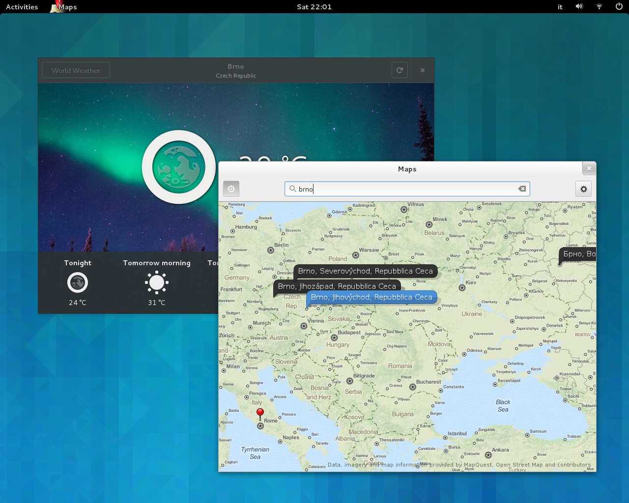
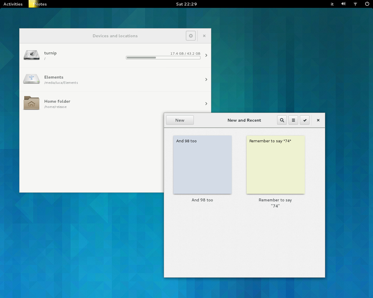
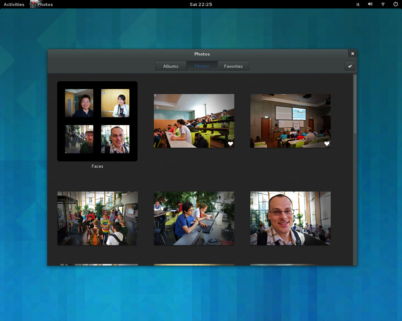
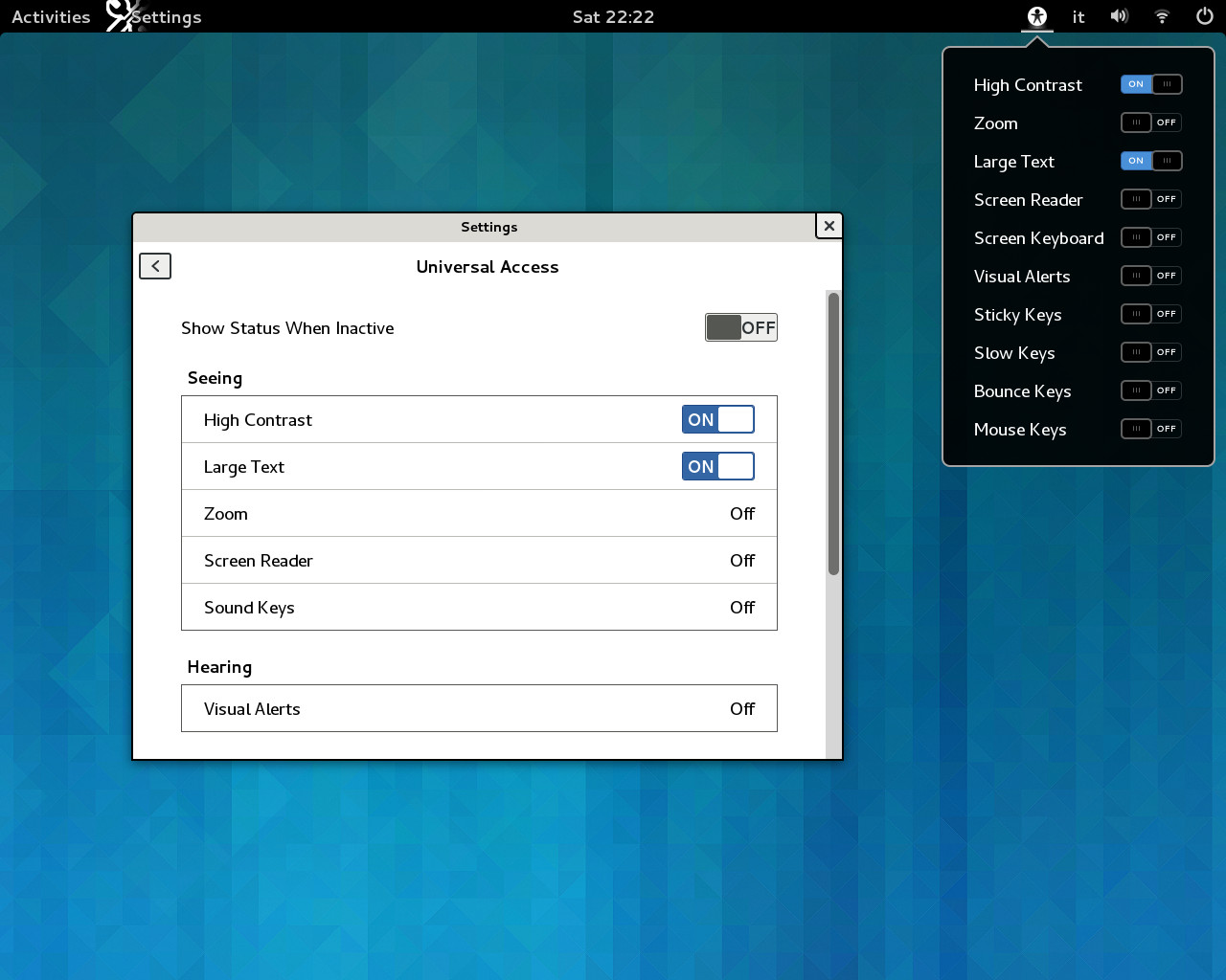
For your visual pleasure, here are some fresh screenshots from GNOME 3.9.5. Enjoy 🙂
Weather and Maps
Disk Usage and Notes
Photos
Universal Access
System Monitor and Nautilus and…
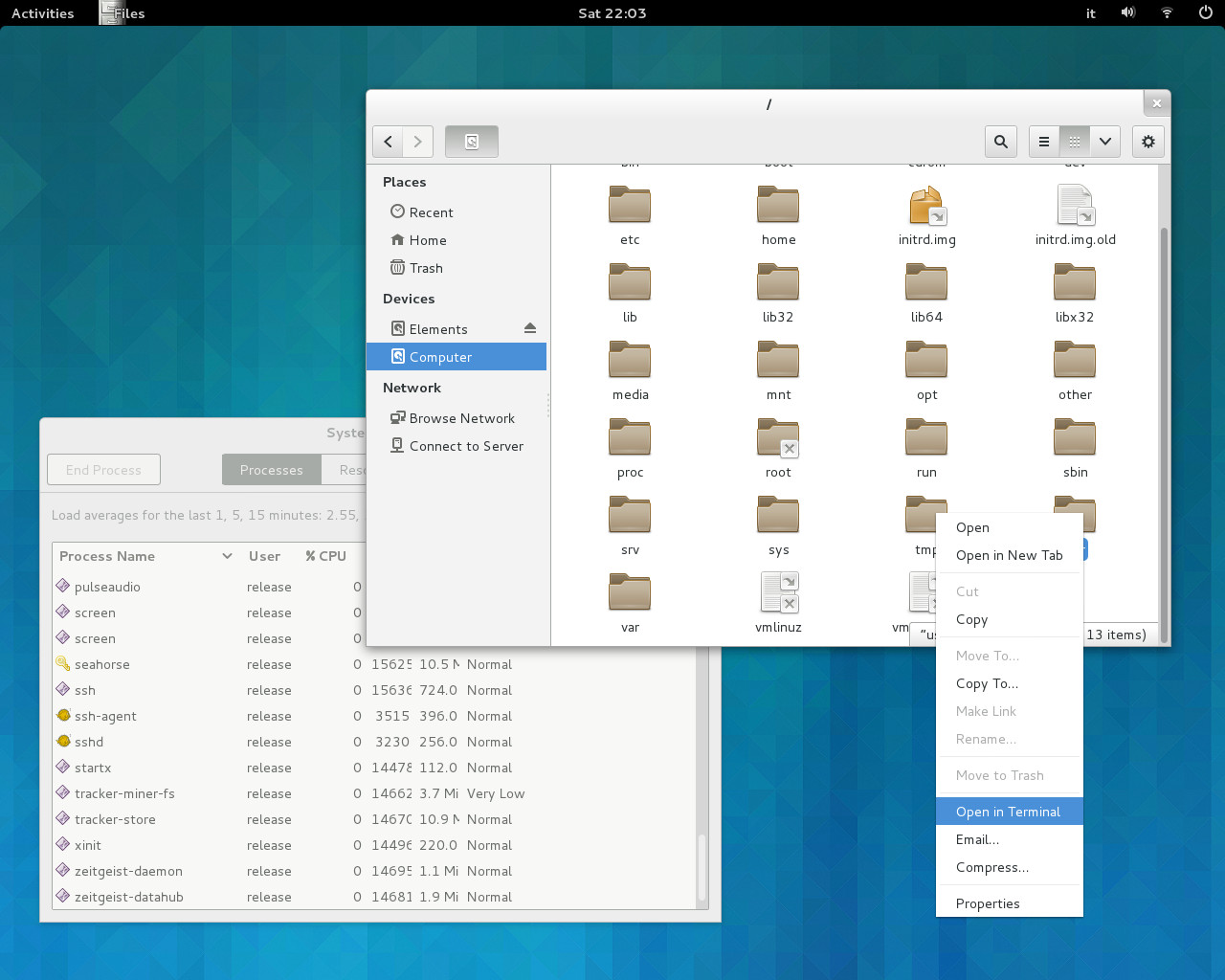
For your visual pleasure, here are some fresh screenshots from GNOME 3.9.5. Enjoy 🙂


GNOMEtters & GNOMErs,
the latest development update before our planned freezes and beta release for GNOME 3.1o is finally available.
I know, better and bigger things are now happening in Brno, but allow me to introduce you one or two changes. This is the first release including GStreamer 1.1 with feature additions for the API and ABI of our favourite multimedia framework. We have an updated geolocalization framework, with a rewritten geocode-glib and the initial release of geoclue2. This means… Yes, GNOME Maps is finally available for your pleasure and testing.
Other noticeable changes include support to RFKill for Linux systems, no more password prompt for Google calendars, redesign for Universal Access panel in System Settings and the ability for all your mortal beings to win a GNOME chess game 😉
More details about all changes and news are available here:
The GNOME 3.9.5 release itself is available here:
JHBuild moduleset to compile GNOME 3.9.5 by hand are available here:
Next stop mark is August 22, with our beta release.
WARNING! WARNING! WARNING!
This release is a snapshot of early development code. Although it is buildable and usable, it is primarily intended for testing and hacking purposes. GNOME uses odd minor version numbers to indicate development status.
For more information about 3.9, the full schedule, the official module lists and the proposed module lists, please see our colourful 3.9 page: http://www.gnome.org/start/unstable
For a quick overview of the GNOME schedule, please see http://wiki.gnome.org/Schedule
——–
Happy coding and testing,
Luca, in the behalf or release team.
As you may know, a little ribellion is rampaging in GNOME. Some people (mostly “simple” users) are complaining against GNOME contributors (mostly developers and designers) about properties and preferences available on new Power panel in System Settings. Probably this will not be the only one change that will shock you. Do you want another example? Well, in GNOME 3.0 you’ll have to place an image file in ~/Pictures if you want to use it as background¹ or use Set as Background feature provided, for instance, by Image Viewer.
There will be big changes. Last week I got a short talk about new stuff in GNOME 3 and my opening slide was: Mantra: “We are going to break your desktop…”
I’m sure GNOME designers and developers are doing their best. I suppose it’s not simple achieve “design a self-teaching interface for beginners, and an efficient interface for advanced users, but optimize for intermediates“. But I also think GNOME userbase needs a little assurance about future directions. We are not developing GNOME for an ideal and stretched user, but for actual people.
So there are two open questions (to everyone) that could be good to answer:
I suppose the best way to gain users’ confidence is avoid to shut up like a clam and show more openness to any input and/or need. On the other side, remember that open source doesn’t mean “you can ask, you will obtain”.
… or… you can Use the Force! 😀
[1] basically, the Background settings panel lacks an “Add” button
[2] GNOME 3.34 == GNOME 4.0, I’m sure
I know what you’re thinking: “Did he fire six shots, or only five?” Well, to tell you the truth, in all this excitement, I’ve kinda lost track myself.
It seems that Ubuntu 11.04 will switch from Rhythmbox to Banshee as default music player¹. Checking on gobby.ubuntu.com I wasn’t able to find any reference to reasons for this chaneg, but just a simple “default music player -> banshee would be the preferred option for this cycle” and a list of issues that could be blocker.
So, let me put the following directly on Planet Ubuntu, hoping to add more elements
#1 Could please someone explain me the reason for this (and no, “Banshee is better” is not a reason, it’s a cheer)?
#2 Did you considered – at least – the following issues in Banshee ?
So, sorry to disappoint you, sorry if this post will start a Rhythmbox vs Banshee Holy War, but my true feeling is currently Rhyhmbox is more consistent with the whole GNOME/Ubuntu desktop as _default_ music player application. I’m not saying is better tout court, just is better as default application.
Coherence matters. This should be your karma 🙂
PS next Holy War: Evolution vs Thunderbird… stay tuned!
[1] as well as default application to access Ubuntu One Music Store, of course.
O mia bela Madunina che te brillet de lontan
tuta d’ora e piscinina, ti te dominet Milan
A week after the workshop at SMAU 2010 Milano I’m finally rested and ready to write something about it.
A full week to restore? Well, not exacly. We (me and Flavia Weisghizzi) also did a meeting in Siena at University, a talk at LinuxDay in Rome, and, of course, we have made up for delay in our works 🙂 So, let’s start from the latter.
LinuxDay, as usual, is a great experience. You can meet fantastic people and share ideas. Our talk was about new stuff in Ubuntu 10.10; the event was at Math Department of La Sapienza University in Rome and… yes, Dalton Maag was right, Greek glyphs in new font was really appreciated by mathematicians.
Siena… wow, what a day. Morning was literally enlightened by Prof. Renzo Davoli and his great talk about Free Software in Free University¹. In the afternoon new edition of our book about Ubuntu was presented, then there was an “exhibition” of some FLOSS project to the public in rectorship yard. Flavia was in Ubuntu stand with Paolo Sammicheli (giving branded CDs and lanyard for free… we need some GNOME marketing stuff too), I was at GNOME stand, explaning to interested people how GNOME Shell (will) works. Oh, KDE guys are awesome too 🙂
And now SMAU. Do you remember penguin gang in Madagascar movie? Good, we were something like this, penguins in sub-tropical Africa 😀 SMAU is an acronym for “Salone Macchine e Attrezzature per l’Ufficio” (showroom for office machinery and equipment) and its first edition was in 1964. Nowadays is an expo for any technologically related stuff: software (yes, the usual big, proprietary names), hardware (PC devices, but also cars), web, marketing. Penguins, yes, but strongly resolute. So we did a showcase of what Ubuntu can offer to business, we explained what Ubuntu is and why it’s different from other OSes and/or distros, we suggested people they can use Ubuntu in their own IT infrastructure, but also provide service or software. Thanks to Canonical, thanks to community. This is maybe the “magic” allowing Ubuntu to be a valuable solution: a great and skilled community² together with a cool and smart company providing a free and libre OS, explosive mix for desktop and server in business.
Two final side notes:
[1] footnote: here in Italy the post-secondary education (as well as any grade of education) is a public affair, in other words an institution of political society; wikipedia says “universities are supported by state funding so that students do not have to pay much for tuition”, but the actual issue and state is far more complex then this.
[2] not only Ubuntu community, but also Debian and upstream
[3] don’t blame the messenger (for the bad news) 😛 oh, this was before Unity on desktop…
Wow, this is really unexpected. Next week me and Flavia Weisghizzi will have a workshop about Ubuntu and business at SMAU 2010 in Milan, Italy and… it seems that seats are running out. So, if you like to join us, make sure to be quick 🙂
SMAU could be a hard audience for open source, at least from a community point of view. We’re ready to talk and speak and slide about FLOSS, women in FLOSS, open formats, Firefox, Webkit, GNOME, Ubuntu, and even KDE or Fedora 😉 But usually our audience is people having interest in Linux on their own desktop. We don’t make business, we don’t sell products, we don’t set up servers, we don’t manage large deployments.
We can just state “ehi, it works and you can find your own marketplace in this universe“. I think propose GNOME/Ubuntu to non-nerd people will be a great and stimulating challenge for my own communication skills
Of course, as you know, sharing is caring, so… if you have some good idea or topic to explore, let us know.
PS a message for the crew: Lapo and Cosimo you do have to be in Siena on Friday 22 October 🙂
PPS see also #smau10Mi
Question: allowing metacity/mutter/compiz/other to raise target window while d’n’ding will infringe some Apple Inc. legal stuff?? 😀
If not, couldn’t it be a cooool addition for 3.0? Let’s imagine: you start the drag action, dwell on (partially hidden) target, the window manager raise the target, you can drop anywhere in the target.
PS tip of the day for new GNOMErs: you can do something like this using the window list (aka taskbar) as intermediate target.
Exhibit #1 — screenshot of the page with new color palette for Ubuntu branding, taken from the PDF available here.
Exhibit #2 — Same as above, edited in GIMP to use colors reported as HEX value.
Exhibit #3 — Same screenshot, similar editing in GIMP, but using CMYK values.
Doubt: which one is the correct one?? 😉
Notes:
Started reading the new Brand Identity Guidelines for Ubuntu (available here).
Page 1… Wait!
“Not empty words or snappy jingles but something – a conviction that access to information should be fast, sophisticated, safe, reliable and entirely free. We stand for the very best operating system in the world, created by the expert few for the global many.”
Hmmm… Am I a member of expert few or global many?!?! I need an identity 😉
Well, an actual expert in Ubuntu world could be Flavia Weisghizzi, our (ubuntu-it) lovely press agent. Today she was on video at Rai3, talking about Ubuntu 10.04 release. If you are able to understand spoken Italian language, follow the link below, if not… maybe we’ll add subtitles 🙂
It seems that latest murrine engine switched from the lovely disclosure triangles for treeview and GtkExpander to old-school (and IMHO misleading) +/- button.
If you really want back triangles you could:
And now… the snippet!
style "expander-fix" = "default" {
engine "" {}
}class "GtkExpander" style "expander-fix"
class "GtkTreeView" style "expander-fix"
class "GtkCTree" style "expander-fix"
PS Yes, disclosure triangles are really apple-ish, but when rationally used they seem really effective.