Jimmac posted a very interesting journal entry about “more features” and a comparison with remote controls. I thought about it a bit and started typing a comment to his blog, but as it grew longer and longer I decided to move it here so that I have a bit more space…
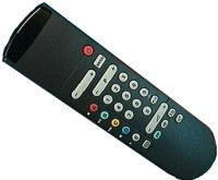
This nice comparison with a remote control made me think about how I use mine. The device that controls my TV (and VCR) has a little flip hiding the “advanced” buttons. I do not have a photo of my remote control, but I found one that is reasonably similar. The top part until the red power button can be opened to reveal more buttons.

The basic buttons such as channel selection, volume and start/stop for the VCR are always visible. If you lift the flip, you get extra buttons for selecting input sources (e.g., DVD player or camera) or outputs, changing the parameters of the display and other exotic stuff. As it turns out, two of the “advanced” buttons on my remote control are as worn out as the channel and volume selection buttons that are among the “normal” buttons. So I am very glad that these buttons exist, otherwise the device would have been far less useful to me. On the other hand, I understand that they are hidden under a flip because some other people (whether they are a majority or a minority is irrelevant) would probably never use them. Even myself, I do not need to see all buttons all the time.
The comparison with this little device that I use almost every day is very interesting to me. And I take some lessons from it: the designers of this device could not predict which buttons I would use most frequently. They modeled this device for a slightly different class of users, yet I enjoy using it because the “advanced” buttons that I need are still within reach when I need them.
In case you cannot guess where I’m heading yet, let me add that the “advanced” buttons are not visible by default so that they do not confuse those who do not need them, but they are easily discoverable and once you get to them, they look and behave exactly like the other buttons. I do not need to open my TV and flip a few DIP switches to get to the advanced options. Translated in the GNOME or GIMP world, this means that I would have a default set of features that I can play with but also some advanced settings that are easily accessible from the application without having to resort to some other obscure tool such as a gconf editor.
I do not really need to have “everything at my fingertips” and be confused by huge configuration dialogs for every little feature. In fact, I prefer to have the less frequently used options hidden away, as long as there is an easy way to access them whenever I need them. It is essential for these advanced options and features to be discoverable, so the dialog that contains the basic options should give a visible hint that more stuff exists but is hidden (using an expander for the dialog or an “advanced options” button or whatever).
Also, even if I do not use some of the other “advanced” buttons on the remote control, I do not think that I would have bought that TV set if I had not seen that these options were available.
Update: moved the image and its description up a bit.