GUADEC Documentation Workshop

Milo and I will be running an all-day documentation workshop during the GUADEC pre-conference on Tuesday, July 27th. This is an exciting opportunity for you to work on our documentation, take part in collaborative planning, and learn best practices from experienced documentation writers. This is an unstructured workshop with lots of one-on-one guidance. You do not have to attend all day. Come when you like and leave when you’re done.

The workshop addresses both user and developer documentation. We will have a list of topics for both. Choose a topic that interests you to plan, write, and review. Or bring in your own application or library to document. We will help you plan effective content, write clearly and concisely, and review what you’ve written to make sure it meets your audience’s needs.

Documentation is important to the success of a free software project. I hope you’ll join us and learn how you can provide better documentation.

Better Yelp Bookmarks

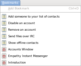
Last week, I revamped Yelp’s bookmarks. Like most other things in Yelp 3, bookmarks are now handled per-document. So when you’re viewing the Empathy help, you don’t see a bunch of bookmarks for Banshee and Tomboy and Brasero. Bookmarks are stored with their title and page type, so we can show the page type icon. We also sort by the page type first, as we do for quick search.

Yelp's Bookmarks Menu

In this screenshot, Add Bookmark is insensitive because I happen to be viewing the page “Empathy Instant Messenger”, which is already bookmarked. It doesn’t make sense to bookmark the same page twice. When you want to bookmark a page, you can either use the menu item, or you can use the icon embedded into the location entry.

Add Bookmark Icon in the Location Entry

And taking a cue from Epiphany, the history and quick-search drop-downs show you which pages you’ve already bookmarked.

Bookmarked Entries in Quick Search

I had to steal Epiphany’s icon for this and install it along with Yelp’s other icons. I was surprised to find that it isn’t a standard icon. I think more applications should mark your bookmarked items when searching.

Mallard API References

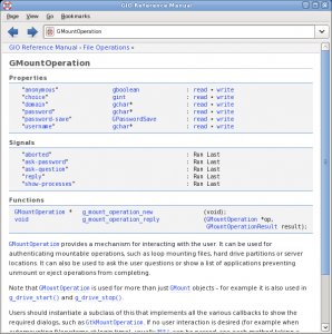
GIO docs in Mallard in Yelp

This is the GIO API reference, generated by gtk-doc, converted to Mallard, and displayed in Yelp 3. Yelp is a surprisingly nice API documentation viewer.

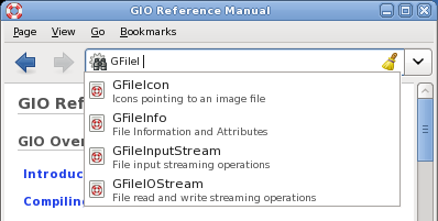
Update: If you use Devhelp a lot, you probably use the Search tab to get to symbols quickly. We’ve got that covered. The quick search feature in Yelp lets you search as you type on page titles and descriptions.

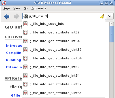
If you type multiple words separated by spaces, Yelp ANDs them. This is really handy for narrowing the results without having to type a perfectly matched string.

Big Blue Button

I was invited to demo Mallard at a DITA Help Subcommittee meeting. They hold their meetings with GoToMeeting, a conferencing and desktop-sharing tool. Unfortunately, GoToMeeting only supports Windows and Mac. That’s a problem for me, because the only thing on my desk is Fedora. I searched a bit and stumbled across BigBlueButton, an open source system with all the bells and whistles of the proprietary ones. The DITA folks were nice enough to use BigBlueButton to talk to me.

There are some quirks. Sometimes the audio is choppy or it drops out. People said my desktop was hard to read unless I massively upped the font size. Some of these issues may just be because we used the demo server, which apparently doesn’t have the best deployment. The BigBlueButton developers, however, were extremely helpful. And they’re actively working on the audio issues.

So even with the quirks, and even though I had to install Flash, using BigBlueButton was a really nice experience. It’s left me wanting something more whenever I have to do IRC meetings. IRC meetings are horribly low-bandwidth, especially for collaborative planning. If I could actually talk to people, and show them what Yelp is doing on my desktop, I think we could be a lot more productive. It’s not quite as good as face time, but it’s a lot better than IRC.

I wonder how we could make awesome collaborative tools like this available to our teams in Gnome. Could we run a BigBlueButton server? Is Flash a non-starter for that? What can Empathy do for us? I know I can have a voice chat and share my desktop with someone, but what about a group of someones? Thoughts?

Faceted Navigation

Ever since Matthew Ellison’s talk at the WritersUA conference, I’ve been thinking a lot about faceted navigation. This is a navigational design where you narrow your focus based on certain criteria. A recent example I’ve encountered a lot lately is in searching for real estate. You can narrow your results by how many bedrooms or a price range. Car sales sites might let you narrow based on color or type of car.

What I always try to do with Mallard is make it as simple as possible to provide rich navigation to help users. It’s not enough to be able to slap some pages on the web; any wiki can do that. The goal is to create something that encourages writers to write and organize well.

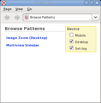
I wanted to explore simple and Mallardesque ways of doing faceted navigation, but it just didn’t make sense for any of the application help documents we’ve been doing. Along came the HIG. Our usability experts want to create a new pattern library to augment our design guidelines, and I decided to explore how well Mallard would fit. This, I realized, was my chance to try faceted navigation.

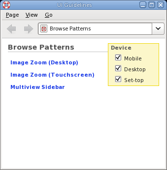
In this simple example, there is one facet with three choices. This is all defined using a simple Mallard extension format in the page file. The topics then declare which facet items they’re relevant for. Deselect ‘Mobile’ and you’ll see this:

This is all very rough at the moment, but it’s interesting. To me, anyway. With enhancements like faceted navigation, I think Mallard would be an excellent base for some new topic-oriented developer guides, such as the following:

  • UI Guidelines and Pattern Library
  • UA Guidelines and Templates
  • Accessibility Guidelines
  • Hacking Intros and Howtos

I’m interested to hear people’s thoughts on this.

Yelp Editor Mode

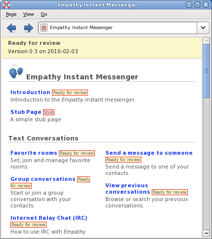
Phil asks, Phil gets. Yelp has an editor mode, which looks like this:

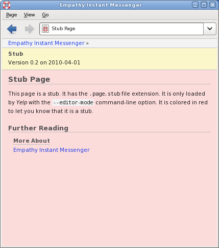
In editor mode, Yelp shows a revisioon banner along the top, as well as revision badges next to link boxes. It also shows editorial comments, though that’s not in this screenshot. Also notice the “Stub Page”. This comes from a file with the .page.stub extension, instead of the regular .page extension. This was an idea Phil had to help us stub out extension points in documents when we write them. Yelp only shows stub pages in editor mode, and it gives them a red background so you know they’re stubs:

And, by the way, this is no longer yelp-3-0. This is master.

Mental Telepathy

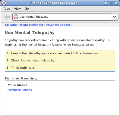
When Jim Campbell and I presented Mallard at the WritersUA conference last week, we wanted to show off how easily you could drop a page into a directory and have it picked up by the dynamic linking system. So Jim created a help page for the (sadly fictitious) “Mental Telepathy” plugin for Empathy. We could just drag it into a folder and restart Yelp, and people would ooh and aah.

This page is too good not to share, so here’s a screenshot:

I hope to see this feature ready by 3.0.

WritersUA Conference

I attended the WritersUA conference this week. This is a major event for people who work on user assistance. Unfortunately, it’s usually full of commercial types, with no representation from the free software world. Jim Campbell and I decided to go show off Mallard and let people know about all the cool things happening in open source documentation.

It was interesting to me to see the cultural differences between commercial UA efforts and the communities of volunteers that I’m used to. I can’t tell you how many times I heard the phrase “business case”. I don’t make business cases. I help users. With some very notable exceptions, most of the people there seemed to want to do their jobs and go home. They’re not interested in looking at new technologies unless it’s something they can buy.

Here’s a few highlights of the things I attended:

Developing Documentation for Open Source Environments

Joe ‘Zonker’ Brockmeier gave a presentation about documentation in open source projects. My head-nodding muscles got tired by the end of the talk. I didn’t take away any great insights, but it was nice to hear that the sorts of challenges we face in GNOME are faced by other teams as well.

Joe presents very well, and I think he did a good job of explaining things to an audience of non-open-source people. I hope some of the audience walked away with a better appreciation of the challenges we face and the innovative solutions we come up with as a result.

Joe also pulled me up to give a quick introduction to Mallard during his presentation. I think that went over pretty well. There were a lot of audience questions, so people are interested.

Accessibility Table

The WritersUA conference has topic-oriented tables for lunch. There are signs on each table giving a discussion topic, and you sit at a table for a topic that interests you. There were a few that interested me, but I decided to sit at the accessibility table.

Alone. There was nobody else there. But I decided to sit there anyway, as a sign of support and solidarity for something I think is very important. Halfway through my lunch, I was finally joined by a guy from Microsoft. That was an interesting conversation.

Mallard Showcase

Jim and I presented Mallard in the peer showcase. There were 23 tables, each showing off some technology, technique, or experience. We got very positive reactions from everybody that came to the table, and a lot of really good questions and ideas.

Unfortunately, most people didn’t come to our table. I think they weren’t interested in a technology showcase that didn’t directly affect their jobs. I understand that their employers are expecting them to come back with a list of recommendations and vendors, and we didn’t fit into that. But exploring new ideas, whether immediately relevant or not, just seems natural to me. It’s what you do when you’re passionate about something.

I also got a really nice compliment during the showcase. One of the attendees who is an expert on readable page layouts said the presentation in Yelp was really good. She liked the subtle use of colors and icons to set off parts of the page without being overbearing. She did call it “a bit unorthodox”, but she liked it. I’m OK with being unorthodox, as long as users are happy.

Turning Search into Find

Matthew Ellison gave a great presentation about how users find information, and how we can improve our search systems to better match what they want. He pointed to a study that showed that search is actually a less effective way of finding information, but that it’s what users prefer to do anyway.

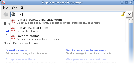
He started off talking about Google’s “suggest” feature, where it shows a list of suggestions as you type in the search field. He thought this was a great feature, and that help systems should do it. I agreed. Fortunately, I had my laptop and emacs close at hand, so I spent the remainder of the talk adding auto-completion on page titles and descriptions to Yelp. Obligatory screenshot:
He also talked about narrowing search results with “facets”. This is a fancy term for the types of selection criteria you often see on shopping sites. An online shoe store, for instance, might allow you to specify size, color, and style, and narrow your results based on that. He suggested using this in help. You could narrow your results based on audience (system administrator) or type of page (troubleshooting, task, overview). This is probably overkill for most application help, but it’s an interesting idea to pursue for larger documents. It could be useful, for example, for the next-generation HIG.

Closing Session

The closing session was a panel of four professionals who gave predictions on various topics. One of the predictions was that we’ll see more help built into applications, using unobtrusive popup help. She said they just needed the tool vendors to make it easy for them. Funny, I was working on a framework for doing exactly that in GTK+ just last month. And I’m planning on talking about it at GUADEC. We don’t wait for vendors. We write our own destiny.

Another panelist suggested that documentation will be increasingly machine translated. While it might not give excellent results, the results may be good enough to justify the savings. She also said that you have no quality control with “crowdsourcing” your translations.

We know better. While proprietary software companies have to make business cases to justify the costs of translating into six languages, we get communities of enthusiastic users translating our software into over 80 languages. And we know how to prevent it from being anarchy. I’ve said before that I believe that GNOME has the best translation teams in the world. I’d lay down money that our translations would meet or excede the quality of those from a proprietary company if sent to an independant reviewer.

In fact, difficulties with translations was a common topic at the conference. A lot of companies are still struggling with managing translations when documents get updated. This is a solved problem to me. Somebody from Transifex or any of the other awesome open source translation tools needs to go next year to show these people what they’re missing.

Next Year

As for me, I’m planning on attending next year and continuing to bridge the gap. We have a lot of really awesome tools and ideas that other people don’t know about. And they have real-world experience, often with real data, that we could learn from.

The conference organizer, Joe Welinski, offered to help me co-host an open source event at next year’s WritersUA. I’m seriously considering running the OpenSourceUA conference the weekend leading into WritersUA. Hopefully at least a few of the WritersUA attendees will be interested enough to come a day or two early. There are no firm plans yet, but I’ll keep people posted.
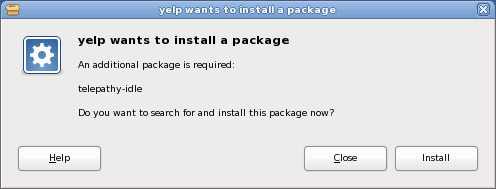
Yelp and PackageKit

Mallard was designed from the beginning to make it easy for plugins to add pages into application help documents. This works really well in a lot of cases, but sometimes you want to mention extra functionality even when the plugin isn’t installed. And sometimes, extra functionality is provided by plugins to backend frameworks. A GStreamer plugin isn’t going to install Banshee help files, and a Telepathy plugin isn’t going to install Empathy help files.

So we have pages in the Empathy help that talk about using IRC. To use IRC in Empathy, you have to have telepathy-idle installed, and it turns out that some distros don’t install it by default. If the help just blindly assumes it’s installed, it just leaves the user confused. So we addressed this by adding a note like this:

This is somewhat helpful. The user at least knows why all those IRC options aren’t showing up. If he’s savvy, he’ll open his package manager and be chatting in no time. If not, he at least has something to Google for. But why not make it easier?

Click the link and you get this:

This is not a mockup. This is yelp-3-0. And it rocks.

More Yelp 3.0 Location Entry

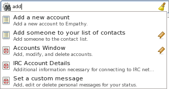
I posted before about the magic search+location entry I’m working on for Yelp. The general goal is to reduce Yelp’s interface to the smallest number of elements possible. The drop-down is very terse, though, and doesn’t give you a lot of information.

One of the things I really like about Mallard guide pages is that they present topics to you with more verbose text descriptions. This allows readers to scan titles quickly, while still letting them check the description for assurance before committing to a click. I wanted to bring that to the location dropdown.

Another problem is that the search entries in the dropdown gave no indication of where they’re searching. For 3.0, we want to have searches be per-document by default, with a link to search the entire help system instead. This would give you two entries in your history that look exactly alike, but return different search results.

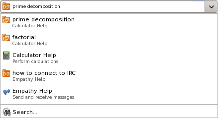
So I played around with using two-line entries in the drop-down. For normal page entries, this is the same title and description you would see if it were on a guide page. For search entries, you see the search terms and where it’s searching.

Obligatory screenshot:

Creative Commons Attribution 3.0 United States
This work by Shaun McCance is licensed under a Creative Commons Attribution 3.0 United States.