
Being a compositor and a compositing window manager, the most important aspect Mutter and GNOME Shell is to paint pixels to your monitors with relevant content. A large part of this content is provided by applications themselves, but many elements still need to be rendered on top of them.
Over the past few years, Mutter’s codebase has slowly but steadily been refactored, cleaned up, reorganized, and modernized. This includes the internal copies of Clutter and Cogl. With the beginning of the GNOME 40 development cycle, it all converged in a specially large and exciting set of changes which we’ll be talking about in this article.
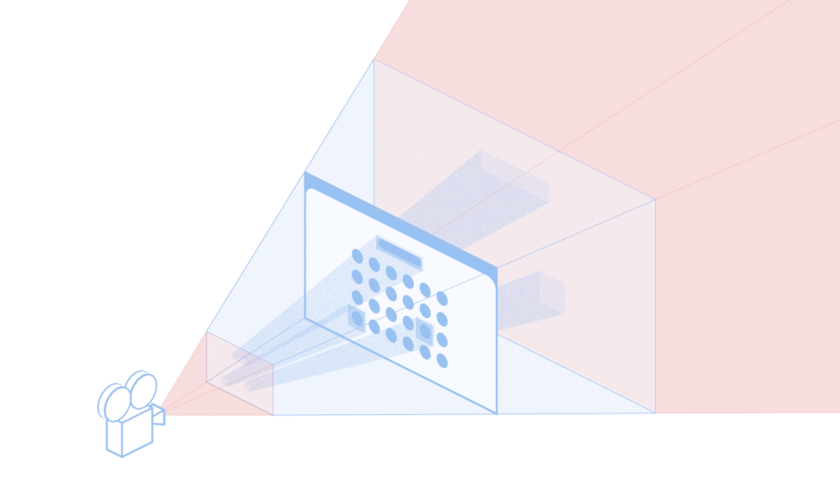
Camera

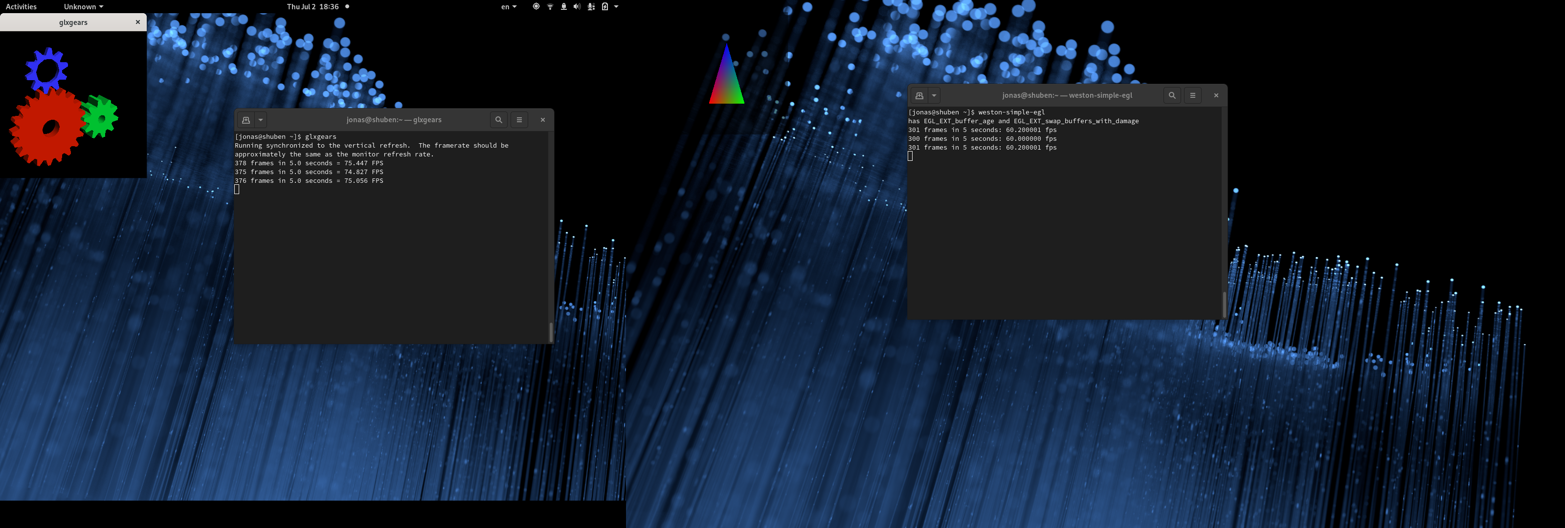
At its core, Mutter inherits the rendering routines of Clutter and Cogl. Cogl itself is a layer above OpenGL / GLX / EGL / GLES, which is what it ultimately boils down to.
An interesting aspect of Clutter is that, despite seeming like a 2D toolkit, it actually renders actors in a 3D space. This is what allows effects like moving, scaling, skewing, and rotating actors.
Clutter uses a traditional perspective projection when rendering. In practice, this mimics the real world where whatever is closer appears bigger, and what’s farther appears smaller. GNOME Shell (the “stage”) itself is rendered in a well-defined position inside this 3D space: the Z-2D plane.
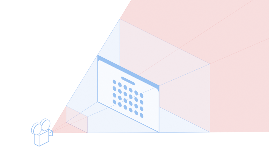
The camera in Clutter is an immutable, implicit camera positioned at the center of the 3D world, and many of the traditional techniques used in rendering engines also apply here, such as the Z-near and Z-far planes (in the illustration above, the planes delimiting the blue region of the view).
Lights

An interesting technique that is familiar to game developers is ray casting. In our case, ray casting is used to detect which element on screen is beneath the cursor, a process known as picking.
Since times immemorial, Clutter used painting for picking. Actors would paint themselves on a frame buffer, each actor with a different color, and Clutter would read a single pixel of the resulting picture. Cogl had several optimizations to try and not send these operations to the GPU through a journaling mechanism, but due to various constraints of how Clutter worked, these optimized code paths weren’t hit very often.
With the 3.34 release, Clutter moved away from this model of picking, and started using geometric picking. Not touching the GPU while picking, and (most importantly) not downloading GPU contents, was a considerable improvement. However, it still involved quite a bit of vertex projection, a relatively heavy operation that should be avoided when possible.
With Mutter 40, we are going a step further and implementing ray-based picking.
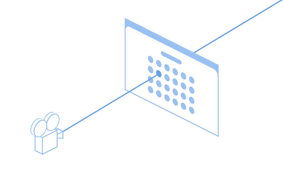
The well established technique of raycast throws a virtual “ray of light” into the scene, and does a hit test against a list of rectangles to figure out which ones are touched by the ray.
One fundamental aspect of ray-based picking is that it can project vertices only when necessary to perform the hit test. In best-case scenarios, it only projects a single group of vertices. In worst-case scenarios, it projects as much as it used to do. Furthermore, by using the graphene_ray_t helper, we also benefit from vectorized operations. These facts led to a measurable reduction in how much time it takes for each pick operation to be executed, and the relative percentage of the frame times it takes.
These refactorings of the pick code enabled another improvement: pick culling. Much like culling out actors when painting, we can now cull out actors when picking. Initial profiling sessions show that, together, these improvements massively reduce pick times.
Action!

While painting what you see on your screen is a fundamental aspect of GNOME Shell, figuring out what not to paint is almost as important!
The process of “culling out” elements from the rendering pipeline is an important optimization. When you hover a button inside an application, for example, it is common that the application will only redraw that specific button, and will tell Mutter which region of it needs to be updated on screen. This allows Mutter to only redraw the region of the screen that should be updated on the next frame.
We’ve written about this feature (regional clipping) before, in a previous article. However, this cycle, we introduced an important improvement on top of it: clip frusta.
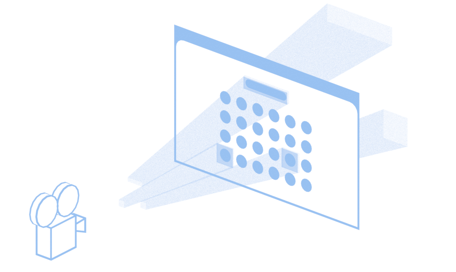
Despite the intimidating name, the concept is familiar: much like a clipping region is a set of 2D rectangles representing which parts of the screen contents must be updated, the clip frusta is a set of 3D volumes (frustum) representing which slices of the 3D space must be updated.
These volumes are built by projecting the 2D clip regions in the 2D plane, and extending them all the way to the camera, and also all the way against the camera. They are also delimited by the Z-near and Z-far planes.
By representing clips in 3D space, we can avoid projecting 3D actors in 2D planes over and over, which is yet another significant optimization of the rendering process.
Thanks to Graphene, we have access to graphene_frustum_t and various routines to operate on it. This allowed us to simultaneously optimize rendering, and remove code!
Carbon-based Compositor
You may have noticed that we’ve mentioned Graphene multiple time throughout this article. Thanks to this fancy library, a set of data structures and algorithms is readily available for us to use.
In addition to frustums and rays, Graphene offers methods and data types for 2-, 3-, and 4-dimensional vectors, boxes, rectangles, triangles, and various onlyothers. Despite using various types from Graphene, only recently Mutter moved away from its own internal implementation of matrices (CoglMatrix) to graphene_matrix_t, which allowed for another 4-digit code cleanup.
What’s Next
Now that we’ve dropped many core components of Mutter, Clutter, and Cogl, in favor of their Graphene counterparts, it is possible to think about other improvements, specially in the rendering pipeline itself.
There already is preliminary work improving the painting routines to use paint nodes more extensively, porting effects to this new API, input processing improvements, and others that directly or indirectly benefit from using Graphene. Stay tuned!
Huge thanks to Jakub Steiner for providing the assets used in this article. Parts of this article were turned into documentation in Mutter’s Wiki.


_showing_search_function_in_overview_mode.png)