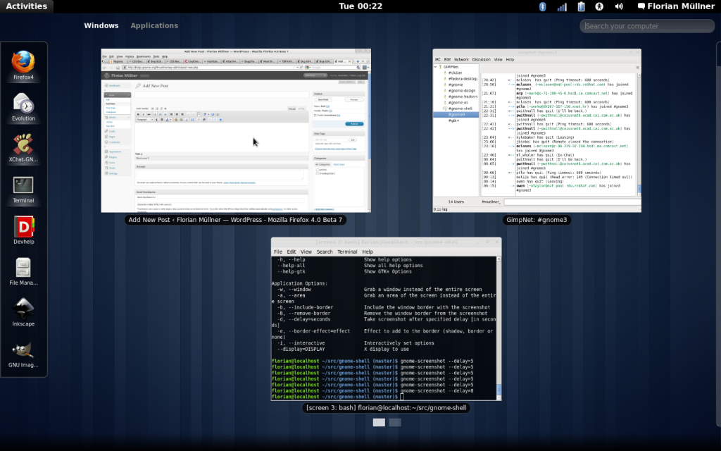
Yesterday I finally opened a Bugzilla bug to land the overview-relayout branch, so the review process has now started and hopefully the work will appear on master soon.
Most recent changes have been internal, but as seen above, the overall design has been tweaked a bit (not least thanks to Allan Day‘s input): the large black boxes around the currently selected view are gone, and the controls to add/remove workspaces have been moved to the screen edge (yup, the F–word!) and slide out on hover and during drags. Also the animation when entering or leaving the overview has been modified to only zoom the window previews — addressing a common complaint about the animation being visually expensive (well, or just “too much”), and resulting in the first bug filed explicitly against the overview-relayout branch — woops.
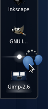
Apart from those tweaks I managed to implement Dash DND, so it is now possible to add / reorder / remove favorites from the dash using DND. The implementation probably still will require some adjustments, but the first reactions have been quite positive, so you might want to give it a try; the impatient can add branches['gnome-shell'] = (None, 'overview-relayout') to their .jhbuildrc, otherwise stay tuned for those changes coming to a Shell near you soon …


Pingback: Moving forwardFlorian Müllner | 9nd.pl
Thanks, you rock!
Pingback: Tweets that mention Moving forward « Florian Müllner -- Topsy.com
Nice work! Just wondering if we could implement the same Favorite Removal behaviour like OS X Dock by drag the icon out of the dock?
Probably, though I’m not sure it wouldn’t conflict with dragging items to the workspace – as there is no visible indication of the workspace bounds, having two vastly different drop actions is at least unintuitive, if not confusing.
Awesome
That fixes one of two reasons why i don’t use shell. Enforced recent documents which i don’t use bugged me so much i couldn’t stand to see shell.
Now, my second gripe is with clock in the middle. If anything with at least little sense would pop down, i’d be hooked on shell. Just my 2 cents. I’d be happiest if something like screenlets would show full screen without window clutter. one could put his own gadget layout and that is it.
Still, thanks. I really wanted to like shel, now i do;)
Something like this maybe?
yep, that does the trick;). not as good as full screen widget/screenlet board, but still nice enough for me to agree with the clock in the middle.
is this implemented already? when i found that sometimes ago i thought that is concept only for now.
It is not fully implemented yet, but there is working code in a branch. Hopefully an initial version will land in master soon and advance from there.
you can color me converted;) looking forward to see all in action the second it lands anywhere where is accessible to others without needing to combine various patches
again, awesome work
Totally Cool! Looking much better than what’s on the preview currently, and the font proportions are more acceptable. Are the fonts used here open-source? Is it shipping with Gnome3? I can’t wait to do Gnome 3 then.
Now that I see the images on this blog and here: http://live.gnome.org/GnomeShell/Design/Whiteboards/DateNTime. I can understand why this background image is so important to Gnome3 … its already part of it. My, does that screen look like Fedora? 🙂 This is good
Uhm – there’s no special font in those screenshots … yet. By default, Gnome 3 will use Cantarell, which is licensed under the SIL Open Font License. It has already been imported into the Gnome VCS and is part of the core 3.0 moduleset. Similarly, the background seen in the screenshots is part of the standard theme, and distributions are encouraged to use it.
Looking great and good to see that it will be merged into master soon.
So are you now finished with the visual overhaul? I’m asking because I really prefer the top panel from the mock-ups to the current one. Will that still be implemented or is the current panel look final?
And is there a chance we will be getting the workspace grid view back? I thought it was out, but then I saw this blog post [1] on the Planet with a mock-up [2] of the grid view in the new design. So is it back in?
[1] http://jimmac.musichall.cz/log/?p=1086
[2] http://jimmac.musichall.cz/images/blog/dash-dnd-remove-from.png
Don’t worry, development won’t stop when merging the branch to master – the new layout just requires code being shifted around quite a bit, so a separate branch is convenient.
The mockups you reference are as official as you can get, so that’s definitively the look we are striving for right now.
I’m not exactly sure about the grid view though – while it is in the latest mockups, the designers are bragging about some new great idea for DND, so until they come out with new mockups I’m as clueless as anyone. Alas, “the grid” was mentioned, so I’m assuming it’s still in …
Speaking about D’n’D, gnome-shell still misses the ability to “drop” a dragged file on a hidden window. Currently in nautius+gnome-panel you can focus a button in window list in order to raise the related window. It’s a deadly useful feature.
Maybe something similar could performed using Dash.
Well, we have an open bug about allowing drags to the overview, so the window previews function as the “old” window list. It involves a lot of movement, so I’m not entirely sold on the idea – I’m sure the designers will appreciate input!
Why did they stole iPhone interface for the desktop system? It proves again open source usability designers are soooo unqualified )
So why don’t you stop wasting your time on unqualified people’s work then?
I wanted to build a car, you know, and because I am sooo qualified to do so, I put on it some super-cool triangular wheels. I am NEVER going with something someone else is already using, that would mean I am unqualified.
Pingback: GNOME Shell torna a far parlare di sé con Müllner e il Dash Drag’n’Drop | bruno trani dot info
Good job Florian, it looks very elegant !
I only miss the “grid” mode with the general view of all the workspaces !
I find the grid mode useful to remember at which workplace I attached every app.
And it is 2D, so I can use every line of the grid for different things.
I really hope it will be no dropped !!!
The other think that it feels strange is the position of the search dialog.
Hey, thanks for the praise – unfortunately it’s the designers who take credit for the appearance. But then, the same applies for the position of the search entry 🙂
The future of the grid view is indeed uncertain, though it is still used in the current mockups for Drag’n’Drop (both for windows and icons).
Looks really slick! 🙂
The favourite removal makes perfect sense, if it was a drag-out-of-dock to remove (aka OSX, Docky) it would conflict with dragging apps to workspaces (like you pointed out). But the mockups still look slicker & more appealing in a few ways (only to be expected), like the top panel for example. Hopefully things like this can also be worked on to be pretty-fied. 😛
Great work, really looking forward to Gnome 3’s release! 🙂
So, using the left bar made the stuff more netbook oriented. But )))
Netbooks have no future )
Yes, it works better for netbooks – but that does not mean that desktop systems do not benefit from a cleaner, less crowded and well-structured interface.
Pingback: [dot]EXE » Gnome Shell Overview-Relayout Branch Gets Polished
Hey Florian,
First off, great job! This new view is just as fast as the old one on my computer and a lot less crowded–even on my 1080p monitor!
Second, if I want to translate GNOME Shell into another language, should I translate it for your branch and submit a patch specific to it, or should I translate based on the master branch. It looks like some of the strings are different in each, just from the UI.
Thanks,
Patrick
Hey, glad you like it! And it is especially great that you want to contribute – unfortunately I’m not too much of a help here, as I am not involved with translations. All I can tell is that translations are indeed done for the master branch, but I don’t know how the language teams organize themselves. Your best bet is probably to get in contact with the GNOME translation project – if your language is already supported, writing an email to the language team leader is recommended.
Hi!
We have a page specifically about how to add translations for GNOME Shell:
http://live.gnome.org/GnomeShell/Translations
As explained in the last step, you’ll need someone in your language team to review your patch, then you need to ask either them or us to push your changes if you don’t have a commit access. You should create the translation for the master branch. Florian’s changes will land there within a week or two. Thanks!
Pingback: Stopped Clock Blog
Pingback: Jakub Steiner: Shell’s Tiled View
Hi Florian/Jackub,
I loved this new overlay but something still seems a bit odd to me related to minimizing/ restoring windows. I use many windows in a screen at a time so each of them uses part of the available area. BUT if I minimize, to restore I need to go the the activities corner see the effect and switch to the new application (the screen changes too much).
With the dash wouldn’t it make sense if I move my mouse by the left side (not necessarely the corner) of the screen it shows only the dash (not the entire overlay… like a hidden MacOS dock) so I could easily restore the screen without too much visual change ?
Thanks for the Work!
Evandro
You touched a good point.
Gnome 3as a whole is a great leap foreward
but the Shell.. the shell..
Unity is much much better conceived, must say..
Speak for yourself 🙂
Pingback: Gnome Shell Overview-Relayout Branch Gets Polished | Exclusive XP4G
Is there a fix to the slow lookup speed of installed programs?
Yes, this is particularly true when the press first letter.
It looks like a cheap website. Damn, you guys are forcing me to switch to Apple at their super-expensive Mac Pro with your badly minded shell 🙁
You are free to switch to whatever you want to – or stay on GNOME 2 if that suits you better. Other than that, constructive criticism is preferred over rants …
Pingback: Rhythmbox Plugins Part 1 - Linux Mint 8 - Wordpress 201