3.0 mockups – Part 1: Desktop organisation
6. September 2008
Shaun’s post reminded me that I wanted to show some ideas how GNOME 3.0 could be different, new and better than any 2.0 release. I completely agree with him that releasing 2.28 as 3.0 without any really new features would be ridicules. User’s won’t be very interested if we just removed deprecated stuff and use Gtk+ 3.0 if they don’t see any real benefit. As I already said before I do think that we need to skip one 2.x release to get this done. Of course we can use branches, etc. etc, but be honest, making a release is a huge amount of work and normally stops any development for at least two months.
Part 1: Desktop organisation
The problem of my computer desktop is that is becomes about as cluttered as my real desktop and with the trend to bigger displays it also tends to become bigger and bigger. Try to save a new file to your desktop and afterwards plug in your usb-drive and you will see two new icons in random places. In addition if you now turn of your big monitor and only use the laptop display using xrandr your Desktop does not longer look good at all. Of course all these things would be theoretically fixable somehow but I want to propose a more radical solution.
The idea is to give the desktop a good but configurable structure. The user can define serveral areas, give them names and put stuff in them. In addition there are predifined areas at least for starters and for the drives (replacing the ugly “Places” menu). This could look about like this:
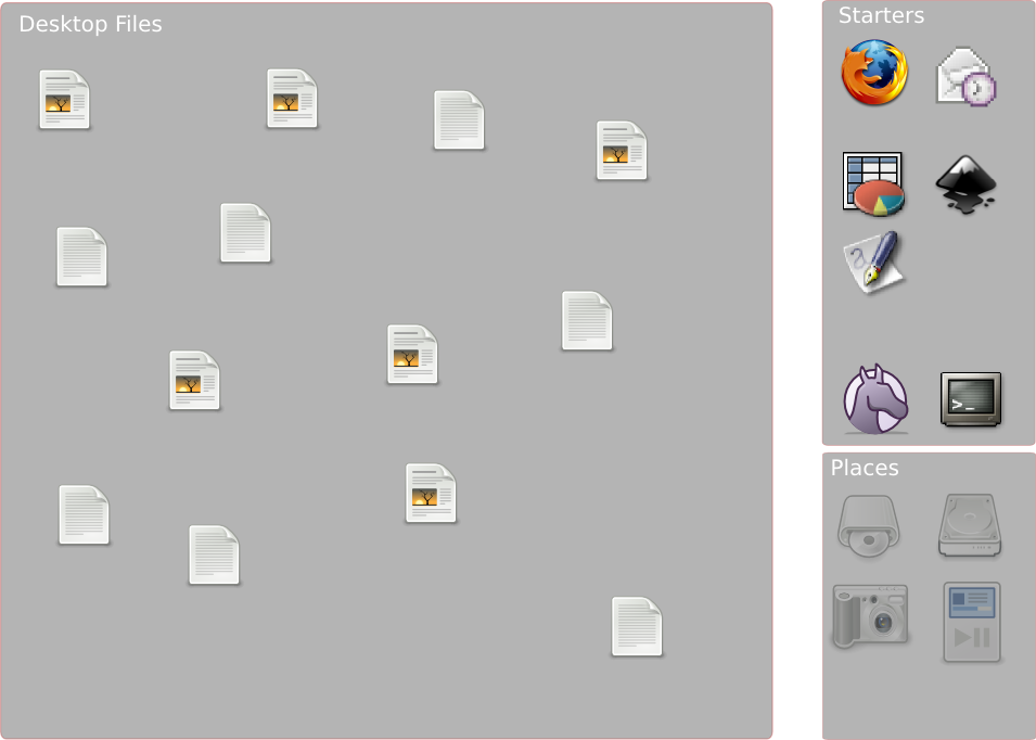
As you still, the left area with the desktop files still sucks. I have no real good idea how to make this look good for everyone but splitting this up to user-defined categories should make it better (let”s say: “Fun”, “Work”, “Development”, etc.). Of course all these areas can be moved by the user, resized, closed, maybe even organised in tabs, scrolled around with some clutter magic or stcked using a system like the one MacSlow showed some time ago. Note that I don’t think these are similar to plasmoids, this IS the desktop, nothing on top of it.
Something else can would be good IMHO would be to create a gnome-3-list at mail.gnome.org to collect ideas, discuss things and bring up a general concept of what GNOME 3.0 should be. I hope I will find the time to continue this series, most likely with part two being “The panel”.
6. September 2008 at 11:14
From a Gnome end user: Even before thinking about those fancy Gnome concepts, just fix icons like those of Anjuta or the worst of all: XSane Image Scanner . In 2008, it’s possible to do better and have more consistency on the desktop with superficial touches like that.
6. September 2008 at 11:35
I think “starters” is misnamed, it should be “applications”. The concept of “starting an application” vs. “going back to a running application” is really quite artificial once applications are well-written.
Of course, on the other hand, the same applies for “a stored document” and “an opened document”, maybe applications whose primary purpose is to edit documents should not be listed as applications but rather in a separate “open documents” area, by document, rather than by application.
6. September 2008 at 11:43
“and with the trend to bigger displays it also tends to become bigger and bigger” — is that true? While it might be true for desktop machines, it hardly seems to be the case with laptops that are getting smaller and smaller (there’s this EEE thing that’s quite popular…). I don’t know about the rest of the world, but here in Denmark the general trend is for people to get rid of their desktop machines, and replace them with laptops. So, I would make quite a different claim than the one I quoted above: displays are getting a lot bigger AND a lot smaller.
6. September 2008 at 12:08
KDE 4.1 is your vision for GNOME 3? This is a screenshot I just took moments ago: http://img78.imageshack.us/my.php?image=kde41zt7.png
Your comment “I don’t think these are similar to plasmoids, this IS the desktop, nothing on top of it.” doesn’t matter because for most users the technology behind the desktop doesn’t matter either.
I btw don’t understand the “we have to add something new or users won’t use 3.0” kind of panic. Common users don’t care. They update to 3.0 like they updated from 2.20 to 2.22. OpenOffice 2.0 wasn’t revolutionary. OpenOffice 3.0 won’t be revolutionary.
Just ship 3.0 without cruft. The following Ubuntu release will pick it up anyway and so will its users.
6. September 2008 at 12:12
This looks quite a bit like Plasma’s way of showing folders. See http://aseigo.blogspot.com/2008/06/ok-then-how-about-video-more.html
6. September 2008 at 12:19
@Veejoy: I am not an artist and I personally like the Anjuta icon…
@Johannes: I don’t really like the idea to see applications as documents in general like it is in OS X but you may be right that starters for things that are just for editing documents might not make much sense.
@Soren: True, but I don’t think it makes sense to have a desktop like things for less than 1024×768. This is a different problem and I don’t think it can be solved in a traditional desktop environment.
@Markus: I never used KDE 4.x but your screenshot looks nice. I have no problem admitting they have nice ideas. There is no need to be different just to be different.
Regarding the 3.0 issue. Well, it’s not that users won’t update but what the real aim is better marketshare which means better press with means to add features people “must have”. BTW, many people don’t update to Vista mostly because it got bad press and has not real advantage for them.
6. September 2008 at 12:35
As an end user I would be very grateful if all the little things would work – more polish to the existing deskop. Fix longstanding bugs. I really don’t care for new metaphors as long as the old, tested ones don’t work as smoothly as in e.g. Mac OSX.
6. September 2008 at 12:40
@jhs: Yes, you’re right, having applications in general as documents like in OSX is stupid, I agree with that.
What I’m thinking though is that the concept of an “application” needs to step into the background. We’ve been taught to think in terms of applications, but why?
An “application” for “email” and “web” makes sense, but an application called “gnumeric” doesn’t really make much sense, that’s either “create new spreadsheet” or “open a spreadsheet (via the file browser)”.
6. September 2008 at 12:55
I just wish people would stop with the toolkit wars and just simply collaborate, if you go on and implement this you will be working on the same thing that the KDE guys have been working on for the last year.
This goes both ways, I could care less if you use qt or gtk, it would be easy to make them look the same, but developers don’t get that.
I’m not saying we should end the choice we have between desktop environments but if something’s already done and goes towards your goals why not just adopt it?
6. September 2008 at 13:02
Some months ago i made this mockup ( http://farm4.static.flickr.com/3270/2329133852_ce75b8bded_o.png ): similar concept.
6. September 2008 at 13:37
Why access apps and bookmarks from the desktop? The desktop is almost always obscured by windows, so you have to first minimize them, and only then choose the item you need.
The desktop can serve as a good starting point for a newbie (from the discoverability point of view) and as a temporary storage for stuff that you haven’t yet decided where to put. Other than that, it’s practically useless, and I don’t get all the obsession with it (including KDE4 plasmoids).
6. September 2008 at 13:48
I agree that the XSane icon is damn ugly, nothing near Tango style.
Your mockup is indeed like an easy thing you can do _ALREADY_ in KDE4.
Just go KDE4 or use QT for the next big Gnome version. If you consider me a troll i really don’t care. You guys should stop duplicating effort and be realistic about the ‘linux world domination’. Kde4 is already great and kicking!
I’m not a gnome hater by any means, i like it. It’s just deprecated imho.
6. September 2008 at 13:51
Why do people not pay attention to the cluetrain? Instead of trying to invent something in an ad-hoc manner, why not read first what Havoc Pennington has to say?
6. September 2008 at 14:05
Talking about desktop, I don’t know why people always want to put widgets, or some kind of importants applications there : desktop is not meant to be viewed, there are always some applications in fullscreen making it not quickly accessible. The strategic thing on the desktop is panel(s).
6. September 2008 at 14:05
GNOME 3.0 is not Gnome Topaz. This looks more like Topaz stuff to me. 🙂
6. September 2008 at 14:33
Just adding something like that for gnome because we can sucks.
Say you have a couple of windows. You want a new app, so you would press the ‘hide/show desktop’ button to go to the desktop and open the app. But now you need all those other windows again, so what d’you do? You press the ‘hide/show’ button again right? Nop, since you have your new window, it’ll just hide that instead of showing the others and putting the new one on top. It’s a mess.
Why not make it simple and have 2 screens, one where you have your windows, the other one for app launchers, places and all your widgets for stocks, clock, twitter etc… Press a button and boom, your in your launchers screen, press again your in your windows screen, Simple. No need for menubars, messy desktop icons, overlay bars or launchers ala OS X.
6. September 2008 at 14:40
@Markus
Although I do not wish to speak for Johannes, when developers are talking about libraries and in *that* context speak of users they usually mean other developers, not end users. The *user* of a library is an API-consumer, ie. another dev/project which will be using the functionality of the new API. Any time a new version of a library comes out which significantly changes it’s API each and every dev/project making use of this library has to rewrite their code to adapt to the changes. A lot of what was in GNOME prior to GTK+-2.0 took a long time to get ported to the 2.0 API, some code never did. New features which are appealing, offering concrete benefits to the *users* of the API, ease the transition, make it easier to justify the time and labor. If the new features trigger the “oh now I could finally do X with my app, which I couldn’t do before without great effort” then people rally around the new version and are want to rapidly port their software-this translates to concrete benefits for us end users-our applications make use of the newest features present in the API.
@GTK+-3.0
Personally I hope the devs take their time when it comes to GTk+-3.0. With time and patience 3.0 could be really amazing. Heres is a couple of things I would like to see:
1) Prior to 3.0 release their should be 100% coverage of the new API in all of the GTK bindings (Python, Ruby, Java, etc.)
2) Vala should reach 1.0 with complete stable bindings for GNOME platform-make sure Adjunta is ready to be *the* IDE for new GNOME apps using Vala.
3) Finish gobject-introspection, GTK bindings should autogenerated with each iteration of the new API-no more pygtk =2.14 etc.
4) finish the transition of GTK to Cairo, give our new desktops resolution independence.
5) get the mono/GTK# guys to sync with the new API.
6) document, document, document
If the time was taken to ensure the completion of these things prior to releasing 3.0- a) there would be enough time to smoothly integrate some significant chunk of Clutter into GTK proper b) devs would have a really mature, well documented and easy platform to create GNOME-3.0. If the bar is not set high many of the things listed here will be pushed to the side and get side-lined in the lure of playing with new tech, recreating much of the malaise currently existing. And I still wonder if Clutter will ever offer what a GTK-evas would(there is already a QT-evas port).
Further off I wonder if Tamarin/tracemonkey could provide GNOME with a way to offer javascript as *the* scripting language of the GNOME desktop(ie. create javascript D-Bus bindings, ensure that all GNOME apps expose their functionality via D-BUS and provide a nice jitting sandboxed environment to give end users a powerful scripting language to really take control of their desktop.
@Johannes
I would love to see something like this in a future version of GNOME. A couple of points I see:
1) object persistence- If I plug in a USB stick HAL/gnome-volume-mount should assign a persistent name to that USB stick. When I move the icon on my desktop for it, the next time I insert that USB stick it’s icon should appear exactly where I last placed it’s icon, and it’s name should be persisent- not disk/disk-/disk-2 depending on if it’s sunday, raining, or the wind is blowing.
2) a region of the desktop could be reserved for newly created/downloaded documents. But then again we have directories for this kind of organization. I personally would prefer to have the virtual desktops functionally utilized for this purpose-ie. each virtual desktop can have it’s own background and it’s own regions and allow users to configure which regions and which desktops are used for displaying which objects. Some regions could be defined to be present on all desktops, others for specific ones. Maybe something along the lines asiego talked about here could be inspirational: http://aseigo.blogspot.com/2008/09/plasma-context-and-nepomuk.html.(telepathy/empathy/galago are all tech’s which lead in the direction of contextualization- “presence”)
3. Perhaps some of these regions could be embedded Nautilus windows( I use devilspie to create windowless embedded gnome-terminals on my desktop). If Nautilus was embedded in a region of the desktop without(hidden-accessible via key combo) menus and without window borders but with a scrollbar these regions could correspond to actual directories.
4. What I really would love would be a region for previewing files: ie. drag a file onto the region and preview the file there- drop a PDF there and let Evince show the contents of the PDF(without opening an Evince window)., drop a song there and have Totem play the file(without opening a Totem window), drag a DOC file there and let Abiword display it’s contents(again without opening Abiword)- expose a tiny subset of functionality-it 2 buttons appear above the displayed DOC file- Print and Edit, or for the song, Add to Playlist, or for the PDF simply Print. Can you tell how much I miss bonobo 😉
Keep up the good work-sorry if this is too long 😉
6. September 2008 at 14:47
[…] http://blogs.gnome.org/johannes/2008/09/06/30-mockups-part-1-desktop-organisation/ […]
6. September 2008 at 15:36
I don’t like the idea very much. Volumes on the desktop… why? App launchers on the deskotp, why?
We should just see GNOME 3.0 as the perfection of the 2.0 series, clean up and make room for new exciting stuff to be added (or replaced) during 3.x. Compare GNOME 2.0 to 2.14… there were HUGE changes over time. Accept that GNOME is not about sudden changes from one release to another, things need to grow.
6. September 2008 at 15:52
I don’t see how this would be an advantage.
Rob’s law says that window usage will expand to cover the entire desktop. I have a 30″ on the desktop and I still only rarely get glimpses of my wallpaper. Even when I am not doing “much” and only am monitoring 4 or 5 windows and can see my wallpaper there is still a 95% chance that what I actually would want off the desktop happens to be covered covered. It is in-fact, the worst place you need to put something you need all the time, not the best.
6. September 2008 at 15:54
you may be interested in reading http://open-source.ecchi.ca/?voir=articles/killing_the_desktop
Just for fun. I am not preaching that this kind of desktopless desktop is to be used as the default and lorded onto users, however. I wrote that article just to tell people that there was this possibility. Hope it helps.
6. September 2008 at 18:03
The desktop should not be an ugly storage tank for files. It should not be an icon ghetto. I usually have mine turned off so I can use screensaver backgrounds and such, but since I found some translucent .png backgrounds and am using them with vertical gradients, i have it on– I do use it, but I use it properly. As a desktop. A working space. –not a file dump.
Rule of thumb: you should never have a folder on your desktop. Ever.
6. September 2008 at 18:38
I love your idea for the desktop. I think there’s a way to make it a bit simpler to create.
[Mockup]
See link in http://brainstorm.ubuntu.com/idea/4363/
[Infrastructure]
Make nautilus group icons as defined in a .groups file.
Example .groups:
“””
[Group1]
file1
file2
file3
[Group2]
file7
file8
file9
.
.
.
“””
Then, add a “create group” context menu entry in nautilus whenever you’ve selected a file.
Then groups could be added to any directory.
6. September 2008 at 19:11
What you’re proposing is just creating folders on the desktop. The purpose of the desktop is shouldn’t be to store files, there’s already home for that. The original purpose of the desktop is having an area to easily work and stort your files.
If you want to change the desktop to anything else, I recommend getting rid of the concept fully – adding to it only makes the concept worst.
6. September 2008 at 19:29
nice idea; despite what you say (: “Note that I don’t think these are similar to plasmoids, this IS the desktop, nothing on top of it.”) you’ve just described the folderview plasmoid exactly. in fact, your sketch looks a *lot* like some hand drawn ones i have here from 3 years back or so. that’s not a bad thing, i just don’t see the point of going out of your way to say “this isn’t like plasma at all!” *shrug*
for those talking about “can’t see the desktop”, that’s why one eventually arrives at the idea of a “pull to front” dashboard. as for panels being the strategic point, that’s why one eventually arrives at the idea that have a separation of component models between panel and desktop is not smart. and finally, allowing people to ‘clean up’ their desktop should obviously be possible and easy; expecting everyone to agree with you on that matter is a fool’s errand however.
@Kar Zollner: things like the previewer already exist in plasma (in fact, the plasmoid is called Previewer and works just as you suggest =) … so i’d assume that if this avenue of thought is seriously explored in GNOME that something similar being made is practically an inevitability.
in fact, i see you even linked to one of my recent blog entries there. it’s really a non-trivial amount of work to get this all going, and i wish we could work all work on it together instead of starting from scratch. *shrug*
@jeff: frontbringer is interesting; we’ve been working on timelining for a while and i hope to actually have some end user visible results for kde 4.3 at the latest. the approach we’re taking (an actual timeline widget + nepomuk) means it can be used from any app and on any data, not just files in a special folder. drop me a line if you”re interesting in comparing notes on these concepts further…
@ethana2: i completely agree =) well, except the “never have a folder on your desktop, ever” bit; there are situations where having a listing of *relevant to the context* files can be rather handy =) not quite the same as having a folder on the desktop, in today’s common usage though, i know ..
6. September 2008 at 19:32
I like the idea to have a dedicated space on the ‘desktop’ for applicatons and folders. But ‘desktop icons’? Nahhh…
The desktop paradigm is simply SO dead.
The future should be a TILING window manager (http://en.wikipedia.org/wiki/X_window_manager#Tiling_window_managers).
To have a taste of how much better than today’s GNOME that would be, think of it as Compiz’s scale as the default look for the desktop. Inactive aren’t overlapped by others or represented in a panel, but simply shrunk to a tiny preview.
Try ‘scale’ and use the left mouse-button to click on a window; see how it zooms closer. Right-click again and see how it zooms away.
Isn’t this the most beautiful AND useful way of window management? You don’t need a desktop; you just need representations of your running applications, your folders and you applications, tiled in one central screen.
If you want to start an app or open a folder you simply zoom out (scale) to see your ‘desktop’.
In other words, I’d like to see the panels enlarged to cover the whole of the desktop – or the desktop to take over the functions of the panels.
As we have it now, we have an irritating duplication of functions between the panels and the windows/desktop; opened folders appear as windows AND as symbols in the panel. Application icons are virtually everywhere; in the panel, in the menu, on the desktop – brrrr…
6. September 2008 at 19:33
I meant “Try ’scale’ and use the RIGHT mouse-button”
6. September 2008 at 19:47
i support Karl Zollner. adding that PROPER c++ bindings for gkt/glib would be very appreciated in year 2009 i think
6. September 2008 at 20:22
I do like the areas idea, mostly for putting all devices in one area… probably the best would be to have a shorcut/small-translucent-button on the desk that shows the boxes’ borders so you can move them/resize them around, and hide them the rest of the time.
However, I love the menu-style applications|places|system, and will defend it to death, the desktop is usually covered with windows anyway, so once you start something it gets lost unless you have a display over 20″.
7. September 2008 at 3:55
its better than the actual desktop but i think that complete the desktop that we have right now will be better, let me explain me a bit, roght now we can only order the icons in our desktop by name and keep aligned or not from top left to bottom right, the year is 2008 and we still cant align our icons at the right of our screen like OSX do, or in rows instead of colums, much less order our icons by date, type,etc.
I think that complete the desktop that we have right now justify a lot the upgrade to gnome 2.28, we dont want a 3.0 version like kde has his 4.1 (i mean in new and incomplete things) we are open to new ideas, like the ones of the KDE team have but we need things that work in the way that shoud be working, so if you want to fix the desktop i think that complete what we have right now is the right way to doit, maybe you can later introduce this folderview like feature later.
(sorry for my english and thaks for your work ppl)
8. September 2008 at 0:26
The Desktop is irrelevant, because 90% of the time users have a bunch of applications open and do not see or use the Desktop. That is Why I LOVE the Places menu – regardless of what windows I have open, I know that I can always get to the folders I need via Places. It is a much better solution than any other on any other system.
Instead of fixing the Desktop (that noone uses anyway) what needs fixing are the panel applets – they take too long to load, use too much RAM and one slow-loading applet can prevent half of the panel from showing up for a minute or more after login.
I would also like to see ‘drawer-like icons linked to real folders, so that pull up a limited file browser just for one folder with a mouse-over, open a document and hide it by moving my mouse away.
10. September 2008 at 15:54
Really, it’s too soon to be doing radical new mockups. They usually just lead to a desktop full of half-finished features, and we have one of those already. Let’s just go out and talk to real users, watch them use GNOME in their schools, homes and workplaces, and figure out what their problems are. *Then* we start discussing how to fix things.
13. September 2008 at 4:13
[…] of a Summer of Code application I made in 2007, titled “Intelligent Desktop.” Recent discussions have reminded me to at least blog about it. And given my current employment status, I have the […]
29. September 2008 at 23:56
I have implemented something similar to this called Desktop Drawers. It allows one to have project spaces by selecting between dynamic and static desktops. If you have any suggestions I would be very grateful. Here is the current source page of Drawers: https://launchpad.net/desktopdrawers