
As you might have heard in many other places a bunch of GNOME and WebKit hackers have met in rainy Coruña for the 3rd WebKitGTK+ hackfest. Many things have been discussed, but today I’m going to give a sneak preview of the new design for Epiphany and its rebirth as the core GNOME Web application.
The design is still very much a work in progress, but I can try to briefly talk about some of the highlights of the refreshed concept:
- Focus on the current page content. This means, in general, that we’ll get rid of as much chrome as we can (a trend that we started some time ago already), and in particular and more visibly that we won’t have a visible tab bar by default.
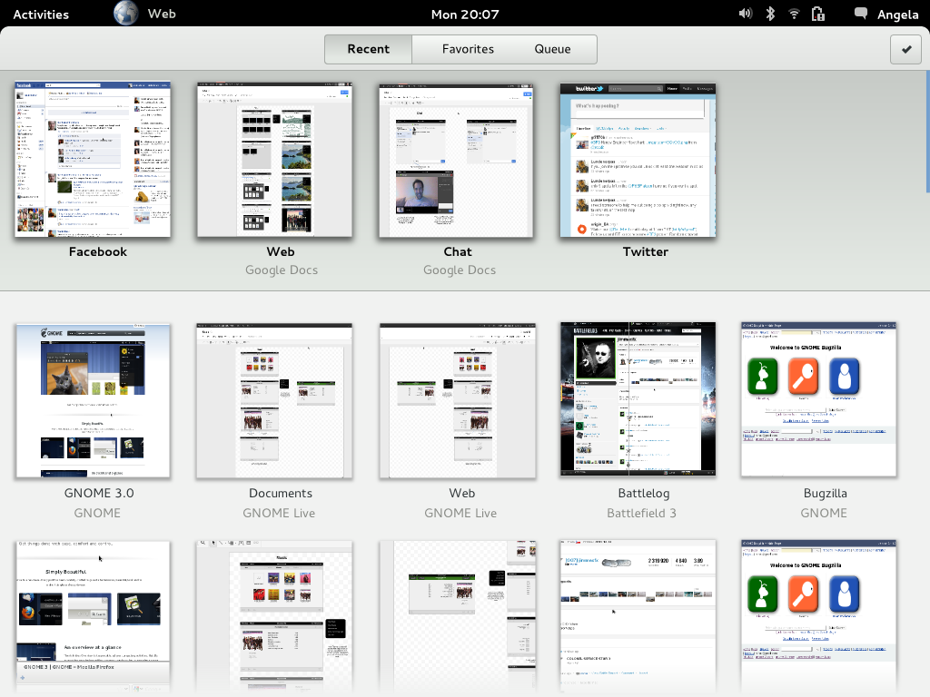
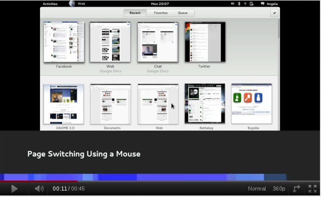
- The tab bar might be gone, but we’ll still offer a convenient, and we think improved, way of switching between pages. All the currently and recently opened pages are visible in the overview (the new start page), and we’ll provide a way of switching between them with the mouse or keyboard shortcuts. You can see an early animated mockup of this in this video of the gnome design youtube channel (link to the video):
- We have tried to identify and make easier other tasks that have been historically solved with tabs. One of the most common ones is “I want to read this web later, I’ll save it in a tab”. Epiphany will now provide a specialized mechanism for this, called Queues. The design team is working on the details of its implementation, but we have already some interesting ideas; for instance, when you open links in a Google Search results page with middle click a new queue could be automatically created with the results page as the parent and all the links you open as items in the queue.
- There’s many more ideas that are either refinements of already existing features, like Web Application integration, or nailing down the last details of long-term developments, like improved stability and performance thanks to the upcoming WebKit2 support. Make sure to follow the GNOME Design team or Epiphany channels to keep in touch with things as they evolve.
The mighty Igalians (namely Claudio and myself) are already busy at work implementing the new design. For now we are focusing on a series of incremental patches that will move us closer to the end goal, that way we’ll have something usable even if the design or the full implementation of the Web application are not ready in time for 3.4. You can check the current Roadmap, and as always if you want to help us just drop by #epiphany @ GimpNet or send an email to the epiphany-devel mailing list.
Until the next time, thanks to all the attendants to this year’s WebKitGTK+ hackfest, and to all the sponsors for their support. Happy hacking!
![]()


Thanks a lot for the video. I was concerned the very first time I saw the design. I wasn’t sure if it’s going to be a dead end or something awesome.
I can’t wait to use it.
[WORDPRESS HASHCASH] The poster sent us ‘0 which is not a hashcash value.
I love the way you guys are rethinking this design. My only 0.02c is that I often use the FF Alt+N, where N is a number to switch to tab number N. I’d like to see this keybinding in Web.
Also, how did you make the fantastic video. Did you use PiTiVi?
[WORDPRESS HASHCASH] The poster sent us ‘0 which is not a hashcash value.
It looks promising! Although I don’t usually use Epiphany, I’m getting amazed by some of the improvements and probably I will change the browser soon 😉
[WORDPRESS HASHCASH] The poster sent us ‘0 which is not a hashcash value.
Pingback: WebKitGTK+ hackfest wrap up « Here we are
Looks great. Will there still be a windowed mode for these applications?
[WORDPRESS HASHCASH] The poster sent us ‘0 which is not a hashcash value.
I hope this ends up being a better way as opposed to merely a different good way.
I may use it, but I must admit I use the middle mouse button to ‘Queue’ webpages quite a bit already. Maybe middle clicking could automatically queue pages rather than opening a new tab? It’ll be interesting to see how this is implemented. I think this idea could work very well after a few iterations, and I’m glad to see the chrome (especially the menu) taken down a bit.
I’m still not sure how discoverable that URL bar will be for common computer users. We’ll definitely need to do some research after the first release, but at least this may get more people using Epiphany.
[WORDPRESS HASHCASH] The poster sent us ‘0 which is not a hashcash value.
While I am a big fan of the minimal UI (My current Epiphany looks like this: http://www.kepstin.ca/dump/epiphany.png – I am a little wary on the removal of tabs. I do a lot of music cataloging on MusicBrainz, and I’ll very often have a working set of tabs open with e.g. an Amazon page, an artist’s discography page, a Wikipedia page and a data entry form on MusicBrainz, copying and pasting data between them. It’s nice to have 1-click access to this smallish number of pages in a working set, rather than click out and back in.
I suppose one way around this would be to use separate windows; but I don’t have enough screen space to show them without overlapping, and using the Gnome 3 overlay is, again, a bunch of extra mouse movement.
The keyboard switcher is nearly a solution, except that (as a somewhat power user of linux), most of my copy/pasting is done using the select/middle-click feature, so I don’t normally touch the keyboard which switching tabs.
There is exactly /one/ menu that I miss from Epiphany when hiding the menu bar. I occasionally browse older Japanese websites in SHIFT-JIS encoding which are not autodetected, and I need a method to switch the character coding manually. As a result, I have to temporarily re-enable the menubar.
…Some things to think about, from a Gnome 3 user.
[WORDPRESS HASHCASH] The poster sent us ‘0 which is not a hashcash value.
I like the direction Web is taking, but I think tab-switching could be improved by better integrating Web with Gnome Shell. Here’s what I mean:
1) Keep the idea of not showing tabs. I think some people will complain, but it does match the ethos of Gnome shell very well.
2) Remove the “Pages” button. Instead, to see an open “page” the user just hovers over Gnome Shell’s “Activities” overlay and sees each page as a separate browser window.
As you have probably figured out by now, this would be very simple to implement: Just make Web a single-document application, and add a “new page” button to the toolbar, which would open a new instance of the browser.
In addition to better integrating with Gnome Shell, this also has the following benefits:
1) Each page runs on a different process!
2) Shrinks the codebase, meaning simpler maintenance, and fewer bugs.
Of course, to make this work seamlessly for the user, the deal-breaker is that the browser’s history, bookmarks, and preferences must always be in sync among all browser instances. With this, all the different instances of Web will work separately while at the same time feeling like a single app.
What do you think?
[WORDPRESS HASHCASH] The poster sent us ‘0 which is not a hashcash value.
How do these “pages” integrate with the desktop? Are we just repeating the tab problem where the browser is it’s own window manager?
[WORDPRESS HASHCASH] The poster sent us ‘0 which is not a hashcash value.
What kind of protection from phishing will Web offer?
Without a visible URL, there’s no way that you can verify whether you’re on a genuine page or not.
[WORDPRESS HASHCASH] The poster sent us ‘0 which is not a hashcash value.
The way epiphany supports tabs today is ahead of any other browser: keeping history in “derivative” tabs, opening next to the current one (contextual browsing), etc.
I am sure you guys are thinking about all this, but the video shows one thing that might be missing: switching between open pages with the keyboard in *both* directions. Ctrl+PgUp/PgDown are easily accessible (I generally hate Ctrl+Tab combination, because they are at such awkward positions on the keyboard to be typed easily with one hand, and I definitely hope the backwards switch won’t be Ctrl+Shift+Tab!). I know PgUp/PgDown won’t make much sense with the “Pages” overview, but just like you did come up with good ideas for everything else, I am sure you can figure this one out as well 🙂
Now, as for the queueing, what I commonly do is research some API documentation. Middle clicking through a bunch of links (not just in Google, but in pages I get to from it), in order to find something about the undocumented obscure API that I am trying to use. These are not “to read later” but “to read next” until a solution is found. When I find the appropriate solution (and confirm it in one other place at least), I might want to close all the other pages I “queued”. Will the queues support this easily?
Also, with all the talk of the Web, and approach to developing it, +1 on reusing Epiphany code (gnome-keyring and gnome integration, extensions, etc).
As for the URL bar, nothing will tell you better if it works or not than user testing, but as a “power” user, as long as it pops up nicely when I Ctrl+L, I’d be a happy camper — fwiw, I usually don’t care about it too much, but the security implications of not being able to easily see what URL you are at might be worrying 🙂 Perhaps only verified https URLs can be shown like this by default for now.
[WORDPRESS HASHCASH] The poster sent us ‘0 which is not a hashcash value.
I love the design in general and would really like to switch if Epiphany becomes a proper peer to Firefox and Chrome.
Few points:
1) I’m not going to use a browser that doesn’t have a URL bar visible at all times. Call me conservative.
2) 40% of all Chrome and Firefox users use extensions. Without extensions, Epiphany won’t fly (and I mean FF or Chrome *compatible* extensions, of course – Linux just isn’t big enough to provide for a vibrant extension community otherwise).
3) Given the great potential for saving vertical space, the top tabs (Recent/Favourites/Queue) seem to waste quite a lot of it.
[WORDPRESS HASHCASH] The poster sent us ‘0 which is not a hashcash value.
Pingback: El futuro de Epiphany se llamará Web, y tendrá un diseño minimalista
Please, oh please, let this minimalistic (computers for dummies) fad soon pass on.
[WORDPRESS HASHCASH] The poster sent us ‘0 which is not a hashcash value.
A simplistic design needs not only to look simple but actually be simple. Having to click “Pages” to see all open pages and then select one is a step more than what we currently have.
I think there is one great option. Since GNOME is a desktop environment and since all screens shipped in this form factor have been for many years more or less widescreen we can have a really beautiful sidebar with all open pages with nice previews. We can even hide it partly and make it appear on mouse-over. It is hands down a faster way to switch between open pages and should be prototyped. It’s even a better approach than tabs because we save vertical screen and use space that is always there except on stupid pages that scale horizontally.
[WORDPRESS HASHCASH] The poster sent us ‘0 which is not a hashcash value.
This is exactly the interface that Apple rage quit on the iPhone and iPad after years of customer complaints. Seriously, guys, if Apple received enough complaints to change, while Jobs was in charge, then it’s a completely bad idea for you to pick it up.
Please, read up on all technology blogs, not just Linux. Gnome seems to be picking up a lot of things that other companies abandoned because customers hated them.
[WORDPRESS HASHCASH] The poster sent us ‘0 which is not a hashcash value.
The browser looks fantastic, and the reduction in chrome is much appreciated. However, I am still undecided on the removal of tabs.
This does seem to be in line with the new Gnome design philosophy: ‘what you used to do in one click now takes two’ style.
With tabs I acould have 4 or 5 pages open and switch between them with 1 click to any tab. Now I must go to the overview and click the iconized view. Two clicks vs. one click. I also lose the short name in the tabs to show me what I do have open currently.
Don’t get me wrong, I am not saying that this change is bad. It is a loss of informational efficiency and of operational efficiency (I lose the immediate info the tab titles provide and I must use more clicks to do something). If these losses are offset and surpassed by other gains, then it is an overall plus.
I mention this seems in line with the current gnome philosophy as embodied by the gnome shell. In the plain vanilla shell to launch a new app, I must go to activities, then applications then search for the app then launch. I gnome 2 this would have been search in hierarchical menu then launch. Or it could have been launch from desktop, or frequently used apps.
The shell does not adress this extreme disruption in workflow by adding benefits to counteract the loss in productivity that it imposes on users. Thankfully 3rd party extensions are begining to provide work arounds for the shell’s inneficient disruptive behavior.
As long as the team is aware their design choices remove some efficiency and then the team provides benefits that outweigh the loss, this could be a beautiful new direction.
[WORDPRESS HASHCASH] The poster sent us ‘0 which is not a hashcash value.
Tabbed browsing requires one click to get to the page you want. With this new method, you are asking the user to not only click 2x as much, but to navigate a full screen of thumbnails to find the one he wants? How is this easier?
[WORDPRESS HASHCASH] The poster sent us ‘0 which is not a hashcash value.
+1 I quote Steven above and I add:
why do You insist to copy a pattern that Apple itself abandoned?
Tabs are more practical for website switching, that view is cute but it could be optional, not a replacement!
Another point, every browser on the eaerth have the ability to close tabs with middle click, a lot of users submitted it to the bug tracker since 2007 for are u waiting for? that is something useful to copy.
my 2c
[WORDPRESS HASHCASH] The poster sent us ‘0 which is not a hashcash value.
I agree with tvst (post 8). If you are going to remove tabs, (I don’t think is the best idea, but hell removing the taskbar for gnome 3 works) make it so that the activities hover shows the different tabs. Other wise you are making it harder not easier. Old way: find tab, click, done. New way: click pages, find page, click, done. I don’t like to have to click more.
[WORDPRESS HASHCASH] The poster sent us ‘0 which is not a hashcash value.
Pingback: Smile » Blog Archive » WebKitGTK+ Hackfest: WK2, a11y and Ephy
Pingback: My Bookmarks » New Epiphany Browser Design, Probably Without Visible Tabs [Mockup]
The queue looks interesting.
But I’m not sure I would like to use a browser that “hides” the open tabs.
[WORDPRESS HASHCASH] The poster sent us ‘0 which is not a hashcash value.
Pingback: A new design for Epiphany: Web | Hallow Demon Friendz
It seems like an improvement over tabs. However it isn’t very search centric (which is more powerfull then just linearly going through a list with ctrl-tab). That would help being able to use many tabs.
[WORDPRESS HASHCASH] The poster sent us ‘0 which is not a hashcash value.
Great idea. But you will have to include options for all the keyboard shortcuts people are used to on other browsers. Trying to get opera to conform to my accustomed usage from firefox I have battled long, and visited many forums. In this process i have discovered the very large number of people who walk away if they cannot get the behaviour they are used to.
Opera never made it, and I never use it.
[WORDPRESS HASHCASH] The poster sent us ‘0 which is not a hashcash value.
I’d like the option to turn them back on.
I currently ignore the current epiphany because:
1. The tab bar is not “always on”. I alway run multiple tabs, and don’t like the moving
2. There does not appear to be a way to startup with multiple tabs
3. There is no “speed dial” function or extension.
[WORDPRESS HASHCASH] The poster sent us ‘0 which is not a hashcash value.
Listen to these comments, GNOME devs! McCann said anyone can have input on GNOME design, so now’s your chance to actually listen, for once, to your users. Don’t make Epiphany even more retarded by hiding navigation behind a small button that has to be moused to carefully and clicked before you can see a handful of open tabs. DON’T BE STUPID. This is vering on too absurd to believe. Who’s in charge? FIRE THEM and start listening to your users.
Even YOU GUYS don’t use Epiphany! You’ll keep using Firefox/Chrome, and you’ll enjoy the tabs much more than this lousy implementation of not-tabs. Either eat your own dog food, and love it, or admit your design sucks.
[WORDPRESS HASHCASH] The poster sent us ‘0 which is not a hashcash value.
Pingback: Highlights of WebKit GTK hackfest. « 0xC0FFEE
One more in agreement with tvst. While I like the idea of epiphany taking on a radically different design to set it apart, I think in the long term Gnome should move toward having some way of having apps pass tab-data to Shell. That way you could truly manage all your activities from a single visualization. Maybe as you hover (or rightclick, or touch-expand) over the app-window you want in Shell, it divides into multiple thumbnails representing its tabs.
As for the mockup, it looks nice and clean. The only trouble I see is the placement of the pages button; I could see myself accidentally overshooting into activities view. But it seems like a great first step in reimagining apps for Gnome 3. I can’t wait to try it out.
[WORDPRESS HASHCASH] The poster sent us ‘0 which is not a hashcash value.
Looking good, it will be great to try out.
[WORDPRESS HASHCASH] The poster sent us ‘0 which is not a hashcash value.
Pingback: Iocane powder » Blog Archive » Epiphany marches on
Pingback: Gnome 3.3.4 mit überarbeitetem Browser | virtualfiles.net
Pingback: My opinion on GNOME 3 « Information Overload