New Drag & Drop support in 3.15 development series:
First of all I would like to thanks once again to the foundation for sponsoring my trip to Brussels to attend the Developer Experience Hackhest and Alberto for inviting me in the first place!
After the hackfest we all agreed that Glade needs some love to make it more newbie friendly, nothing we did not already knew, but please do not move along Glade needs your help!
On of the thing that new people find the most difficult to understand about creating GUI with Gtk+/Glade is the container packing paradigm which is very powerful once you get used to it but not as intuitive as one would like.
A way to improve this situation would be to create a new free form layout container similar to Java’s GroupLayout as suggested by Alex in this mail which of course is a lot of work specially in Glade so… help and/or sponsorship is welcome!!
But for now being able to drag & drop widgets around should make thinks easier, right?
[vimeo width=”640″ height=”400″]https://vimeo.com/60841071[/vimeo]
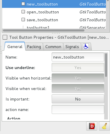
The next thing we want to address is the property editor. Not only does not look good (In its defense the whole thing is autogenerated) but thanks to wide screen displays being ubiquitous nowadays it is wasting some precious vertical space :S
This is how it currently looks like
So… to save some vertical space and make it look more modern this are the changes I made
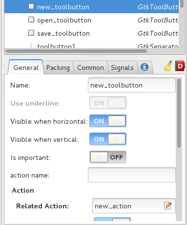
- New ATK icon
- Replaced toggle buttons with switches
- Fields do not expand by default
- Replaced text field edit button with an entry edit icon
- Removed class field title
- Moved clear and help buttons to the top of the notebook
The last item is definitely not definitive since it might make more sense to move it inside the scrolled window or simply to the toolbar.
As you can see there is lot of room for improvement so if you come up with a good idea help us!
Awesome! This makes Glade feel like a “real” UI creator.
Hehe thanks Eric! I appreciate it!
BTW if you use Gtk master the scroll wheel will start working on the palette!
Hi Juan!
Hey, take a look at how space-efficient lazarus object inspector is: http://upload.wikimedia.org/wikipedia/commons/b/b4/Lazarus_0.9.26_Carbon.png . Try to take some inspiration for glade from it.
Yeah, looks like a compact treeview. If we choose to go in that direction we would save around 20% of space but I do not think that is the solution, I mean instead of showing more properties we should only show the ones that matter!
So my idea is to use Glade itself to create custom editors!!
Drag and drop at last ! Thank you !
However, I’m not sure that using GtkSwith here is a great idea, see http://live.gnome.org/Design/HIG/Switches
Yes! I know it does not follow the guidelines that is why I made a development release before including such changes in a stable release. I was tempted for a moment to use a checkbox but we already use them for optional properties like width and height request in common tab.
That bring us back to the good old toggle button, perhaps a true/false toggle with the same style as the switch will do the trick
A checkbox would do the trick, IMHO. I don’t think it would conflict with optional properties. That’s what dconf-editor uses, too. If you think this doesn’t work, then go with GtkSwitch, that’s still better than that big ugly toggle button. Oh, and I think you should strive to keep these fields values left aligned, that’s not the case on your screenshots.
well, having two checks one next to the other would be confusing even if there are few places where that could happen I still would have to do something about it.
About the alignment thing, the widgets are actually aligned! the problem is GtkSwitch reserves some space around to draw the focus
so it looks misaligned. I will fix it in gtk or at least file a bug 🙂
There’s also the on/off texts without switches, but that might look a bit weird:
http://1.bp.blogspot.com/-MI35Cho4C40/UUeCPYii-2I/AAAAAAAAARo/Ob7HWhkMyWM/s640/Schermata+da+2013-03-18+22:04:39.png
Yeah, this is how it currently looks on master (toggle with a check mark)
https://blogs.gnome.org/xjuan/files/2013/03/boolean_properties.png
and on the right how it would look with a toggle button with a switch style
BTW I am not very convinced by either look, I still have to try with a checkbox, but that needs a little bit more work than just replacing the editor widget, because optional props already have a check.
There might be other ways to indicate that a property is optional (by wording or grouping possibly), so a checkbox could work.
Another thing to possibly look into for the properties controls in Glade is the mini-controls used in GIMP. It saves quite a lot of space.
Which mini controls?
I notice they use a smaller font and have that custom spin/progress bar widget but the rest of the controls seems regular widgets to me.
Maybe a newer version? I have 2.8.4
I guess it’s the smaller font size that makes the widgets smaller indeed.
Top job! Congratulations and thanks a bunch!
Would like the switch to be a bit more verbose.
Put the on and off on the same places.
And the option that is not selected grayed out.
You still have the switch slider, but now it will display the text on it off the option selected.
Seems more obvious and clearer to me, the option that the switch is the one selected.
Option: [ [ON] OFF ] //on position, off is grayed out
Option: [ ON [OFF] ] //off position, on is grayed out
Not sure if the switch is a good idea though.
In the screenshot you give, it seems like a checkbox would be fine.
Well, the switch is part of Gtk so I do not have a say on how it looks.
This is one of the main reason why I choose to use it, Its there, it works and looks good 🙂