GNOME 3.10 was released last week. A lot of hard work went into it (I know I felt pretty exhausted by the end), but I think that it was worth it. We ended up with an excellent release.
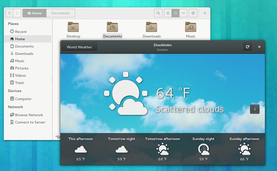
I’ve been using bits and pieces of 3.10 for some time, and completely adopted it (through Fedora 20) about a week ago. It feels like some important aspects of the GNOME 3 experience have started to fall into place with the latest release. Most obviously, we have quite a few new applications, which fill gaps in the core application set. We are also seeing the application design patterns starting to mature. The addition of header bars makes a fantastic difference.
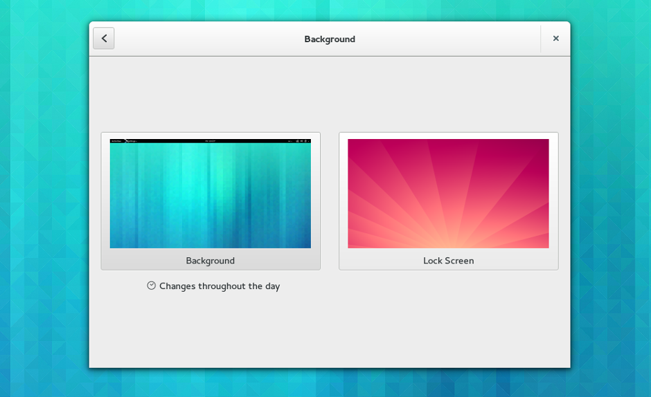
This release also includes some new things which have been planned for a long time, and which round out features that we released in previous versions. Lock screen customisation is one of these, as is the updated application launching view, both of which feel great.
Another exciting thing that happened for 3.10 is that our efforts to modernise the toolkit have started to bear fruit. GTK+ 3.10 has a whole collection of new widgets which will enable developers to make better applications, and should also reduce the amount of work that they have to do. I really hope that this trend continues with even more new widgets and improvements to the developer experience.
GNOME 3 is already in good shape, but as each release comes by, so the vision as a whole takes another step towards realisation. When that finally happens, I think we’ll achieve a qualitative shift in the kind of experience that we’re able to offer. 3.10 is a strong indication that GNOME is making good progress towards that goal, and is a taste of what is to come. Exciting times.


It’s starting to look better and better. Keep up the good work, guys!
By the way, is there another way to ship applications with GNOME3? I was experimenting lately with python and Gobject-Introspection, and it’s really easy to start making an aplication (I used Glade as the UI designer).
I was thinking to go further and make an application for 9gag (or 4chan, it doesn’t really matter), but to ship it with the distributions, it’s both slow and it ain’t gonna happen at all probably (people at Debian demand only high-quality software, and it take years to get in the repositories or get released)
So the option 1 drops.
2. with gnome extensions – well, that’s not the purpose of GE, and it’s not possible, afaik.
3. some kind of GA? Gnome Apps? – but this is non-existing, and it implies a lot of work on mantaining a separate repository (QA, testing, compatibility, etc.) ; but that can be minimized if Gnome abstracts enough the distributions/OS
The header bar is in my opinion a very welcome change, since – especially when switching from Unity – the amount of wasted space in every window was staggering. Even now the bars are still way too bulky, but I hope more sense will come in that direction too.. :)
Another thing that baffles me is the dark grey weather app. Why the difference in colour? Has the drive for a uniform desktop experience gone the way of the dinosaur/windows? Everything is beige/cream colored, except that one app. *sigh*
The weather app uses the dark variant of the theme because it is a highly visual app which makes use of photography. It’s the equivalent of turning the lights down to see a film or a slideshow. We do this for other highly visual apps, like Photos and Videos.
I’m not sure I’d turn down the lights to view the weather though?
I always feel startled when I open a dark themed app. Maybe it’d be more appropriate to only go dark when the app is maximized or full screen.
Would be interesting if this light vs. dark theme was related to the time of day like the wallpaper background (light theme = daytime, dark theme = nighttime).
I agree, a brilliant release.
Now lets renew the homepage (gnome.org) ;) It looks quite strange..
Is there anything we (GNOME) could do better for next release?
Great to hear, though!
Looks great, can’t wait to be able to upgrade!
Great release, congrats!
I have been wondering for a long time: Why does the top window bar (the title window) uses so much empty space on gnome, and why are the icons so large (and they have a so much vertical spacing too)? Look at the third print-screen “Background”. With today’s form factor of LCD screen 16:9 I was expecting Gnome 3 to reduce top window bar, but it did not change since Gnome 2. From my experience Gnome is the DE that uses the more space on the window title. I wish the title window would use less screen estate on Gnome 3. Thank you.
Yeah, I really enjoy the smooth animations in the header bars and other widgets- the system settings application is a great example of where this is all coming together to make a significant leap in the modernity of a single application. The designs are good and all, but seeing the tech follow so swiftly behind recently is really encouraging.
As the core apps are further polished and update for the next release, along with the other stack improvements (such as Wayland), I’m sure we’ll be getting to the original vision much sooner than we think. I’m glad we’re over the teething pains and really marching forward, now.
… and why is Cantarell so blurry now? I hate it!
Cantarell isn’t the problem here. Sounds like you are on Fedora 20; they have a new font rendering thing which causes the blurriness. Try changing your font hinting from medium to slight.
Why I don’t see status of wired network connection? I only use wired network connection on pc and now I can’t switch wired network off from system status menu.
A great step forward. But it make only me feeling more and more with an incomplete set of great apps not yet ready. I’m still depending on Evolution, shotwell, rhythmbox and liferea for my main uses. Also, Ubuntu is a pain to get updated GNOME apps.
Great work! I’m really looking forward to a nice mail and calendar application with the new GNOME3 look. I know that there exists some design ideas, but is someone actually working on it? This would be really awsome! Keep up the good work!