Before we start, let’s get this out of the way because the week long delirium on social media has dragged enough.
Yes, libadwaita “hardcodes” Adwaita. Yes, applications, as is, will not be following a custom system theme. Yes this does improve the default behavior of application for GNOME when run on other platforms like Elementary OS. However, this is the result of a technical limitation, and not some evil plot as Twitter will keep telling you…
The reason is that in order for High Contrast (and the upcoming Dark Style) to work, libadwaita needs to override the theme name property so it doesn’t fallback to GTK’s “Default” High Contrast style. The “Default” style is an older version of Adwaita, not your system style.
Compared to GTK 3, there isn’t a new way to enforce the “hardcoded” style. The GTK_THEME Debug variable still works, as does ~/.config/gtk-4.0/gtk.css which you can use to set more permanent changes, and there are probably 3 other ways of doing this. The process to theme your system might be a bit different compared to GTK 3 but it will still work. Likewise, if you are developing a distribution, you have control of the end product and can do anything you want with the code. There is a plethora of options available. Apparently complaining on social media and bullying volunteers into submission was one such option…
And I guess this also needs to be stated: this change only affects apps that choose to use libadwaita and adopt the GNOME Design Guidelines, not “every” GTK 4 application.
As usual, the fact that the themes keep working doesn’t mean they are supported. The same issues about restyling applications when they don’t expect it apply and GNOME can not realistically support arbitrary stylesheets that none of the contributors develop against and test.
Now onto the actual blogpost.
There seems to be some confusion when it comes to libadwaita’s stylesheet and coloring APIs. It’s easy to mix them up when you haven’t heard of libadwaita before, so here is a short introduction on what they are and how they differ.
Keep in mind that the features discussed below are not guaranteed to land. After libadwaita 1.0 the stylesheet will be frozen and treated as an API. That means that if a feature doesn’t make it by 1.0 it will be a breaking change and will have to wait for libadwaita 2.0.
An Application Coloring API / Accent Colors
The idea here is that you can define “accent” colors to be applied for various parts of widgets. You can also recolor any part of a widget however you like. Take a look at Epiphany’s private mode header bar for an example. For this to be possible the whole stylesheet had to be reworked. Extra care was needed to ensure that the functionality wouldn’t conflict with the high contrast preference and wouldn’t need special handling. I hope Alexander will blog about this work in more detail, as it was truly fascinating. I am very excited to see what developers do with the coloring API.
For now the colors can be controlled with the GTK-specific @define-color, similar to CSS variables. Programmatic API will be added later on as the dust settles. The API will be based on AdwStyleManager which is getting introduced by the Dark style preference MR and hasn’t landed yet.
Here’s a quick example:
@define-color accent_color @yellow_5;
@define-color accent_bg_color @yellow_2;
@define-color accent_fg_color black;

.controls {
    color: white;
    background: linear-gradient(to right, shade(@blue_3, .8), @purple_2);
}

.slider > trough > highlight {
    background: linear-gradient(to left, shade(@red_1, .8), @yellow_4);
}

.controls textview text {
  background: none;
}

.controls entry,
.controls spinbutton,
.controls textview {
  background-color: alpha(black, .15);
  color: white;
}

.navigation-sidebar,
headerbar {
  background: alpha(white, .1);
  color: white;
}
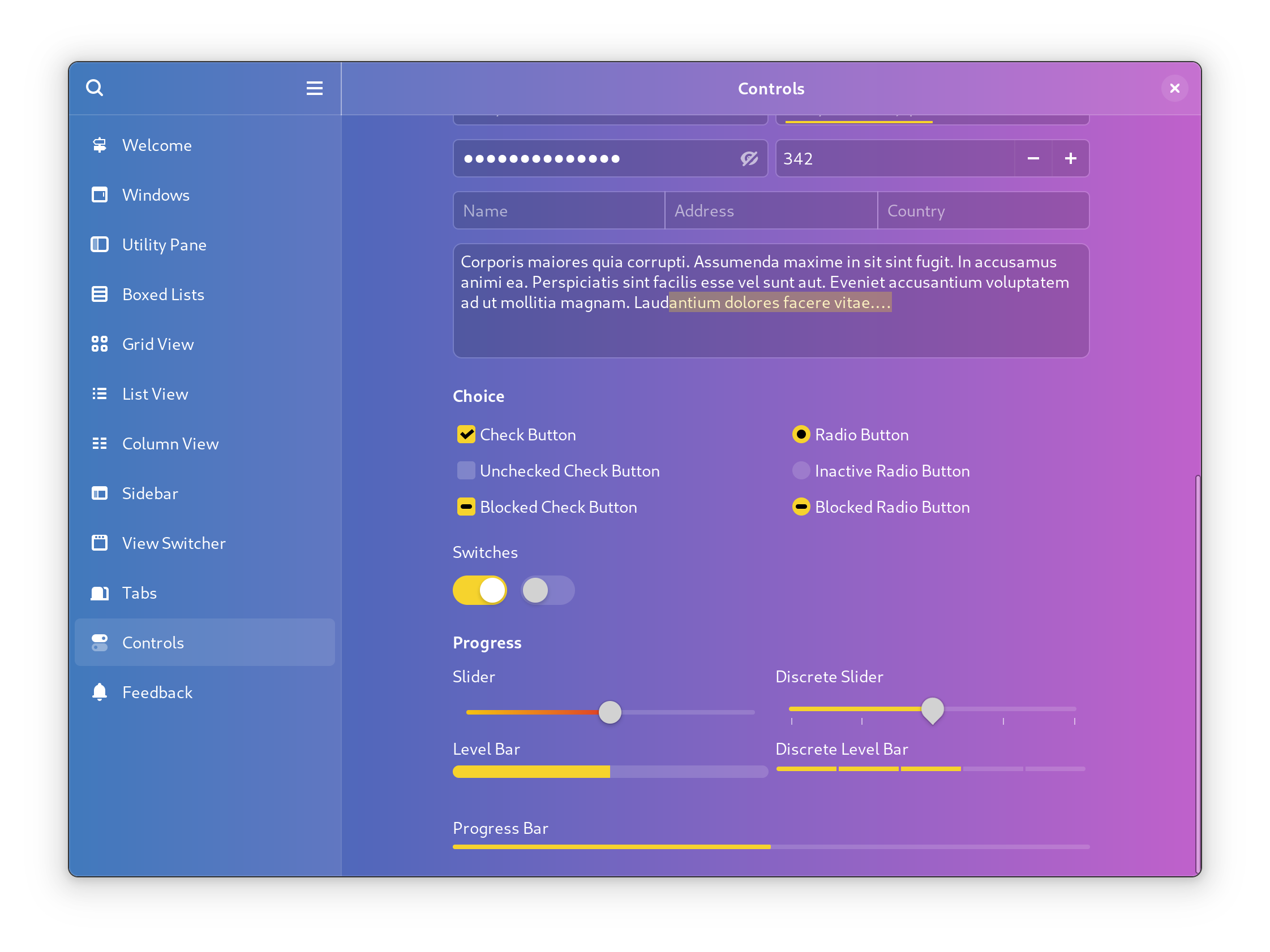
For a more detailed example of what you can do check Federico’s recent blogpost.
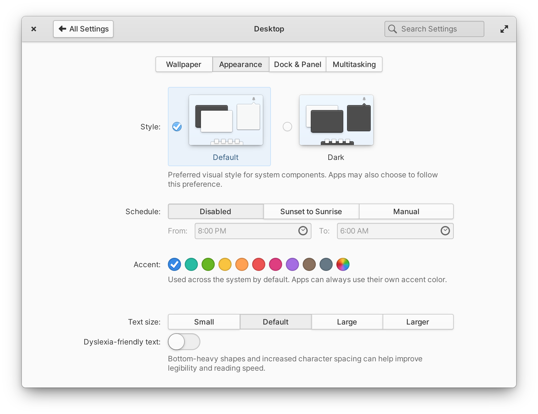
System Accents
This is heavily inspired by system accent settings in elementary OS, and it’s similar in function. Think of it like a way to set the accent color system-wide, then applications can read it and decide to follow or override it. A case where you want to override would be if your app had a Sepia mode for example.
The coloring API mentioned above is designed in a way that makes this feature easy to implement. The interface and UI for this are not yet fleshed out completely, and it’s debatable if it’s going to be implemented/merged at all. There are a couple of design issues and concerns that need further research. It’s a possibility, but don’t bet on it.
Vendor Styling
The story behind this idea is extensive and best left for another post, so here’s the current status on this infamous topic.
There have been great accomplishments to reducing the possible fallout of restyling applications with brand colors. Nowadays vendors recognize that arbitrary restyling can be damaging to application developers and have taken some precautions.
Yaru reworked its style and rebased it on Adwaita, this helped reduced the changes to mostly the color palette and minor stylistic tweaks. This got rid of a lot of bugs surfacing in applications, as Yaru now at least has the same spacing, margins and padding as Adwaita. Pop!_OS followed suit shortly after, I believe it’s now based on Yaru.
However, both Ubuntu and Pop also introduced “Dark-modes”, Pop making it the default, which broke applications’ expectations. They did it despite being warned about it. As a result this ended up increasing the issues with theming by about an order of magnitude as now you would frequently end up with black on black, grey on grey and other fun coloring bugs. It should also be noted that neither Ubuntu nor System 76 approached any contributor I know of, about properly implementing a Dark Style preference upstream. Even though GNOME and Elementary contributors had been collaborating in public for the last 3 years.
Yaru developers did some research on the topic and there was a call for engagement by GNOME, but unfortunately ever since the last theming BoF in 2019, the conversation had dried up. The interested parties haven’t provided any details on what the scope of the API would need to be, how it would look like, or the detailed requirements. Nobody stepped up to help with the Adwaita changes that were required either, or with dark mode, or to work on the QA tooling, or to figure out the implementation details. Now we are sadly out of time for libadwaita 1.0 and there isn’t much hope for such a complex thing to be ready in the next 4 months.
Conclusion
For libadwaita 1.0 and GNOME 42 the work on recoloring widgets will likely be completed. A proper Dark Style setting will likely also be implement by then. System-wide accent colors are being discussed and looked at, but there are design related concerns about them, so it’s possible that they will never land. And there won’t be any “Theming API” for libadawaita 1.0. Maybe there will be renewed interest from the vendors that want it in the future, but given the story so far, I won’t hold my breath. I hope to be proven wrong.
Really nice text. Love the way it’s written and definetly a needed one to stop the social media mess :/.
I love Zorin Themes, so I hope Canonical, System76, Zorin or any other party gets interested into writing a theming api.
Canonical definitely is, and nothing in happened in the past days is coming directly from us.
We’ve been put in the middle of the social fights various times, but if we didn’t contribute so far was for lack of resources, not of interest on doing this upstream.
Excellent post! Not everything is as I would like it (themes…), but the whole article is informative, non-argumentative (as I interpret it), and makes Gnome’s point of view clear in a very positive way.
Looking forward to Gnome 42, a working dark theme *and* accents. Keep up the posts (and the code). It’s very much appreciated.
Thank you for this. Yes, I can see the logic behind it and I can see how people will rail against it just because it is change. But the truth is your focus on accessibility and standardised theming which can be applied across all platforms and form factors seems a step in the right direction. When you think about the changes needed for mobile and portable devices as well as multiscreen desktop set-ups you need to have a way to make sure the look is familiar and intuitive both in look and feel.
I think one of the things that the Gnome Project needs to address though is clear, regular and concise communication about what technical decisions are being made and what you are trying to achieve by making them.
I have faith it will all work out in the end, but I have been using Linux for such a long time that I know it is not always going to be smooth going as it could be.
The bullying is intense from this vocal minority, it’s nice to see you haven’t given up on the good work!
I applaud all these efforts and look forward to the changes. With accent colors. Like MacOS. A beautiful default theme with accent color choices. That would be perfect.
I see an issue on the horizon though. If libadwaita itself contains the theme CSS, then you have a couple of huge issues coming soon:
1. If you want to evolve the libadwaita theme you say that you need to release a new major library version? So that means some apps will be styled in the adwaita 1 CSS and others in adwaita 2 and adwaita 3 etc? Why not do what MacOS does. They change the style every release yet all applications work and get the new look no matter how old they are.
2. If distros have outdated libadwaita versions, you will get many bug reports because applications expect newer/fixed versions of libadwaita. This seems painful for everyone.
Anyway it is a huge step in the right direction.
Hi, libadwaita maintainer here.
1. I mean it depends on whether the apps will have to do anything to adapt. If it’s a tiny change that nobody will notice – e.g. a bugfix or slightly tweaking button hover of whatever – it’s fine to do it right away. However, bigger change such as the ongoing redesign, or the 3.32 one, or the macOS Catalina->Big Sur one – these will need a major version, yes.
There aren’t many alternatives here – ultimately, breaking changes are breaking changes. It was same in GTK – e.g. the 3.20 refresh broke a lot of apps, and some are still broken (this is more related to selector changes rather than style changes, but they come hand in hand), and the 3.32 refresh (which happened in a GTK point release required public announcement blog posts, a way to test it beforehand and apps still needed changes. I don’t remember if the high contrast refresh happened after that or the same time, but that one caused some breaks too, e.g. in Epiphany reader mode icon or the gamepad config view in Games.
Treating this as a breaking change is not without precedent either: 3.x/4.x era Android apps won’t get Material, and 2.x and earlier won’t get Holo until they are rebuilt. Newer styles come in compat libraries, so 5.x era apps will also stay with that. And I mean – you also always have GTK3 apps anyway. At least libadwaita is gonna be moving faster than GTK.
macOS indeed doesn’t treat it as breaking changes, and IMO it’s a good example of why it’s a bad idea to force it on older apps. For example, Firefox 30 running on Big Sur looks like this: https://i.imgur.com/fMbJv2N.png
With the broken window title above tabs, transparent titlebar, broken General tab and outdated styles on toolbar and the view switcher, I think it’s pretty clear it’s not robust enough. And yes, Firefox is not using native AppKit widgets – but the only part that _is_ native there –
the titlebar on the preferences window – also happens to be the most broken one. 🙂
2. This is not any different from Adwaita in GTK3/from Default in GTK4, so no changes here.
Thanks a lot, Alexander, for your great explanation! Everything makes perfect sense.
I am glad to hear that CSS bugfixes will still go into the current libadwaita 1.x even after release.
And as for major style changes (2x.) making applications on the desktop look different from each other, I suppose the most popular applications will quickly upgrade to the new versions. Abandoned applications would be an issue, but I guess it’s better that those look outdated than that their CSS breaks, you’re right. 🙂
Thanks again for the great answer!
I’m really looking forward to the new, flatter Adwaita in GNOME 42. Can barely wait for it since I’ve seen the early screenshots. It’s beautiful. But I really hope you’ll be able to implement accent colors since those make the desktop feel more personal. All other operating systems have accent colors (Windows 10/11, macOS) and it’s a great feature. I was a little bit concerned when I heard that customizable accents may not be added, or that applications will be able to opt out, which sounds bad to me (it would break desktop uniformity). But I guess it remains to be seen how this works out. 🙂
— Johnny