As the title, this is a spin-off of my last post in which I’ll talk about on Files list view instead of grid view.
But before that, a brief summary of what happened in-between.
Legitimate succession
In my last post we were at the interregnum: Files grid view was temporarily managed by GtkFlowBox. Since then the switch to GTK4 has happened and with it came GtkColumnView to claim its due place.
Despite that, GNOME 42 couldn’t ship the GTK4-based Files app (but it still benefited from it, with the new pathbar and more). Can you guess whose blame it was?
A view of trees

That’s how the spin-off starts.
Files list view has for a long time been managed by GtkTreeView, a venerable GTK widget which is still in GTK4 and didn’t have major API changes.
What looked like good news, for ease of porting, was hiding bad news: its drag-and-drop API is still a nightmare.
Drag and drag
GTK4 bring a new drag-and-drop paradigm to the table that makes it dramatically easier to implement drag-and-drop within and between apps. But GtkTreeView doesn’t employ widgets for its rows, so it can’t use the new paradigm.
So, it does its own thing, but with a different API from GTK3 too. I tried to use it to restore drag-and-drop on list view, but:
1. it was laborious and time-consuming;
2. grid view, which still lacked drag-and-drop support, couldn’t benefit from this work;
3. it might require debugging and improving GtkTreeView itself.
So I realized GtkTreeView was just dragging me down and we’d better move on.
Because treeview
Users, designers, and developers have long requested things for Files list view that are basically impossible to do correctly and maintainably with GtkTreeView:
- rubberband selection;
- background space around items (for folder context menu);
- sort menu shared with the grid view;
- CSS styling;
- animations;
- rich search results list (without a clunky “Location” column);
- and more…
Much like EelCanvas, GtkTreeView doesn’t employ child widgets for the content items, which makes it lack many useful GTK features.
A view of columns

In my previous blog post I’ve mentioned how GTK4 brings new scalable view widgets. But I didn’t mention they are super amazing, did I?
The hero of this blog post is GtkColumnView. It is a relative of GtkGridView, but displays items in a list with column instead.
Both take a model and use a factory to produce item widgets on-demand.
This has made it simpler to implement the new list view. All I had to do was copy the grid view code and make a few changes. That was going to be easy!
Famous last words
While the initial implementation was indeed a quick job, it was possible only by taking many shortcuts. Also known as very ugly hacks. It was good enough to share this screenshot in early February, but not good enough to release in GNOME 42.
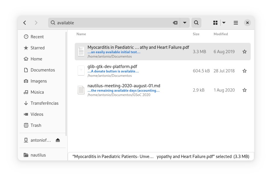
As the 42 release was no longer the target, there was enough time to do things right. I’ve learnt more about GtkColumnView, fixed some GTK bugs, reported a few others and engaged with GTK developers on API discussion. Thanks their invaluable help, I was able to get rid of the hacks one by one and the quality and design of the code have improved significantly.
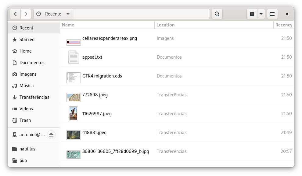
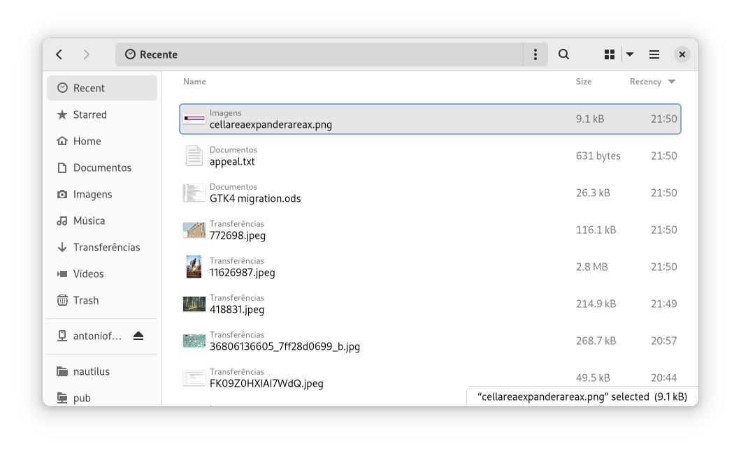
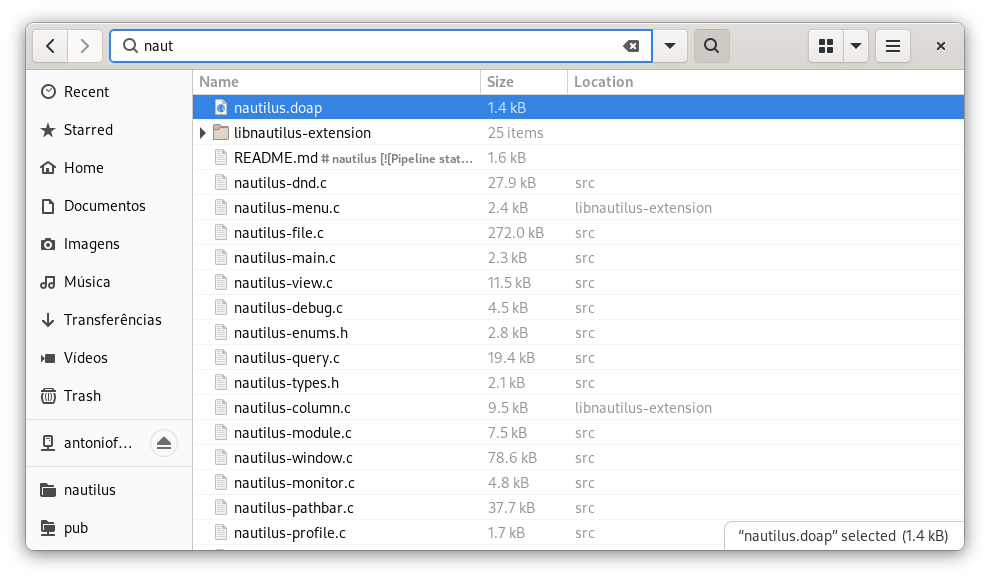
Old VS New
Who needs words when I have screenshots?
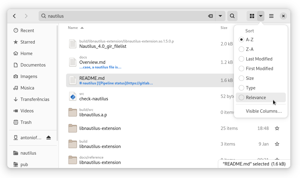
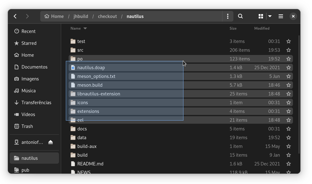
Columns & trees?
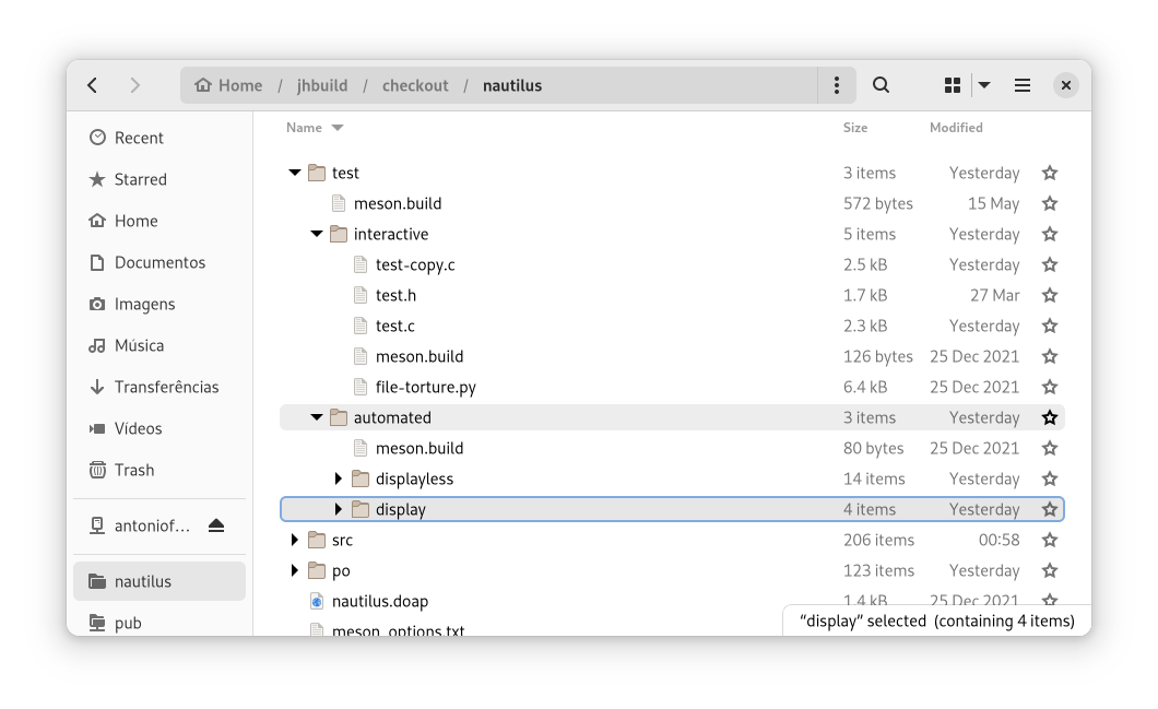
For a long time, Files has got an optional feature for list view which allows expanding folders in the same view. I don’t use it, but still did my best to implement it in GtkColumnView.
However, this implementation is still very unstable, so there is a chance GNOME 43 won’t have this feature. If you can code and want this feature to be included in GNOME 43, you can pick up on where I’ve left, your help is welcome!
A view of cells
Unlike the previous blog post, I’m going to share a little about the code design.
As mentioned, both GtkGridView and GtkColumnView use a model. The new Files list and grid views use a NautilusViewModel (containing NautilusViewItem objects) and share a lot of model-related code under a NautilusListBase abstract class.
src/nautilus-list-base.c: 1291 lines of code
src/nautilus-list-view.c: 1139 lines of code
src/nautilus-grid-base.c: 502 lines of code
In order to maximize the shared code, the child widgets of both views inherit from a NautilusViewCell widget class:
- in grid view, each item creates one cell widget:
NautilusGridCell; - in list view, each item creates one cell widget per column:
NautilusNameCellfor the first column.NautilusStarCellfor the last column.NautilusLabelCellfor every other column.
Thanks to this cell abstraction, NautilusListBase can also hold common code for child widgets of both views, including event controllers! And this means they are also going to share drag-and-drop code!
Reviews welcome in https://gitlab.gnome.org/GNOME/nautilus/-/merge_requests/847
Amazing write-up, and thank you for all the insanely hard work you’ve been putting in. I’ve been watching the progress on Gitlab. Thanks!
Thanks, I’m glad people enjoyed the post!
Switching Files on GTK 4 might give a chance to restore implementation of able adding files and folders on the desktop? As I know, from Files was removed desktop code, so with GTK 4 this feature maybe will be easier to bring back?
The opposite, actually. Ever since the desktop icons module was taken out of Files, the code has been changed in ways that make it further incompatible with usage as implementation of icons on desktop.
But that’s what’s making all these new features possible.
Great article! Nice read!
Many UX designers will be happy with the possibilities of the new design!
Two small suggestions
* Put the name of the file on top and the location at the bottom.
People are looking for the name of the file first and then the location.
* At some padding at the top of the row with the column names.
This will make it just look more beautiful.
Thanks for the suggestions. I don’t have a strong opinion on these two points, so indeed I welcome designers guidance.
Please, PLEASE, while at it consider bringing back type-ahead, even as a non-default hidden feature buried somewhere in dconf. I’ve been keeping patching it back in since it’s been removed, but that surely won’t be possible anymore once this rolls out.
Personally (as a user; I’m not one of the devs/maintainers), I would rather like to see super fast search by simply avoiding search backend spamming, with this somewhat simple optimization trick: https://gitlab.gnome.org/GNOME/nautilus/-/issues/1731
That feature has been gone for a whole decade.
Unfortunately, our search hasn’t been fast enough for a whole decade too.
The good news: the code design of these new views is going to allow making search instantaneous for results in the current folder.
this is amazing! I can’t wait to be able to use it
I can’t wait to release it in September! ?
Fantastic job, this was an immense amount of work. Whichever version this actually lands in, I’m sure users will notice.
Thank you for all you do 🙂
Thanks for the kind words, Julian!
Good work!
Side, very important note: One thing that needs to change in Files is merging bookmarks with places, or making places hideable. It’s easy to put a reset default bookmarks option in the settings or just in a right click menu for people who need them back. It’s really bad to have to look at a bunch of bookmarks I don’t use, and have to scroll past those, and scroll past removable storage, just to see my frequent bookmarks. Bookmarks should be the thing you have the quickest access to.