Compiz in a Box

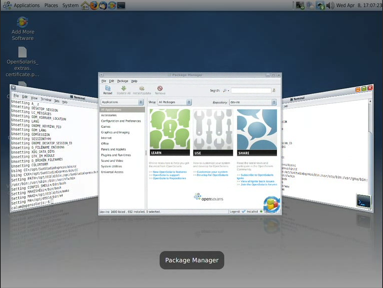
In VirtualBox 2.2.0, which was released today, that is. The new OpenGL acceleration for Linux and Solaris guests allows compiz to run very nicely in a virtual machine. (Click the thumbnail for a Theora video of compiz running in an OpenSolaris guest in OS X.)

Compiz running in VirtualBox

EDIT: I suppose I ought to add there’s some other cool stuff in 2.2.0 as well, particularly the ability to import/export appliances in OVF format.

.

Different day, same Places

A couple of years ago, I bemoaned the inconsistency of our presentation of bookmarks and places.

Last week I had cause to revisit the issue (for much the same reason as before—updating the OpenSolaris UI spec), hoping that things would have improved and I wouldn’t have to suggest too many tweaks to the OpenSolaris layout to keep things nice and consistent.

Unfortunately, it doesn’t look like much has changed though, really, which is kind of disappointing. (Especially as seeing this bug marked as resolved had built up my hopes a little…)

Caveat: as in my original post, the latest release of Ubuntu (8.10, GNOME 2.24.1) was the closest I had to a community build when I was doing the comparison. So things may really be a little better or worse than they appear here, or may have been fixed in 2.25/2.26.

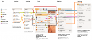
So I hacked up a quick diagram showing all the menus and sidebars where bookmarks and places appear, and aligned them on the “Home Folder” entry since that was about the only one that was consistently placed. Here’s what I came up with:

Side-by-side comparison of bookmarks/places in Ubuntu 8.10

The plusses:

  • The two Places menus on the panel (one in the menubar applet, one in the main menu applet) are now identical, at least in Ubuntu. This is good to see, although most users won’t see both at the same time anyway.
  • The Go and Places menus in Nautilus (browser mode and spatial mode respectively) are pretty consistent with each other too.

The minuses:

  • Inconsistent appearance/placement of mounted media, Computer, Desktop, Templates, File System, and CD/DVD Creator between sidebars and menus.

Of course, it would be wrong to complain without offering any proposals, and I’ll get to that—just haven’t got time today. The current draft of the OpenSolaris 2009.04 UI spec does include my first quick attempt, but that’s currently based more on “least amount of work to fix” rather than “what might be most useful”… and we all know that’s not really the way to do it, right kids? 🙂

OpenSolaris 2008.11

Sun are officially launching OpenSolaris 2008.11 today… although as the name suggests, it was pretty much ready to go at the end of last month, and those in the know have been able to download it from both the community website and the distro website since then 🙂 You can join us at 1700 UTC today for a web chat with some of the people involved.

Glynn has written up a good summary of new features, which include GNOME 2.24, ZFS Time Slider, accessible install, and big improvements to plug’n’play printer support, automatic network configuration, and laptop suspend/resume. The number of additional packages available in the repositories has greatly improved since the 2008.05 release, and we now have various repos and a new process that will make contributing packages easier than ever.

Roman Strobl has produced a 12 minute screencast to show off some of the new bits, and Erwann Chénedé has a shorter one that focuses exclusively on Time Slider, which seems to have been generating a lot of interest.

Of course, 2008.11 still has all the usual Solaris goodness like ZFS, Zones and Dtrace built-in, with the Solaris Trusted Extensions now just a click away too, giving you access to one of the most secure desktops on the planet*.

So why not give the LiveCD a spin? You can grab it via BitTorrent, or download the ISO directly from Sun (or alternatively, from the genunix mirror, or via FTP from LTH in Sweden).

* Probably 🙂 (OpenSolaris Trusted Extensions hasn’t received Common Criteria Certfication yet, but the Solaris 10 version was most recently certified at EAL 4+. More information here.)

End of an era…

usability.gnome.org is no more.

Well, okay, that’s not quite true 🙂 The old developer.gnome.org sub-site it redirected to is no more, because all the content has moved, mainly to the Usability Project wiki. Hopefully we’ll get some new redirects in place soon.

This has left the online version of the development branch of the HIG without a home (the stable version, of course, moved to library.gnome.org a while ago). So for now, I’m hosting that here.

EDIT: D’oh, seems the development version was already online too, at http://library.gnome.org/devel/hig-book/nightly. I’ll dump the version from my homepage shortly.

On the new shell

It’s great to see Vincent, Owen, Federico, Karl et al. thinking about bold ways to bring the GNOME desktop into the 21st century.  With guys like that motivated to make it happen, we certainly have more than a fighting chance.

But despite taking a keen interest in GNOME usability for the thick end of a decade, I haven’t specifically commented on any of their mockups.  Why not?

Because if we’re serious about this undertaking, now isn’t the time to debate the merits of major design changes among ourselves. It’s the time to go out, talk to our users, watch them using GNOME, and work out what needs to change, what might be cool to change, and (just as importantly) what needs leaving alone. And that’s before we even think about making any more mockups.

And when I say “our users”, I’m not talking about the usual suspects here, either.  I mean the silent majority who don’t show up at GUADEC, don’t hang out on mailing lists or IRC, and don’t file bugs.  The ones who might not even use GNOME through choice, but might just have got out of bed one day to find it’s been installed on their office or school computer, or on the kiosk in their library.  And the ones who don’t even know they’re running GNOME at all, but who just know they have some desktop or mobile device that doesn’t look exactly the same as Windows does at home, but that it kind of works the same.

With all due respect to those who’ve put their ideas on the line so far, making visionary mockups of a brave new world isn’t usually all that difficult—although it’s certainly fun 🙂 Making mockups that meet well-researched, documented user requirements takes a bit more effort, though, and refining those mockups into a product based on iterative feedback from a representative sample of users is, well, a lot of hard work.  You only need to look at the amount of software that sucks for proof of that.

With that in mind, let’s do it!

(FWIW, I did some further waffling on this theory in my response to Stormy’s mail on the usability mailing list recently.)
Step back in time

Slightly crummy name, but great to see the first phase of the ZFS Time Slider project that Erwann, Niall and Tim have been working on coming together in time for our OpenSolaris 2008.11 release next month.

It works a bit like another company’s product of a similar name, except right now ours only takes regular snapshots to the same disk, rather than backing up to removable media (but we’ll probably end up doing that too). It’s not quite the auto-save function that Federico was talking about last week and at GUADEC, but it’s certainly nice to see some of the power of ZFS in use on the desktop at last.

HIG 2.2

I just bumped the stable version of the HIG to v2.2.  

Really it’s more of a 2.0.1 release, as none of the content has changed apart from the illustrations, which have all been updated to use the Clearlooks theme.  But given the number of people involved (Mihai Anca, Denis Anisimov, and Wouter Bron did the bulk of the illustrations) and the length of time it’s taken me to integrate them (about 9 months!), 2.2 seemed more appropriate…

(Unfortunately, nowadays you don’t get to see new versions of the HIG online until there’s a new release of gnome-devel-docs, and I know I just missed 2.24.0. But hopefully there’ll be another one along soon.)

Of course, this doesn’t address the more fundamental issue that the HIG now lags several years behind the curve of GNOME development. I’d like to think we’ll get around to doing something about that before the year is out.

On app-specific themeable icons

So, we’re attempting to follow this advice for a couple of OpenSolaris applications we’re working on.

It works fine for the hicolor icons, but the advice for themes that want to over-ride them is rather vague: “You can also provide icons for other themes in here [$pkgdatadir/icons], by installing them into a subdirectory for that theme.”The question is, who’s responsible for installing them? The theme or the app? Seems to me there are problems either way.

If the theme installs them, first it has to find out where that app installed its hicolor app-specific icons. It will usually be /usr/share/appname/icons/hicolor, but there’s no guarantee about the value of $pkgdatadir for any particular application.

Once over that hurdle, the theme is now stomping in the application’s territory. At best, uninstalling the app will leave a $pkgdatatdir/icons directory on your disk, containing a bunch of icons that aren’t going to be used any more. At worst, the app uninstall might just lazily blow away the $pkgdatadir directory altogether, wantonly deleting files that were installed by another package (the theme).

On the other hand, though, we surely can’t expect each app to be responsible for installing icons for every theme that wants to override them. Distros can of course patch those apps downstream with their branded icons du jour, but that will soon become cumbersome when there are more than two or three such apps. And independent theme artists, such as those who contribute to art.gnome.org, don’t have the luxury of patching any apps at all. So their themes would never be able to override app-specific icons.

So what to do? The more I work with themes, the more I wish they’d all go away and we’d just use a single, identifiably-GNOME look-and-feel like the grown-up desktops do 😛 

Tab frenzy

Have to admit I cringe every time somebody adds tabs to an application. Not because I have anything against appropriate use of tabs (and I’ll reserve judgment on which of the recent additions are appropriate for another day), but because it’s such a wasteful duplication of effort, with each instance doubtless having its own inevitable little bugs and inconsistencies.

The HIG advises against document-level tabs in an app, largely because at the time, the usability team hoped GNOME would have a tabbed window manager in its not-too-distant future. The tab-related activity in the past week has me thinking me that we need this more than ever! App developers shouldn’t have to implement basic window management features, and (perhaps more importantly) users shouldn’t be restricted to grouping documents from the same application into tabbed windows–with a tabbed WM, they could still do so if they wanted to of course, but they’d also be free to group windows by task or project, or indeed any other way they wanted.

Is it worth starting to think a bit harder about how a tabbed WM might work (I don’t think we’ve ever sat down to try to design one for GNOME, although I know at least one tabbed WM has been implemented before)?  Or is it just something that’s just never likely to happen?