- “Wow, GNOME looks pretty much the same today as it did four years ago— that’s awesome!”
- “Wow, GNOME looks pretty much the same today as it did four years ago— that sucks!”
Discuss.
Discuss.
I do wish mobile phone companies (well, Nokia in particular) would print model numbers somewhere on all their handsets. I’ve had three different ones now, and every time I go to buy an accessory, I can never remember which one I’ve got. (I think I currently have a 3100, and Julie has a 3220… but it could quite conceivably be the other way around. Or neither.)
I don’t know who designed the heating system in our house, but they could do with attending a usability course or two.
We have a gas combi boiler, which has three controls. One is a master on/off switch, with two settings– “off” and “radiators” (according to the icons). The second is a thermostat, with no numerical legend, just another “radiator” icon. The third is a 24-hour timer with those annoying tiny pins you have to pop in and out, which also has its own three-setting on/off switch (on, off and timed).
On top of that, there’s a thermostat in the hall with temperature markings on it, and a lever beside the hot tank to switch between “radiators and water” and “water only”. Add to that the variable controls on the radiators themselves, and it certainly becomes quite a challenge to decide what to adjust when you’re feeling a bit chilly.
Anyway, right now we have it set to “water only”, and all the radiators are off, as it’s 25C+ outside most days at the moment. This morning, I went for a shower (which takes the water from the hot tank), and there was no hot water…. the combi boiler hadn’t come on in the early hours like it was supposed to. Went downstairs, checked the gas supply on the cooker… fine. Switched the timer switch from ‘timed’ to ‘on’, which should light the gas immediately… nothing. Tried switching the boiler off and back on again… nothing. Pressed the Reset button… nothing. The boiler doesn’t have a pilot light, so I knew that wasn’t the problem. And the front is screwed on, which suggested I shouldn’t really try poking around in it.
Was on the verge of calling a heating engineer when I decided that the only control I hadn’t played with was the thermostat in the hall, which was set to a reasonable enough 24C (if you disregard the fact that the radiators are turned off anyway). Turned it down… nothing. Turned it up, and… click, the boiler lit up. That’s right, in our house you can’t have hot water unless the radiator-controlling thermostat is set to something above room temperature, even when the radiators have been turned off for months. Marvellous.
Kudos to the Thunderbird team for adding a neck-saving feature (maybe it’s been there forever, but I’ve only just encountered it tonight)… an alert that pops up when you try to send a mail using the keyboard shortcut rather than clicking Send. How I’ve laughed in the past whenever I’ve sent incomplete/embarrassing/borderline-litigious emails by mistake (usually when trying to use some other keyboard shortcut, followed by Enter) before I’d counted to ten and rewritten them 🙂
Now, you could well argue that it’s a poor shortcut (Cmd-Enter on Mac, presumably Ctrl-Enter on others) that’s easy to hit by mistake. But it’s kind of a standard one these days, so the warning is appreciated in the meantime until they pick a better one.
Part of the reason StarOffice (and by association, OpenOffice.org) is “just as complicated and feature overridden as the real thing“, of course, is that whenever Sun tries to take out feature X, customer Y complains and stops buying it. Being disruptive is so much easier when you’re starting from scratch with nothing to lose 🙂
While working on a proposal for desktop defaults for our next version of the Java Desktop System, I’ve been somewhat perturbed by the mess that our concept of “Places” is in.
These screenshots are from Ubuntu Dapper as I’m on my Powerbook at the moment, but IIRC the vanilla community version isn’t significantly different (except for the Documents ‘place’ that Ubuntu has– but we have that in JDS too so that’s part of my problem as well). I have one bookmark and a few network places set up– this is one of my everyday, working desktops, so my experiences are presumably fairly typical.
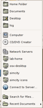
The user’s first encounter is most likely on the Places menu on the panel:

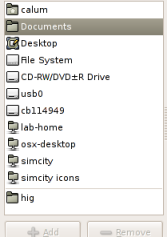
Then when they open a file, they get this collection of Places instead– now their bookmarks are at the bottom, and they can choose from devices that weren’t available on the Places menu:

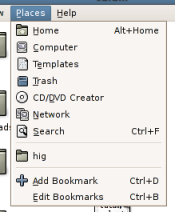
Using nautilus in spatial mode, we get this different content and ordering again– and a third different term for the home folder:

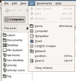
And using nautilus in Browse mode, the Places sidebar and Go menu don’t even agree with each other, let alone anything else:

Now, obviously a wee bit of context sensitivity is appropriate… in the file selector, you’re unlikely to want to open files from the CD Burner or Trash locations for example (although I’d be quite happy to allow opening from Trash– I always get annoyed at OSes that force you to drag things out the trash before you can look at them again). But surely we can do a better job of consistency here overall? My Places are my Places wherever I’m accessing them, and in general I’d expect to see the same ones in the same order.
Or is it just me…?
Glynn mentioned Marney’s departure1 and her Bonehead List… just to remind folks we’ve had a (slightly older and slightly GNOME-ised) version of this list on the GUP website for a couple of years, which I’d encourage everyone to think about before they start a new project. It’s interesting to see how the list has evolved since Marney worked in the Accessibility Program Office, and as Sun have become even more involved with open source projects… I should probably update the list on the GUP website accordingly.
1Which I’m also sad about… Marney was one of the people who interviewed me for my job at Sun, and was my dotted-line manager for a couple of years.
As one of those people who complained about the HTML output of DocBook recently, it’s good to see Shaun kickstarting some progress on this.
I think my main concern with those mockups is the line length… in English, ten words is about the most you can fit on a line before reading speed slows down. This isn’t so much of an issue for stuff that turns up in help browsers, as the narrow width of the window naturally restricts this anyway, but it’s a problem for things like the HIG that are normally read in a web browser. I’ve tried to deal with this in the draft HIG’s stylesheet recently by indenting the body text from both sides of the page, which also makes it easier to pick out headers. (Example)
My main gripe with the HTML version of large DocBook documents, though, is the lack of a navigation sidebar. Things like the HIG are a pain in the bahookie to jump around, when every other major online styleguide (Mac, WIndows, Java) makes it simple.
My Christmas break started on Wednesday, and I won’t be back in the office until January 9th (except next Wednesday to see if I won anything in the annual corporate-gifts-we’re-not-allowed-to-accept raffle). I don’t anticipate that GNOME usability will suffer in any way while I spend the next month parked on a beanbag eating chocolate and trying to finish as many of my old PS2 games as possible so I can pick up some new ones in the January sales, but my waistline inevitably will. Happy whatever-it-is-you-feel-like-celebrating!
Heh… those of you who remember Jakob Nielsen’s infamous Why Frames Suck article might find this Ajax spoof amusing…