Justified and ancient

Although it’s common for Metacity themes to have centred titles, there are still several themes which have the title justified to the left or right. GNOME bug 612940 makes the not unreasonable suggestion that the justification should be swapped when the system is running in a language such as Hebrew, Arabic, or Urdu which is written from right to left.

There is a patch supplied, but it swaps only the position of the text. This isn’t a problem when the titlebar’s decoration is symmetrical, but when (as in the case of Crux) it isn’t, the title moves without taking the decoration along for the ride.  See the illustration on the right; the word “שלום” is written in white on the grey part of the titlebar instead of on the blue part.

The way forward from here might be:

  • to leave everything as it is
  • to commit this patch, and hope that people who speak these languages will avoid themes with non-centred window titles and asymmetrical titlebars
  • to mirror the entire window border decoration if we’re running in a right-to-left language.  This may be non-trivial.

Your thoughts, gentle reader, are as welcome as they ever were.

Theme-based button layouts

day 80Some window border themes, such as Radiance Chrome or any theme attempting to recreate the look of OS X, have the window buttons carefully designed as separate images which can’t be re-ordered without breaking the design.

At present, the order of buttons is under the control of the user, not the theme.  If a theme artist creates such a theme, they must tell the users separately to set the button_layout key in GConf to whatever is needed.  This problem is particularly acute because Ubuntu 10.04 Lucid Lynx uses such a theme by default, and accordingly sets button_layout to an unusual value; see Launchpad bug 532633 for much more discussion of this matter.  Users of Lucid who switch to other themes will still find the buttons arranged as before, which may confuse them.

GNOME bug 613522 suggests solving the problem by allowing themes to specify an override for button_layout.  This may be a workable idea.  However, according to policy, once a version of the theme format is released, it’s set in stone. So we can’t add new information to v2 themes: we can only move up to v3.

One possible workaround, however, is to allow a GKeyFile in the theme directory which specifies only the new value for button_layout:

[ButtonsOverride]
button_layout = menu:minimize,maximize,close

That would allow newer versions of Metacity to honour the layout request while allowing older versions only to honour what’s written in the theme file.  Gentle reader, what are your thoughts on such a scheme?

Launchpad bug 542772 is another attempt to deal with this problem, by adding an option to the window menu to choose the layout.  However, this is unlikely to be implemented: the window menu is already cluttered, and besides the button layout is a matter for gnome-control-center to decide.

Photo © kygp, cc-by-nc-nd.

Specifying button widths in CSS

The height of a button in a CSS theme is determined by the height of the titlebar, which in turn is determined in most cases by the height of the titlebar font, but occasionally explicitly.  The height of buttons cannot be set explicitly.

For the width of the button, however, there are two common cases:

  • The artist wants it to be a specified number of pixels, millimetres, ems, etc.
  • Much more often, the artist wants it to be a specified multiple of the button’s height, often 1:1.

There has been some controversy about how we should represent this in CSS:

  • In the first draft of the themes specification, the width and height properties could be set on a button, but were only used to calculate the ratio.  Explicit widths could be set using max-width and min-width.  Screwtape called this abuse of the semantics “a bit cruel”.
  • We could honour width directly for absolute values, but then there comes the question of how to handle ratios.  If you set the width to a percentage, we could use that, but traditionally that has meant a percentage of the width of the enclosing element, not of the height.  We could make an exception in this case, of course.
  • The universal solution of width: -cowbell-button-ratio(0.25), or whatever, which is ugly.
  • Or alternatively allow width to be set directly for absolute widths, and as an alternative have -cowbell-width-ratio: 0.25.
  • Invent a new unit!  width: 0.25ht.  This idea should probably be avoided.

Your chronicler is stumped as to the solution which would be clearest to theme artists.  Gentle reader, do you have a suggestion?

Themes roundup

Here are four pieces of news from the world of theming.

  1. Human may be replaced. We don’t usually cover news about specific themes here (although perhaps we should) but it’s worth noting that Ubuntu’s default theme, Human, although very beautiful, is a little long in the tooth.  There has been a proposal to replace it in 10.4 Lucid Lynx with a new, similar theme called Homosapien.  (Your chronicler notes that the human species is homo sapiens sapiens, not *homo sapien, and wonders whether it is too late to change the name.)
  2. Universal theme format. At present, there are scores of different formats for theming user interfaces, some of which are often packaged together to be complementary or alternatives. There are also various metatheme formats for packaging several disparate types of theme together, but they are specific to a particular desktop. David D Lowe has proposed a “universal theme format”, which is a container for various types of themes, to be considered as a freedesktop.org standard. Time will tell whether it’s adopted, but for the moment, gentle reader, you can find out the details in this PDF (there is no HTML version, unfortunately).
  3. The state of Cowbell. Speaking of universal theme formats, Cowbell is an attempt to allow theming using CSS rather than Metacity’s own rather recondite theme format, which may hopefully one day be picked up by other window managers.  More work has been done on the cowbell branch than has seen the light of day, but it has proved difficult to merge the existing content with the master branch; furthermore, we should probably be looking at keeping the CSS theme code separate in a library so that other window managers can use it as well.  So the branch has been quiet recently.  There are plans to forge ahead with what we have, however, and to integrate the results of the detailed discussion on the subject at the end of last year.
  4. Cowbell and its dependencies. There are several ways in which the current libccss-based implementation falls short of what we need, at least last time we checked. Any or all of these apparent problems may be mistaken, but:
    • Several of the CSS3 selectors which would be really useful weren’t implemented, even things like sibling selectors.
    • There’s also a lot of flexibility we don’t need, since our “documents” are of a fixed form.
    • There’s apparently no way to refer to a window’s icon other than by saving it as a bitmap and reloading it.
    • Some of the extensions we’d need to have equivalent power to the v2 theme system, such as -cowbell-replace-color, look like they’d be a nightmare to implement for similar reasons.
    • We can’t easily implement the requirement that it should be possible to load images from a tarball, for similar reasons.
    • We can’t easily add new colours, which we’d need to to implement system colours (which may be deprecated but suit our purpose very well), or any similar way of getting at the GTK colours.

    We could work around these, but it’s far better to make the theme format usable by humans than to tie ourselves in knots to get around infelicities in the software.  And we always have the option of adapting libccss to our needs.  But a lot of what we need to do is specific to our own case, and if this results in tying the library in knots it may become better to write a stripped-down in-house CSS parser that does what we want and is, as they used to say in Cambridge in the old days, BALGE: by and large good enough.

Gentle reader, we love your letters.  Let us know your news, whether or not it’s about themes.

Photo © camera_obscura, cc-by-nc.

Border widths under user control

halfsiesAt present, the width of a window’s border is decided by the current theme.  However, some people find it harder either to see thin borders or to click on them.  They would prefer thicker borders than most people want.

In addition, Metacity measures border widths in pixels.  The higher the resolution of a display, the thinner the borders will appear, exacerbating the problem.

Of course, since borders are under theme control, one solution is to make a new theme; this is after all what we do for users who need high-contrast window borders.  However, this modification will need to be made for every theme a user wants to use.  Furthermore, the Metacity theme format is not easy for the general public to modify.

CSS themes would circumvent the problem by allowing widths to be specified in millimetres, rather than pixels.  However, this is not currently supported by the underlying libraries, and even if it was, the problem of themes which still used pixels would remain.

GNOME bug 496536, which mirrors Launchpad bug 160311, discusses this issue.  Two suggestions are made:

  1. A setting to allow the user to override the width of borders.  There is a patch to allow this, but it has not yet been committed. For example, here is the Crux theme with the border width set to 100 pixels.
  2. Make “the mouse stick to the border”.  If this means making the cursor pause briefly while moving over the border of a window, it may pose a problem with implementation.
  3. A third suggestion, not made on either bug, is that the clickable area of a border should be a few pixels wider than its visible area.

Your chronicler would like to hear from readers who have this difficulty, particularly because of an accessibility problem, as well as your opinions on what should be done about the matter.

Photo © Lauren Marek, cc-by-nc.

Future directions of Cowbell

Traffic signsFuture directions. Here’s where Cowbell is going next:

  1. The existing functionality is going to be moved into a library called libcowbell.  Very little will be changed at this point from what we already have.  (But there will be some extra tests.)
  2. A release of the metacity-cowbell branch will be made that can use libcowbell.
  3. A release of real Metacity will be made that can use either libcowbell or conventional themes.
  4. Development of libcowbell can continue.  (I expect pseudoclasses to be among the first things added.)

More more cowbell. Iain has pointed out an existing GNOME-based project called cowbell.  I hope the fact that this project will be libcowbell will be enough to avoid confusion.

Feedback on feedback. Screwtape has reviewed the existing cowbell documentation in a web page here.  Here is my feedback on the feedback:

  • §3: I did start out by showing the structure as pseudo-XML, but people commented as if the window borders were the result of rendering that XML (as if it were XUL, or something similar), so I think it may be misleading.
  • §3: I dithered over using the ID or a class for this sort of thing for quite a while.  In the end I went with a class because we use classes for buttons (since they may repeat) and it seemed as well to use the same design for areas, and because you may have more than one content area visible at once, even if they are on separate windows.  But I may have been wrong, and I invite opposing opinions.
  • §3: buttongroup: I really like this idea.  But AFAIK libccss doesn’t yet support last-child etc (see next…)
  • §3.1: I want our CSS support to be up to level 3 wherever possible.  However, we are constrained partly by what libccss is currently capable of.  Of course we can patch libccss too!  Backgrounds and Borders is largely supported by libccss, though.
  • §3.2: Unpainted areas are transparent (though if the frame is opaque, you’ll just see the frame through them).
  • §3.3: font-size is important; what should the interaction be between the font size set in Metacity gconf and the font size in the theme?  Just use the theme font size for scaling as in v2?
  • §3.3: button heights: I think I didn’t explain myself properly here.  You can (should) set height and width on buttons.  But these only serve to establish an aspect ratio.  The height is always calculated from the titlebar height at present.  Perhaps this is overly confusing.
  • §3.5: :focus pseudoclass: perhaps this should be set on all elements in a focused window.  Or perhaps just the frame and we can use the descendant selector.
  • §3.5: :disabled — hadn’t thought of this, good idea.  TMTOWTDI.
  • §3.5: I’m not sure libccss supports :not() (but maybe it does!)  If so, yes, we should use it.  It’s far better to work the way people expect us to work.
  • §3.7: I hope we support SVG too.  It would be extra nice if it could be styled with the same CSS somehow.
  • §3.8: I really want mm and em as well as px.  I’m not certain libccss knows how to do this, but I will check.
  • §4: Nobody’s really tried to put Dublin Core data in CSS before, and I’m probably not doing it the best way.  I worry that including a required custom XML file will be slipping back into using custom formats, though.  Maybe we should use an @rule.  Or specially-formatted comments.  Or maybe we should give up on the whole required metadata idea.
  • §4: I like the idea of specifying alternative stylesheets, though metadata in the stylesheets themselves could also do this.
  • §6.1: yes, we really need a default stylesheet.  I’m not sure what should go into it.  I will think about this and include it in the first libcowbell release.
  • §6.2: okay, we’ll avoid data: URLs.
  • §6.2: let’s implement the single file doctrine by allowing any file in ~/.themes/ThemeName/cowbell/ThemeName.tar to be treated as if it was in ~/.themes/ThemeName/cowbell/.  I think we can get that in the first libcowbell release too.
  • §6.5: I really like Firebug.  Are you thinking we could use Firebug itself, or just copy its UI?
  • §6.11: Maybe we could also modify hue/saturation/value directly in the URL thus: url(‘file:fred.png?hue=#f00’)?
  • §6.13: I was thinking of themes which, say, repeat a pattern an integral number of times on the otherwise empty part of the titlebar, scaled to fit; this wouldn’t be possible using border-images, but would work fine with filler.  On the other hand, perhaps this is overkill.

Feedback from everyone reading this, on the above and on the original document, is very welcome.

Maybe we need to take over a little piece of live.gnome.org to hash all this out.  Or maybe we need a mailing list.  I’ll wikify all this tonight and then post about it here.

Photo © Honza Soukup, cc-by.

Future directions for Cowbell

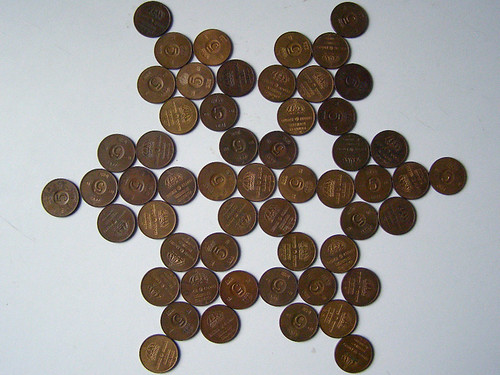
55 femöringar - five-öre coinsI believe the best direction in the immediate future for Cowbell is as follows:

  1. Fix the :hover and :active pseudoclasses.
  2. Add support for v2 themes back in.
  3. Provide a patch for Mutter.
  4. Port some more themes, such as Crux.

Anyone wishing to advocate for anything else on the future directions list to come sooner is welcome to make their point, however.

Please let me know if you’re testing Cowbell, or if you’re interested in it. whether or not you’re working on new themes.  I’d like to keep the Cowbell community cohesive.

Photo © Eva the Weaver, cc-by-nc-sa.

The Sunshine theme

In order to demonstrate Cowbell more adequately, I asked Firinel to help design a new and simple theme. The result was Sunshine.

In order to test Cowbell, you will need to download Sunshine.  Then follow the instructions in the README to unpack it into your ~/.themes directory.  The tarball also includes a copy of Crux, so that you can share GConf settings between desktop Metacity and Metacity-with-Cowbell running in a Xephyr window.

I hope this new CSS theme is the first of many.

CSS on window borders experimental layout language

cowbellI’m happy to announce the first experimental version of Metacity with support for CSS window borders (“Cowbell”).  This work was largely supported by Collabora Ltd.

You can:

This diagram should explain everything, perhaps.

I would especially like to hear from:

  • theme artists, to let me know whether it’s adequately powerful;
  • anyone else interested in hacking on this with me;
  • the GTK client-side decoration people, so that we can harmonise the way we represent things;
  • people who know a lot about CSS and can offer insights into the suitability of the way we represent things;
  • people who know a lot about the Dublin Core and can offer insights into whether our metadata system uses it appropriately;
  • maintainers of other window managers (especially Mutter), so we can talk about including CSS support in other window managers;
  • everyone else, to suggest which of the directions for future development are most interesting.

I think it may perhaps be helpful to set up a Cowbell mailing list, so that we can compare notes on implementations.  For example, I haven’t written down anywhere how to place an image to the right of the title, which is commonly needed (you use border-image).

Photo © Craft*ology, cc-by-nc.

Creative Commons Attribution-NonCommercial-ShareAlike 3.0 Unported
This work is licensed under a Creative Commons Attribution-NonCommercial-ShareAlike 3.0 Unported.