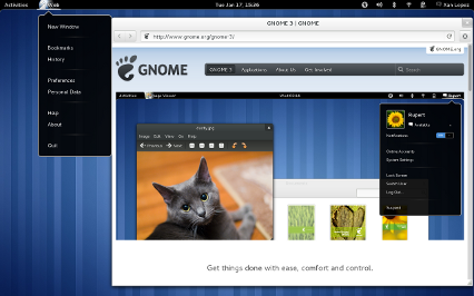
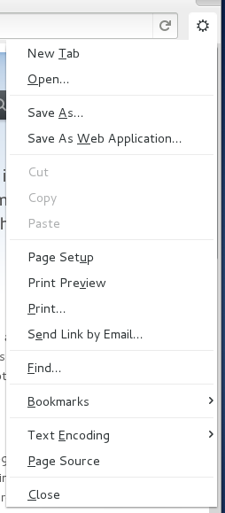
Previously in this space we saw how the bright future of Epiphany looked like, and vague promises about incremental steps towards it were done. A month later, Epiphany 3.3.4 is out there, so let’s see how well we’ve done.
There’s a lot of new stuff here, so let’s go step by step.
Application menu
The application menu, accessible from its usual location in the Shell, holds actions that affect the entire application as opposed to the currently focused window or tab. You’ll need a fairly recent version of the Shell and gnome-settings-daemon (3.3.4 of both should do, when they are out) to get it working, otherwise the browser will fallback to a lonely “Application” entry in a now deserted menubar.
Also, notice that we now brand ourselves as “Web” in all user visible strings.
New toolbar
The bulk of the changes are here. As you can see the Back and Forward buttons have been visually merged, a fate shared by the location entry and the reload/stop button. The entire menubar is gone, being replaced by a “super menu” triggered by the funny looking button with a gear (more on this later). Everything else that used to be in the default toolbar layout is now gone, as is the ability to edit its contents, making the concept of a default layout more dramatic. Finally, we use a new style for the toolbar, making it seamlessly merge with the window decoration. We think it looks great!
Super menu
In the quest to save as much vertical space as possible in the default layout we have moved all the remaining actions of our menubar into a side “super menu”. Here will live actions related to the current page, although for the moment we have some visitors there en route to their new destination (like the Bookmarks menu, which will live in the new Overview).
The devil is in the details
A lot of other small tweaks and cleanups have happened, too many to mention. From a renewed floating statusbar (now shared with Nautilus), to spacing tweaks, to more thorough use of symbolic icons throughout the UI. Special thanks go to the Design Team, it’s a pleasure to work with them in both the small details and in the big picture re-designs.
Also, one benefit of having a renewed design focus is that it allows you to do this:
135 files changed, 14988 insertions(+), 26958 deletions(-)
Around 12,000 lines of code have been deleted since 3.3.2; the biggest chunk comes from the demise of EphyToolbarEditor and friends, but in other places we have just managed to do the same, or more, with less. This means more energy devoted to make Epiphany really good at what it should be doing, which is what every core GNOME application should aspire to do.
More to come
This is only the beginning, not the end. The Epiphany team will now continue full steam ahead to implement the new Overview, merge the new SQLite history backend, port our extension system to libpeas and many other exciting features, maybe including some surprise gift in the Web Application camp. Stay tuned to this space and, as usual, happy hacking!


Pingback: Smile » Blog Archive » Accessibility support in WebKit2GTK+
@Jeremy,
The whole idea of the application menu being in the gnome shell top panel is just bad. The top panel does not span two monitors. So if you have your browser on your non-primary monitor you have to move you mouse back to the primary monitor to make a menu selection. Also this prevents you from keeping focus on a single display. The mac has this same problem and it is just annoying to use a mac application on a non-primary display.
[WORDPRESS HASHCASH] The poster sent us ‘0 which is not a hashcash value.
Pingback: GNOME 3.3.4 é disponibilizado « BLOG do Aureliano
Pingback: osS) (Side blog » Proviamo Web, il browser secondo Gnome 3 (text & empathy)
Pingback: Iocane powder » Blog Archive » Web. It’s what’s for dinner.
Pingback: As novidades do GNOME 3.4 | DPKG