The first beta of GNOME 3.4 came out at the tail end of last week, which means that we are roughly on track for a final release at the end of March. The beta also marks the beginning of the UI freeze for this cycle, so now seems like a good time to check out the cool stuff that’s coming in 3.4.
The following are just the changes that I know about; I’m sure that there are plenty of others. There’s no shortage of things to talk about though: the amount of improvement in recent GNOME releases has been really impressive, and this release looks like it will be no exception.
Updated Applications
Applications are where many of the big changes can be found for this release. Documents and Contacts had their first releases in 3.2. Now they’re back, and they’re joined by Boxes too. All three of these new GNOME applications feature updated user interfaces, which is the outcome of the ongoing application design work that I discussed in my last blog post. We think they’re better than what we had before; we hope you do too.
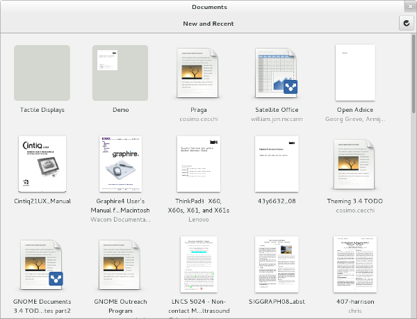
GNOME Documents no longer has a sidepane, and instead features inline collections and a big thumbnail grid that fills the entire window. The searching and filtering experience has also been greatly improved.
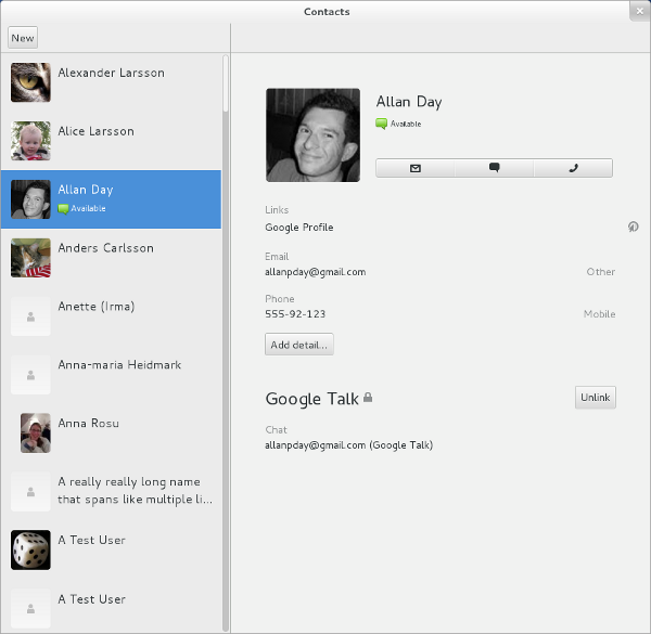
Contacts has been redesigned to include a new list layout and a cleaner contacts pane that features inline editing and automatic linking suggestions.
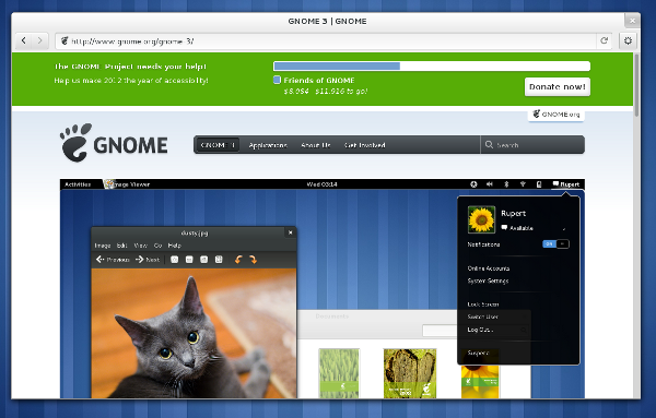
Several existing GNOME applications have also received big updates this cycle. Epiphany is the principal example here. It has lost its menu bar and gained linked back and forward buttons and a really nice new address bar.
Empathy also has a new video calling UI, and Seahorse, the GNOME keyring application, has been given a facelift.

UI Components
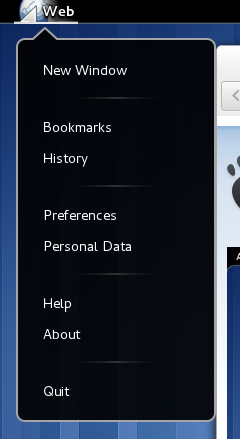
There have been a number of improvements to GNOME’s user interface toolkit and visual theme this cycle. Application menus have now arrived, so that GNOME applications can place a menu in the top bar. This will be an important feature for future application design work, and a number of applications, such as Documents, Contacts and Epiphany, are already using it.
Smoothing rough edges and improving polish has been a big focus for 3.4. Several user interface widgets have also been substantially improved for the release. Spin buttons, which were rather tricky to use previously, have been re-engineered to make them easier. GNOME’s colour chooser dialog has also been modernised, and is vastly improved as a result.


The GNOME 3 visual theme has also received a lot of work this cycle. Many of the changes are subtle, but almost every part of the theme has been modified in some way. The overall effect is that it feels and looks much better.
The toolkit crew are also working hard to get smooth scrolling included in 3.4 and, I’ve been told, are almost done. This will be a major improvement to the whole experience if and when it is incorporated.
Core User Experience
Improvements have also been made to the GNOME 3 core user experience. One of the most important of these is the new ability for applications to act as search providers for the Activities Overview. GNOME Documents is already taking advantage of this, meaning that you will be able to search your documents directly from the overview.
These changes to the way that GNOME 3 does search means that any application will be able to provide search results for the overview. Eventually we hope that searching from the overview will allow you to tap into virtually all of your applications from a single place.

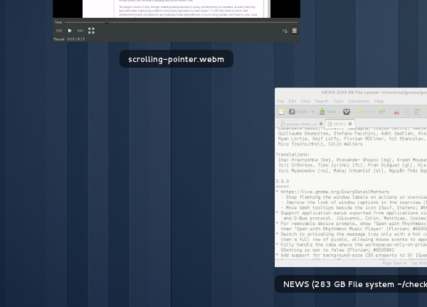
The Activities Overview also features a lot of small improvements, thanks to the Every Detail Matters initiative. This includes many bug fixes and visual improvements, such as restyled application and window labels. The overview should provide a much smoother and easier experience thanks to these efforts.

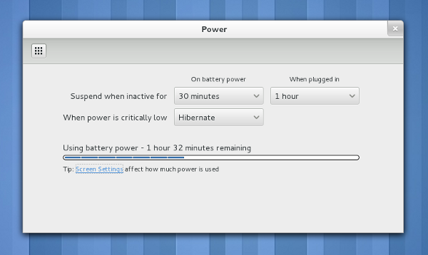
There are also some nice enhancements to the GNOME System Settings, including better looking power settings and enhanced graphics tablet configuration.
There are lots of other changes in 3.4, of course: there have been improvements to GNOME 3’s built-in screen recorder, a live wallpaper that subtly updates throughout the day has been created, and we have new, fully integrated authentication dialogs for networking. And I’m sure there are many other improvements besides those.
Altogether, the changes in 3.4 should provide a much nicer, smoother experience. This is also an important release in terms of what it means for the future. 3.4 contains the results of GNOME’s new focus on application development, which is something that will continue for a long time to come. It also provides new facilities for applications – such as application menus and integrated application search – that will become central parts of the user experience in the future.
Thanks to everyone who helped with the screenshots for this post!
Comments on this post are now closed
Will the application/global menu replace the normal window menus (in the long term)?
Nope, the application menu is strictly for global actions affecting the whole application rather than those in the window context.
https://live.gnome.org/GnomeShell/Design/Whiteboards/AppMenu
OK, I see. Thanks for the clarification!
Given that most new applications have a single window (not counting pop-up dialogs and similar), and even applications like Firefox with multi-window support encourage a single-window workflow (via tabs), many such applications could consolidate their complex menus into an appropriate application menu. Consider the current Firefox style with its menu button; that seems like a perfect fit for an application menu.
That’s going to be troublesome for anyone who uses focus-follows-mouse.
I use Fallback mode. I hope donte erase these mode
If you look at gnome-panel’s updates, it seems that they’re putting a lot of work into actively maintaining fallback mode. However, it is possible that the llvmpipe driver may eliminate the need for fallback mode, and we may abandon it. Also, whenever we move to support Wayland, we may end up dropping non-composited stuff altogether in favor of llvmpipe’s software driver.
You’ve always got XFCE, though.
Any chance of a vertical panel to those of us having wide but low screens?
Cinnamon is a good alternative to that.
I tried the alpha of Fedora 17, and Fallback was still there.
Looks really great. There used to be a way to put drop shadows on screenshots ala MacOSX – is that planned to go back in? It’s a small job and I’d be happy to do it if it’s just that there’s a lack of manpower.
Shutter can do this for you with shadow plugin.
There is a hidden option to do that. Look through /org/gnome/gnome-screenshot, change border-effect to shadow.
Ooooh, fancy. Who do I need to romance to get this as a default? It really adds flare to screenshots which can look a little flat otherwise.
Looks cool. I wonder if there are plans to think about people with big screens (22″-30″) for the next cycle. Right now window management using a mouse is suboptimal as we have to first push the mouse into the top-left corner and then move it to the right panel.
You can allways use the Super Key (aka Windows Key) to call the overview, it’s really fast.
*I* know the key and I am using them, but my wife is a quite mouse centric person. Right now she is very unhappy with the performance. She likes the look, but she feels the desktop is uncomfortable. Some issues could be mitigated with extensions (like having the favourites in the top panel). I have not found a solution to the window switching issue though.
ATM there are a pair of keyboard shortcut you may find usefull, ctrl+alt+up/down to change workspace w/o entering overview and ctrl+alt+shift+up/down (yeah octopus style :-)) to move the focused window on the workspace above/below.
Why do you hate mouse users? :)
Seriously: Gnome 3 is very workspace centric, so workspace switches should be as easy as possible, even if you are currently just holding a mouse and don’t want to return your hands to the keyboard. Edge-flipping would be very fantastic. A quick way to switch workspaces by mouse is what I miss most at Gnome.
There were some concept images of Empathy that were shown a while ago with a view for multi-user videoconferencing. Was the new call UI made with that use case in mind?
you’re probably thinking MuJi
http://telepathy.freedesktop.org/wiki/Muji
(but that seems to be dead)
afaik there are no multi-user-conference initiatives in Empathy
but you can try Jitsi
https://en.wikipedia.org/wiki/Jitsi
The only thing I don’t like is that your new app designs only work well with Adwaita. For example, the joined buttons and address bar in Epiphany aka Internet Explorer look bad in any other Unico theme.
I don’t think there’s anything the GNOME developers can do to make sure everyone else keeps up with GTK 3’s styling improvements. It would seem it’s up to the authors of Unico to implement them in their engine. I’m not sure if there’s another way around this, although the elementary guys have some alternative solution. Not sure if that’s suitable for this project or not.
We do our best to have proper solutions, but things are moving quite fast so there are some custom styles around, which is up to alternative theme authors to render nicelly in their theme. Having to care about every possible theme when styling or designing something imposes pretty severe limits (think about gnome 2), so we’re not doing that.
Please tell me the global menus are optional. global menus completely break sloppy mouse focus!
Nope it’s not optional and more and more apps will use it in the future, which could be a nice way to make it not totally unusable with sloppy focus? A shortcut to let you keyboard navigate it? (We may have it already)
That’s disappointing. The global menu is one UI decision I have never understood and I don’t see an easy way to make it work with sloppy focus. I suppose you could either use a key binding to activate it, or hold down a key while moving your mouse to keep the mouse from activating the windows as it passes over them, but those are both unintuitive, bad hacks.
I guess I just don’t see the real advantage of the global menu.
So, for the small portion of people who actually prefer global menus, is there any chance to just stuff all menues into the AppMenu and hide window-local menu bar? i.e., for legacy apps?
I find most windows look much cleaner without a menu bar. Some exceptions apply, e.g., Inkscape.
Also, how do global menus work when a gnome application is run from another desktop environment? Does it completely break the application? At home I use gnome-shell and really enjoy it, but at work my setup is for optimization, and I use a tiling window manager (ion3) with lots of gnome applications.
I think point-to-type can work by not changing the menubar unless you actually click in the other windows. IE the menubar changes at the same times it would for click-to-type. But keystrokes (including menu item shortcuts) go to the window the mouse is pointing at.
guys, stop right there: it’s not a “global menu” – it’s an application menu:
https://live.gnome.org/Design/HIG/ApplicationMenus
it only contains entries that relate to an application as a whole; so: preferences – yes; editing tools – no.
the menu is defined by the application, using XML; Unity (and OSX) will be able to grab the entire menu bar, while GNOME Shell will only take the items marked to be “application”. if you’re running a GNOME app outside of these environments, the application menu will be displayed inside the application window itself.
it’s all part of the Application class in GTK+ 3:
http://developer.gnome.org/gtk3/unstable/GtkApplication.html
the Application class also handles session management and other nifty things; apps should start porting to it, in order to integrate better with different environments. and since this whole thing is exposed on DBus, I fully expect Qt applications to be able to get the same behaviour.
How about opening the global menu when middle clicking in the window’s title bar? Then other windows can’t steal the focus while the menu has it.
Emmanuele Bassi says:
the menu is defined by the application, using XML; Unity (and OSX) will be able to grab the entire menu bar, while GNOME Shell will only take the items marked to be “application”. if you’re running a GNOME app outside of these environments, the application menu will be displayed inside the application window itself.
This is what I don’t get. Not. At. All.
So, it (GtkApplication class) has a built in ability to do the entire menu bar (at top), or just “application” at top in GNOME Shell, or displayed in the application window itself, yet there is no option to toggle that behavior!?!? It would be a single checkbox or dropdown. Stick it in an “advanced” config pane if you want, but why they hell wouldn’t you expose the option?
These other possible work-arounds to focus follows mouse are awful. A single checkbox would keep focus follows mouse people from abandoning GNOME Shell (at least for that reason). The severe castration of even simple customization makes no sense. Dumb down the defaults – fine. Completely remove options that are well supported internally and historically – wrong.
@unrtst: because whether to have a full blown menu at the top or just an application menu, or nothing at all, is *not* an option for users – it’s something that comes with the platform, so it’s either for application developers or for the platform developers to chose.
This stuff looks good.
BTW: Can I use the mouse to add a tab in the new epiphany? (assume that I want to use middle click to paste an url that I want to load)
To open a new tab with the mouse you can use the menu on the gear button
Uhm, that little suboptimal. Now to open new tab with url from primary selection we have:
1. Firefox (optimal) – middle click on non-active area of webpage.
2. Firefox with new tab (so-so) – left click on “New tab” button, then middle click
3. Chromium with new tab (so-so) – middle-click on “New tab” button
4. Epiphany (bad) – click na gear, click on ne tab, middle click on url, ENTER.
As I understand “New tab” button does not fit in design. Could I propose to have middle click on gear icon to open new tab with content from primary (like 3. above)? It would fit as power-user feature, not really discoverable but massively improving usability.
It could be fun to see a screenshot where several tabs have been opened. I guess that this screenshot will contain an “add tab” button. So the power users will not be slowed down a lot.
I love it all. Took a look through the WIP HIG for GNOME 3, and I can’t express how satisfying it is to see these modern revisions to the way we think of creating applications. It’s going to be very interesting when it comes online (I hope it’s by the end of the year).
Hopefully, with this release, people will focus on GTK 3 and the new ways of developing applications. It’s an awesome new world to join.
I have two issues (as always). One- the split in the toolbar (in Contacts) looks great full-screen, but not so much in the window. As we have limited control over how mutter styles the titlebar, how could we go about making this less abrasive? (of course, if apps are full-screen most of the time, this isn’t a huge problem)
Second issue- both in the mockups for the ‘Apps’ button in the overview and in the new icon for ‘All Settings’ in System Settings, there are nine square blocks in a grid. Wouldn’t it look more pleasant and identifiable to people with poor eyesight if it were four blocks with slightly rounded edges? Just a matter of personal taste, but I think it would be more pleasant, especially if we have it in the overview next to a bunch of slick, high resolution icons and a refined font.
I can say, however, that I’m satisfied with 99 percent of what’s going on with GNOME these days, and that’s a lot more than I can say for any other computing environment. Keep up the amazing work- it’s all paying off.
Contacts splitted toolbar can be improved via the theme, I have a pair of ideas to try out, unfortunatelly I haven’t had time to look at it sooner and we’re already in UI freeze, but I’ll see what I can do. Worst case it will have to wait 3.6.
If it’s possible to detect which state the window is in and fade the line out near the top in windowed mode, that may be satisfactory. Of course, you’ve given it some thought and I’m sure you guys can come up with a clean solution. Thanks for the descriptive response. :)
Has the “Power off” button come back yet?
(I realize it can be accessed with Alt and made permanent with an extension, but not having it made default annoys me and prevents me from recommending Gnome Shell to people.)
No, it’s still Suspend by default. (but you can always point them to the Alternative Status Menu extension)
Nope. Actually not so bad if suspend is reliable, but it is not anymore for me :(
Actually some people actually like the hidden ShutDown. I’ve installed Gnome3 on a lot of people’s computers, and offered to bring back the Shut Down option using an extension. But most of the like dit the way it is because other idiots cant shut down their PCs now :D
At extensions.gnome.org you can find an extension that adds a power off option to the menu. I use it and it works very well.
if that’s the only thing that prevents you from recommending GNOME 3, and there are two ways to change it with minimal disruption, then I’d say we’ve done a pretty bang up job. ;-)
So you’re volunteering to walk my grandma through how to use extensions.gnome.org? That’s a bit more than what I’d call minimal disruption.
Perhaps its actually the mentality behind hiding the shutdown button, when suspend more often than not doesn’t work under Linux, that is keeping him from recommending GNOME 3.
@TomJ: why not? even though I suspect you’re being facetious. if your grandmother managed to install GNOME on her computer then she can also find a bunch of extensions. if *you*, on the other hand, managed to install GNOME on her laptop, then you can also install the extension.
@Anonymous: then we ought to fix the suspend situation, not paper over it. the reason why we’re getting better OpenGL drivers in Linux is because people have started using GL for the GUI outside of games; the only way to make the hardware-related issues go away is to putting them in front and center, so that they get fixed.
new scrollbars? real or mockups?
Real.
new scrollbar appearance, courtesy of Adwaita.
Wow. How wonderful it is! Hope can see GNOME 3.4 as soon as possible!
I tried to vote with my wallet by making a small donation at gnome.org, but paypal won’t accept my credit card because it is not from an “approved country” :(
Ouch, sorry about that!
We’re working on getting Google Checkout working for Friends of GNOME. Hopefully it will be online soon.
You could also take a look at Adyen (adyen.com). Not affiliated with them, but they seem to have cracked the international payment problem better than anyone else I’ve seen.
Is there still no lid switch configuration in the power controls? The screenshots seem to indicate that there isn’t.
Looks very slick, I’d like to see how it performs on my laptop.
I really really which the Gnome control panel had an advanced settings pane built in, instead of having to download and install gnome tweak tool. Every version of Windows, OSX, OS9, just about every thing else out there let the user change the UI appearance, why has this been removed and relegated to a third party application in Gnome.
I like Gnome 3, nice design, easy to extend via JS, it just desperately needs a BUILT IN appearance customization pane.
How will the global menu interact with focus-follows-mouse?
Is there a theme that gets rid of that excessive overuse of whitespace everywhere?
Gone 3.4 is *really* pretty!
If it was a girl I’d be trying to chat her up and get her phone number!
Global menu = killer reason to switch from Unity :D
Too much wasted space
How will the global menu work with large screens? Right now I can work in the bottom-right of my 30″ monitor without having to move my attention anywhere else. Does the global menu mean I will have to start dragging the mouse the full width and height of the monitor? Thanks!
I like all the new designs, but Epiphany still fundamentally fails as a web browser for me. Until it has decent SSL/TLS support, including making it visually obvious when a site is “secure”, stopping on validation errors instead of showing the content anyway (by which time it may already be too late security-wise), and allowing certificates to be viewed (https://bugzilla.gnome.org/show_bug.cgi?id=594856 anyone? Over 2 years old!), I just won’t trust it as my main browser.
Looking nice is a bonus, but being a robust, secure browser simply has to come first, and I am repeatedly disappointed when I fire up new versions and find that nothing has changed in that regard.
Do people still use Gnome3? I tried it for 3 months, but hated every minute.
Try Cinnamon, you’ll never look back.
When will it be possible to move the clock (and in general the elements) on the top bar? Ie… to make room for *multiple* application menues? (for instance, for those with screens bigger than 10″).
The global application menu seems to be a real bad UI regression for everyone using multiple large monitors. Do I have to travel three monitors to reach the app menu on my leftmost monitor? Seems to break really any good ui design by whatever criteria one might want to use. But if the apps can display the menu inside when using a different window manager I’m happy enough, since I use a tiling wm anyway.
The other changes look good. I’m how useful documents is going to be.
Now for some multi-user goodness, like search on shared disks incl protecting docs/dirs from search by users/groups even if they’re visible to them, tagging with user and group (or context) specific tag sets, a file manager that can show me which of my shared documents have been opened / modified by others recently and an awareness feature that lets me see who else is browsing the same dir as I am, maybe combined with an activity stream for dirs and or users.
And last but not least: give me a way to break file read protection using two other accounts, without a supervisor, notifying the user and sysadmin of the break. Then people wouldn’t have to leave their passwords with the secretary any longer, and I had a useful security trail, instead of this idiotic situation today where I can’t see this because it’s either someone posing as the guy on vacation or the uncontrollable superuser.
Social security is the only security that works, and it’s much better to allow this and make it visible than to force users to find invisible ways around it by e.g. handing out their passwords “just in case”
Looks good. I only noticed that the color chooser dialog has too few color shades by default (it should have at least two more rows for lighter colors IMO).
It would be great if it is possible to open the change window overlay with a mouse button, like the 4th button or the clickwheel
Does someone know if the nautilus plugin for seahorse is being ported? I really think that the easy use of gpg is a must, because security needs to be easy – otherwise no one will use it…
Do we finally have the option to turn the screen saver / screen blanking Off from System Settings rather than having to fiddle under the hood to do it – which seems to not always work anyway?
It makes Gnome 3 unusable for public kiosk machines which is a shame.
Some good stuff!
I’d really like to see a usability study on the effect of stuffing things from each window/application in the top bar. :)