So Meego 1.0 for Netbooks shipped last week. Although I miss that tubby cat, Meego 1.0 is very visually attractive and quite nifty.
One of the really neat things about Meego is how it integrates messaging right into the interface. Unsurprisingly, this messaging is powered by Telepathy, the framework that makes communications into a service that you can use throughout your product. Collabora, with its team of Telepathic Ninjas, helped Intel with some of the Telepathy integration for this release.

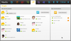
The People Panel shows your available contacts on the left, and a list of your ongoing conversations on the right. Each conversation lists the number of unread messages.
This integration requires no code in Telepathy, and is all done using a Telepathy Observer (I’ve talked about Observers before). This will work with Empathy, or any other well behaved chat client (as it turned out that Empathy originally wasn’t well behaved, that had to be fixed, those fixes are in Empathy 2.30).
Mission Control allows any application to ensure a communications channel exists, and find an appropriate application to handle that channel. This means that double clicking on a user or ongoing conversation in the People Panel causes Mission Control to signal Empathy (the handler) to bring that conversation to the user’s attention (pop it up) or open a new window if required, even though the People Panel and Empathy are completely separate applications and completely unaware of one another. Again this will work with any well behaved chat client.
This same feature could easily be integrated into GNOME Shell or anywhere else. The code to implement this in Meego is free software.


All of these MeeGo examples seem geared to netbook size screens, if it’s going to take over duty for Maemos role I’d be interested to see how all these programmes look on a mobile phone size screen.
For instance on this app on a really small screen having the ‘Available’ text next to every user probably wouldn’t be necessary when the icons there too.
@Stu: this is Meego for Netbooks. It’s not really possible to share interface code between different device form factors, so yeah there will be differences on phones. The underlying frameworks and support libraries can all be reused though.
How does that People panel look when you have 30+ contacts… I’d think
rather crowded.
I see no quick way of filtering results either. (Show People Online Only, Show People Offline)
Running it on my complete contact list (which includes the entire of Collabora), it does get a little crowded, but it’s no worse than Empathy (IMO). It would probably benefit from some kind of live search, I agree (this has also been added to Empathy recently).
You’re right that it only shows online contacts. It doesn’t permit full contact management like Empathy does (e.g. controlling subscription etc.) so being able to show offline contacts isn’t so useful. You can click the button on the right to show the Empathy roster.