Almost 3 months, and 15 releases later, Portfolio development has been moving pretty fast. Well, for a weekend project 😅. So much so, it’s worth of another blog post. With today’s release, it provides a much smoother file management experience for mobile users. These are the highlights:
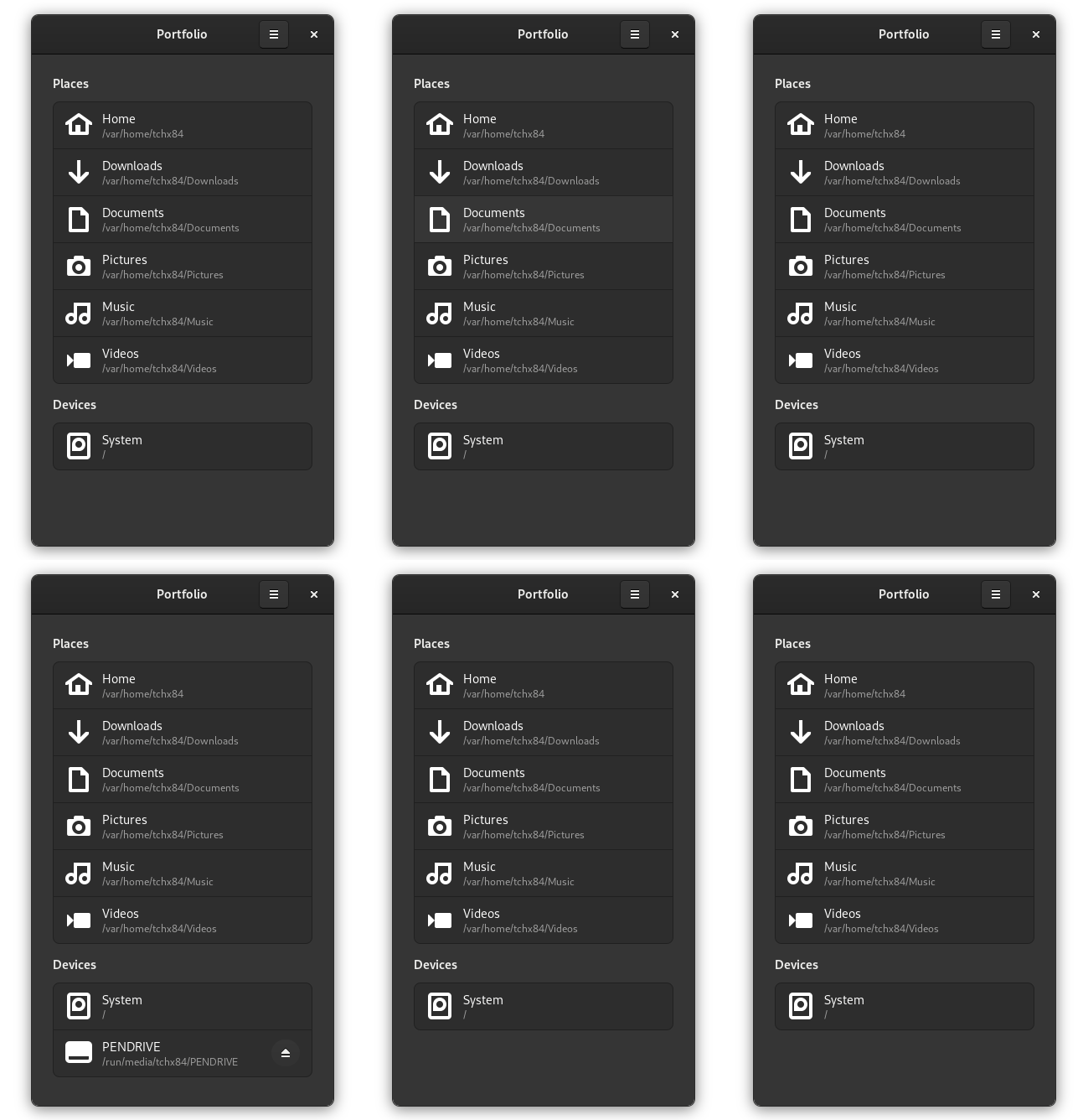
This new release introduces a new home page, which serves as the starting point for the navigation experience. Besides its utility as “quick access”, it also provides a better interface for managing external devices. Kudos to @nahuelwexd for designing it.
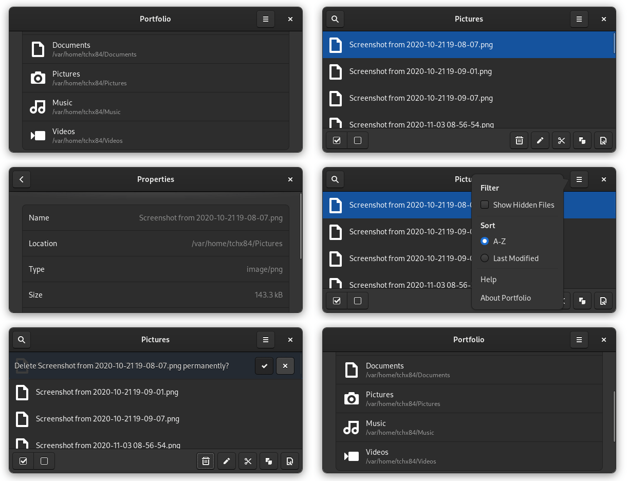
Moving places and devices to the home page solved one of the biggest issues preventing Portfolio to run in portrait mode. Even though is not perfect, it feels pretty good already, like holding a handheld game console.
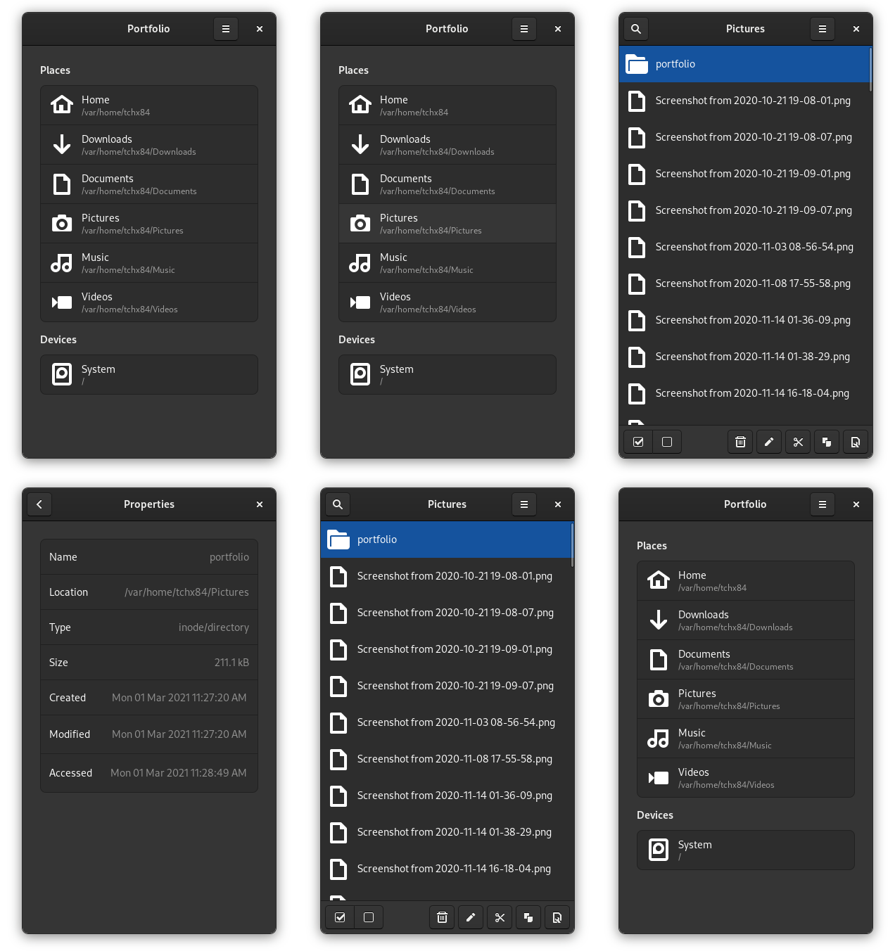
Another missing piece, now set in place, is the properties viewer. For now, the viewer displays the most basic properties but, I can keep adding more on demand. Thanks to @bertob for the design hints.
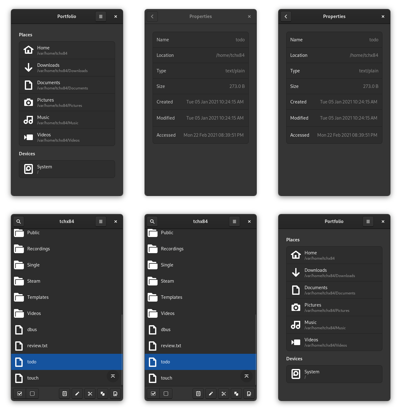
With the properties viewer in place, I was finally able to finish the org.freedesktop.FileManager1 interface implementation. In case you’re wondering, this is what other applications invoke to display files, e.g. Chromium’s “Show in folder” button on it’s downloads page.
Like these, many other things improved and changed since the original release. Portfolio is, and feels, generally faster, e.g. the loading progress bar doesn’t show up anymore unnecessarily, cancelling paste operations is now instant, and is available in 6 different languages. But, if you’re curious, here’s the full CHANGELOG.
Of course, all of these improvements would not have been possible without the feedback from the community. Big thanks to everyone who has contributed so far. Now roll the credits!
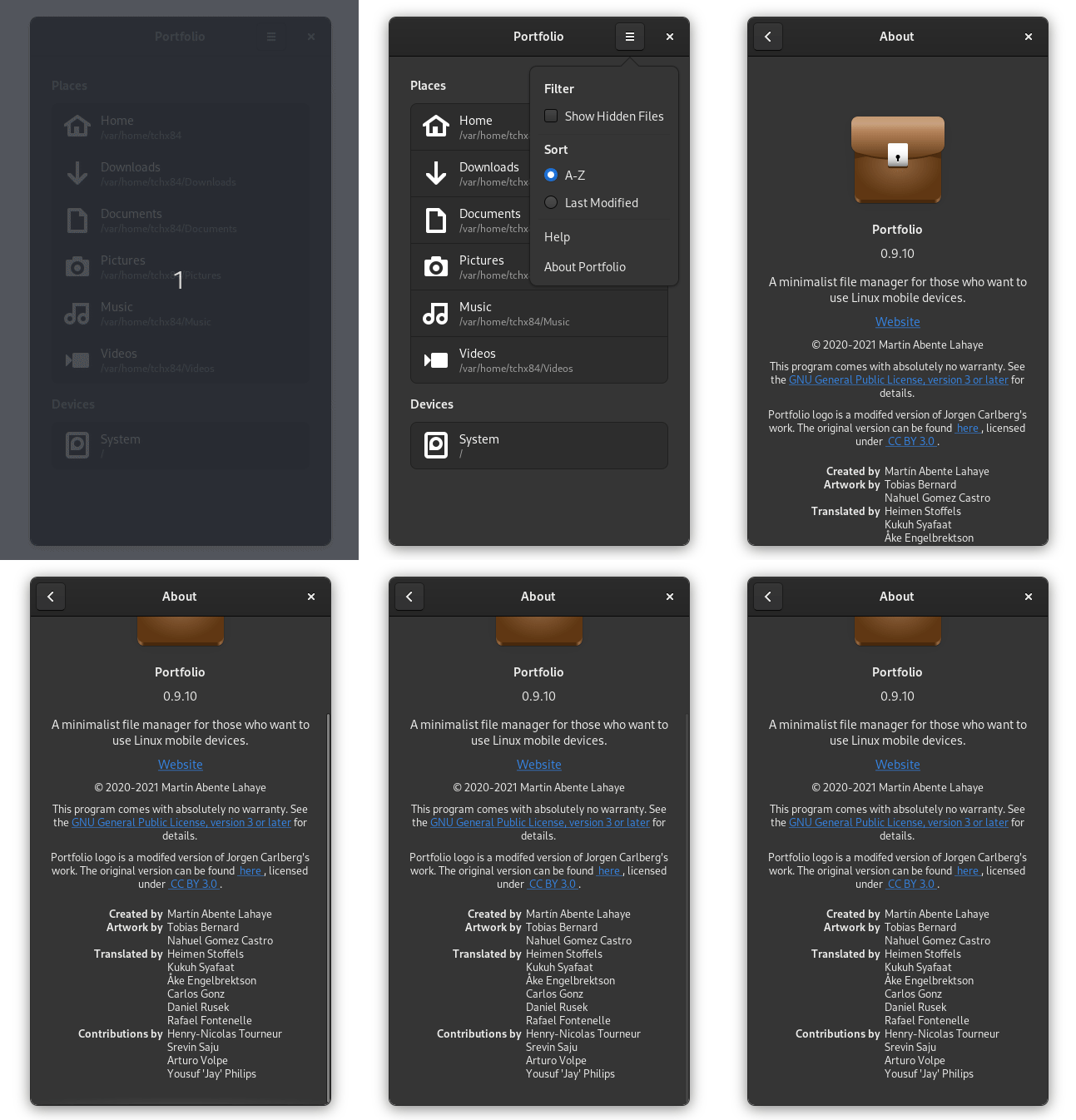
Kudos to @eson57, @Vistaus, @henry-nicolas, @AsciiWolf, @cho2, @rffontenelle, @srevinsaju, @GNUuser, @aVolpe, @philipzae, @MobianLinux, @linmobblog and @DanctNIX.
