On mobile phones with GNOME
Ever since I met @Kekun in Barcelona, during LAS 2019, I got intrigued by this wave of “running GNOME on phones”. It took several months until I could get my teeth into it though. Between my Sugar applications project, Flatseal, a new job and, mostly, due to how hard it is to get a proper Linux-capable phone in Paraguay, I had no time or choice really.
My first mobile-related project started in August, after many failed attempts to buy a proper Linux-capable phone, I decided that my only way forward was to get a refurbished Moto G4 Play, which has acceptable support thanks to PostmarketOS. The project goal was to provide more clarity on how far we are from a Flathub-powered GNOME community-driven OS for phones. The results were better than I expected, but still far from a daily driver. If you’re curious about this research you can find it here.
To my surprise, one of the biggest missing pieces was the file manager. I tried all the options that fell into my selection criteria, but none provided a good experience for me. The major issue I found is that the available options seem to land on a “designed for the desktop, but will fit in a small screen with a few tweaks to improve the UI” category.
Since then, I started to think about how would a simple file manager for phones would look like. By simple I mean two things. First, that it provides that ninety percent of things that people need to manage their files and, second, a UI/UX that is specifically crafted for phones and small touch screens.
A couple of weeks ago I finally got the weekend slots I needed to hack on these ideas.
Introducing Portfolio
A minimalist file manager for those who want to use Linux mobile devices.

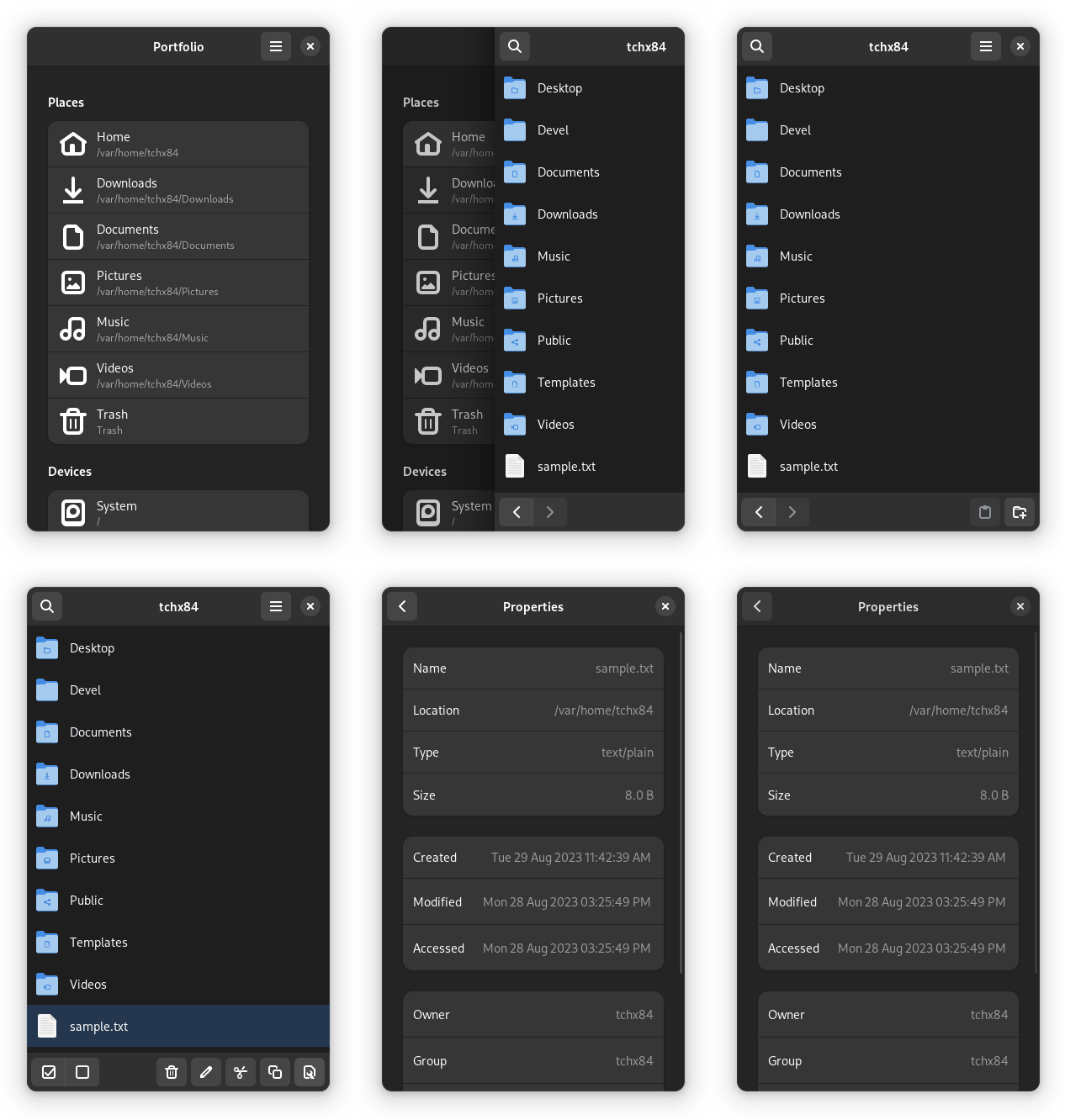
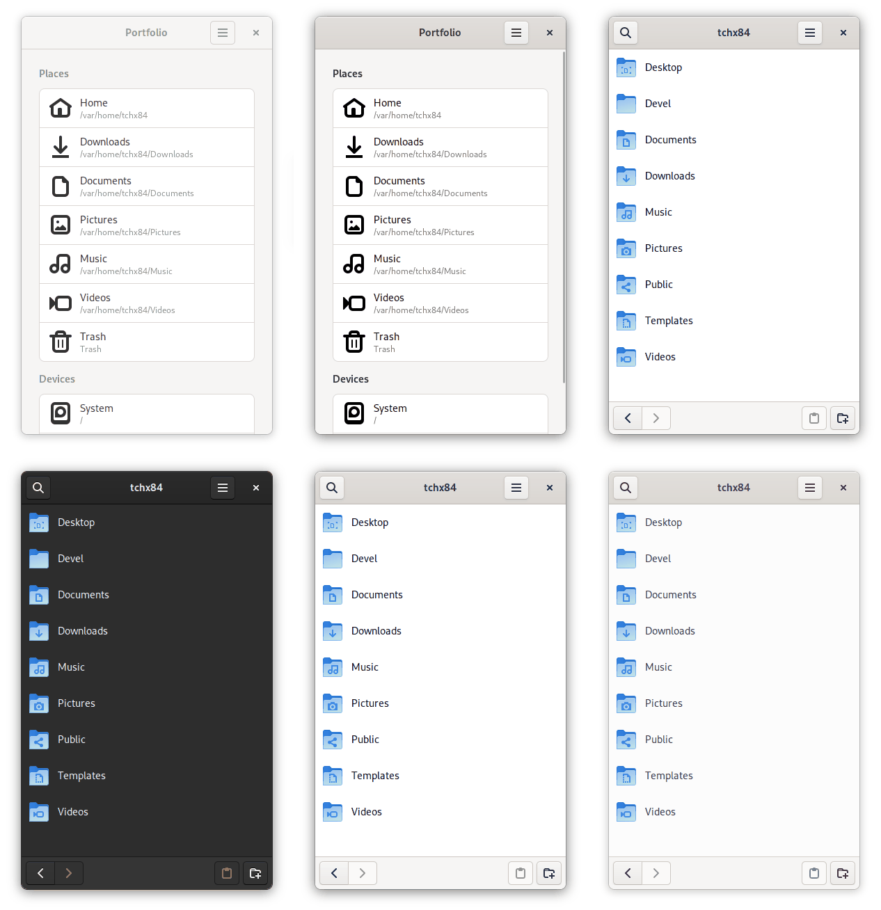
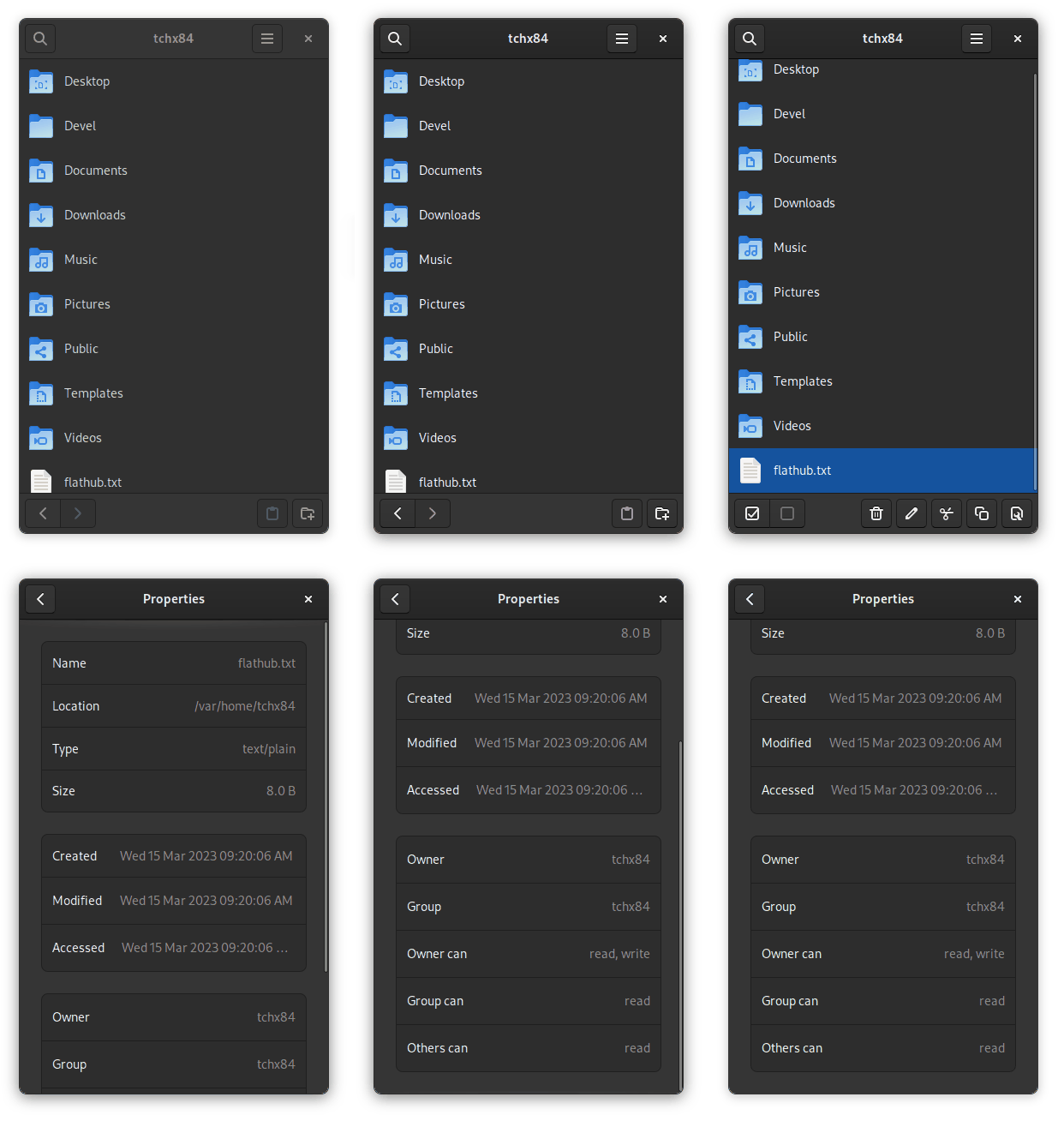
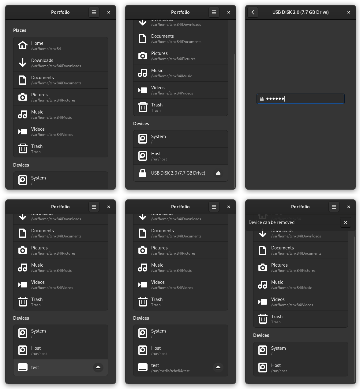
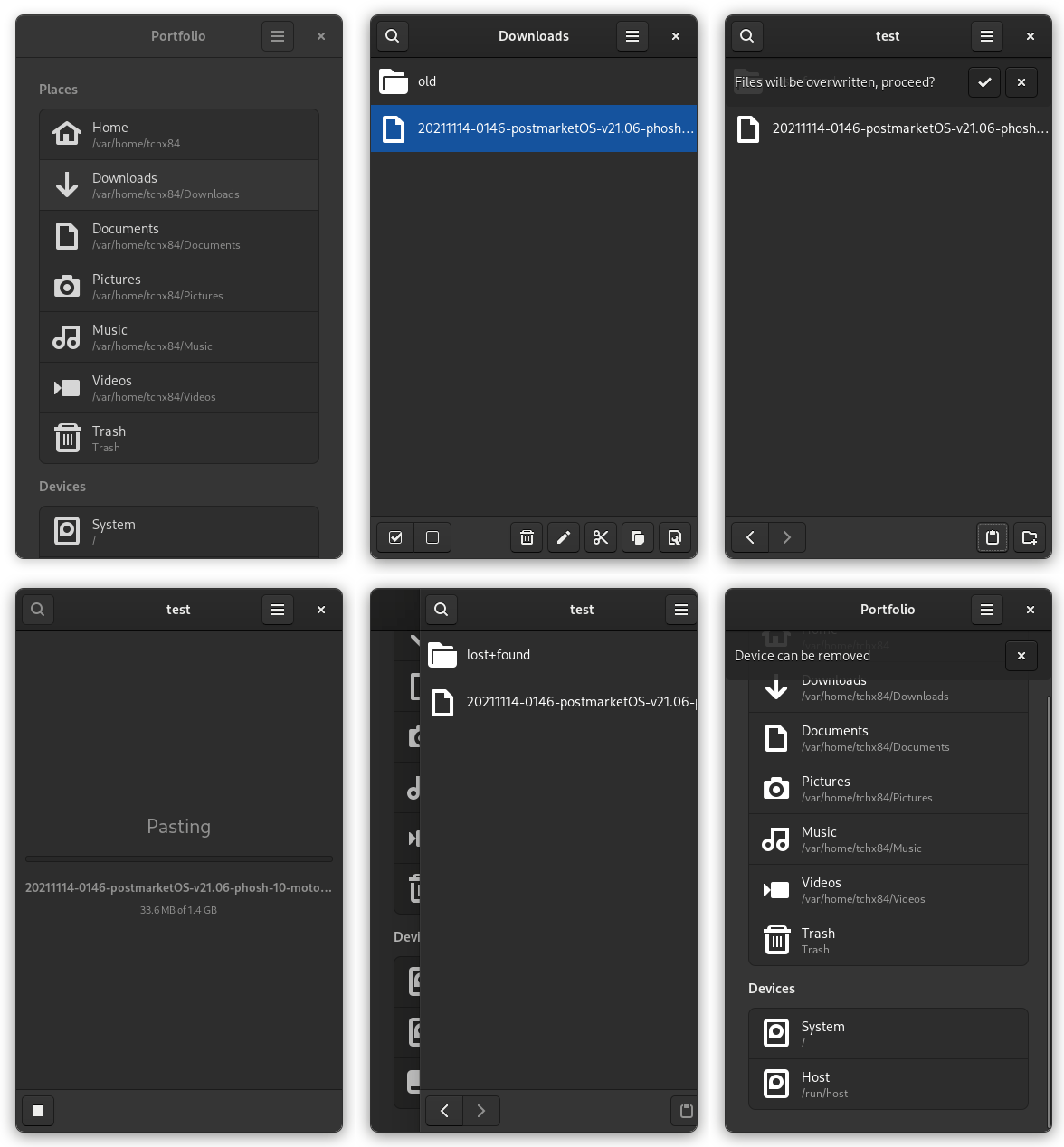
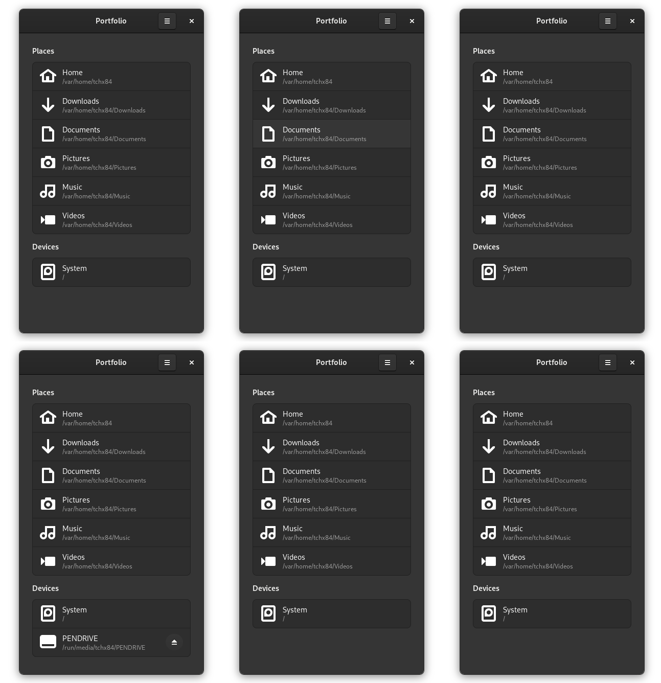
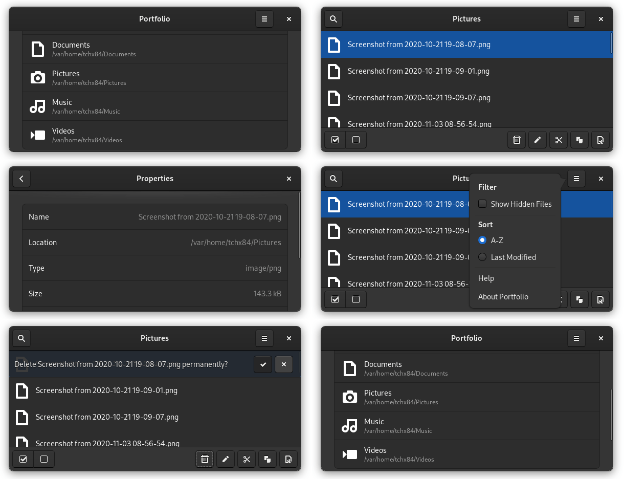
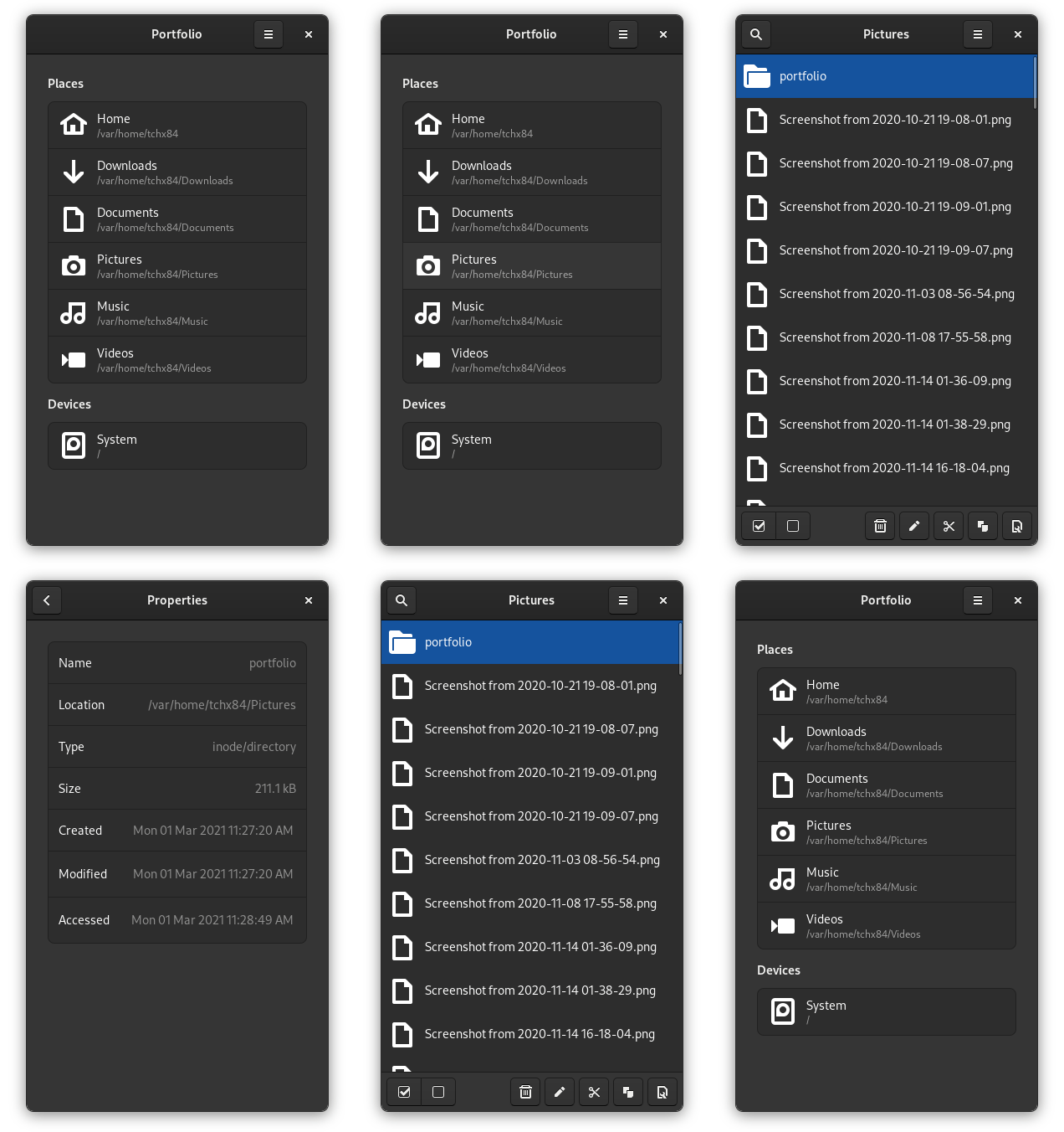
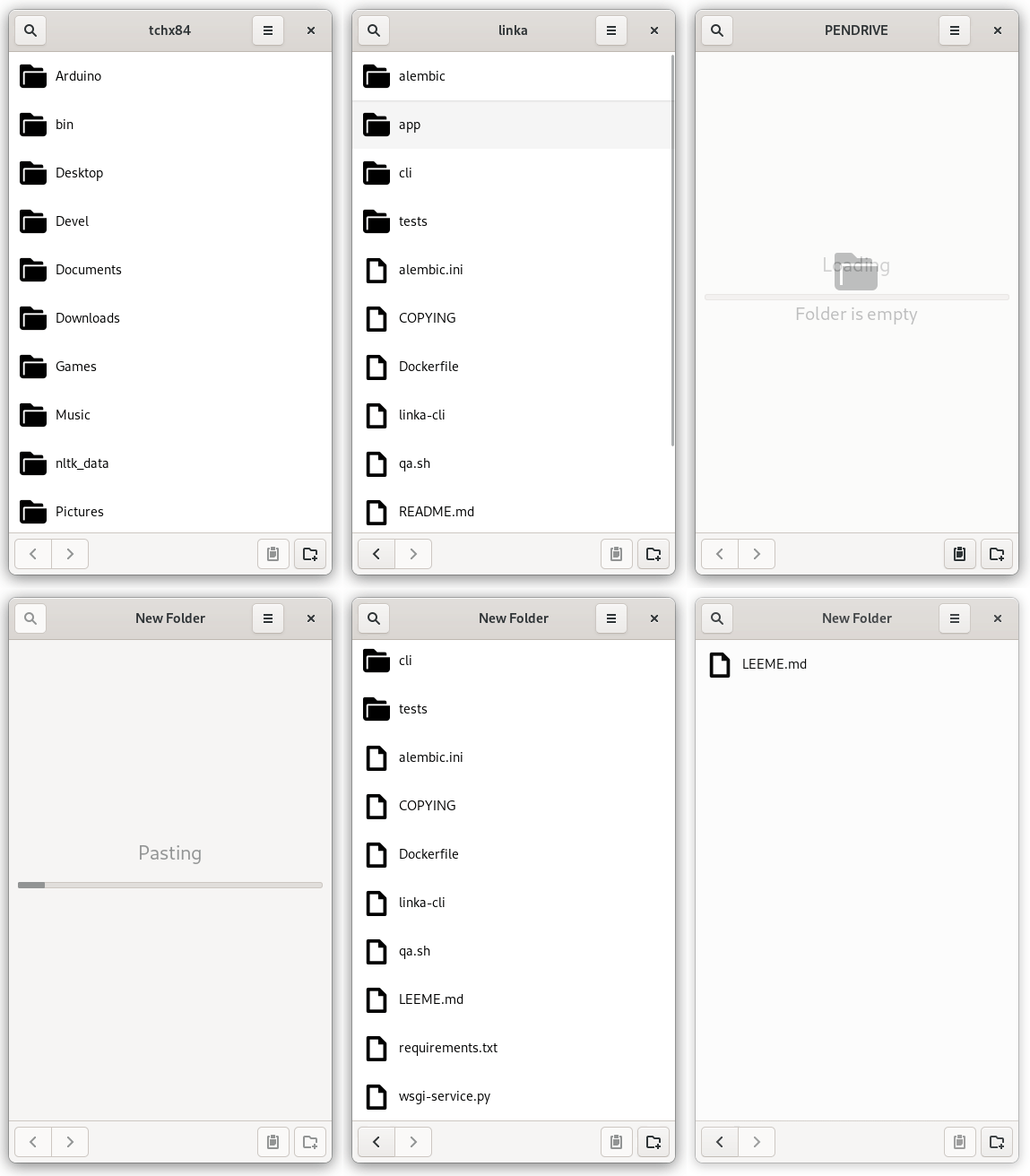
That was the best description I could come up with, hah, it’s funny because it’s true. Portfolio is my first application that is one hundred percent designed for mobile devices. Supports the most simple, yet most common, tasks like browsing, opening, moving, copying, deleting and renaming files.
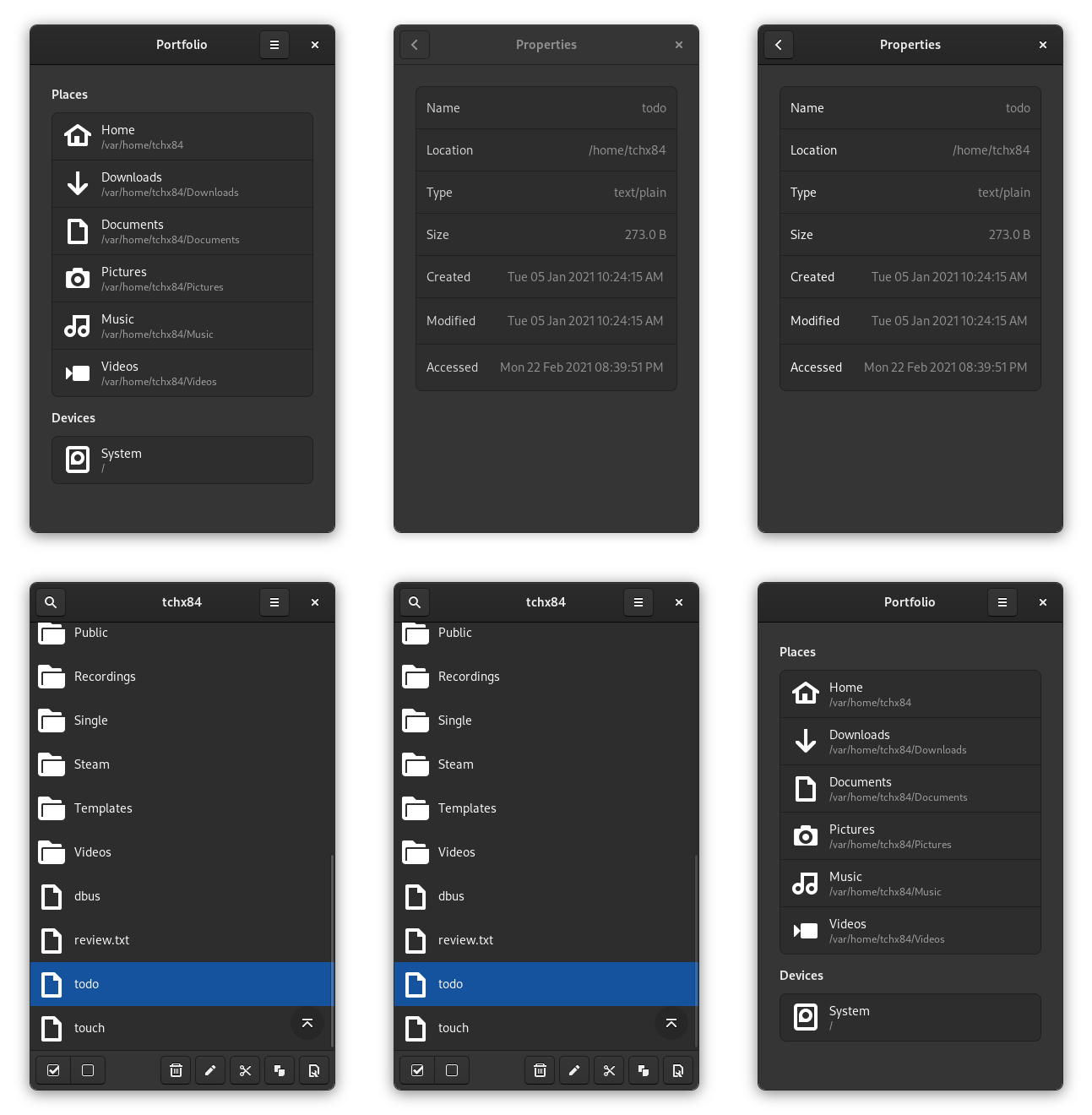
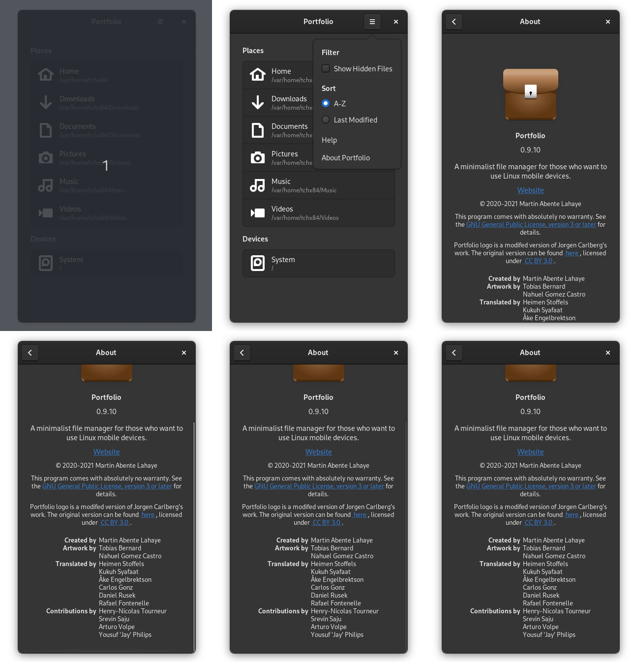
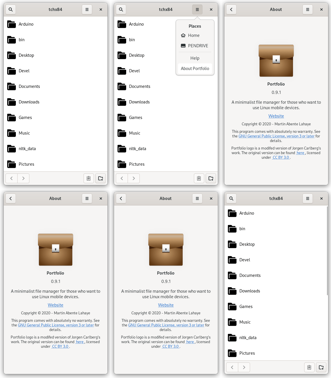
A whole weekend went into just getting the interaction model right, but I believe it paid off. The UI is clean. The relevant actions are always visible and just one tap away. The application assumes it’s running on a resource limited device and, therefore, sacrifices some speed for improved responsiveness. As seen above, it even provides an About “dialog” fit for small screens.

Of course, this application is far from perfect and, actually, it’s just a few days old. It urgently needs lazy loading, an explicit way to get out of selection mode, tests, tests, tests, among other things but, I believe getting the interaction model was the right priority for these limited weekend slots.
Portfolio is now available on Flathub. If you have a Linux-capable phone, please give it a try!
Last but not least, thanks to @eddsalkield and @bertob for their amazing early feedback.

