I’ve been meaning to write a short post showing what we’ve been able to do with Glade since we introduced composite widget templates in GTK+, the post will be as brief as possible since I’m preoccupied with other things but here’s a run over of what’s changed in the Dogg Food release.
Basically, after finally landing the composite template machinery (thanks to Openismus for giving me the time to do that), I couldn’t resist going the extra mile in Glade, over the weekends and such, to leverage the great new features and do some redesign work in Glade itself.
So please enjoy ! or don’t and yell very loudly about how you miss the old editor design, and make suggestions 🙂
Glade Preferences Dialog
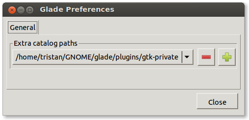
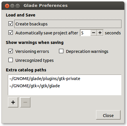
The old preferences dialog was a sort of lazy combo box, now that we have composite templates and create the interface using GtkBuilder, it was pretty easy to add the treeview and create a nicer interface for adding customized catalog paths.
Also there are some new features and configurations in the dialog, since the new Dogg Food release we now have an Autosave feature, and we optionally save your old file.ui to a file.ui~ backup every time you save. There are also some configurations on what kind of warnings to show when saving your glade file (since it can be annoying if you already know there are deprecated widgets, or unrecognized widgets and have the dialog popup every time you save).
Glade Project Properties
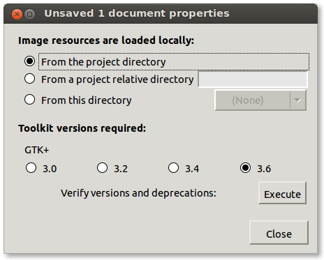
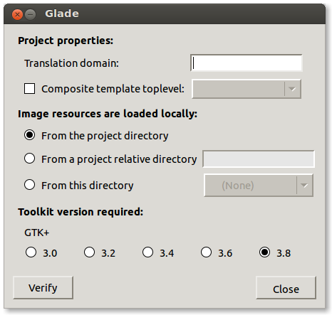
Refactoring out the project properties dialog into a separate source file, and implementing the UI with Glade makes the GladeProject code more readable, also the UI benefits again, notice the not so clear “Execute” button has been moved to be a secondary dialog button (with a tooltip explaining what it does).
Also the new project attributes have been added to allow one to set the project’s translation domain or Composite Template toplevel widget.
Now that’s just the beginning, let’s walk through the new custom editors.
Button Editor
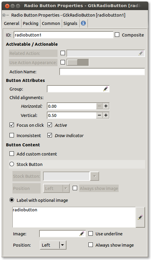
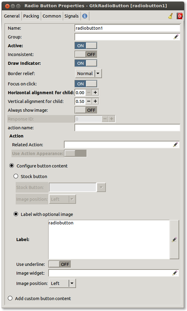
Here’s where the fun starts, while we did have some custom editors before, they all had to be hand written, now I’ve added some base classes making it much easier to design the customized property editors with Glade.
First thing to notice is we have these check button property editors for some boolean properties which we can place wherever in the customized property editor layout (checkbuttons previously didnt make any sense in a layout where one always expects to see the title label on the left, and the property control on the right, in a table or grid layout).
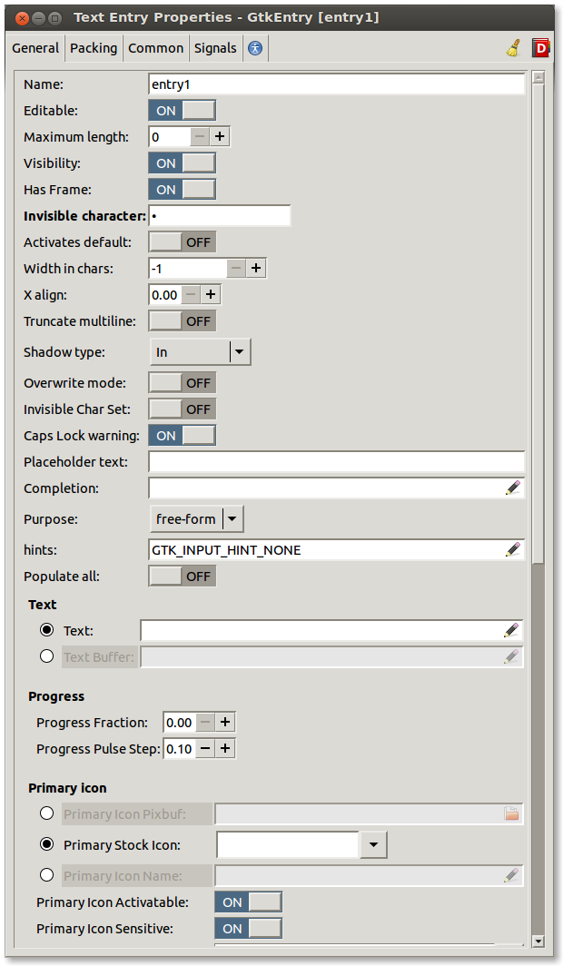
Entry Editor Before
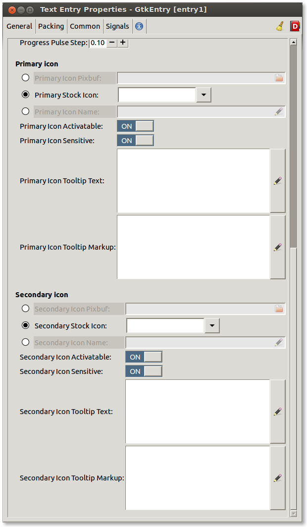
Entry Editor After
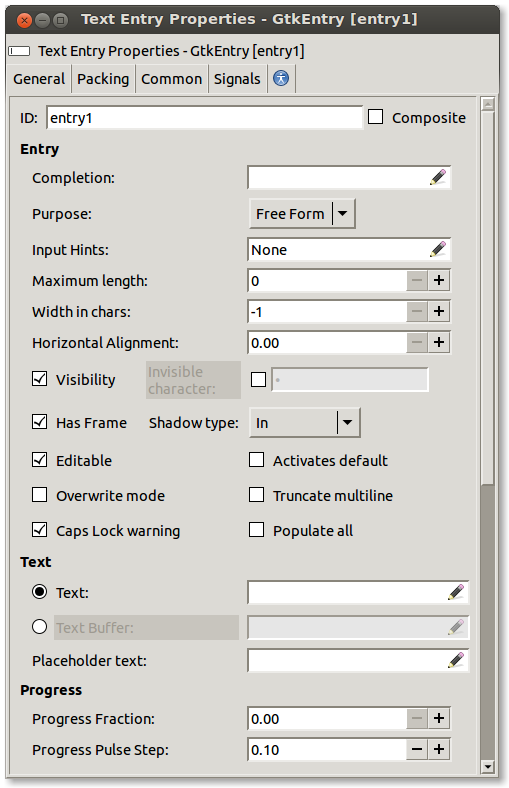
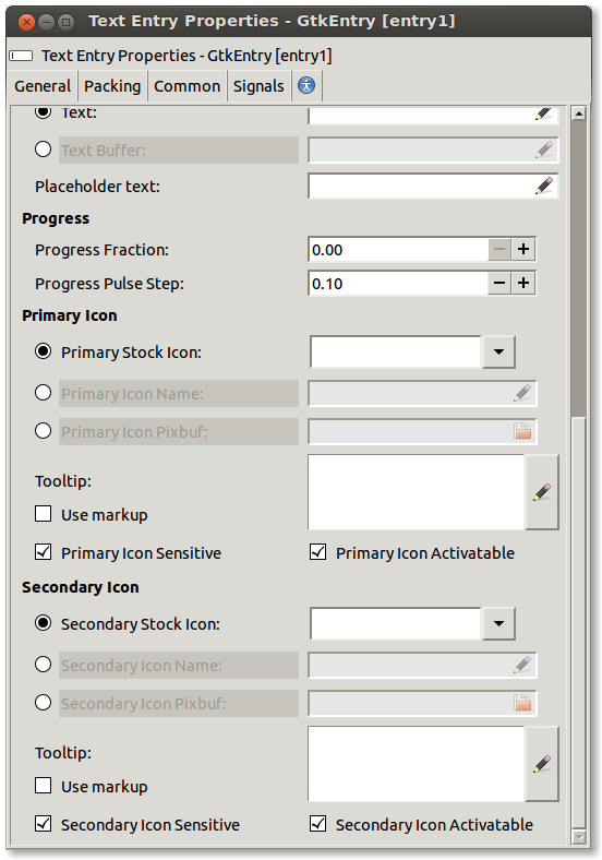
All around better layout I think, also we save space by playing tricks with the tooltip-text / tooltip-markup properties for the icons. While in reality GTK+ has separate properties, we just add a “Use Markup” check to the tooltip editor and use that to decide whether to edit the normal tooltip text property, or the tooltip markup property.
Image Editor
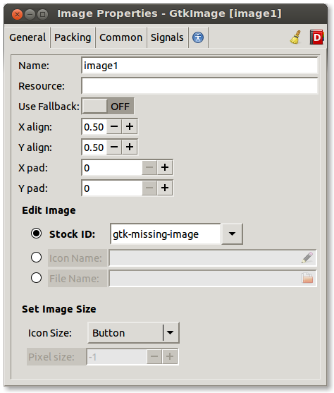
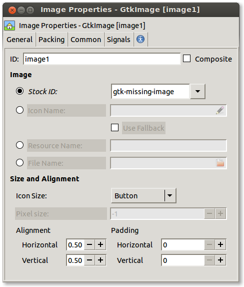
Here we economize on space a bit by putting the GtkMisc alignment and padding details down at the bottom, also we group the “use-fallback” property with the icon name setting, since the fallback property can only apply to images that are set by icon name.
Label Editor
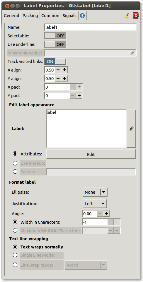
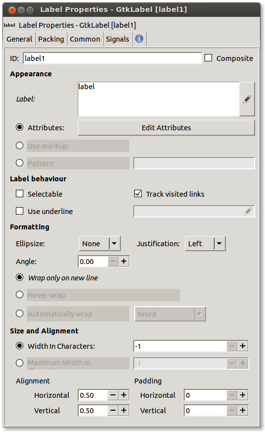
Like the GtkImage Editor, we’ve grouped the GtkMisc properties together near the bottom. We also have generally better grouping all around of properties, hopefully this will help the user find what they are looking for more quickly. Another interesting thing is that the mnemonic widget editor is insensitive if “use-underline” is FALSE, when “use-underline” becomes selected, the mnemonic widget property can be set directly to the right of the “use-underline” property.
Widget Editor / Common Tab
Last but not least (of what we’ve done so far) is a completely new custom editor for the “Common” tab (perhaps we can do away with the “Common” tab altogether… use expanders where we currently have bold heading labels, now that we do it all with GtkBuilder script, sky is the limit really)
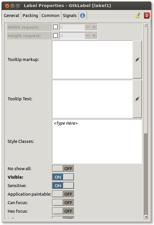
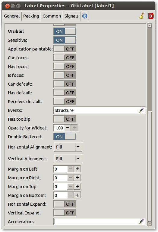
Widget Editor After
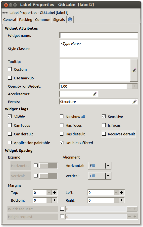
Here again we play some tricks with the tooltip, so that we don’t have two separate property entries for “tooltip-text” and “tooltip-markup” but instead a simple switch deciding whether to set the tooltip as markup or not. The little “Custom” check button in there makes the tooltip editors insensitive and instead sets the “has-tooltip” property to TRUE, so that you can hook into the “query-tooltip” signal to create a custom tooltip window.
Now while these are just the first iterations of the new editor designs and layouts, the really great news is that we can now use Glade to design the layouts of Glade’s widget editors, so you can expect (and even request ;-)) better designs in the future. Also, we’re open to ideas, if you have any great ideas on how to make widget property editing more fun, more obvious, more usable… please share them with us in bugzilla or on our mailing list.
Extra amendment: Fitting images into blog post side by side has been a delicate exercise, it looks different in the editor, different at blogs.gnome.org, and again different on planet.gnome.org, just goes to show that I make for a terrible poster boy, not to mention I don’t post quite that often… anyway… hope the formatting of this post is endurable at least, it’s best viewed at blogs.gnome.org I think.
There is a small typo in the new Preferences Dialog: “Create bsackups” (still in git master: https://git.gnome.org/browse/glade/tree/src/glade-preferences.glade#n56)
Thanks !
Just fixed in master 😉
I love the changes!
By the way, what’s the Gtk+ theme used for these screenshots? Also, why not Adwaita?
I’d love to be able to try Adwaita.
Unfortunately that requires modification to my own system, as GTK+ is still a little primitive with CSS, there is no way I can set GTK_CSS_PATH=/opt/devel/path/to/theme, and apparently this is all tightly bound into GSettings, again, I apparently cannot run a relocated set of settings.
I may end up with Adwaita yet 😉 perhaps the next time I install a new system on my laptop… I’d rather not be doing that every year though… (once every two years is enough I think).
Hello,
I am developing my software with the Granite GTK+ Toolkit.
As of now, we are hardcoding design things into our vala code, as Glade did not work with Granite.
Can you tell me something about that? What is missing in Glade so I can do my designs, and combine them with the actual code for my granite powered elementary gtk+ application?
Greetings, Eduard Gotwig
To use Granite widgets from Glade, you need a catalog for the Granite widgets, and possibly a plugin library depending if Granite would need one (you would need supporting plugin code to handle complex container widgets, but most widgets can be supported simply with some XML).
Presumably Granite’s dev package would install a Glade catalog (and plugin) so that it’s widgets would show up in Glade’s palette automatically.
If you are developing Granite and need to create a plugin for Glade, these docs should help you get started: https://developer.gnome.org/gladeui/unstable/
There also exist some other plugins in the wild which can be used as an example, Glade itself has a couple of catalogs (for GTK+ and for embedding Glade itself into other applications), GtkSourceView has one, I think gnome-terminal also has a catalog.
Looks nice – great work!
Btw. why are some labels in the new layout in italics?
Good question Oliver, I didn’t mention that in the blog.
Normally Glade uses bold lettering in property labels to show feedback that a property is ‘set’, i.e. not at it’s original default value.
But after designing some editors, I found that bold lettering is nice to use to catch the eye and identify some related properties which I’ve grouped together (i.e. heading labels).
Having bold lettering in the group headings, and additionally on some property labels, looks really odd and imbalanced, so I changed the identifier showing that a property is modified from bold to italic (since italic catches your attention too, but less so than bold lettering).
Hopefully this change will not be too unsettling, it certainly makes more sense when actually using the editors than just looking at a screenshot (since you see immediate feedback that after modifying a property it becomes italic, so the meaning of italic lettering I think is conveyed well enough while using Glade).
Looks lovely. Great work.