This is the next installment on the subject of GtkCellArea hacking (which I introduced last week).
After a raw struggle with GtkComboBox and some final brain-wracking problem solving I was able to finally deliver a new and improved GtkComboBox with much more flexibility in terms of rendering cells.
Of course you’ve all seen what GtkTreeMenu does last week, so there’s not much left to show… except I did have to do a bit of problem solving to make sure it renders properly when cells are oriented vertically as well, even when their height is not fixed over a collection of GtkTreeModel rows (or, menu items).
The end compromise is that cell alignments (i.e. particularly the alignments of cells relative to the same cells in adjacent rows) can only be done when the collection of rows have a fixed size in the said orientation. If that’s not clear enough, take for example a treeview; in a treeview column every row gets the same width… in this case it’s possible to align cells with the same cell’s position above and below it in adjacent rows. However if the column cells are oriented vertically, space is not reserved vertically to match the space used in rows above and below… that can only be done if the treeview is set to use a fixed row height. (actually, it would be technically possible to do where only the last cell defines the difference in height, but that would be very tricky both for the GtkCellArea to handle as well as for the calling GtkTreeView widget, for reasons I wont get into in this post, in the end I think its a very logical tradeoff).
So, here’s some illustration of the combo box in action, delegating a large portion of the work to GtkTreeMenu.
GtkComboBox using GtkTreeMenu using GtkCellArea
For convenience sake, instead of adding lots of code to testcombo.c I just added a combo-box reflecting the same model and cell area already defined in testtreemenu:
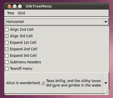
Note in this shot that the combo box is taller than the contents but is still at it’s minimum size. This was always a requirement because the combo box should not start changing size depending on what item is selected (of course). However now instead of some jumbled iterative code in gtkcombobox.c, this is achieved by telling the cellview it packs onto itself to “fit-model”. The GtkCellView in turn assumes the job of properly requesting enough space to fit the entire GtkTreeModel for any selection it might receive.
Heres another basic shot with another row selected (with the tallest / longest wrapping text):
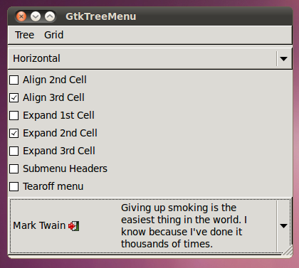
This row constitutes the tallest size for the combo box and is the reason for requesting so much space. Note that since we’ve set the third cell to “align” with adjacent cells, there is a gap between the second and third cell (Actually if you fire the test up yourself you will find the effect quite nice when using keynav or mouse scroller to navigate through items, since the last cell always stays aligned with previously shown selections).
But the part that hurt my brain the most to get right was…
Vertically stacked Cells
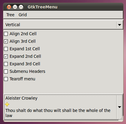
In the case of vertically stacked cells, alignments only work on the GtkCellView that is displayed on top of the combo box. Since the GtkCellView on top needs to request enough space for any row in the model, it can afford to allocate a fixed height to the underlying GtkCellArea which does the rendering (i.e. the height used to display every row of data is a constant height).
However a compromise is made for the menu items, since they naturally use a different height for every menu item the alignments are thrown away and ignored (expand space is also irrelevant here because a menu never receives more space than it requested).
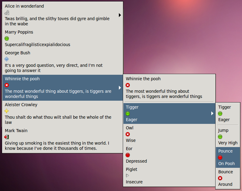
As you can see here every individual menu item uses only exactly the height which it needs.
Now, of course this example is only here to show the potential of what can be done with new menus and combo boxes… the above example is not exactly a “nice” menu to render with cells vertically stacked, however vertically stacking menus might still be attractive.
Or better yet, if your really hard-core you could take it to the next level and write a tabular GtkCellArea and use that to render the cells in your combo-boxes and menus (for instance, a thumbnail on the left and then some vertically stacked text/icon on the right might be interesting).
Although at Openismus we were only particularly interested in achieving proper alignments of cells in combo boxes and menus (for the normal case of multiple cells rendered horizontally), GtkCellArea brings alot of new stuff into the game of rendering cells.
Stay tuned for the actual GtkTreeView using GtkCellArea to render its cells 🙂
Update
Murray wanted a normal screen shot displaying how a basic combo-box drop down menu can be properly aligned so I went ahead and added a (simpler) test case to testcombo this time displaying aligned cells in the drop down menu.
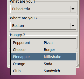
Here we have a normal combo box displaying more than a single column and the cells are setup to “align” with cells in adjacent rows (note that the “align” child property of cells is meaningless for the first cell in a box, because it has no preceding cells it is always placed at the beginning of the allocation… however this might not be the case for right-to-left text direction, I still need to finalize the details of rtl layouting).
Can I see a screenshot with the popup menu open?
Thanks. That’s last screenshot really suggests that my bug will be fixed by this, so multi-column/cell GtkComboBoxes will now be actually usable. Result!
https://bugzilla.gnome.org/show_bug.cgi?id=629133
(People would probably be surprised to find that the cells are not aligned already. Note to self: Upload a screenshot showing the old behaviour.)
Cool job. Keep on pushing gtk+! 🙂