The GNOME Project has been working hard to evolve and improve GNOME 3 since it was initially released in April 2011. We’ve made substantial progress, introducing new features, like GNOME Online Accounts, the lock screen and integrated input sources. We’ve also adjusted and refined many parts of the core UX, including improvements to the Activities Overview, the new-look Message Tray and ongoing work on System Settings. This is important work, and there is more that still needs to be done.
However, the core UX isn’t just about the Activities Overview or System Settings. There is another, crucial aspect of the new experience that we are in the process of building: core applications. And there’s one type of application that is especially important for the GNOME 3 user experience: the content application.
Content is one of the most important parts of a user experience. People care about content. Software is often just a means to get at and do something with it, whether it is the means to share holiday photos with your family, create documents for work, or play that new album you just bought. If we are going to provide a competitive, first-class user experience, we have to do content well.
Those of us who work on GNOME design have been thinking about content for some time. (Creating a new way to access content has actually been one of the goals of GNOME 3 from the very beginning.) If you’ve been following the development of GNOME 3, you might remember Jon’s blog post on the subject and some of the early mockups we had for presenting content in the shell.
The designs have moved on since then, but the goal remains the same: to provide a better way to access and work with content. We are aiming to make it quicker and less laborious for people to find content, and we want to provide effective tools for people to organise it. We also want to create content tools that are in tune with today’s users, with things like fast search and cloud integration. This new approach to content is also designed to be complementary to the file browser rather than a replacement for it.
To this end, we’re aiming to build a suite of new GNOME content applications: Music, Documents, Photos, Videos and Transfers. Each of these applications aims to provide a quick and easy way to access content, and will seamlessly integrate with the cloud. Through these applications, we want content to become a key part of the GNOME 3 experience.
The design of the new content applications follows some key principles:
- Provide fast and effective search.
- Tailor the view to the type of content. Music doesn’t need to look exactly the same as my documents, for example: we can optimise for each content type.
- In most cases (there are a few exceptions) order content according to what was used last. Among other things, this provides a useful reminding function for content that you might be interested in.
- Use a separate view for browsing and viewing. This uses screen space effectively and allows the UI to be focused on the task in hand.
- Automatically access content that is stored online (through GNOME Online Accounts). One of the goals behind these applications is that a new user should be able to enter their online account details during initial setup, and immediately have access to all their cloud content.
- Enable people to manually tag or organise their content, but don’t let that organisation become restrictive or burdensome.
- Include functionality that is relevant to the content type. You want to be able to play music and videos, share photos, print documents, and so on.
- Let users open their content using specialised applications. While the content applications will provide some basic functionality, there will be many cases where someone wants to use a specialist application to work with that content.
- Integrate application search into the Activities Overview, so that a single search can simultaneously tap into all of the content applications.
Mockups and designs for the new GNOME 3 content applications can be found on the wiki.
Documents
Music
Photos
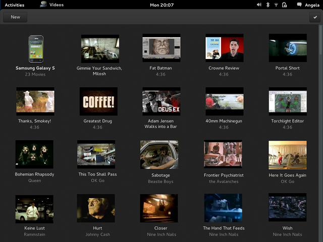
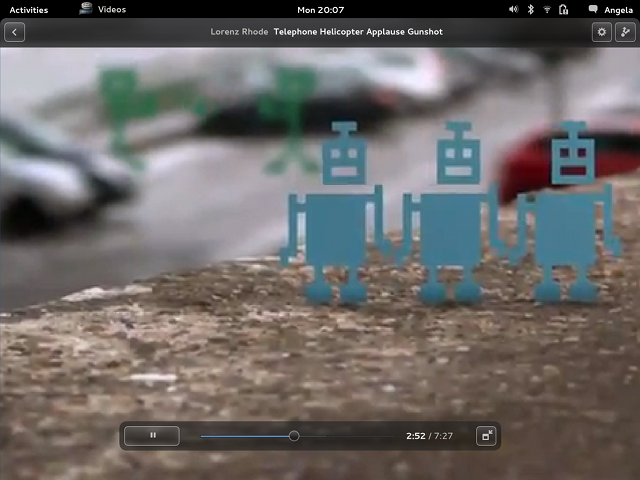
Videos
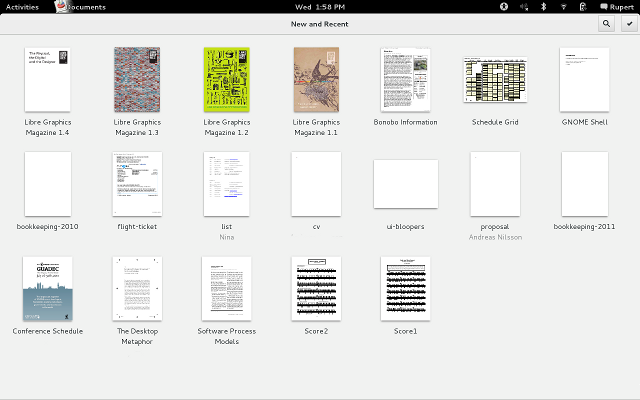
We are making good progress towards the creation of these applications. Documents has been with us for a while, and is getting better with each release. (It has also enabled us to create a set of interface components that can be reused in other applications.) Totem is on its way to becoming Videos. Photos is in the early stages of development. There has even been a bit of activity around Music. Transfers is still only on paper, but there has been some interest in it.
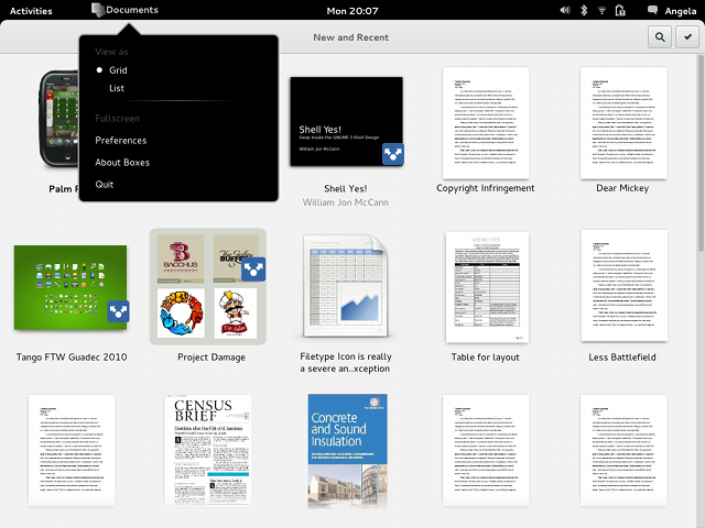
This is the current state of Documents:
Making these five new applications a reality is the next step for GNOME, in my opinion. Once we have them and they are integrated with Activities Overview search, GNOME 3 will be much more compelling. If you want to help GNOME take its next step and get involved in the development of a shiny new GNOME application, just get in touch. We’d love to have you involved, and there is plenty of work to do.
I don’t like the design focused around full screen applications: I am getting large high resolution screens so I can work on a few things at the same time, and put them next to each other (for instance, I like having both my editor for coding and web page with API reference side-by-side; I can imagine somebody writing content in a word processor might want something similar). We can claim that this is simply window manager’s problem, but I don’t think that would be entirely true: we need to design applications about efficient workflows people will want to use, or the applications will simply fail to attract enough usage.
I generally find the mockups aesthetically pleasing, but I don’t think I’d get myself to use them: while browsing/viewing are separate tasks, I like being able to see both at the same time (“hey, this thing I am looking at actually came out of here”).
Danilo, they don’t have to be maximized (we actually don’t want to maximise by default if the screen is large). Also, adding the ability to pop out a preview into a second window something we could add in the future. :)
> adding the ability to pop out a preview into a second window something we could add in the future.
I have this on Mac since years. Honestly, I’d be more happy to see innovations from such a huge project.
I believe people who complain about this want to be able to quickly switch between windows. I understand there are keyboard shortcuts and people would still prefer a section on the screen where they can easily click to switch between active applications (i.e. gnome2/windows 7 and below) rather than have a messy screen with many minimised applications.
Why not have this as a configurable option? There’s a lot of space between the active app icon+title and the date. Why not shift the date to the right side of the top bar and display the icons of the other minimised applications next to the active app icon+title and only display the title of the currently running app. Again, make this an option for people to decide whether this should be at the top or not, or even an extra dedicated black strip or people with larger screens who do not want the top bar to be cluttered with icons.
Just a small change that can go a long way to helping people out with their workflow whilst not having to make huge changes to the current modern design. I know this would make me definitely want to use GNOME3. At this current point in time, I need this type of dedicated work flow.
I second your request. I do programming. I want the code in one window and the documentation in another. Side by side, particularly with C++ programming and the explanation of the class description on the right.
I use super+left arrow for Vim and super+right for documentation.
Hey Allan, thanks for the post. Keep ’em coming! :D
There is one issue I have with Music, which is the name you chose. Not everything is a music file, and not everyone will use it to listen to music. I just removed a media player because it said ‘922 Songs’ about my ‘lectures’ files. Have you considered that? The same thing can be said about Photos, but it’s not as out-of-place. :)
I also listen to a lot of podcasts.
Related anecdote: my Nokia N9 uses tracker to index all audio files and presents them as “songs”. I usually listen to music by shuffling them all. This kind of breaks down when I copy an audiobook (or a podcast) to the phone and it’s picked up as another “song”. Very annoying when I’m in the shower, listening to some music, and there’s suddenly an hour-length speech which I cannot skip because my hands are wet.
Agreed here. Something more generic, like Audio (not Music) or Images/Pictures (not Photos) would be more suitable.
I guess I’ll stay away from GNOME when in the shower. :D
I totally agree with you Marius, it’s necessary to recognise the difference between a generic audio file and a Music file; as example I have some old audio registration found somewhere on the Internet and I don’t want to treat them like a song :)
Also since gstreamer is fully capable of playing music as well. So its an option for totem to be playing music files as well. Isnt it kind of a paradox to be playing music with an application called Videos?
I would like to put a link to an arbitrary directory onto the favourites bar. That means a lot to having fast access to a folder. (Download for example, or /tmp. It is nice to have my home directory, but that is not enough.
The top left corner. Moving the mouse there sometimes is a result of overshoot to the File area on an open window. Immediately the screen switches mode. The user should be able to place that action at any frame location and b) put in a hover time. That is, let the mouse rest on that action for xxx milliseconds before invoking the action.
Hi Leslie, yes, we know that’s a problem. We’ve got some plans to improve the situation for 3.8. :)
I am fortunate to be right handed, But the favorites bar should be able to be placed on the right, for left handed individuals.
I think the situation of the dash is more related to Left-To-Right and Right-To-Left language than to the right and left handed
I am left-handed: I’m pretty sure we all use mice with our right hands, and on a trackpad it makes no difference. I fact, I’m using my right hand for my trackpad right now. I’m sure I switch all the time.
This isn’t necessary for me. Just an anecdote, but there you have it. Every time someone tries to be considerate when setting a table or something, I have to put my cutlery etc. back the normal way around. Being left handed doesn’t mean I do everything backwards. It just means I prefer my left hand and it’s better at writing.
For any tweak that we are able to download. there should be an untweak.
Reason: I have installed one tweak and want to remove it, but I don’t know where it is stored. I am looking into all my hidden files for clues.
If it was an extension you can easily get rid of it on https://extensions.gnome.org/local/
I just hope you do a Books application with epub/mobi support one day :) (saw it in the list of possible apps)
Yes, A reader application is a must. The documents do not even show any of the ebooks (except pdf) and is also not as great to be used as an actual reader. As the intention is to have a content browser. A reader application would be supercool!
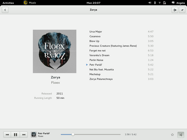
Floex – Zorya ^^
You forgot about Notes (or bijiben). :-)
Those rounded left and right corners are not good.
If you’re talking about the rounded corners at the edges, on the bottom of the top bar, then I agree. They conflict with the less rounded buttons on full-screen applications.
It just occurs to me: to what extent do you think about keyboard navigability (is that even a word?) when designing (these) applications? For example, is it possible to switch to selecting mode with the keyboard without just tabbing twenty times?
I know I am starting to annoy with this but “Integrate application search into the Activities Overview, so that a single search can simultaneously tap into all of the content applications.” this simply does not work for documents … we tried it with 3.4 and the result is very bad IMO.
What if you’re working in a project that has documents and pictures and audio files? Once I tried to organize my home directory by types of files and it was a complete disaster. Grouping files by file type doesn’t make any sense.
I could be wrong, but I think the idea here is that if you look at what people typically do, they have a bunch of music files, a bunch of photos and a bunch of documents, all being unrelated to each other. And while you can use Nautilus to browse them, it’s not really optimized for music or photos. So if you instead specialize the browser (I believe old Nautilus back in the Eazel days actually did this) somewhat, you can get a better experience browsing your music/photos/documents.
In your case, you have a project which would probably map to something in Documents, a document plus some related stuff. I don’t know if Documents actually handle this correctly, but it probably should. Or perhaps there needs to be a Projects application? Allan, have you thought about this?
I think most people usually work with a project setup rather than spewing out individual documents. It depends on your job, of course.
“Documents” is the only one of these I’ve tried, and while the concept is useful for looking for documents, it’s useless for looking *at* documents. Once I find the PDF I’m looking for, I don’t want to open it in some limited-function internal viewer – I want to open it in my normal PDF viewer (i.e. Evince). Unfortunately, the Documents design is such that the latter takes much more effort than the former…
See https://bugzilla.gnome.org/show_bug.cgi?id=671533
That’s part of it, yeah – that searching for a file in the Shell opens it in Documents, instead of a more useful application (something I see no sensible use case for). But I’m also talking about when I intentionally use Documents to locate files – in that scenario, it’s trivial to open them in the internal viewer, but a lot clumsier to open them in a specialised app.
And that’s unfortunate, because while Documents is kind of handy as a document-oriented view onto the filesystem and cloud storage, I see no value in the built-in document viewers. I already have a very good specialised PDF viewer on the system – I don’t need a half-assed one built into Documents to get in my way.
Actually reading the bug in more detail, I see that discussion does cover my case as well…
Trying Documents on Gnome Shell 3.6,
– click on select item on top right.
– select the pdf you want to see, a bottom panel will be displayed to open with Evince, print, organize and properties,
Basically, in select mode, you can open your file with whatever application.
When opening PDF, Documents will preview the content and then you can open with Evince via gear on top-right.
That is not intuitive at all, and it’s a time-waster. I know how I want to view a document. I want to immediately open it in an application of my choosing. I do not want to preview it, and then have to find some obscure gear button in order to open it in a real viewer or editor.
Just because Chrome makes a stupid decision and sticks everything under one inconvenient menu doesn’t mean that GNOME should do the same.
I really like the dark theme in the applications and the general direction of where the gnome desktop is going! But one of the things that has been bugging me a lot (for no apparent reason) is that when you click on the activities button and start going through the applications, the filters are now on the right, but i really feel it should be on the left side.. it has a more logical flow i think.. the button is on the right then the filters should be next as you go to the right, and next to the filters should be the results.. Is it just me?
No, a lot of people just think the same, and the designers too.
Categories should be removed in favor of pages that you could organize, like in http://git.gnome.org/browse/gnome-shell-design/plain/mockups/static/overview-application-picker.png (might be outdated).
The filters might go away in the future, being replaced by apager and the ability to reorder your applications.
I just wanted to say that this music player design is what I’ve been waiting on, it just doesn’t exist anywhere on any platform. Looking forward to it.
Seconded.
Dare I say Gnome AppStore? A proper one for end users (not yum or apt)
How about letting commercial companies charge for software?
Have you consider building the Photos atop of Shotwell? It serves as GNOME Photo Manager pretty well in the past.
Hi Tommy! Good point. This might be of interest to you: http://debarshiray.wordpress.com/2012/11/20/gnome-photos/#comment-216
What is the rationale behind using black in Photos and Videos but white everything else?
Can not think of one.
Reducing background light pollution.
I don’t see any purpose for those apps which isn’t fullfilled by a competent file manager. Just let me again put files and folders where I want (including the desktop) and that is all needed. Put the focus on developing good apps wo *work with* the content: there is no good video editor, Audacity can use some improvements, the GIMP development rate is slow, Libre Office is still a beast, Evince (or any other FOSS PDF viewer) lacks enterprise features…
That’s a very good point, Nicu. You’re looking at it from the perspective of those who create content and I think we should work on making Linux a great platform for creating content. All these apps are for consuming content. On the other hand, I’m not sure if it should be GNOME who should provide powerful apps for creating software. GNOME as a desktop environment should provide basic functioning apps and apps such as GIMP, Inkscape, LibreOffice should be standalone projects with their own goals.
yes, those are flagship, cross-platform applications. still, remember things like PiTiVi that were worked by GNOME people? Abiword?
desktop computers are for getting your work done. if i want just to consume, i guess i can install Android or the upcoming Firefox OS on my computer.
Yep, can’t wait KDE, XFCE, LXDE, MATE, Cinnamon, Elementary, etc. developers to stop working on their projects and start to invest to FOSS projects you mentioned.
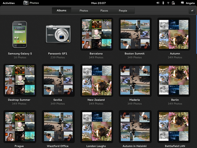
i do *a lot* of photography, still looking at the “Photos” mockup, what is that? is supposed to be a “content application” but looks like a glorified file manager view.
Check out “About Face 3.0” by Nielsen.
i highly doubt he’s wasting his time with that
OK, photography is a nice hobby and feels like it’s the most popular one nowadays. If you prefer to view your photographs with file manager you are still able to do so.
Personally I prefer to use an environment that has effective and easy to use applications with coherent user experience. I don’t understand why some people thinks it is a bad thing to have that kind of environment finally on Linux as well.
From the mockup above, it does not look like adding any functionality over a file manager. If you want a real photo manager, then something like Darktable is the answer (or maybe Shotwell after a *ton* on improvements).
Is a bad thing when you have to have installed two apps for each task: one with limited functionality for a quick preview, like the apps described above and another for when you really want to do some work. Finally you’ll switch the powerfull app as the default and ignore the other one. But it still be there, since the desktop is designed this way, and make your acces to your favorite app harder. They stand in the way.
Hi,
Interesting. What about the other kind of content : PIM. We needs Mail, Contacts, Calendar, Notes. Contacts is here. But we lake the others !
Regards,
Calendar and Notes are in the making:
http://git.gnome.org/browse/gnome-calendar
http://git.gnome.org/browse/bijiben
I think Allan wanted to highlight the Finding & Reminding applications in this post, which is he left them out.
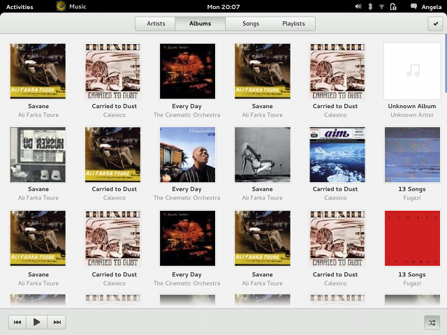
The Music player design looks interesting, but I have a lot of non-UX questions about how it should function. Where should the music live? How do your current users manage their music — do they have large collections on their local machine? A remote one? A portable drive? Cloud services? How do you present a UI onto these disparate locations? That’s for current users – but what is your focus? Who is this aimed at?
Thanks for the invitation to get involved. Where is the best place to take this conversation?
What Jon said… I’m particularly interested in this in the context of http://openhome.org/
Different ‘content silos’ reflect a misapprehension about how people work. If I am creating a presentation or working on any medium-sized project, the operable unit of organisation is a the project directory.
I can’t see a role for these applications in an ordinary workflow, except as an aesthetically pleasing way to browse passively. I’ve spent some time voluntarily teaching basic computer skills to the elderly. For them, content libraries are one abstraction too far, and frequently sources of confusion.
Who is GNOME targetting here — the people who find libraries confusing, or the people who wouldn’t use them anyway? Are there any usability studies on how the mythical ‘average user’ interacts with these content silos?
(That last remark isn’t empty rhetoric. What should I be reading to understand what you’re trying to do.)
This is exactly what I said. I don’t know. No matter from what angle I look at it, it seems to me that they’re building a mobile phone interface. The problem is GTK that is also used by many projects other than Gnome is following the same steps.
Please think of the users for which CODE is content. Not everybody is about Facebook, Facebook and Facebook these days.
These used to be a key audience for Gnome, but they no longer are.
“Code is content” : do you mean Anjuta?
I have one plea: please use the phrase “Track” or “Piece” instead of “Song” in Music. Not all music lovers are listening to pieces that involve a singer.
looks beautiful
guys, unification of content usage application is the great idea! I think about it many times!
Why is gnome re-inventing all these again. We already have quite a few good music players and we have pdf readers as well.
Agreed.
With Rythmbox being the closest to an official GNOME music player I’m assuming it’s going to be the one that evolves into “GNOME Music” ?
I’m really looking forward to the music player, it looks great! I’ve tried a lot of players but banshee is very unstable and slow in my opinion, and a bit of a heavy weight. Rhytmbox on the other side is overloaded and doesn’t look very nice (eg. no albom cover overview).
We have a few music players with truly awful user interfaces, even Rhythembox which is pretty damn simple has huge amounts of information packed into multiple really tight spaces (lists). What we don’t have is a single good music player that lets you visually drill down from artist to album to tracks; well, maybe we do now.
Don’t be so quick to dismiss something that you do want as something that nobody wants. Especially when a bunch of comments have already mentioned that they like what they see.
I can understand the trepidation at this Photos app, but for me it makes a lot of sense to have specialised Music and Video libraries, so I’m willing to try it before I shout it down.
As I’ve been hearing a lot lately GNOME has a communications problem; people complain often about design decisions often more than half a year after those decisions have been made (and documented on GNOME Live!)
So, with that in mind, where is the discussion about this happening?
I avidly follow these design changes as a user, and was thinking that it might be time to start a blog about it. GNOME Journal almost filled this role, except that it’s a “journal” and usually reports on things well after they’ve happened, and that it hasn’t been updated for more than a year.
Maybe I can finally be useful to the GNOME community…
Please account for Chameleon documents – a document location that is a stream, whose mime-type may even change, but will more likely update once git & subversion are done by GAO.
You should really make your very own, high quality operating system that would incorporate it’s very own technology and applications. DO NOT LOOK AT THE PEOPLE WHO ARE SAYING THAT GNOME 3 IS NOT USABLE !!. Those people are probably some 90s-era geeks who are being used to the terminal app only. Continue your hard work no matter what !! ;)
As songs and ‘podcasts/audiobooks’ are two very different use cases, they should be served by separate apps. Make an app called “Caster” or something.
I am really curious about the first image where you have removed all of the buttons from the toolbar/menubar/titlebar and moved them into a menu. Yet you have not used the bar for other things. This significantly increases the complexity of the user’s interaction with the application as now they need to dive into a menu to do anything beyond a very simple set of actions.
I am not even get into how frustrating it is to have a menu with a small number of items on it, or how it could hardly be less clear that the application name produces a drop down menu (even though you have tried to make it clear that it is a button), or how a check mark could not convey the idea of selection less clearly.
I understand that the gnome project has a goal of simplicity and that you are trying to achieve that by minimalism, but you have passed the point of diminishing returns. You can increase simplicity by removing a button that the vast majority of users will waste time parsing it but never use. You can not increase simplicity by removing a button that any significant portion of the user base uses. As all those users will now have to go looking for that functionality and the rest of the users will see only marginal benefit from not having to scan one more button.
I just want to make it clear that these mockups, and the current documents application, are an extremely bad idea. Gnome Shell has a very solid set of design principles and the design of these mockups only satisfies two of these: “don’t unnecessarily rely on metaphor”, “less is More” and “Principle of non-preemption”(while I do not like your interpretation of this last rule, I agree that it is a valid one). As for the other 5:
“Take responsibility for the user’s experience”
These designs provide from little to no room for variability in modes of user interaction, everything fits a very specific set of needs
“Principle of Least Astonishment”
There is extremely little that is not astonishing about these programs. Example astonishments include: what do the icons mean, in a given view mode, what mode do I end up in when I click on something(does clicking on an artist switch to album mode or go to a different view and what does clicking on a given document do?), what fields is search searching, why are some of my files not showing up and how do I make them show up, etc.
“Design a self-teaching interface for beginners, and an efficient interface for advanced users, but optimize for intermediates”
While very simple interaction is obvious, any additional interaction requires either careful tooltip reading or going through help files(have you considered ways to make help accessible within the applications themselves?). If there is any tailoring towards an intermediate user, it is completely hidden in the designs. If there is any advanced functionality in the applications it does not appear in the designs nor in the current implementation
“Be considerate and forgiving”
Restricting the power of the application is not sufficient to accomplish this. This is not apparent in the mockups yet but adding undo semantics to the select actions would be relatively simple.
“The technology should act as a mediator”
I am sorry but these applications could not be less transparent. There are no clues to what the application is currently doing, what any given action is going to do, or how any complicated action is being performed under the surface (combining new and recent is not transparent).
I think in addition to browsing, Documents should also have some functions in annotation and highlight when viewing your pdf. In this way, it can replace Evince. In fact, I think Evince really sucks because it lacks basic functions of annotation and highlighting that nearly every pdf viewer in Wndows and Mac has. As a person who read a lot of pdf, this is really disappointing. And I don’t see any signs of Gnome in investing the resource to solve this problem of viewing content. (When we read content, we often highlight and annotate it; this is a natural way to consume the content). In my humble opinion, this should be a priority of Gnome project.
why is it that UI designers always have to limit functionality. content is not just about five categories. what about my autocad designs? what about music projects. what about my personal website?
it would be a lot easier if gnome developers made a customizable list of these categories and let developers and users create new categories based on MIME types or extensions. PLEASE dont limit it to 5 categories.
for proprietary products it is unreasonable to ask them to leave their product open-ended and leave room for user to add functionality. but free software spirit is all about (developer) user being in charge. this is one thing that most large projects including gnome are running away from it. there were days that i could accomplish tasks by writing a few shell scripts. but nowadays to create a work flow i have to code a complete gui application from scratch in order to have button a and b do something for me.
How will Tracker and Zeitgeist relate together? Will Documents also include content like Activity Journal? What if Tracker is not available?
You write, Content is one of the most important parts of a user experience. You push my user experience until 3.2: Left Corner -> 4-6 Letters and the right document appears!
My only wish: I wane “Recent Items” search provider back! Please, Please, Please.
It cost so much time to search on nautilus, that i thinking to downgrade to 3.2.!
I’m willing to do some donate to get this feature back.
https://extensions.gnome.org/extension/558/search-recently-used-files/
Is that what you want?