In praise of Jim Hall

At the beginning of this year, Jon was contacted by someone who was interested in doing user testing on GNOME. This person said that he wanted to promote usability in open source software, and had research experience. His name was Jim Hall.

Fast forward to the present day, and Jim has conducted a set of user tests on GNOME 3.10 and 3.12, which he has analysed and presented to Jakub and me. I have started filing bugs so we can fix the usability issues he discovered. More bug reports are on their way, and we’re pushing to use Jim’s testing data to increase GNOME’s usability for the next release. (Check out the bugs if you’re interested in helping out with this!)

The best thing about working with Jim has been how keen he has been to work us in the GNOME project throughout the research process. We were able to tell him about the kinds of things we were interested in for user testing, were able to give feedback and comments on his test plans, and were able to discuss his results with him shortly after the tests were conducted. This kind of direct access to the research process was fantastic, and ensured that the tests were relevant to our ongoing work.

Jim will be presenting his test results at GUADEC next month.

A notifications update

A couple of weeks ago I posted about ongoing work to redesign notifications in GNOME 3. Since then, the redesign has moved on a fair bit, so I thought that an update was in order. My previous post also generated a fair amount comment, and I’ve been wanting to respond to the questions and comments we received.

What’s happening now

Previously, I described a work-in-progress design that we have been pursuing in GNOME design. Since that post, the process has diversified, and we are exploring several variations on the original design. These different options are in a state of evolution, and we are developing and evaluating them in parallel. To help with this, Jasper has created a couple of rough prototypes that we’ve been testing.

I’m not going to go into the details of these different designs here – they’re in a state of flux, and it would take a fair amount of time and effort to go through each one. However, if you are interested, there’s plenty of activity in the usual places: check out the wiki, our mockups repository, or hang out on the -design or -shell IRC channels (note that details are necessarily incomplete as the design is in a state of flux).

Each of the designs we are considering have some basic things in common, like using a time ordered list for the Message Tray. They also share some goals, like simplifying the UI and code base. This has meant that the design project has been able to move forward in some areas, and our plans for the technical architecture have been moving forward.

Comments and questions

I read every comment that is made on my blog, as well as the responses I get on social media. Since there was a fair amount of feedback on my last post, I wanted to take the time to respond in a more structured manner than usual.

The first thing to say here is thanks for all the positive comments and encouragement. Most people seemed to think that the new designs were a step in the right direction, and I’m really happy about that. There were concerns and suggestions of course. These are the most popular ones that I saw:

Lock screen privacy concerns

A number of people raised privacy concerns about displaying notifications on the lock screen. This was largely the result of a misunderstanding (my fault!): the mockup I posted in my previous post featured detailed notification banners on the lock screen, and this led people to think that this was going to be a feature of the new design.

The current behaviour is to show notifications on the lock screen, but to only indicate the application which sent the notification – we don’t include the content of notifications on the lock screen by default. The new design didn’t involve us changing this policy, even though the mockup alone suggested otherwise.

That said, the comments about this did prompt us to re-examine how the current lock screen notifications design performs when notification content isn’t displayed, and we might well make some changes here.

Notifications getting in the way

The comments contained multiple reports of the existing toaster-style notifications getting in the way of what users are doing in applications. This was observed to be a particular issue when using chat clients, IRC or terminals.

We’ve been aware of this issue for some time, and it is something that we’ve attempted to resolve in the past. The designs that I presented last time around didn’t fix the issue, and one of the reasons why we’ve made the decision to investigate other options is to see if we can do better.

It should be noted that most notification systems involve popups appearing over applications, and an alternative design will likely have its own quirks. This is something we need to take seriously when considering major design changes.

Missed notifications

A number of people told us that they miss notifications with the existing GNOME 3 notifications, and this observation often prompted the suggestion that the new notifications design should include a permanent visual indication of pending notifications.

The issue of missed notifications is definitely an important factor that we are attempting to address, by changing the position, size and timing of notification banners. We are also hoping to introduce a priority setting for notifications, so that more important popups (like for chat messages) can be made more noticable. We are also considering an indicator for pending or missed notifications as a part of the design.

What about the top bar?

There were various requests that the top bar should be used for notifications. This is a complex question that touches on a fundamental part of the notifications design: if you give notifications a presence in the top bar, it is my view that notification banners need to be located in the same area of the screen, and this raises a whole other set of issues and questions.

GNOME 3 has historically had its notifications at the bottom of the screen (I mentioned some reasons for this in my previous post): it allowed notification banners to be expanded so that actions could be taken on them. In particular, this arrangement was designed to facilitate the chat integration features we see in GNOME 3 today.

Having a way to access notifications from the top bar would have a number of advantages. It would give you a discoverable click target, and the top screen edge has ergonomic advantages. It would also locate notifications amongst other system functionality. However, it would be a big change, which would require an even bigger redesign than the one I have already described. Nevertheless, it is something that we’re seriously looking at.

Status icons

Status icons are another outstanding issue that we received feedback about. There are known interaction issues associated with them in GNOME 3, and this is something that we want to resolve. One of the major issues here is the problematic nature of the status icon API – if we are going to deal with the problem properly, we need to establish a new API and give applications time to port over to it. We are currently working on a plan for this.

What next?

Notifications are complex, and we are taking the time to make sure that any design changes that we make are a genuine improvement. As I mentioned, we are currently working with a number of designs. Once we’ve developed one of them to a state where we are happy with it, I’ll try to post another update with details.

Notify me

Over the past several GNOME releases, we have been aiming to stabilise GNOME Shell as much as possible. We have been largely successful in this: the last major UI change was in 3.10, when we introduced the combined system status area, and the main improvements in the recent 3.12 release were for performance and bug fixing. This is a good thing. At the same time, there is one area where a number of us still feel that bigger changes are needed. This is notifications, particularly the Message Tray.

In this post, I’m going to present a new set of designs for notifications and the Message Tray, which we’re hoping to implement for the next GNOME release. As ever, these aren’t set in stone and are in a state of evolution. The aim of publicising the designs is to get feedback so we can improve them.

A bit of history

The original notifications design for GNOME 3 was introduced with 3.0. One of the main features of that design was being able to take actions directly from notifications. There was also an emphasis on integrated chat – you could reply to messages directly from a notification, and you could (and still can) see your conversations in the Message Tray and post to them from there. This feature influenced the basic design of the tray, which was structured as a set of “message sources” that you can interact with from the bottom of the screen.

The first iteration of the Message Tray implementation had some UI bugs with it, which we sought to address with a design update in 3.8. Despite these changes, we have continued to encounter a number of issues with the design of the Message Tray, and I think it’s fair to say that the tray hasn’t been performing as well as we’d hoped. Reasons for this include:

  • The layout of the tray as a strip of icons means that it doesn’t communicate a lot of information when it is first opened. It also makes it hard work to use, since each notification source has to be individually opened to get more information.
  • The tray is too difficult to open with a pointer, as it requires a lot of downward pressure against the bottom screen-edge.
  • There isn’t a way to quickly see how many notifications are in the tray, and there’s no reminder provided about waiting notifications.

Addressing these issues requires that we rethink the overall design of the Message Tray. This is also an opportunity to address a range of smaller interaction issues with the existing design.

This said, the original vision for notifications in GNOME 3 has some very positive aspects, which we want to preserve. Being able to directly act on notifications is a powerful feature, for example. The combination of a minimal message banner (the initial notification popup) which can be expanded is also good, as is the concept of having a tray where outstanding notifications can be viewed and interacted with.

Design goals

Before I get into the details of the design itself, it’s worth talking a little bit about the goals and principles behind it. As the new design has evolved, a number of themes and objectives have emerged, and reviewing these helps to clarify what the design aims to achieve. These goals include:

  • Be immediately useful. We want the tray to instantly provide useful information, and we want it to be possible to act on notifications straight away.
  • Make use of physical affordances. In particular, we want to make greater use of the screen edge when using the pointer. This should make interacting with notifications and the tray easier.
  • Sequential ordering. Notifications occur in time. Reflecting this in the layout of the Message Tray means that it will provide a more accurate representation of your notifications.
  • Advertise interactivity. Some interactive parts of the existing design often haven’t been noticed. We’ll be making these much more obvious with the new design.
  • Consistency and simplification. The existing design has been a bit burdened by its complexity, particularly because notifications are organised into different message sources. With the new design, we are pushing to simplify the design as much as possible. This should help to reduce the number of bugs, as well as improve usability, since we are aiming to ensure that notifications have a consistent appearance and layout.

The final goal is one that was at the core of the original design, and which is central to the design of GNOME 3 as a whole: that is, to be noticable and useful without being distracting. Wherever possible with GNOME 3, we have tried to produce a distraction-free experience which helps you concentrate on the task in hand. This requires a fine balancing act, which can be tricky to get right. With the new designs, we want to change that balance slightly, by making notifications a bit more noticable and by providing more effective reminders, but we still want to retain the emphasis on avoiding distraction.

A new design

The new design that we’re hoping to implement for GNOME 3.14 has been evolving for a while. There’s been a lot of experimentation in the design space, and quite a few concepts have been evaluated and thrown out. The design that is described below is the current state of that process. Since notifications can be quite complex, there are a lot of details involved. If you’re interested, there is plenty of information on the wiki.

The Message Tray

message-tray-drawer

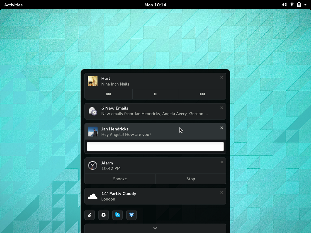
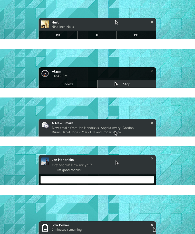
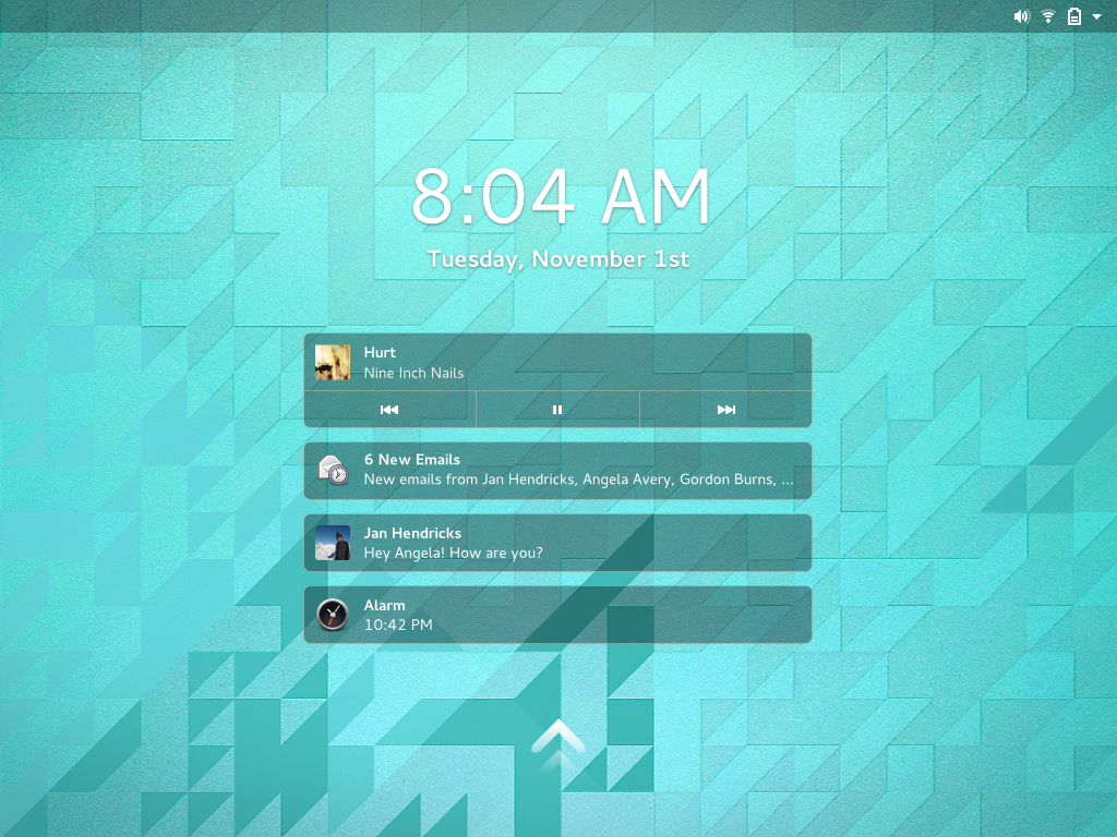
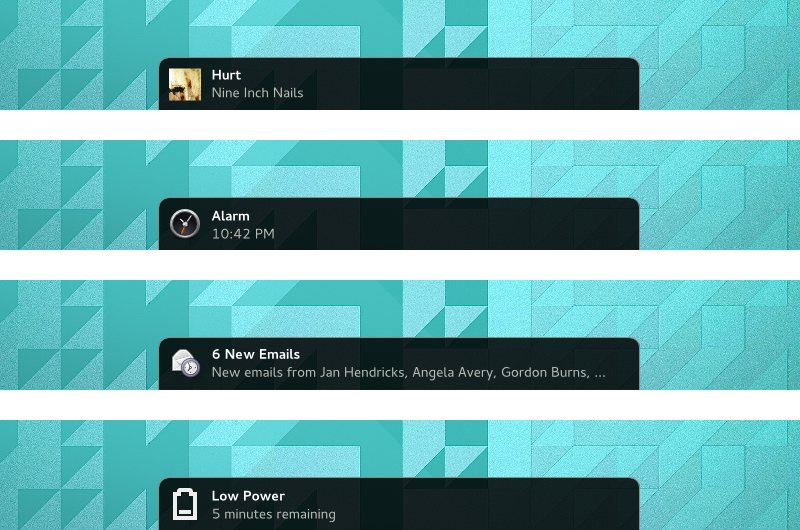
The most striking change with the new design is the introduction of a completely new Message Tray. The previous Message Tray design presented message sources as a set of icons in a strip along the bottom of the screen. With the new design, the tray contains a list of notifications, and slides up from the same bottom screen edge. This allows simplification, since the notifications are no longer reorganised into a set of message sources. The list is time-ordered, reflecting their sequential nature. It is also immediately useful, since you can see information about each notification straight away.

https://www.youtube.com/watch?v=C4TzqY0Ct90

The new design also changes the way that the tray is opened. Hovering or pushing on the screen edge will cause the tray to peek up, along with an indication of the number of notifications in the tray. Clicking the visible portion of the tray will cause it to open and a second click will cause it to hide again. The peeking tray, along with the notification count, will always be visible in the Activities Overview, in order to provide a reminding function.

This aspect of the design is intended to provide a quick way to check if you have missed any notifications, as well as to quickly inspect the contents of the tray itself. We also want to make the action of opening the tray much easier than it is now.

Lock Screen

lock-screen

One of the primary goals of the lock screen was to show missed notifications when you return to the computer. Designs for expanding the role of lock screen notifications have existed for some time, particularly with regards to being able to activate notifications from the lock screen. I’m not sure whether we’ll get chance to implement this aspect of the design for 3.14, but it should be said that the new design makes an effort to make the Lock Screen and Message Tray notifications as consistent as possible.

Notification banners

banners-dissect

The existing formula for notification banners remains the same with the new design. Some aspects of the layout have changed, however: this enables them to have a consistent layout, irrespective of whether they are presented as a popup, are in the Message Tray, or are on the Lock Screen. The banners are bigger, which makes them more noticable.

expanded-banners-dissect

Expanded banners also remain fundamentally the same, albeit with a modified layout. Buttons are now flush against the screen edge, making them easier to target with a pointer. We also plan to use hover states more readily, in order to communicate interactivity.

Next steps

Everything I have presented here is currently being treated as experimental. Jasper has an initial implementation in the works, which we are already testing, and are going to continue evaluating as it is developed. As usual, the design might change as we try things out, and we’ll only merge this into 3.14 if and when we feel that it is worthwhile.

You can help us to develop the designs with your questions, comments and feedback.

LGM 2014

I have just returned home from this year’s Libre Graphics Meeting, which was held in Leipzig, Germany. As always, it was a great event, which is somewhat unique in bringing together art and design practitioners with programmers and engineers.

LGM is a good opportunity to meet with friends in other projects, especially graphics applications. I was really happy to be able to spend time with members of the GIMP and Inkscape projects, and hope that this will lead to closer ties and working relationships in the future.

GNOME and Libre Graphics have a lot in common. GNOME design uses free tools developed by the Libre Graphics community, and we practice open design in the way that many of those at LGM also do. I think that GNOME also helps to bring people into the Libre Graphics community, and it was nice to see a good contingent of people from GNOME at LGM this year. This is something that Jakub and I talked about in our presentation on the last conference day.

The Libre Graphics community is creative and passionate, and I always feel refreshed after LGM. Big thanks to the organisers for putting on another great conference.

Popovers & You

GTK+ has been getting some really nice new features in recent times. Over the past few releases the list new of widgets has come to include things like ListBoxes and FlowBoxes, stacks and stack switchers, revealers and header bars. Now, in the upcoming 3.12 release, there will be another new widget: popovers. This is something that those of us who work on GNOME design have wanted for a while, and it’s exciting to finally have them.

Of course, once you have a new interface widget, you need to know what to do with it, so I thought I’d write a bit about how to design with popovers. If you’re an application developer or designer and you’re not sure what popovers are for or how to use them, then this post is for you.

What is a popover, anyway?

popovers

Popovers are containers that appear over a parent window. They have some significant characteristics:

  • They are generic containers, meaning that they can contain a variety of widget types (just like a dialog).
  • They have arrow points which are always directed at a specific interface element. Often, this is a button, icon or thumbnail, and the popover appears when this is pressed. (This isn’t always the case though, as one of the later examples indicates.)
  • They cannot be moved and have a fixed position.

Popovers are used to show additional controls or information. As such, they are an example of a widget that allows you to practice “progressive disclosure” in your application. This essentially means hiding non-essential or infrequently used interface elements slightly out of the way. Progress disclosure helps to keep your UI focused by giving more attention to the most important elements. As my favourite part of the HIG states:

“Every extra piece of information or interface control competes with the truly relevant bits of information and distracts the user from important information. Hence, don’t clutter your interface, and don’t overload the user with buttons, menu options, icons, or irrelevant information. Instead, use progressive disclosure and other techniques to limit what the user sees at any given moment.”

The next time you are adding extra controls or information to a UI, you might want to think: “maybe I should put this in a popover”.

When to use popovers

Popovers are one of a number of ways to achieve progressive disclosure, and there are a number of other widgets that can be used in a similar way. In particular, they are similar to dialog windows, so you might find yourself being uncertain about whether to use a dialog or a popover. There are a few things to consider here.

  1. What is the size and complexity of the content you want to display? A popover should generally be small and simple, so if you have a lot of information or controls to disclose, a dialog window is often better: they are nicer than popovers at larger sizes, and you can use tabs to break them up into sections.
  2. Is there a specific element that can act as the source of the popover? If the answer is no, you should use a dialog, since they don’t have to point to something.
  3. Do any of the established conventions for dialogs apply in this case? There are certain interaction patterns where dialogs are the established convention, such as presenting confirmation checks or application preferences. It is best not to abandon the conventions that people are familiar with for dialogs, as this will help your users understand what is happening.

If you can answer these questions and a popover still seems like a good idea, you may well want to use one. In fact, popovers have a number of advantages over dialogs when used correctly. They aren’t as disruptive, since dialogs require a bigger focus shift and give the users more new UI to interpret. In contrast, popovers don’t change the frame in which the user is working, and are generally a more subtle visual presence. This involves less severe context switches and a smoother user experience.

Examples

We’ve been utilising popovers in our application designs for some time, so I thought that it might be instructive to end this post with some examples from our mockups. Hopefully this will give you a better idea about some of the possibilities they present.

A filter menu

This is taken from our mockups for a new character map application. Here a popover is used to allow a filter to be selected for the view (in this case, selecting a font). In the past we would have had to have used a combobox or a dialog for this. A popover is better than either option: it is easier to scroll and search than a combobox, and less disruptive than a dialog.

filter-menu

Note that the popover header shown in this mockup currently isn’t possible, although you could implement something quite similar without it.

Gear menus

Gear menus are a common pattern in GNOME applications. Previously we have used a menu that is activated by a button for this. Popovers are a much nicer way to present a button menu though. Not only can popovers be used as a simple replacement for button menus, but you can also supplement the menu with other controls. In this example, taken from our latest Nautilus mockups, the menu has been prefaced with a pair of buttons and a slider. This makes the menu more compact and interesting, and the slider is a more appropriate control for setting the zoom level than menu items.

gear-menu

A word of caution when using popovers in this way: be careful not to make the popover too complex by loading them with lots of different types of widget. As a rule of thumb, use no more than three different widget types.

Editing Selections

One really nice way to use popovers is for editing controls. Here, the popover can appear in relation to the selection. The great thing about this is that it avoids showing controls until they are needed, so you don’t have toolbars full of insensitive buttons. It also emphasises the context specific nature of the controls that are being presented.

You can already see how this can work in the Notes app, which has had its own popovers implementation for a while. Here’s one of our early mockups for that:

notes-single

And here is a similar pattern for Sudoku controls:

sudoku

Have Fun!

Popovers are an extremely flexible widget, which means that they lend themselves to creative design. They are a really nice way to inject interest and originality into applications, I’m really looking forward to seeing how people end up using them. If anyone has any questions about how to design with popovers, I’d be happy to offer advice.