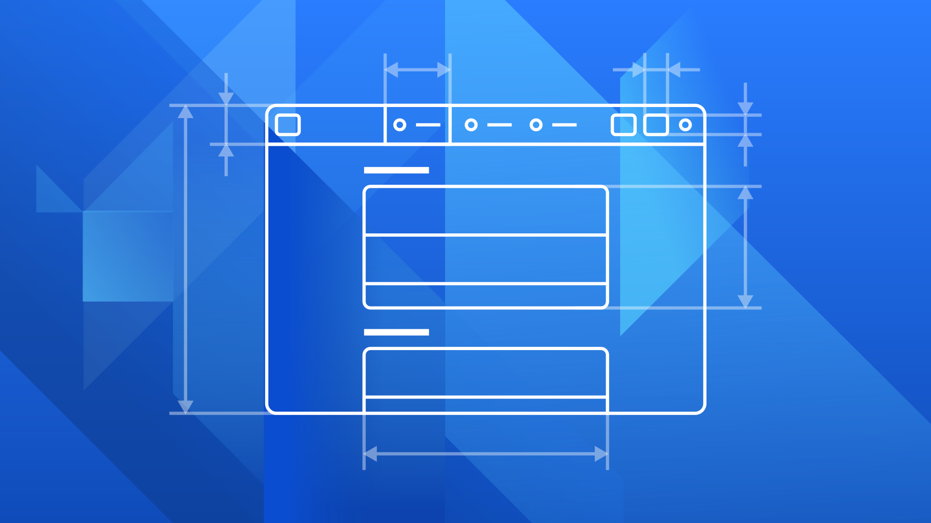
In recent weeks, I’ve been working on a major update to the GNOME Human Interface Guidelines (HIG). The motivations for this work were varied. The HIG is fairly out of date, both in relation to contemporary design practice, as well as GNOME platform capabilities, and so needed updating. But we also wanted to improve the quality of the design guidance that we offer, and do a much better job at integrating our design docs with the rest of the developer platform.
As part of these changes, large parts of HIG have been restructured, and the vast majority of the content has been rewritten to some extent. It has also been expanded to cover a greater range of topics, including app naming, app icons, UI styling, accessibility and tooltips.
We’ve also changed how the HIG is hosted. It now has its own project on Gitlab, uses a lightweight markup language, and has its own website which is automatically updated to reflect the latest changes. This makes it a much more attractive proposition for contributors, and we’re already seeing the number of contributors increase.
A New Era
The new HIG comes at an exciting time for the GNOME platform — there have been some truly amazing developments recently!
First, GNOME design conventions have matured significantly and, I think, are in a really strong place. In the past we maybe didn’t have all the pieces in place, but now it feels like we do, and have a much more comprehensive, integrated and consistent design system.
Second, the platform itself has seen some major improvements, with the release of GTK 4 and the development of libadwaita and libhandy. These include a big set of features that designers and developers can take advantage of, like new widgets for tabs and drop-down lists, a new widget for placeholders, and GTK 4’s high-performance list and grid views.
Third, thanks to Bilal and Zander, we now have a whole collection fantastic design apps, including App Icon Preview, Symbolic Preview, Icon Library, Color Palette and Typography.
Finally, we also have new tooling for API documentation, thanks to Emmanuele and gi-docgen.
If you put all of this together, I think you’ve got a recipe for a really great developer experience. The new HIG aims to bring all these different pieces together: it documents the current state of the design system, references all the latest widgets, tells you when to use the design apps, and links to the correct places in the new developer docs.
Design >< Code
The old HIG documents design conventions which require developers to either use cut and paste widgets, or to write their own custom UI. Often it isn’t clear how this can be done. Not a great developer experience.
The new version does away with this, and has a closer relationship with the developer platform. Every design pattern has a corresponding widget which is included in the developer platform, which the HIG explicitly references. This means that, if you’re using the HIG, you can be confident that everything it describes can be easily implemented.
As part of this effort to bring the HIG closer to the platform, there have been a few terminology changes. For example, “grids” are now “flow boxes”, and “presentation dialogs” have become “secondary windows”. This will hopefully help to ensure that designers and developers are talk the same language.
There’s also been a lot of back and forth with platform developers, to ensure that the design guidelines are in tune with technical reality (which hasn’t always been the case, historically).
Notable Changes
Most of the changes in the new HIG shouldn’t be disruptive: most of them are additions or restructuring of existing advice. However, if you are responsible for an app, there are some changes which it’s worth being aware of.
Widget Updates
As mentioned, the HIG contains advice on using new widgets, and there are a number of places where it recommends using a new widget in place of an old one:
| Design Pattern | Old Widget | New Widget |
|---|---|---|
| View switchers | Linked toggle buttons | AdwSwitcherBar/HdySwitcherBar |
| Drop-down lists | GtkComboBox, or custom-build your own | GtkDropDown |
| Tabs | GtkNoteBook | AdwTabBar / HdyTabBar |
There’s also a number of new widgets that we recommend where none previously existed. This includes:
- AdwStatusPage and HdyStatusPage for placeholders
- AdwPreferencesWindow and HdyPreferencesWindow for preferences windows
- GtkPasswordEntry for text entries containing secrets
- GtkListView, GtkColumnView, and GtkGridView for large and/or dynamic lists and grids
Utility Panes
Utility panes is a new term for an old concept: a sidebar which includes navigation, information or settings for the current view. It has been introduced to differentiate between sidebars which contain supplementary content for the view, as opposed to sidebars that act as the top-level navigation of a window (the latter being what we actually call a sidebar).
This distinction becomes particularly relevant when it comes to responsive behaviour since, when the window becomes narrow, a sidebar needs to collapse to become the top-level view you go back to, whereas a utility pane needs to behave so that it’s secondary to the main view.
Tooltips
The previous HIG was silent on the subject of tooltips, which led to a fair amount of inconsistency. This has been corrected with the new version. The advice boils down to: show tooltips for all the controls in header bars. Otherwise, use them with restraint, but do so consistently.
Tooltip labels should be similar to button labels (for example, "Fullscreen") as opposed to being written as descriptions (for example, "Press to switch to fullscreen").
Placeholders
The old HIG documents two types of placeholders: initial state placeholders, and empty state placeholders. The former were colourful and engaging, and intended to support onboarding, while the latter were muted and non-distracting, and for cases when a view was, well, empty.
The previous advice was a bit on the complicated side: it said to use both types of placeholder in the same view, depending on circumstances. A user would see the initial state placeholder on first run, but if they populated the app and then removed all the content, they’d get the empty placeholder.
For the new HIG, we’ve simplified the advice. We still have two types of placeholder, but we advise to just use one for each view. So, if you have a main view which uses a more engaging placeholder, then that’s what should be shown whenever that view is empty.
Accessibility
As part of the rewrite, I’ve reviewed GNOME’s old accessibility UI design guide, and incorporated any relevant material directly into the HIG. This means that we’ll be able to retire the UI section of the accessibility guide, and accessibility will be integrated into a standard design guidelines, as it should be. If you happen to still use the old accessibility guide, it’s recommended that you switch to the HIG instead.
Next Steps
The new version of the HIG is yet to officially replace the old one, and is being hosted in a temporary location. Some of us are going to be working on an updated developer.gnome.org site in the near future; once that’s done we’ll publish the new HIG alongside it.
There are a few critical pieces that the HIG will need in order to shine. First, it will need a stable libadwaita release, since the HIG is primarily targeting GTK 4. Second, it needs a demo app, with examples of the key design patterns. Neither of these are likely to be ready for the initial publication of the new HIG, but they are both in progress and hopefully won’t be too far behind.
What about tabs in headbar? Do you think that in the future GNOME hig could somehow count with them?
What’s your interest in tabs in the header bar, Ondřej?
This is dope!
Thanks! :)
> The smallest recommended displays for GNOME is currently 1024×600px
In the Scaling & Responsiveness part. I think you should really stay away from time-limiting wording like “currently” entirely. It weakens the whole part and feels more like some kind of wishywashy statement
In general nice work! Thanks for this!
https://teams.pages.gitlab.gnome.org/Design/hig-www/controls/checkboxes.html
‘swiches’ -> ‘switches’
Thanks, fixed! https://gitlab.gnome.org/Teams/Design/hig-www/-/commit/02cd33874dc06649fa520ca7b34eb0ecc2172240