This post is part of a series on UX strategy. In my previous two posts, I described what I hope are the beginnings of a UX strategy for GNOME. In the first post, I described some background research and analysis. In the second post, I introduced what I think ought to be the high-level goals and principles for the UX strategy.
Now it’s time for the fun bit! For this instalment, I’m going to go over recent work that the GNOME design team has been doing. I’m doing this for two reasons. First: I want to show off some of the great work that the design team has been doing! Second, I want to show this design work fits into the strategic approach that I’ve previously described. A key element of that plan was to prioritise on areas which will have the biggest impact, and I’m going to be using the prioritisation word a lot in what follows.
This post is intended as an overview and, as such, I’m not going to go into the designs in great detail. However, there are detailed designs behind everything I’m presenting, and there’s a list of links at the end of the post, for those who want to learn more.
Core System
In my previous post, I argued that prioritisation ought to be a key part of our UX strategy. This is intended to help us drive up quality, as well as deliver impactful improvements. One way that we can prioritise is by focusing on those parts of GNOME that people use all the time.
The obvious place to start with this is the core elements of the GNOME system: those parts of the software that make up the most basic and common interactions, like login, app launching, window switching, notifications, and so on. I believe that improving the level of polish of these basic features would go a long way to elevating the standing of the entire platform.
Unlock and Login
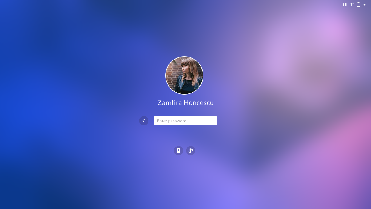
The design team has longstanding ambitions to update GNOME’s unlock and login experience. The designs have continued to evolve since I last blogged about them, and we continue to return to and improve them.
System unlock is a classic example of a touchstone experience. People unlock their computers all the time and, as the entry point to the system, it comes to define the overall experience. It’s the face of the system. It is therefore critical that unlock and login leave a good impression.
The new designs are intended to reduce the amount of friction that people experience when they unlock. They require users to take fewer steps and involve going through fewer transitions, so that people can get to their session faster and more seamlessly. This will in turn make the experience feel more comfortable.
The designs are also intended to be beautiful! As an emblematic part of the GNOME UX, we want unlock and login to look and feel fantastic.
Notifications
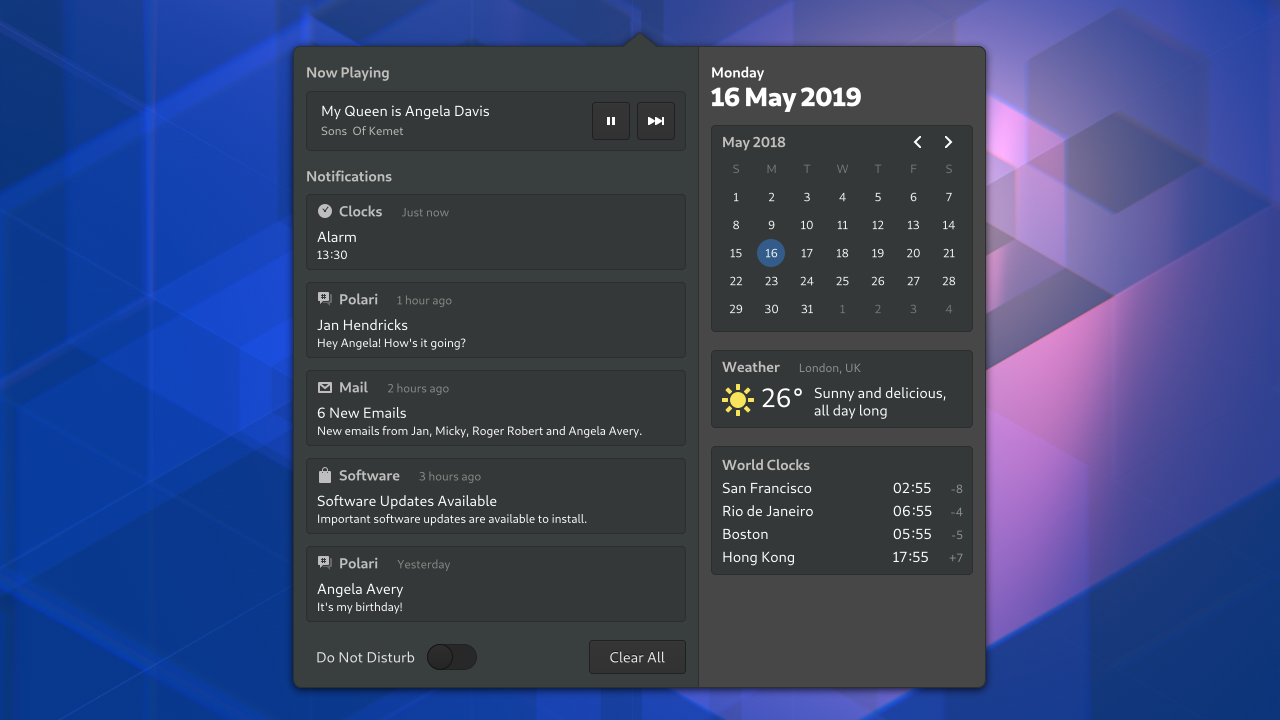
The design team has been systematically reviewing almost all parts of the core GNOME system, with a view to polish and refine them. Some of this work has already landed in GNOME 3.34, where you will see a collection of visual style improvements.
One area where we want to develop this work is the calendar and notifictions list. The improvements here are mostly visual – nicer layout, better typography, and so on – but there are functional improvements too. Our latest designs include a switch for do not disturb mode, for example.
There are other functional improvements that we’d like to see in subsequent iterations to the notification list, such as grouping notifications by application, and allowing notification actions to be accessed from the list.
Notifications are another great example where we can deliver clear value for our users: they’re something that users encounter all the time, and which are almost always relevant, irrespective of the apps that someone uses.
System Polish
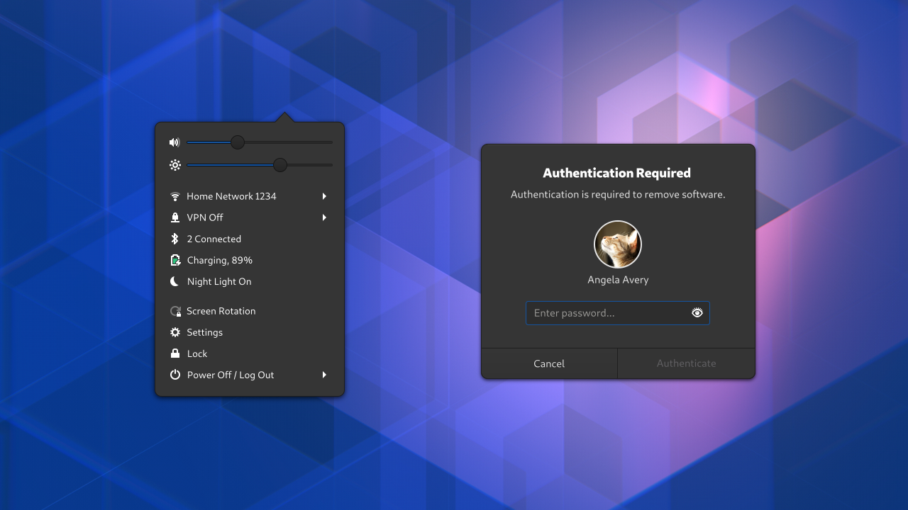
Our core system polish and refinement drive knows no bounds! We have designs for an updated system menu, which are primarily intended to resolve some long-standing discoverability issues. We’ve also systematically gone through all of the system dialogs, in order to ensure that each one is consistent and beautiful (something that is sadly lacking at the moment).
These aren’t the only parts of the core system that the design team is interested in improving. One key area that we are planning on working on in the near future is application launching. We’ve already done some experimental work in this area, and are planning on building on the drag and drop work that Georges Stavracas landed for GNOME 3.34.
Apps
The principle of prioritisation can also be applied to GNOME’s applications. The design team already spends a lot of time on the most essential applications, like Settings, Software and Files. Following the principle of prioritisation, we’ve also been taking a fresh look at some of the really basic apps that people use every day.
Two key examples of this are the document and image viewers. These are essential utilities that everyone uses. Such basic features ought to look and feel great and be firmly part of the GNOME experience. If we can’t get them right, then people won’t get a great impression.
Today our document and image viewers do their jobs reasonably well, but they lack refinement in some areas and they don’t always feel like they belong to the rest of the system. They also lack a few critical features.
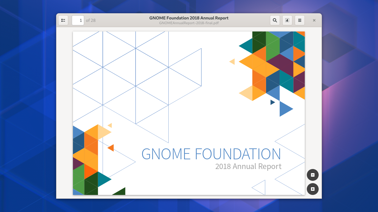
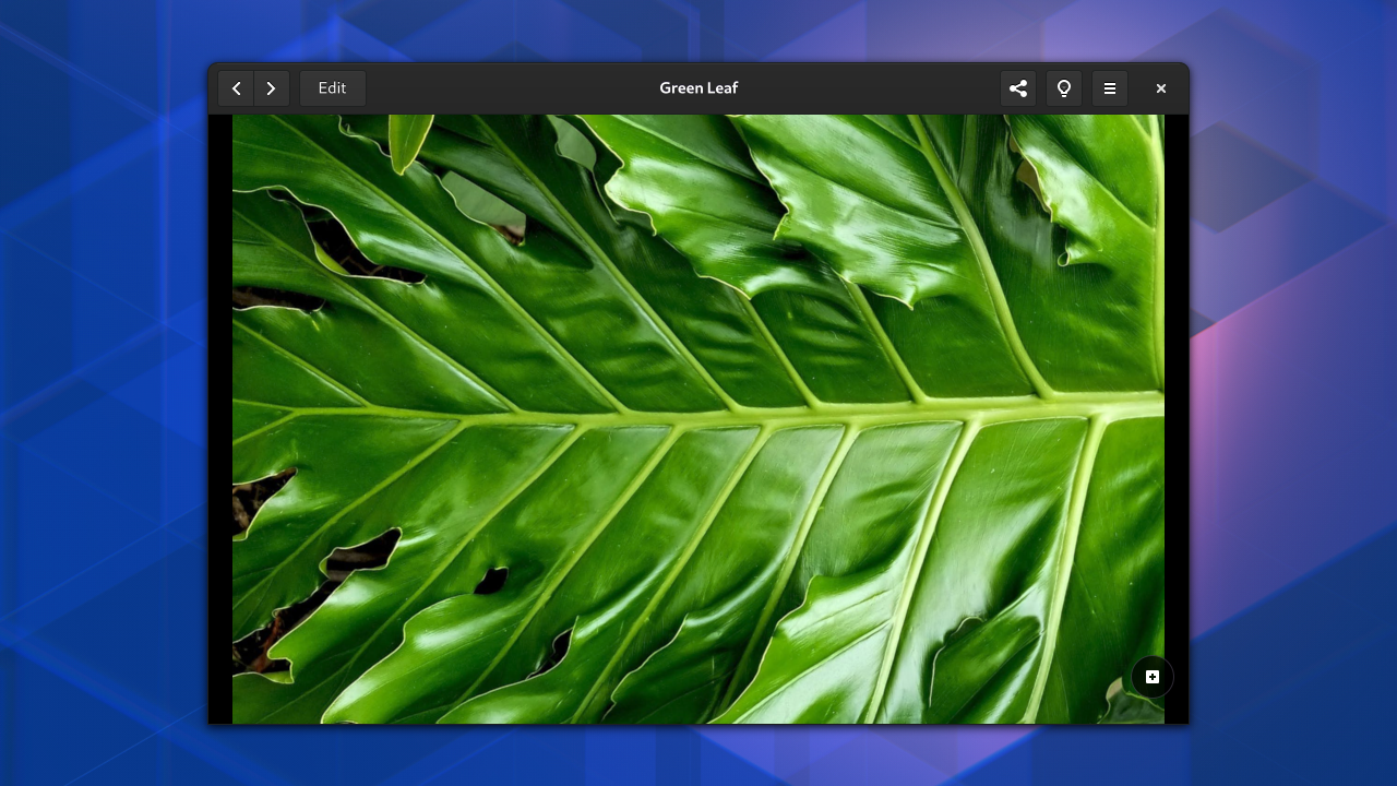
This is why the design team has created updated designs for both the document and image viewers. These use the same design patterns, so they will feel like they belong together (as well as to the rest of the system). They also include some additional important features, like basic image editing (from talking to GNOME users, we know that this is a sorely missed feature).
It would be great to extend this work to look at some of the other basic, frequently-used apps, like the Text Editor and Videos.
There’s a lot of other great application design work that I could share here, but am not going to, because I do think that focusing on these core apps first makes the most strategic sense.
Development Platform
Another way that we can prioritise is by working on the app development platform. Improvements in this area make it easier for developers to create apps. They also have the potential to make every GNOME app look and behave better, and can therefore be an extremely effective way to improve the GNOME UX.
Again, this is an area where the design team has already been doing a lot of work, particularly around our icon system. This is part of the application platform, and a lot of work has recently gone into making it easier than ever to create new icons as well as consume the ones that GNOME provides out of the box. If you’re interested in this topic, I’d recommend Jakub’s GUADEC talk on the subject.
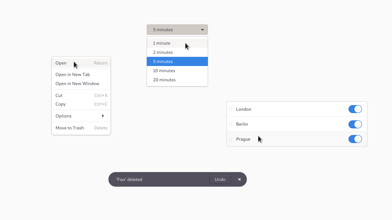
Aside from the icon system, we have also been working to ensure that all the key design patterns are fully supported by the application development platform. The story here is patchy: not all of the design patterns have corresponding widgets in GTK and, in some cases it can be a lot of work to implement standard GNOME application designs. The result can also lack the quality that we’d like to see.
This is why the design team has been reviewing each of our design patterns, with a view to ensuring that each one is both great quality, and is fully supported. We want each pattern to look great, function really well, and be easy for application developers to use. So far, we have new designs for menus, dropdown lists, listboxes and in-app notifications, and there’s more to come. This initiative is ongoing, and we need help from platform and toolkit developers to drive it to completion.
What Next?
UX is more than UI: it is everything that makes up the user’s experience. As such, what I’ve presented here only represents a fraction of what would need to be included in a comprehensive UX strategy. That said, I do think that the work I’ve described above is of critical importance. It represents a programme to drive up the quality of the experience we provide, in a way that I believe would really resonate with users, because it focuses on features that people use every day, and aims to deliver tangible improvements.
As an open, upstream project, GNOME doesn’t have direct control over who works on what. However, it is able to informally influence where resources go, whether it’s by advertising priorities, encouraging contributions in particular areas, or tracking progress towards goals. If we are serious about wanting to compete in the marketplace, then doing this for the kind of UX programme that I’ve described seems like it could be an important step forward.
If there’s one thing I’d like to see come out of this series, it would be a serious conversation about how GNOME can be more strategic in its outlook and organisation.
This post marks the end of the “what” part of the series. In the next and final part, I’ll be moving onto the “how”: rather than talking about what we should be working on and what our priorities should be, I’ll set out how we ought to be working. This “how” part of the equation is critical: you can have the best strategy in the world, but still fail due to poor processes. So, in the final instalment, we’ll be discussing development process and methodology!
Further Reading
More information about the designs mentioned in this post:
- Unlock/login designs – mockups
- Calendar and notification list – Gitlab issue
- System menu improvement – Gitlab issue
- System dialog improvement – Gitlab issue, mockups
- Document viewer – design page
- Image viewer – design page
- Development platform – design pattern review page
These designs look exceptionally rad :) I really like the typography (anything going on in the development platform to help with that?), and the tidier feel of all the things that pop out of the top bar. Especially the system menu. I didn’t realize that was needed, and yet it is _much_ better. Excellent example of why having a separate design team that works asynchronously is a powerful thing.
One thing that nags at me with GNOME releases as an enthusiastic end user is how each of these design documents kind of inches towards being fully implemented with each release. I wish it was more feasible to go “okay, the design for notifications is done so this release depends on having that implemented.”
I guess there’s a danger there of components getting out of sync like that, but it’s always odd (and exudes “good enough”) when one of these components is most of the way there but missing a few of the details that pull the designs together.
Hey Dylan! Yes we are working on adding typographic styles to the platform. This is the issue, and this mockup shows the latest iteration of the styles, as well as how they’d look in use.
I hear you on the release readiness question; there’s going to be a bit about that in the next post.
KDE’s current SDDM login screen already has had that kind of UX.
I think you guys should sometimes brainstorm with KDE developers. They really know what users really need.
They built what users call efficient and –the most important– effective UX.
Can you please go easy on the blur? IOS, Mac and Windows are really overdoing it with the blur and it just looks gaudy.
I suppose a mix of tiny blur radius, tinting and noise could work in some places. I think Windows has a “noisy” blur and it help create the impression of an actual surface, making the thing look more natural.
But overall too much blurred glass just looks gaudy, distracting and generic. So I hope Gnome won’t go all in on this aesthetic. Natural-looking and understated design is one of the things you can only find on Gnome these days. Everything else just looks synthetic and overdone.
This all looks very nice! And I appreciate your multi-part description of the UX strategy.
> The new designs are intended to reduce the amount of friction
> that people experience when they unlock. They require users to
> take fewer steps and involve going through fewer transitions, so
> that people can get to their session faster and more seamlessly.
This sounds like the phone-like sliding shield thing at login is going away? That would be a most welcome change!
You have a grand vision here but also reasonable and focused, which is uncommon to see in an open-source development, specially in desktops.
Maybe it would be nice if you also included some desktop gesture support as part as your top priority features, they really make a difference in terms of usability and of “polishment perception”, Alexander is doing a great job in that front.
Thanks alot for your article, it all sounds good but…
“It would be great to extend this work to look at some of the other basic, frequently-used apps, like the Text Editor and Videos.”
What about Dia? An update of its UI would be very much welcome… I see the app is maintained and yet its 90’s design seem absolutely not a priority to update for its devs… How is that?
I would like to help if I’d know GTK, and years passed since my last line of C…
Mostly because the maintainer is the ultimate arbiter as to what goes on the project. If the maintainer decided that they like the UI they have, or they don’t have the bandwidth to deal with a complete UI refresh, then there isn’t much to be done—outside of maybe offering to work on it and see what happens.
GNOME is not a company: there’s no resource allocation going on from the top down.
> or they don’t have the bandwidth to deal with a complete UI refresh
Nobody does, except for a multi-million dollar company. That’s why all the major software packages stick to the traditional designs. But what is the point of the “Gnome UX strategy” if even the major GTK apps aren’t ever going to be impacted by it (e.g. GIMP, Flowblade, Inkscape, Transmission, Deluge etc), to say nothing of other toolkits?
So I wonder: does it have to be all or nothing? I mean can’t there be some intermediate redesign that makes an app like Dia passably Gnomish?
Currently, to port Dia or GIMP to Gnome HIG, you’d have to convert half your vast menu hierarchy into contextual tools and put the other half somewhere else (where?). That would be a daunting task even for Allan Day just to design, nevermind actually implementing it. I think even Adobe would scratch their head for many months if they were told to just abandon the menubar. It’s never been done by anyone.
Perhaps add a command-search interface and allow the menubar to be hidden or shown with Alt, like on Firefox? Another idea, would be to put the menubar into the headerbar. But the HIG says, you either use the traditional Palo Alto interface or you redesign your UI from scratch without even much of a roadmap. If developers can’t replace/move the menubar in the interface, they are never go to redesign their apps.
I think most would be happy if these applications looked at least look passably Gnomish
Of course, the obvious solution would be to bring the menu out of the application window entirely.
It doesn’t have to be a global menubar (it can take the form of a sidebar, popup, or any other form – it just has to be able to house all the menuitems in one interface).
GTK supports menu export natively now, as does electron, QT, SWing, VCL. So benefit is that is that it’s no longer “just for Gnome(TM).” If Dbus menu proxy isn’t good enough for some reason, then perhaps it could be improved somehow? But it work already, so it can be used until something new is created.
From there, you’d just need to move some toolbar items into the CSD and others into context menus etc. Much more straightforward. Tons of incredibly complex Mac applications have been able to move their toolbar items right into the “headerbar”, and Linux apps could do the same.
What do you think about this? I honestly can’t think of any other UX strategy. Redesigning every part of the UI from scratch isn’t a strategy.
Question for Allan.
Menu bars are covered in the HIG today, and they’re supported by GTK. If an app like Dia wants to carry on using them, then that’s fine as far as I’m concerned. And there’s plenty of scope for modernisation and improvement without touching the menus.
That isn’t to say that I don’t think that apps are usually better off without menu bars, and there are plenty of examples of highly sophisticated apps that don’t use them. This is something that I’d love to see covered more in the HIG.
Does a global menu bar make sense for GNOME? My view is no. That kind of one size fits all approach doesn’t work out well in practice. It might have the appearance of consistency, but that soon falls apart when the standard menus don’t make sense in every circumstance.
More than that, a menu bar is designed to accommodate a lot menu items, which many apps don’t have and don’t need to have. They encourage complexity, when what we ought to be championing is simplicity (that’s simple in use, not effect – simple can still be powerful!)
> That would be a daunting task even for Allan Day just to design, nevermind actually implementing it. I think even Adobe would scratch their head for many months if they were told to just abandon the menubar. It’s never been done by anyone.
Sorry but that’s not completely true. Unity and MacOS have come around this exact same issue by moving the menubar to the panel.
Looks really much like Gnome’s latest strategy (~3.0) was to make the entire environment mobile friendly (but PC unfriendly)… Indeed, while the result is elegant and ergonomic for simple needs (mobile needs, simple applications), they’ve completly disregarded PC applications such as Dia and Gimp (and LibreOffice which is not Gnome but still…). Such applications are complex and do need a menubar. Hiding it to unhide it is not a solution.
Gnome could fix the PC issue the same way as did MacOS and Unity, and keeping mobile as it is now. I’d like to know why Gnome wouldn’t do that?
> Looks really much like Gnome’s latest strategy (~3.0) was to make the entire environment mobile friendly (but PC unfriendly)…
That’s a myth as far as I’m concerned. You don’t have to look for long at the GNOME 3 design to realise that it’s highly focused on desktop form factors (the top bar, hot corner, and quick access to search all spring to mind).
> That’s a myth as far as I’m concerned. You don’t have to look for long at the GNOME 3 design to realise that it’s highly focused on desktop form factors (the top bar, hot corner, and quick access to search all spring to mind).
Allan, I agree, Gnome Shell is great for PC users, I love using it as it is meant to be used, it’s keyboard driven and yet fits also touchscreens. Gnome Shell is a perl and the main reason I use Gnome DE as my daily driver.
But rather, I was meaning that PC applications (complex applications such as Gimp, LibreOffice, (and to a least extend Dia)) don’t fit well in the current Gnome UX strategy making it seem like it has been thought for simple applications exclusively (those that can be used on mobile)…
Or why those complex applications (PC applications) are still implementing a classical menubar instead of using the headerbar /(menu)?/ buttons as suggested by Gnome’s guideline?
At the danger of repeating myself: I don’t think that an app that’s using a menu bar is going against the GNOME HIG or GNOME UX strategy. That design pattern is supported and we do provide guidance for it. Having some apps with menu bars and some without isn’t a terrible problem.
At the same time, there are “complex” applications on other platforms that don’t have menu bars, so it can be done and it can be a really nice approach. The question for GNOME is how to evolve the application platform to support this kind of approach. To be honest, we haven’t done a huge amount of work on that so far, but we have done some limited experiments and it continues to be a topic of interest.
A couple of thoughts/requests:
* Would you consider splitting up the notifications and calendar, as well as making the calendar more detailed (e.g., grouped by sub-calendar). Currently I have homework, classes, (where homework and classes are seperate sub-calendars) and notifications all mixed up. It would be great to have a separate column for each.
* Has any more thought gone into persistent background apps? For instance having discord/fractal always on but hidden, with notifications still coming through, and then the UI instantly opening when clicking on a notification.
Hi! Yes, we definitely want to separate events from notifications. Indicating which calendar each event belongs to is an interesting idea; I’ll have to look into that.
There has been some progress on persistent background apps on the Flatpak/portals side. I suspect that there’s more work to do though.
I really like reading these blog posts about the the new UX strategy of GNOME but I can’t help feeling that the biggest problem of GNOME is not addressed.
The biggest problem of GNOME is not the unlock & login screen, is not the notification menu and is not the system menu. The biggest problem of GNOME is the workflow itself. How a user opens, switches an closes applications. And I belief that as long that’s not addressed, GNOME will not become a viable desktop.
Don’t get me wrong: I *really* try to like GNOME 3!! To be honest: I try to like it since the launch of GNOME 3 in 2011! But even after 8 years I still don’t know how to work with GNOME 3 efficiently (and I worked with many desktop environments)!
I do *not* ask for a complete redesign of the GNOME desktop. Most of the design can remain intact. Maybe it’s possible to ‘correct’ the workflow with some small adjustments.
Questions:
* What did the users of your survey say about the workflow of GNOME 3?
* Which extensions are used the most (this can help finding out what people are missing)?
> That’s a myth as far as I’m concerned. You don’t have to look for long at the GNOME 3 design to realise that it’s highly focused on desktop form factors (the top bar, hot corner, and quick access to search all spring to mind).
Slide-to-unlock is a very common pattern on mobile and almost unknown on desktops. Also, using sliding switches instead of checkboxes is very mobilesque. I find the sliding switches much more ambiguous, although one could argue they’re becoming the standard these days.
Thanks, Allan. I really like the mockups.