Last month, I announced a new initiative called Every Detail Matters. Its goal: to make GNOME 3 really awesome by ensuring that small design details are taken care of. Each round of the initiative will focus on a particular part of GNOME 3. Designers and developers will work together on refining the user experience.
For this first round of Every Detail Matters, we are focusing on the Activities Overview. We are being ambitious and are aiming to fix 20 UX bugs by the end of the release cycle.
There has already been an amazing response to Every Detail Matters. A whole crew of contributors have set to work, including some new contributors. Zan Dobersek, Seif Lotfy, Stefano Candori and Marc Plano Lesay have all successfully sumbitted patches. Vít Stanislav and Stefano Facchini are also hard at work on contributions of their own. The development version of GNOME Shell is already much nicer thanks to what they’ve been doing.


Every Detail Matters has got off to a great start, then; but there’s still lots more to do. We’re not even half way towards our 20 bug target! So, if you are interested in helping us to reach our goal, please get in touch. Every bug counts, and the clock is ticking.
Taking care of details does not just mean tackling easy bugs, and there are a number of more advanced tasks that we are looking for help with. If you are an experienced developer and want to make a valuable contribution, you can play an important role. Check out the wiki page for more details.
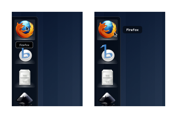
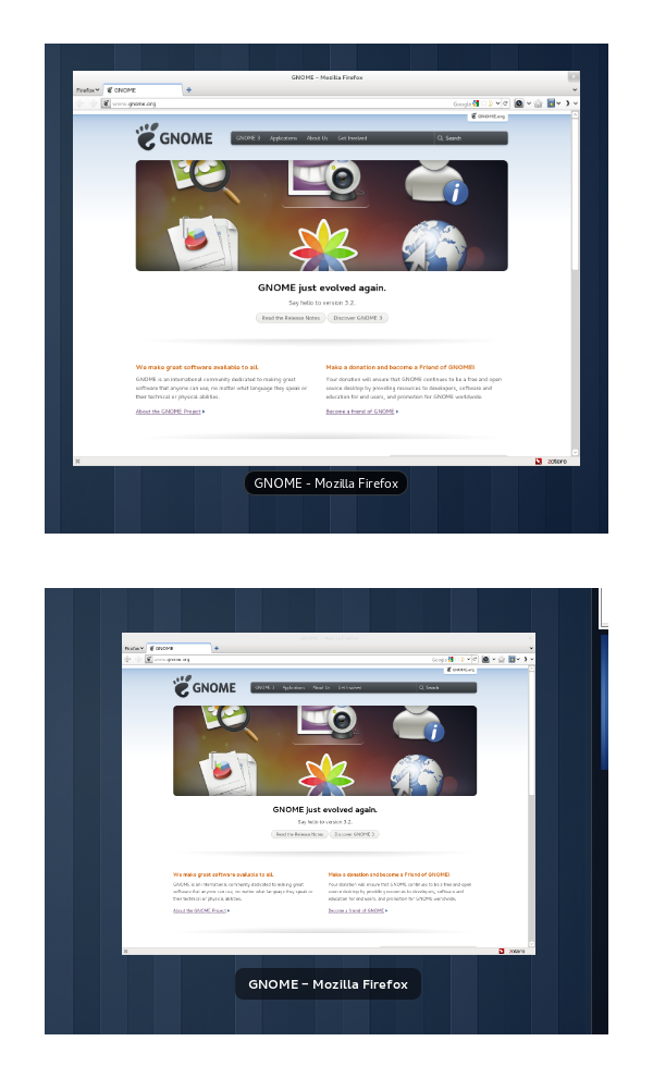
The firs is improvement since the label doesn’t clutter other icons, but how the second is improvement? The background of the label is lighter reducing the contrast and font is fatter reducing readability.. I don’t see it as improved at all, quite the opposite.
The rendering of the screenshot got a little degraded somewhere along the line. I find the bold text to be much clearer. It’s stronger and the text is larger. The other thing that has improved is the shape, size and position of the label background, which looks much better now and is consistent with other parts of the theme (opaque black didn’t fit in very well).
There’s plenty of time for the font weight to be tested and it’s easy to change it back if the consensus is that it sucks. :)
True, the things are seen the best when on one’s own computer. Will see how it looks then. The other concern I’m having is that now the label takes more of the horizontal space, potentially reducing the amount of info displayed, especially when more windows are open, so they are smaller in overview.
That’s a fair concern to have. For my part, my main concern is to have the text be noticable and readable. We’ve got some separate bugs that aim to make the labels wider, btw…
Hi Allan, I think this is a great initiative.
I was hesitant to move to GNOME3, after reading all the hate going around – but now that I’ve embraced it, it’s actually a joy to use.
I have a UX suggestion I was just thinking about. For example, after a fresh boot, I want to set up my workspace. In this example, I’m doing some Django work and listening to music. I want to be able to open up the ‘Overview (?)’ view and start dragging the icons of Chrome, Firefox, terminal, nautilus and Banshee all to their own new workspace.
If I currently try to do this, I have to wait for the app to start on the selected workspace before the next empty workspace is spawned. It would make more sense to me if I were able to drag the application icon over to the workspace and the workspace recognise that an application is starting on that workspace and immediately spawn a new empty workspace.
I’m sure of the underlying details, but maybe this could be implemented based on the startup-notification in the .desktop files?
Should I submit a bug about this?
Hey Andy, that’s an important detail indeed. I would certainly agree that that is a bug, although whether it is the fault of GNOME Shell or slow applications is an interesting question.
Seems like a good thing to report though.
Allan, I think it needs to be fixed in GS anyway, even if it’s someone elses fault.
Even if we all agreed that applications start too slow, hell would still freeze before all applications are fixed.
Haven’t tried it but maybe this extension helps? https://extensions.gnome.org/extension/16/auto-move-windows/
I’ll check it out – thanks
Much nicer, the borders were very noisy. :)
Awesome! Was looking forward to this update as well!
Very cool!
I wonder if Ephy could have been used for the demonstration instead of Firefox? :)
Subtle change but I like it. :) I’m waiting for something bigger like this (https://github.com/gnome-design-team/gnome-mockups/blob/master/shell/tints.png)
Some fresh colors in darkness of Shell. Not just pretty but very useful to instantly distinguish similar windows without reading captions (red Opera and orange Firefox). This effect could also be applied as highlight only on hover (mouse over). And please add icons in captions. :)
There’s another thing I’ve been wondering about: While trying to hit the jumplist in the shell bar at the top, it’s *very* easy to overshoot and hit the Activities hotspot[1]. A one-pixel pointer barrier at the top on the boundary between the two buttons would eliminate this problem[2]!
1. http://dev.gentoo.org/~nirbheek/files/gnome3/shell/jumplist-miss.png
2. http://dev.gentoo.org/~nirbheek/files/gnome3/shell/jumplist-hit.png
Great initative! Indeed: Every detail matters.
The new text is easier to read – and clearly attributed to the icon.
One question: What happens if one uses touchscreens. Is the description covered by the users fingers or there a different look / user interaction in this case?