Every Detail Matters is back for a second round, and let me tell you: it is bigger and better than ever. I have been totally blown away by the response we’ve received.
We managed to fix 20 Every Detail Matters bugs for GNOME 3.4. That target has already been blown out of the water for the 3.8 cycle. At the time of writing, I count 27 bugs fixed by 9 different contributors. We’ve got some really great fixes in there, like improving animations in the lock screen and making the login experience smoother. There’s also been some nice usability enhancements to the Message Tray and Activities Overview.
We’re not done yet though: there are 14 bugs that are currently being worked on, and many more that we want to tackle. I’m adding items to the list all the time, including new features as well as smaller tasks for newcomers. If you want to help make GNOME 3.8 awesome, check out the Every Detail Matters wiki page. If there isn’t something that appeals straight away, come back and check again: we’re updating the page all the time. There’s plenty of time to get involved.
Everyone who has contributed to Every Detail Matters has done a fantastic job so far. A special mention has to go out to Stéphane Démurget, who only recently started contributing, but who has been doing a brilliant job. Stéphane hasn’t just been fixing lots of bugs, but he has been fixing them with style, and has been a real pleasure to work with.
I’d also like to give big thanks to Giovanni Campanga, Florian Muellner and Jasper St. Pierre, who are regular contributors who have been busy fixing bugs and reviewing patches. And now for some screenshots of the work done so far. :)
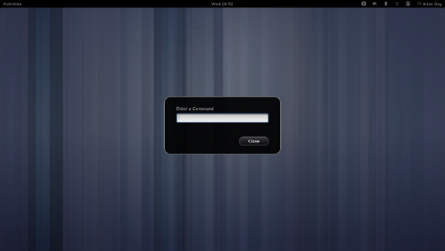
Yes, it’s a detail. But then, details matter: we have a nicer looking run dialog now. The most important feature of this is that it now has a close button, which means that people have an escape route if they accidentally open it. Another thing that this screenshot shows is our new background shade, which is used for modal dialogs and the overview. It used to be a flat transparency, but it has now been updated to use a radial gradient. This gives added depth and atmosphere.
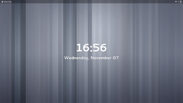
I’m cheating with this one, because it hasn’t actually landed yet. It is cool though: Florian has updated the lock screen to use a translucent top bar, which fits better with the overlaid screen shield metaphor that we’re using here. It also looks awesome. :)
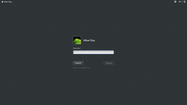
Finally, another detail (which, like all details, matters): the login screen now has properly styled insensitive buttons, and we make sure that the Unlock button is insensitive until the password entry field contains some text.
Expect more updates in the future.


You guys are really awesome! Since I don’t have the time to jump in and start contributing myself, I’ll just try to cheer you guys on as much as possible! :D
Nonsense, you have plenty of time. There’s never been a single time in history where “I don’t have enough time” has been true.
Most of the time, Free software lives with people jumping in and jumping out and keeping a small group of core developers.
Even if you jump in for a couple of hours once or twice, this is already a good asset. Allan is doing a fantastic job finding ultra easy to medium tasks to do, from a simple label change to more complex stuff. There’s work for people with different skill and time.
My reasoning is that even if we only fix small issues, that’s still time won by the core developers to bring us awesome features and do not lose time and tiny details. Plus the core developers are taking a lot of time to review all the patches very quickly
Good times ahead!
A bit odd that the user name jumps from right to left?
Does it make sense to have a close button on the run dialog considering the only way to open it, to my knowledge, is Alt+F2 (that is, a keyboard stroke)? Can I assume Esc still works to dismiss it?
Speaking of the Run Dialog, why does it still exist? It seems more consistent, and conceptually cleaner, to include that functionality in the Overview.
Thanks for the update.
Liam
It also looks a bit odd that it now has a “close” button but no “run” button – usually dialogs will have a button for their main command. :)
I was thinking the same, and also thinking that “close” may be a bit ambiguous – “do action and close”, or “cancel and close”? Might be better to call it what it is – “cancel”.
How about the remaining parts from round one? Will they be promoted to round two? There are some pretty important stuff there also.
Great job team Shell! It is very encouraging to see many new hackers. So far it looks like Stephane could be the new Javier. Btw I recommend going to wogue and look up the statistics for Shell. Many new hackers, lots of commit action and a maturing code base which is past the initial “every week is adding LOCs week”
Shell is becoming a true gem! Love!
Desensitising the unlock button until there is some text in the unlock dialog prevents empty passwords from being used. This is problematic with guest accounts or public use laptops which don’t have a password. (For example, my laptop has a password-less guest account which sometimes family uses)
What would be point of asking for an empty password? This just takes time and is borring if you do not need it. For guest accounts or public use, simply use the “User Accounts” panel and set “Log in without a password”: the password will not even be asked, that’s simpler! This panel also prevents using an empty password: either you do not want a password, or you use an efficient one.
If you set the no password option, I’m sure your family will be happy to just click on the guest account without getting to an unuseful password entry :)
I didn’t know there was an option for no password :)
Sorry, I take my comment back…
Sorry, this may not be the correct place to post this as a ‘Every Detail Matters’ request, and it may already be solved in 3.8 (I’m only on 3.4). But here goes, and if it’s the wrong place, please tell me what the right place is.
I use the mouse left handed and on log in I need to remember to use the left button, not right button to log in (as log in assumes a right handed mouse). This is mildly irritating and unnecessary as I’ll argue below.
I understand that of course login cannot know my mouse preferences before I’ve logged in, however there is an easy solution to this.
Simply that both left and right hand clicks perform exactly the same job on the log in screen (there is no other-button ‘menu’ option). That way my mouse preferences don’t need to be known and either button will select my name or push the login buttons.
Similarly for locked screens.
Ok, only 10% of people use left-handed mice, but this is IMHO definitely a detail that matters.
Keep up the good work with Gnome – it is definitely becoming a very usable desktop.
Best regards
Neill Jones
I can understand the feeling :)
The best place is always bugzilla.gnome.org. You should open an issue there :)
Thanks for the reply. Posted it under gdm as an enhancement.
Give me a panel back that is as easy to modify as the old Gnome 2 panel and supports a proper TaskBar. I was using Gnome 3 for a long time untill I tried out XFCE and and remembered what I loved so much about Gnome 2. Classic Menu, TaskBar which groups the windows. Notification area that doesn’t hide from you. You can move everything around and add/remove launchers/indicators from it just by right clicking the panel.
I hope we can finally change default font without having to install extra software. If I can change the desktop background, why not the font of the system? I can’t find a reasonable answer for this. If I install gnome in a large screen I almost can’t see the font. May I use accessibility interface? It does not make any sense.
I really like Gnome 3.6, but there are some rough edges. I will try to make a list here because this post shows some solutions to those rough edges.
1. The run dialog has a close buttong, but no run button. Anyone who manages to bring up the run dialog with Alt-F2 can probably guess that Enter will run the command and ESC will close the dialog. What would be nice is command auto-completion and a completion list.
2. The top bar keeps changing between desktop, screensaver and unlock screen. It keeps changing in terms of looks, functionality and order of “applets”. In terms of looks, how about making it all the same as in https://afaikblog.files.wordpress.com/2012/11/edm-lock-screen-640×360.png?w=640&h=360? Maybe a little less transparent would be nice. White text and symbolic icons with a black border should be universally readable on any background wallpaper. The user-menu applet moves from right to left, very strange and inconsistent. The spacing between icons changes, very inconsistent. When I click on the network icon in the screensaver, I get the option to change the volume? Very strange. Same for battery? Very strange.
3. In the screensaver, I have to press ESC and only ESC to get to the unlock screen? Is it ok to make it that any key-press will take me to the unlock screen and actually put in the key I pressed as part of the password? So that I can simply type in my password in the case where I’m not interested in looking at the clock/notifications/etc…? Pressing ESC in the unlock dialog should take me back to the screensaver, that would be nice.
I think those 3 points will make things more consistent. I would like to hear your opinion.
Hey Fred,
Those are interesting points. I’m not convinced that points 1 and 2 are really bugs. You can read https://bugzilla.gnome.org/show_bug.cgi?id=687127 for background on the run dialog. As for point 2, there are good reasons to present the top bar differently in the lock and login screens. You can’t have a user menu here, for example, since you haven’t logged in yet. The user name and lock icon are there purely as indication that that particular user’s session is locked.
I agree about point 3 and that is a bug that we are targeting as a part of Every Detail Matters.
Nice to read. Talking about UI details, I hope in fedora18 I can finally manage to set up the calendar on the top of the screen to have as first day monday. I made the mistake of picking en-US when installing fedora. I have now changed everything to en-IE, but it’s still displaying sunday as the first day of the week.
I really love GNOME3, BUT I really wonder why everything is crisp and smooth – except the borders (panel, run dialog and so on) – it’s a thick grey border… Wouldn’t it be better to make it thinner and more crisp? :)