A little while ago, I wrote about using data-driven design approaches in GNOME. For the 3.36 development cycle we successfully used one these techniques to improve the Settings app, and I wanted to share the story of what we did, and how the testing we’ve conducted is feeding into the GNOME user experience.
Starting out
The inspiration for the testing initiative came from several sources of feedback. A number of our own contributors had complained that, in the Settings app, they struggled to remember which settings were in each of the two sub-sections (called Devices and Details). Then, last GUADEC, Deb Nicholson ran a SpinachCon (a kind of usability testing event) and a number people were observed having trouble finding some of the settings, particularly the Date & Time settings.
Suspecting that there might be an issue around settings navigation, we experimented with some ideas for how the structure of the Settings app could be improved.
Hypothesis testing
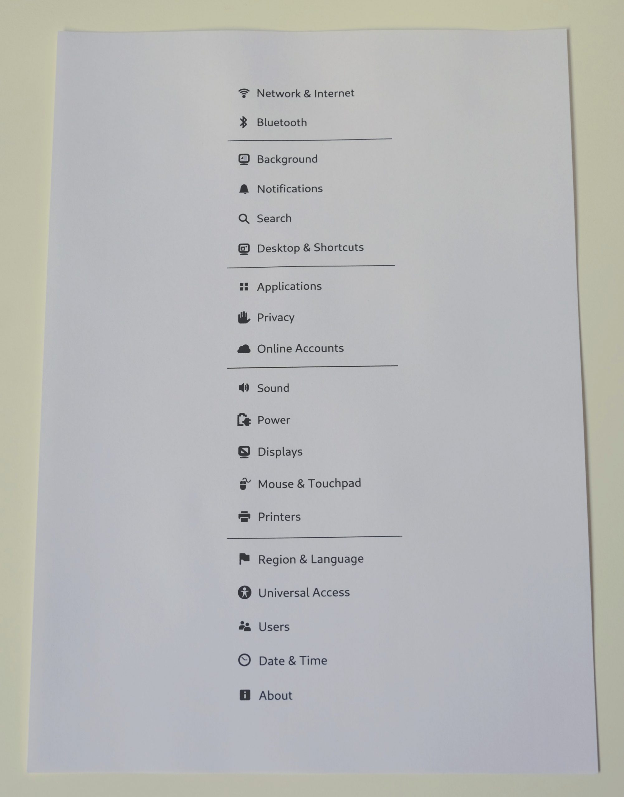
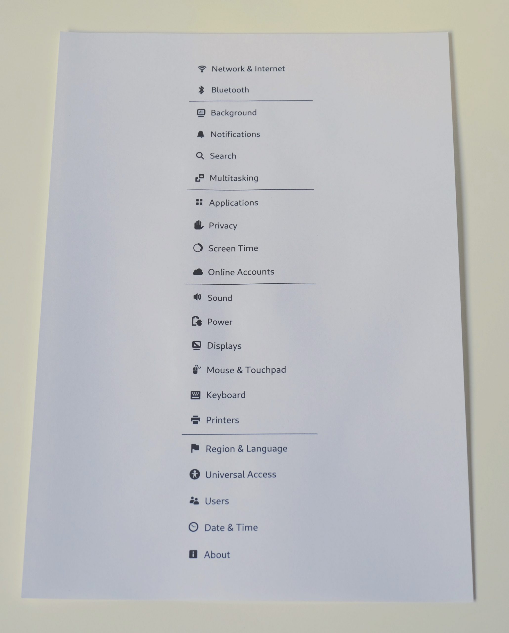
After a little experimentation, we came up with an updated design for settings navigation, which we hoped would solve the issue with the sub-categories. But would it work? I wanted to put the new design to the test, rather than assuming that the new design would be successful. Happily, the nature of the design – shuffling settings categories around – made it relatively easy to test. A simple paper prototype would do.
Paper prototyping is great if you can do it: it’s quick and easy to do and, most importantly, it allows different changes to be tested before developers spend time implementing them. The initial prototype consisted of a set of cards, each one representing one of the settings panels. These were laid out in front of the test participant, who was asked to pick a card where they thought a particular setting might be found.
After running a pilot test, I realised that the cards weren’t necessary and that a simple rendering of the list of settings panels would be more accurate, as well as being easier to produce (no more cutting up pieces of paper). The lesson: always run a pilot test!

With zero setup for the testing arrangements, the paper prototypes raised the possibility of drafting in volunteers from the GNOME community to help run the tests. To help standardise the tests, I wrote a testing script for the test facilitators to read out. The script included the list of test scenarios, for example:
You are in a cafe with your laptop, and you have connected to the wi-fi. A friend joins you and asks for the wi-fi password. Where would you go to look it up?
Each of these scenarios was designed to test a different aspect of the design, and we managed to test 16 separate scenarios over the entire exercise.
Test, redesign, test
In the first round of testing, we conducted the test with four people. Generally you would test with more people than this, but some issues with the design were already becoming clear. Improving the design and running tests on the new version seemed like a better use of our time, rather than re-confirming obvious problems.
We updated the design to try and resolve the issues that we saw in the first round of testing, and then we conducted tests on the new version. This design, test, redesign, retest is a powerful way to iteratively improve UX designs.

The results from the second round showed that the updated design had resolved a number of the issues we’d seen in the first round of testing. The main UI changes we were planning – grouping the networking settings, removing the sub-categories, moving default apps and removable media under apps – had all performed well. These results gave us the confidence to move ahead with the design changes.
The upcoming GNOME 3.36 includes some of these UI changes. Most noticably, the Devices and Details subsections have been removed (the settings they contained are now all visible on the top level). We’re confident that these changes will make it easier for users to find their way around the Settings app.
Further changes are planned for future releases: we want to consolidate the list of settings panels into fewer items, by merging the Wi-Fi and Network panels, and moving Default Applications and Removable Media inside the Applications section. These changes have been tested and, we think, validated from a navigation perspective.
New discoveries
The tests that we ran did their job, and allowed us to validate the updated Settings design prior to it being implemented. At the same time, we also discovered a number of other separate issues with Settings navigation. These varied in terms of their scale, and included issues in both the existing version and future changes that we have planned.
In some cases we’ve already been able to make improvements based on these new discoveries. For example, we’ve improved the icons for a number of the settings categories, to make it more obvious what they are. In other cases, we are still working on design solutions to the issues we observed. This includes things like:
- Making it easier to find the keyboard layout settings
- Helping people to get to the screen lock settings
- Reducing confusion around what Universal Access means
These are all small papercut issues which it will be great to try and make progress on over the upcoming 3.38 release cycle.
The additional issues that we discovered are a good example of how exploratory testing can have a role alongside validation of existing proposals. I think it also shows how research needs to be regular and ongoing: once we’ve figured out designs to fix these new issues, we should really do more tests to see if they really have been resolved.
Summary
Hopefully this initiative is a good example of how lightweight testing can improve quality and reduce design and development overhead by identifying design issues early in the development process.
The exercise enabled us to test a design, reject some aspects of it, and then test a revised version, without having to write a single line of code. Without this out-of-band testing, the same process would have required implementing the design, releasing it, (maybe) getting feedback, then redesigning it and implementing the new design.
The other really nice thing about this process is that it enabled a whole array of contributors to participate in the design process. By the end, we’d had 11 tests conducted by five contributors, located in four different countries. That’s pretty cool!
Speaking of contributors: many thanks to António Fernandez, Vojtech Stanek, Philip Withnall and Clarissa Borges, all of whom conducted tests and made this initiative possible.
Thanks for merging network settings, I’ve waited for this! However, “Multitasking” sounds a bit strange to me – when I read that, I would not know what it contains.
Not sure if people appreciate how powerful this really is.
Thanks for taking the time to do this!