The GNOME design team has recently been working on GNOME’s application development platform, and I thought that it might be interesting for people to hear about what we’ve been up to.
The following is an overview of our recent platform design activities, particularly libadwaita. It will give an idea of what is currently going into the GNOME platform from a UXD perspective, as well as some of things that people might expect from the platform in the future.
Some context
If you follow GNOME development, you’ll know that GTK 4 was released back in December 2020. You’ll also maybe know about libhandy, which can be used in conjunction with GTK 3 to add additional widgets and capabilities. And you might know that libadwaita is being worked on as the libhandy successor for GTK 4.
Adrien Plazas did a great post announcing libadwaita, and Alexander Mikhaylenko has been posting detailed updates. libadwaita still isn’t stable, but the hope is to have a stable 1.0 release in the not too distant future.
One of the central goals of libadwaita is to make it easy to make great apps, using the components and design practices that make up GNOME’s app design approach. Needless to say, the GNOME design team has been on board with this initiative from the start! It has also required quite a bit of work from us, both to document and systematise the design conventions we’ve been using, as well as to design missing platform pieces.
The first major step in this work was completed last development cycle, with the rewritten HIG. The new version is synchronized with GTK 4 and libadwaita, so its design advice is an accurate portrayal of what can be done with the emerging new version of the GNOME platform.
The updated HIG will be an important part of the application developer experience, and we are now focused on delivering the other key elements.
Ongoing work
The following describes some of the areas of platform design work that the design team are currently involved with, particularly in the run up to libadwaita 1.0. As such, it covers work that is unfinished and is in various states of flux.
Styling
One of the first things that people will notice about apps that are using GTK 4 and libadwaita is their look, which is noticeably different from GTK 3 apps.
Header bar buttons are generally plain icons without outline or background. Other buttons have a flat colour. The background colours of container widgets are lighter in light mode, and darker in dark mode. Many of these changes in appearance are driven by technical changes: libadwaita’s support for dark mode and recolouring has knock-on effects for how widgets can be styled.
However, the design team is also keen to use the opportunity of libadwaita 1.0 to update the style of GNOME apps. The last time GTK had a style update was for GNOME 3.32, back in March 2019, and it could be several years before we get another opportunity to make changes.
On top of that, we do feel that the current GTK 3 look could be improved when compared to what’s being done on other platforms.
We are actively testing the style changes that have been made so far, using both in mockups and actual apps, and there could be adjustments before libadwaita 1.0. We also have a few other relatively minor style changes planned.
Dark mode
The new dark style preference is probably the main “feature” to come out of libadwaita — see Alexander’s recent post about it, if you haven’t already.
A properly supported dark style isn’t just a simple switch between two alternate CSS stylesheets, and the design team is currently working through a list of work items to make it into an excellent experience. This includes adjusting application-specific styling to work in both light and dark styles, modifying any full-colour icons we use to have adequate contrast in both modes, and creating light and dark versions of the GNOME wallpapers.
We have also, obviously, been working on designs for how to expose the dark preference itself.
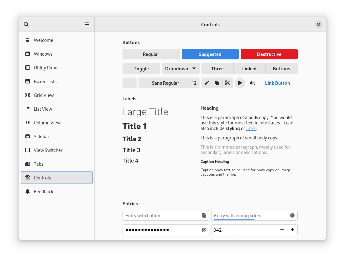
Patterns app
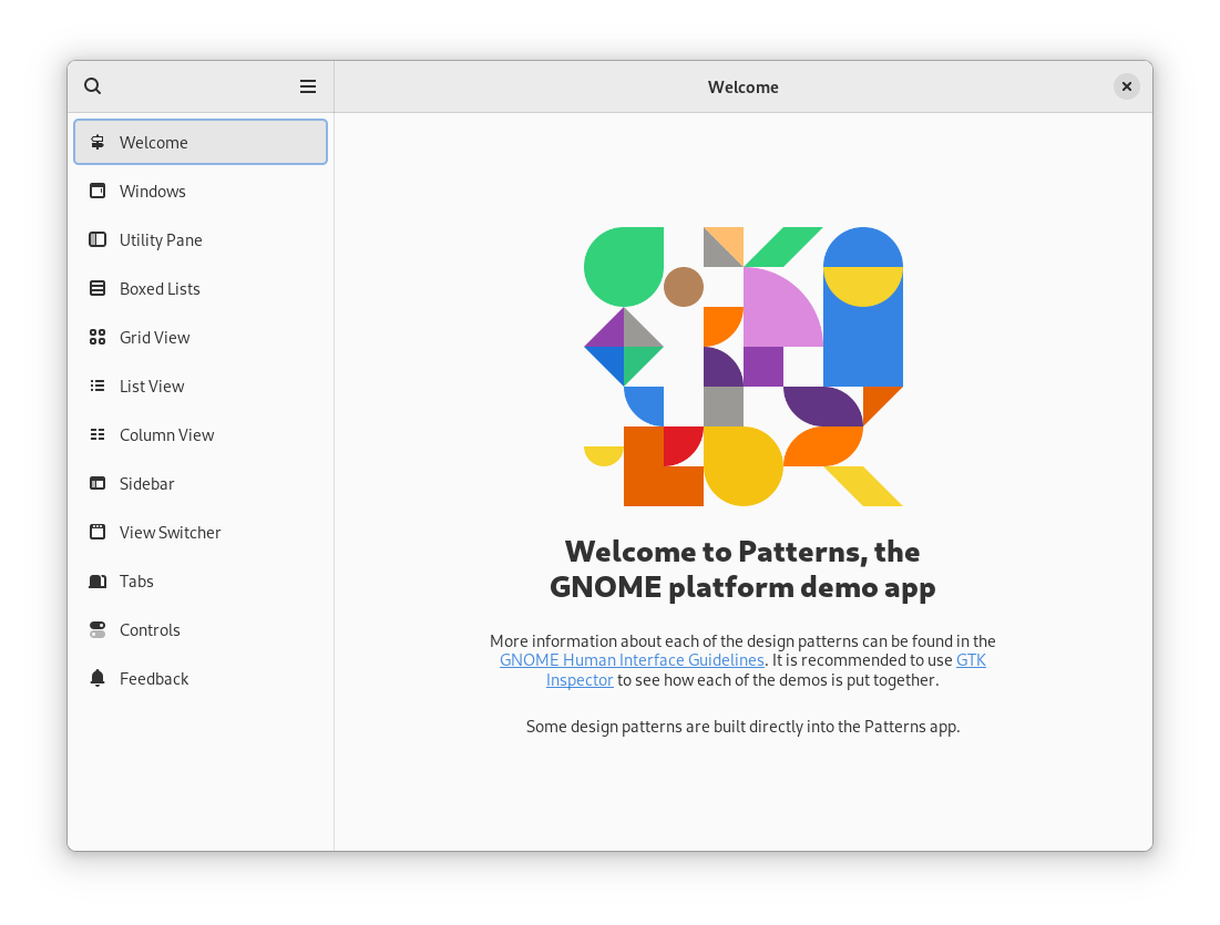
Another ongoing initiative is the design and development of Patterns. This is a demo app which is intended to accompany libadwaita and the HIG.
One explicit goal of Patterns is to demonstrate those design patterns which we recommend app developers as part of the HIG, as opposed to demonstrating every possible UI that the platform is technically capable of producing.
There is plenty of work yet to do on Patterns, so if you’d like to help out with this effort, just head over to its Gitlab project.
New about
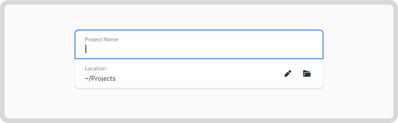
There isn’t much scope to add new widgets prior to libadwaita 1.0, but there are a few which the design team is hoping to sneak in. One of these is an updated about window design. The goal is to have a simple, refined design, which works on a variety of form factors.
Looking to the future
In addition to supporting development work that is currently ongoing, the design team is also working on designs which will hopefully happen in future versions of libadwaita, after 1.0, and I’ll give an overview of these so you can see what’s coming down the tracks. That said, all of these designs are speculative, so there is no guarantee that they will happen, or that they will happen in the form that’s described here. Also, note that the images here are mockups which aren’t a fully realistic representation of what any final UI might look like.
Entry rows
Boxed lists are a common design pattern in our apps, and libadwaita includes a number of convenience widgets to make it easy to create common types of lists and rows (currently, AdwActionRow, AdwComboRow, and AdwExpanderRow). One thing that’s missing here is a dedicated widget for rows which contain a text entry, and this is something that we’ve been actively exploring. It’s a tricky design problem but is something that we’re determined to resolve.
Toasts
In-app notifications are the bars that appear below the header bars of some GNOME apps, to show transient messages. They have been used for some time, and play a key role in a number of core apps. However, despite their centrality, they have never really been supported by the platform, having been provided as cut and paste code from libgd, which has meant that they’ve often been out of reach for many app developers.
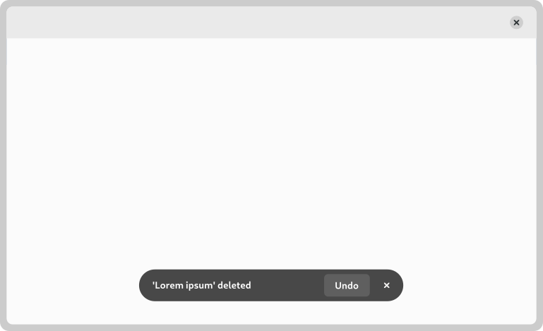
Toasts are planned to be a new widget which will be provided by libadwaita, and which will effectively replace in-app notifications. We plan on avoiding some of the issues that can be seen with the existing in-app notifications, by providing a simple API which takes care of the tricky aspects of showing message popups, such as message queing.
Banners
Another widget which we hope to provide an alternative to is GtkInfoBars. These have been around for a very long time, and are used in many apps to show a coloured strip below the header containing text and controls.
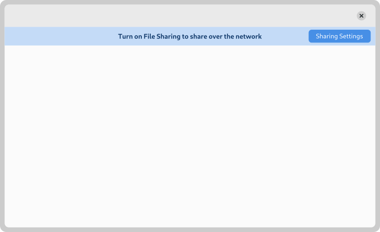
Info bars require developers to pack the content of the bar themselves, which results in consistency and quality issues, as well as more work for developers. Also, they aren’t adaptive. So we are planning to introduce a new widget – banners – which are simpler to use, adaptive, and which take care of their own internal layout. This will avoid the info bar issues of the past, and be less work to use.
Selection mode
Another area of design development has been selection mode. This is found in some of the GNOME core apps, but is not currently covered by the HIG. Recent design exploration has sought to refine and update the design pattern, in order to allow us to recommend it to developers.
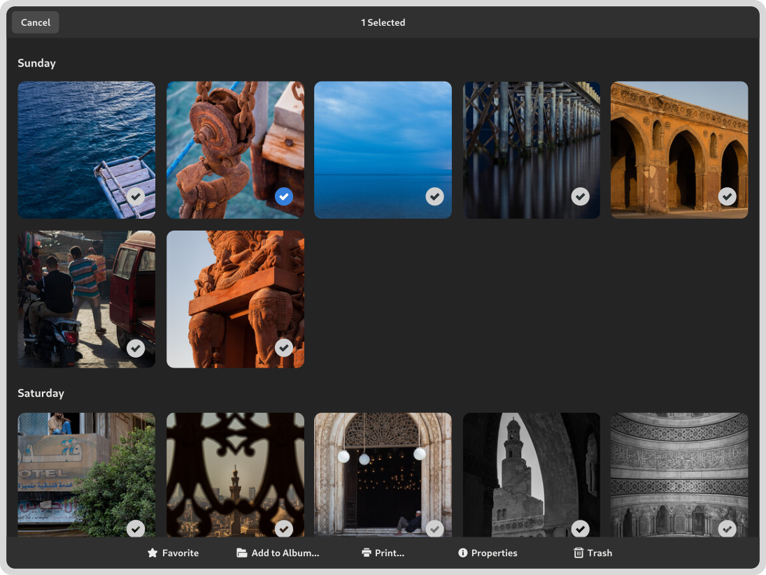
A good next step here will be to try the updated design in a core app, so we get an opportunity to validate it.
Putting it into practice
Over the past few weeks, I’ve been updating a number of GNOME’s core app designs, to put our updating styling and design patterns into practice, and make sure that they work together.
Here, you can see what Contacts, Photos and Clocks might look like once ported to GTK 4 and libadwaita. Obviously, these are just experiments, but they are a helpful way of exploring our new direction.
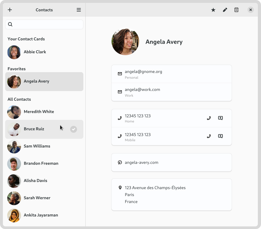
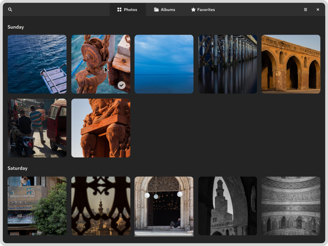
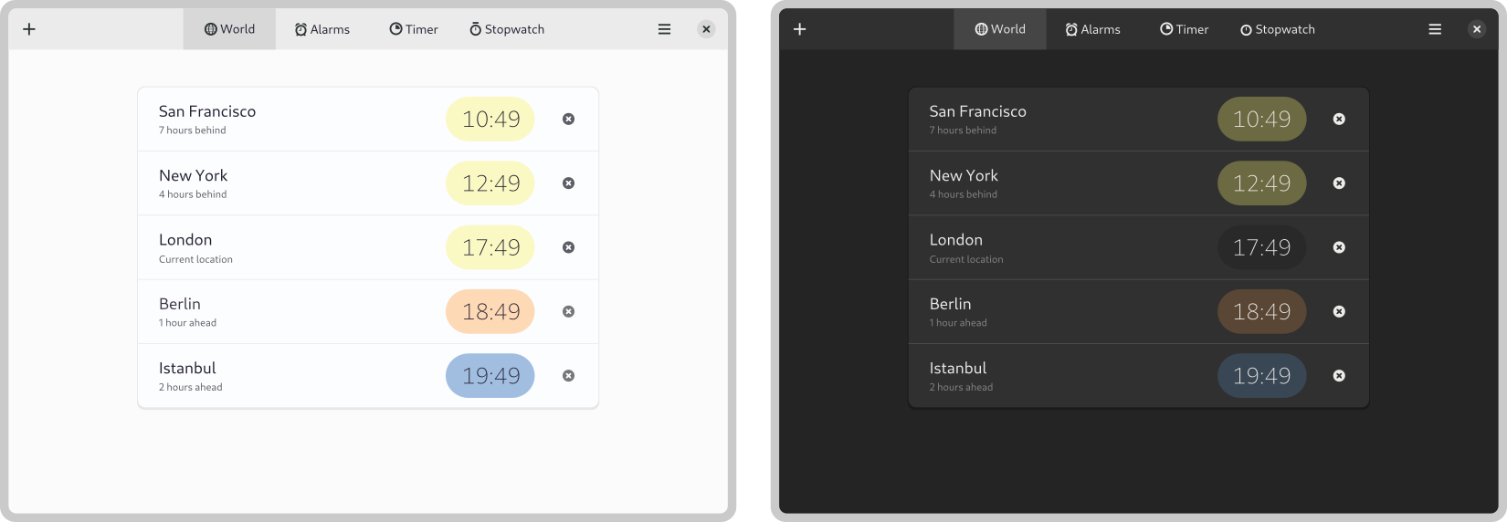
I have to say that, applying the new style to existing apps has been extremely refreshing from a design perspective, and the new approach has been working even better than I’d expected. The simplified visual style feels lighter, and a number of awkward old designs clicked into place when using the new list and button patterns.
Closing thoughts
Many of the things that are being done for the GNOME platform right now have been a dream for many years, so the fact that they are now happening is incredibly exciting. Having fully supported design patterns, with integrated documentation and demos will be huge win for anyone creating apps for the GNOME platform.
Alexander Mikhaylenko deserves special thanks for his work on libadwaita, which is making all this possible. Tobias Bernard, Adrien Plazas, Chris Davis, Jakub Steiner, and Maximiliano are all also playing key roles.
While phenomenal progress is being made in this area, resources are tight and there’s a lot of work falling on the shoulders of a few contributors. A good number of things we would like to implement for libadwaita 1.0 won’t make it because of these constraints. Which is my way of saying: help would be welcome!
I’ve seen in a lot of mockups in which the dark styles don’t have bright borders that is currently present in libadwaita; for example, at the side bars. Will libadwaita remove those? (I hope so since they are just too prominent / distracting imo.)
This is just padding on the screenshots
I don’t mean the screenshots in this post. They look good IMO.
I meant the actual libadwaita (for example, if you build the demo from the main branch or look at the nighly build of the new text editor, todo etc). Its dark style looks very different. There were a lot of bright lines added to it. Separating the side bar, the header bar….
This is the feeling on the design team side too – we’d like to tone down the borders in dark style whenever possible.
There are a constraints which mean that we’ll need light borders in some places, but overall, darker is the way to go!
That’s great to hear. Thanks for the reply!
What are your thoughts about embedding banners in boxed lists?
It seems strange to have them span the entire width of the window and would be easier to have them work in an adaptive design if it was just e.g an entry on a sidebar.
You could even have multiple if you utilise the concept with badges which may or may not be wanted depending on context.
But at least as an app developer you would have the option of stacking multiple behind a badge if you would like.
You would also have greater control over the context in which a banner is shown, you could nest under an existing entry , e.g people, if photos supported faces, or locations (to enable location tracking) or artists, albums, playlists on music.
If it’s a banner that doesn’t fit into an existing entry or covers multiple then the banner could be displayed on the top level instead of nested context.
Sorry, I’m not sure I understand what you’re proposing here. It’s always hard to communicate designs with words alone!
Awesome work guys! Those guidelines are more than necessary to ensure a great user experience and make Gnome the best DE. Coming from 20 years in thr Apple world Gnome helped me to adopt Linux for 3 years now and start developing apps for Linux. Keep those articles coming!
Well, this is actually great to hear :)
I’ve been using GNOME for a good while now and I’m very happy with how well the design currently looks and how usable it is. Looking at these changes, it seems like there are going to be many improvements that are going to have very positive effects on the platform. However, I’m afraid a few of these changes are an unnecessary step backwards.
Looking at the screenshots I can tell the design team has been looking into finding ways to “flatten” the design, or remove elements that may seem excess, which is indicated mainly by the lack of gradients and the redesign of the buttons. I think both the aforementioned changes are unnecessary and constitute change for the sake of change and a departure from the values and ideas that made the old design so usable.
> On top of that, we do feel that the current GTK 3 look could be improved when compared to what’s being done on other platforms.
If looks were the main concern of the design when considering this change then I don’t think this change is explained, since the previous design already looked gorgeous and this new design style – flattening everything as much as possible – is part of a fashion-like cycle that will look outdated in a while – if it doesn’t already look outdated for some people, like it does for me.
Even so, I don’t think GNOME should directly compare itself to other platforms without accounting the usability of other designs especially since the old GNOME design accomplished that well, unlike other platforms that have recently started stepping back on many of their design changes for that reason. The purpose of a GUI is to allow a human to interface with a computer efficiently, looks should always be a secondary goal (still a goal to achieve, mind you, just secondary).
And getting to the meat of it, this change is horrible for usability and accessibility and this has been **proven** to be the case for flat designs. Removing things like the gradients on the header bar or changing buttons to be plain icons means removing crucially important contrast between elements and weakening visual cues to the user that things are clickable. In effect it makes it harder for the brain to “parse” the interface the person is looking at and leads to users having a harder time navigating the interface. Even if it doesn’t seem like much, removing a lot or all of these cues can and will add up, leading to a worsening user experience.
I think the GNOME design team should reconsider some of the changes shown here, specifically the flattening of the buttons and considering re-introducing their borders, a drop-shadow and maybe even a gradient. I appreciate the work they have done over the years but
I’d like to point out that there’s still a high contrast theme, which essentially increases the contrast on Adwaita, and it is available in the accessibility settings.