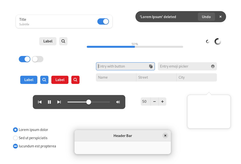
After a lot of hard work, libadwaita 1.0 was released on the last day of 2021. If you haven’t already, check out Alexander’s announcement, which covers a lot of what’s in the new release.
When we rewrote the HIG back in May 2021, the new version expected and recommended libadwaita. However, libadwaita evolved between then and 1.0, so changes were needed to bring the HIG up to date.
Therefore, over the last two or three weeks, I’ve been working on updating the HIG to cover libadwaita 1.0. Hopefully this will mean that developers who are porting to GTK 4 and libadwaita have everything that they need in terms of design documentation but, if anything isn’t clear, do reach out using the usual GNOME design channels.
In the rest of this post, I’ll review what’s changed in the HIG, compared with the previous version.
What’s changed
There’s a bunch of new content in the latest HIG version, which reflects additional capabilities that are present in libadwaita 1.0. This includes material on:
- How to style header bar buttons
- Pill and circular styles button styles
- Boxed list convenience widgets (action rows, combo rows, and expander rows)
- Toasts
- Dark mode
There have also been updates to existing content: all screenshots have been updated to use the latest UI style from libadwaita, and the guidelines on UI styling have been updated, to reflect the flexibility that comes with libadwaita’s new stylesheet.
As you might expect, there have been some general improvements to the HIG, which are unrelated to libadwaita. The page on navigation has been improved, to make it more accessible. A page on selection mode has also been added (we used to have this documented, then dropped the documentation while the pattern was updated). There has also been a large number of small style and structure changes, which should make the HIG an easier read.
If you spot any issues, the HIG issue tracker is open, and you can send merge requests too!
